Title

Nissin Cup Noodle Tomato Chili Red Green


Topics

Food Packaging Logos

Details

Uploaded user: Leo

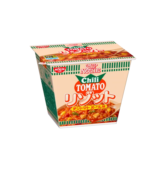
A tapered paper cup of Nissin Cup Noodles sits at a slight three-quarter angle, revealing the front and left side panels. The packaging features a cream-colored base with bold green vertical stripes running along the lower rim, while the central label displays 'Chili TOMATO' in red serif lettering above large pink Japanese characters. A photographic image of tomato-based noodles with visible chili pieces occupies the lower half of the cup, and the Nissin logo appears in a small red rectangle on the upper left edge.

Visual interest stems from the specific color palette combining warm tomato-reds, vibrant greens, and soft cream tones that signal a spicy flavor profile. The typography hierarchy creates clear distinction between the English flavor name and the prominent Japanese script, offering a study in bilingual package layout for international markets. Green striping provides a rhythmic graphic element that breaks up the solid color fields and draws the eye toward the product photography.

Food packaging designers might examine this reference when developing instant noodle variants requiring bold flavor communication through color coding. Illustrators working on commercial food art could analyze how the steam and sauce textures are rendered within the confined label space. Brand strategists evaluating Japanese market entry could note the balance between global English branding and local language prominence.