PonPon Instant Noodle Vegetables Green Traditional
Topics
Details
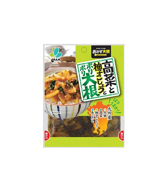
A rectangular plastic pouch dominates the frame, featuring a vibrant lime-green header that transitions into a transparent lower section revealing the preserved vegetable contents inside. The upper half displays a photographic image of a bowl filled with rice and the prepared dish, garnished with green herbs, while bold Japanese characters in white, green, and black announce the product as 'Takana to Yuzu Kosho Ponpon Daikon' from Kyushu. A small orange map of Japan's Kyushu region sits in the bottom right corner of the green field, accompanied by additional descriptive text and a circular logo with blue and green leaf-like shapes in the top left.
Visual hierarchy is established through the contrasting block colors and the dynamic orientation of the main text box, which is tilted slightly to create energy within the otherwise structured layout. The combination of appetizing food photography with clear regional branding—specifically the mention of Kyushu ingredients like takana greens and yuzu pepper—gives the packaging a distinct artisanal feel despite its mass-market appearance. Bright, even lighting ensures every detail of both the graphic elements and the textured product visible through the clear film is easily legible.
Packaging designers studying Asian grocery aesthetics will find the color blocking and typographic arrangement particularly useful for understanding how to balance information density with visual appeal. Food stylists might examine the composition of the bowl photograph to see how preserved vegetables are presented as an appealing meal component rather than just a condiment. Brand identity specialists could analyze how geographic indicators like the regional map and specific ingredient callouts are integrated into the overall marketing message to convey authenticity.