Calbee Ramen Spring Flavor Pink Floral Design
Topics
Details
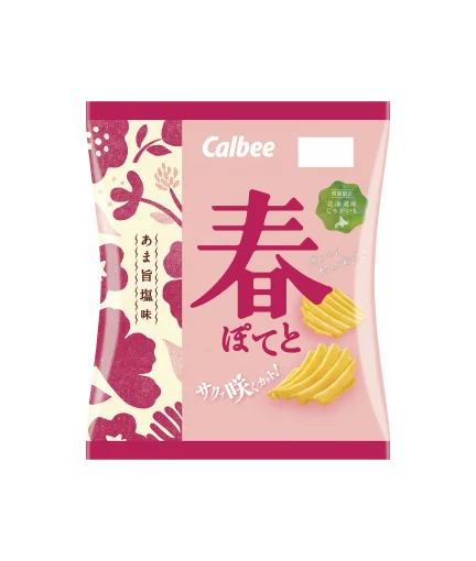
A soft pink Calbee potato chip bag dominates the frame, featuring a bold magenta kanji character for 'Spring' at its center. The left edge displays a cream-colored panel decorated with stylized burgundy floral silhouettes and white polka dots, while the right side shows ridged yellow chips. White text reading 'Calbee' sits above the main graphic, and a green circular badge with Japanese text appears to the right of the large character, all captured from a straight-on, flat perspective.
What sets this packaging apart is its seasonal color palette, which swaps the brand's typical earthy tones for a delicate pastel scheme that feels fresh and vernal. The juxtaposition of traditional Japanese typography with modern, playful floral patterns creates a unique visual tension between heritage and contemporary snack marketing. Subtle details like the vertical text strip on the floral panel add depth without cluttering the overall composition.
Brand strategists might study this example when developing limited-edition product lines that need to signal seasonality through color psychology alone. Illustrators could reference the way botanical elements are simplified into bold shapes that remain recognizable yet graphic. Packaging engineers may note how the layout balances large typographic focal points with smaller informational badges to guide the consumer's eye effectively across the surface.