Nissin Donbei Ramen Duck Noodle Yellow Red Traditional
Topics
Details
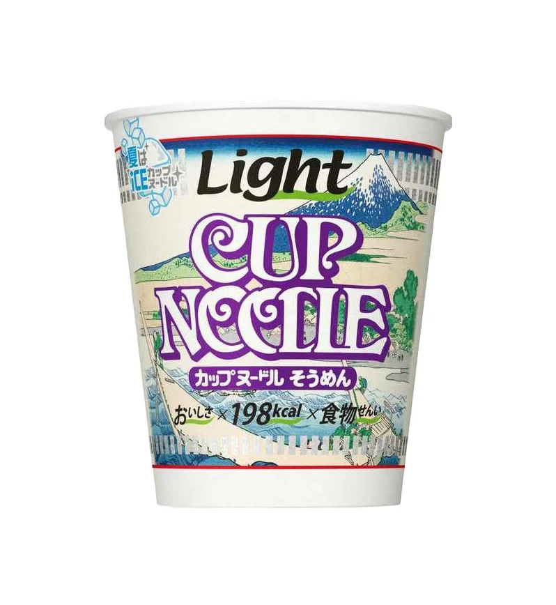
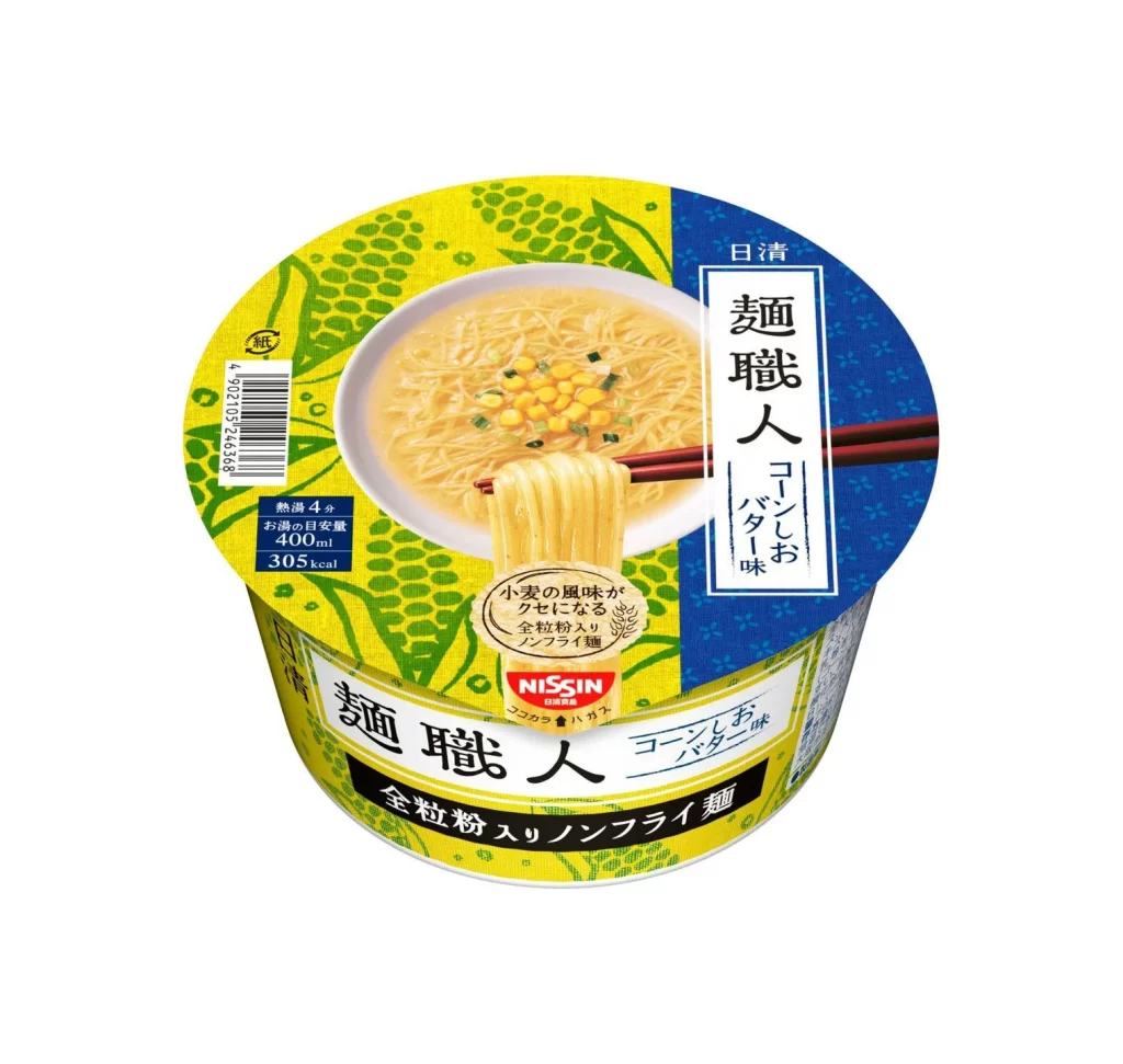
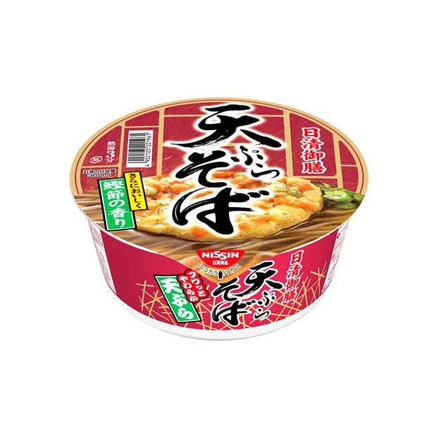
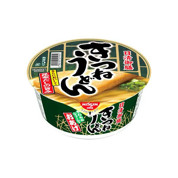
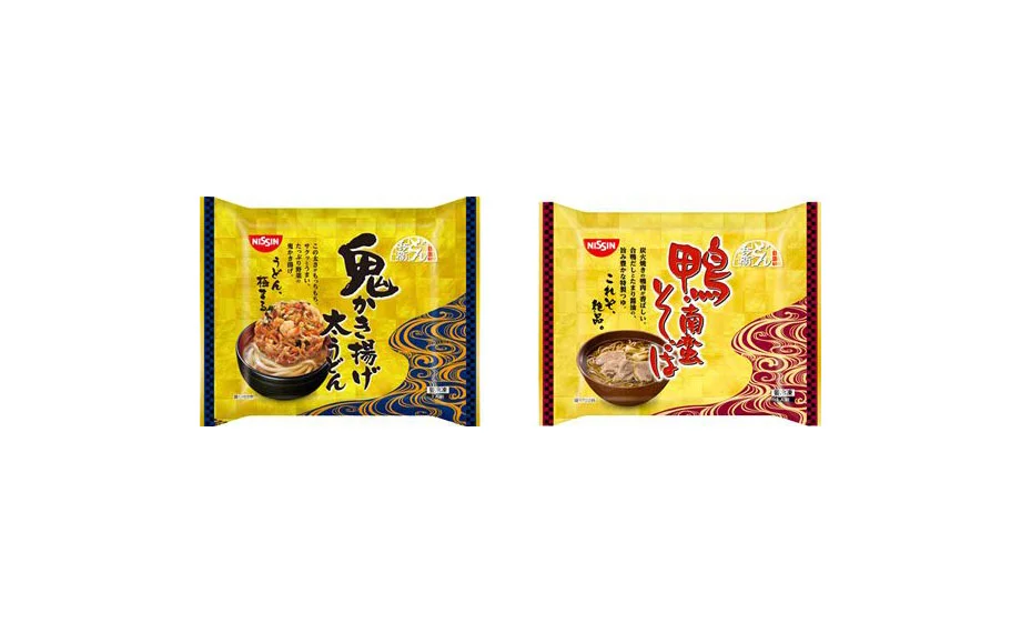
Two rectangular Nissin instant noodle packages sit side by side, each featuring a dominant yellow field with contrasting border accents. The left packet displays deep blue wave patterns along its right edge and showcases a bowl of noodles topped with crispy fried garnish beneath bold black kanji characters. Its counterpart on the right substitutes crimson wave motifs for the blue and presents sliced duck meat in its food photography, with the product name rendered in vivid red calligraphy against the same golden-yellow backdrop.
Visual distinction emerges from the deliberate color-coding system that differentiates flavors while maintaining brand cohesion through consistent layout architecture. The wave patterns evoke traditional Japanese water imagery, creating movement across the static packaging surface, while the typographic hierarchy balances large stylized characters with smaller descriptive text blocks. Food imagery occupies the lower third of each design, anchoring the composition with realistic texture that contrasts against the flat graphic elements above.
Packaging designers studying Japanese convenience goods would examine these examples to understand how color psychology signals flavor profiles without relying on photographic realism alone. Brand identity specialists could analyze the consistent placement of the red Nissin logo across variants to evaluate visual equity maintenance across product lines. Culinary illustrators might reference the specific rendering techniques used for broth transparency and meat texture when developing their own Asian food packaging artwork.