Urban Decay Eyeshadow Jar Design
DownloadTopics
Details
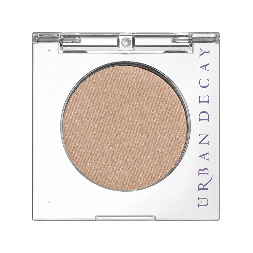
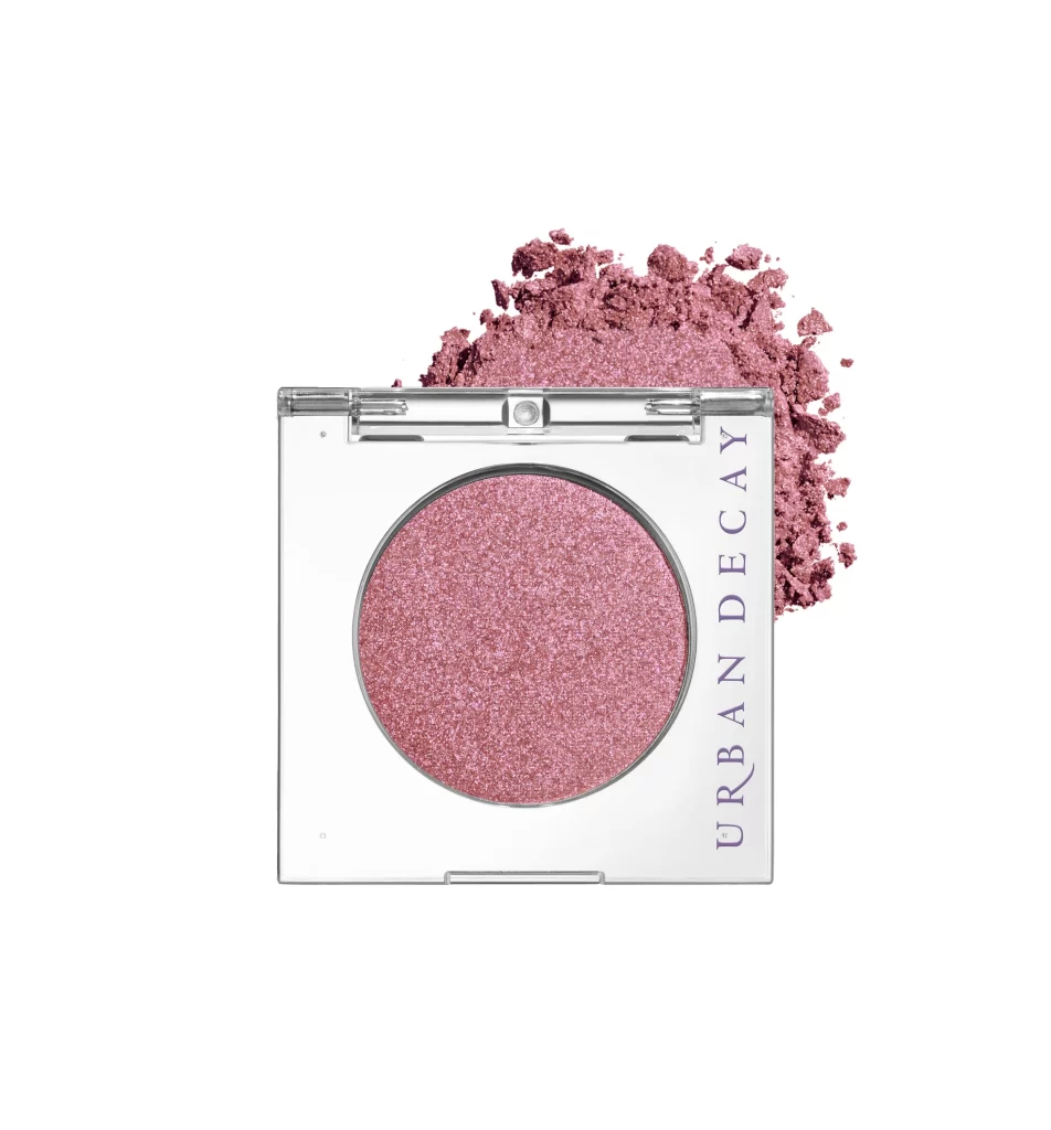
A square, transparent compact with silver trim displays a circular pan of shimmering rose-pink eyeshadow. The brand name 'URBAN DECAY' appears vertically in dark lettering along the right edge of the white base. Crushed powder in the same metallic pink hue spills behind the container, creating texture against the clean background.
Minimalist transparency defines this packaging concept, allowing the product itself to become the primary visual element rather than hidden behind opaque branding. The deliberate spillage technique transforms a standard product shot into a tactile composition, where the contrast between the contained pressed powder and the chaotic loose particles creates dynamic visual tension. Designers studying cosmetic photography will note how the monochromatic background forces attention onto the material qualities of the shimmer finish.
Cosmetic packaging engineers might analyze the hinge mechanism and clasp details visible along the compact’s upper edge for structural inspiration. Digital artists requiring precise color matching for rose-gold metallic textures can access the full-resolution file at no cost to study the specific hex values and glitter distribution patterns. Marketing teams developing shade-naming conventions could reference how the visual warmth of this particular hue communicates luxury without additional contextual elements.