Urban Decay Eyeshadow Jar View
Topics
Details
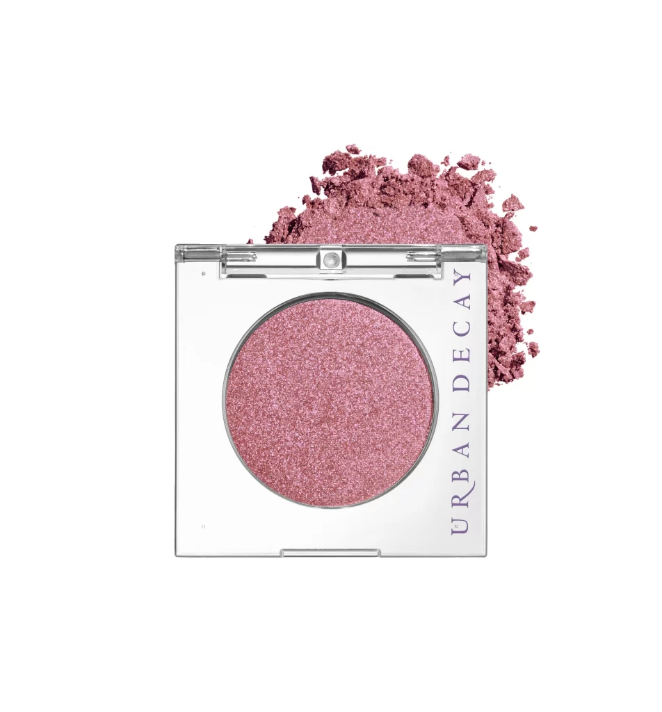
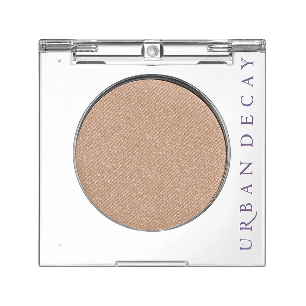
Centered within a square, transparent plastic compact, a single circular pan of pressed powder dominates the frame. The cosmetic product displays a warm, champagne-beige hue with a fine, pearlescent shimmer that catches the light evenly across its matte surface. Running vertically along the right interior edge of the clear casing, the brand name 'URBAN DECAY' appears in a clean, sans-serif typeface colored in deep violet. A straight-on camera angle reveals the metallic silver hinge and clasp mechanism at the top against a stark white background that eliminates all shadows.
Minimalist packaging design allows the actual color payoff to remain the focal point without visual distraction from external artwork. The contrast between the cool-toned purple lettering and the warm neutral shade inside creates a sophisticated color palette for branding analysis. Transparent materials emphasize the product's physical dimensions and the texture of the pressed powder, offering a clear view of how light interacts with the shimmer particles.
Cosmetic photographers might study this composition to understand standard product lighting techniques for beauty e-commerce listings. Industrial designers could examine the structural details of the hinge and the precise alignment of the text placement. Color theorists will find value in documenting the specific relationship between the violet ink and the golden-beige pigment for future palette development.