19 Crimes Wine Bottle Closeup
Topics
Details
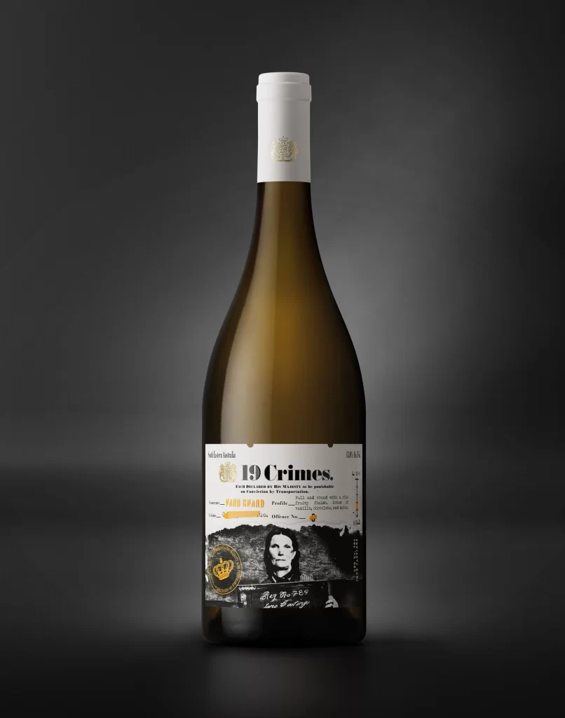
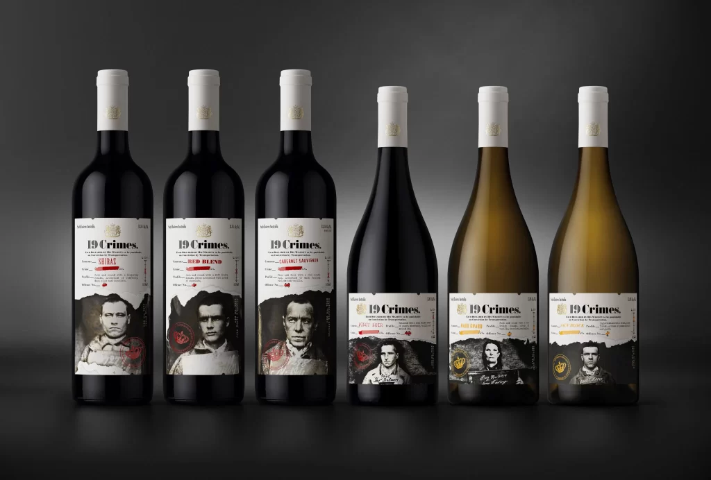
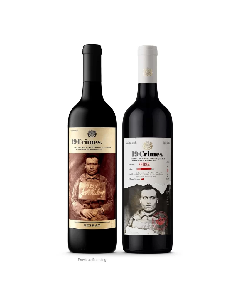
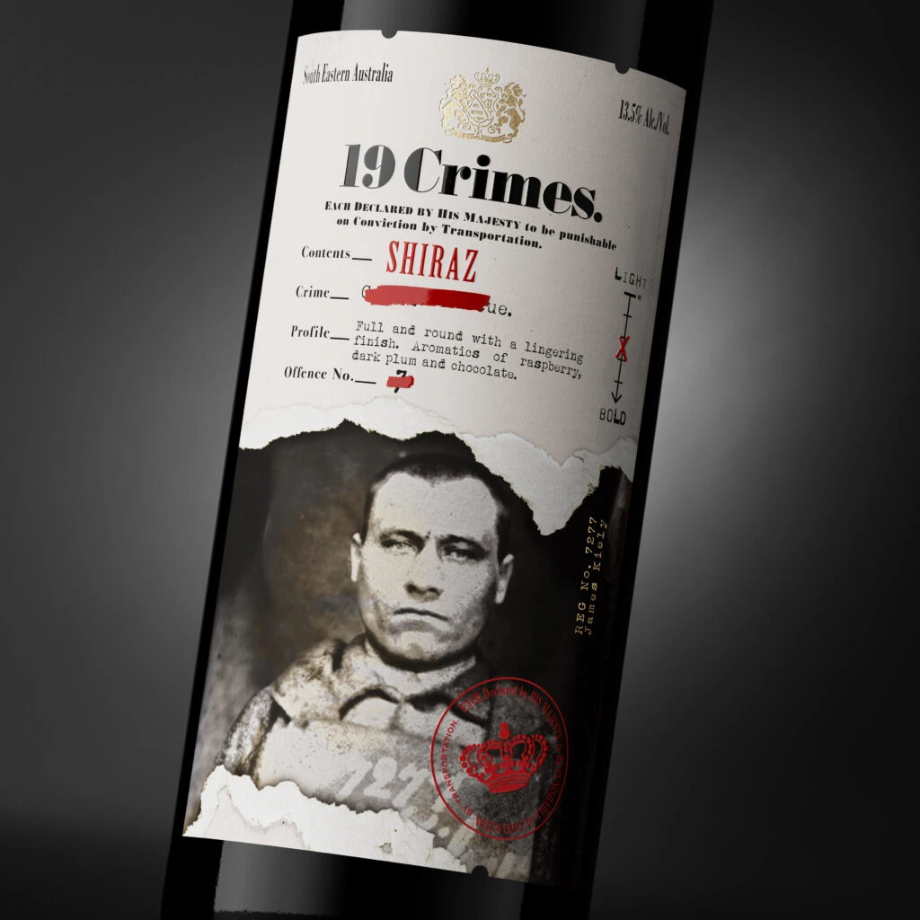
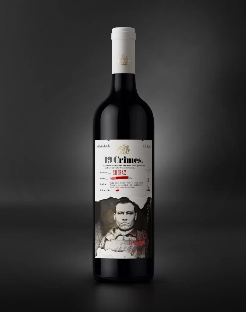
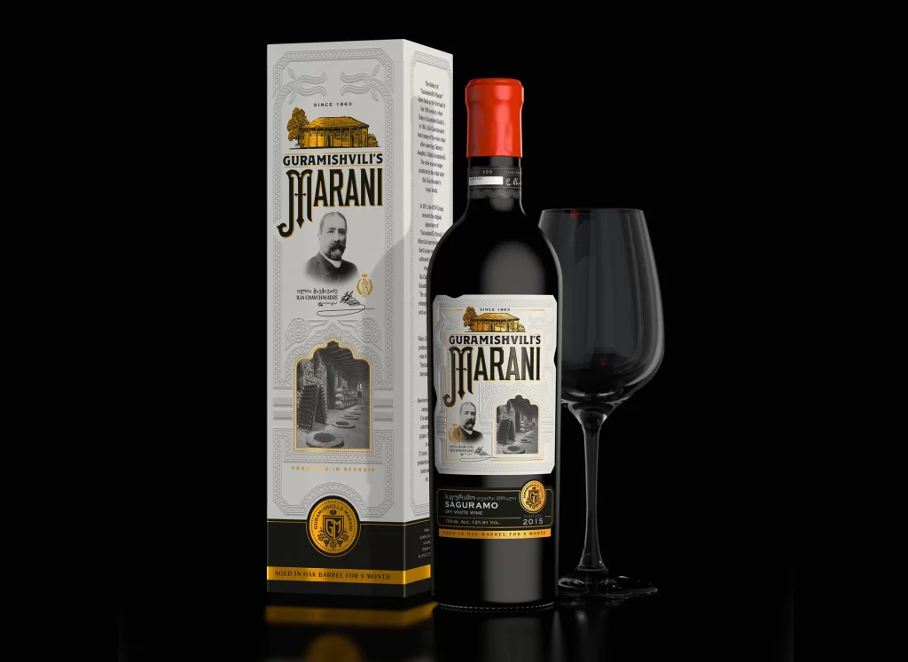
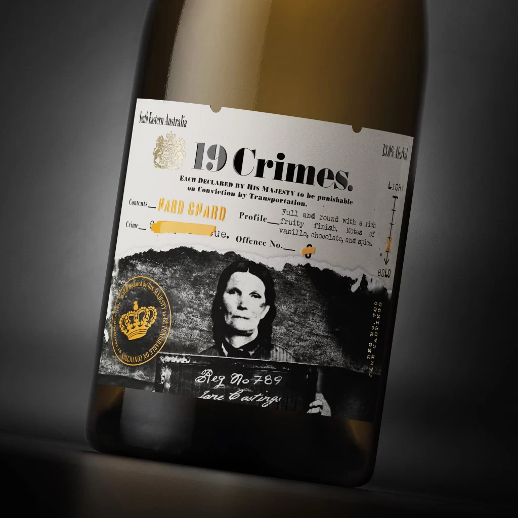
Positioned at a slight three-quarter angle, the bottle reveals a label dominated by stark white and deep black tones with selective gold accents. The typography mixes a bold serif for the brand name with smaller sans-serif details like the 13.0% alcohol volume and 'South Eastern Australia' origin. A monochromatic mugshot of Jane Castings anchors the lower half, overlaid by a circular gold seal and handwritten script reading 'Reg No 789', all set against a dark gradient background that emphasizes the glass curvature.
Visual interest stems from the clever juxtaposition of official-looking documentation and consumer packaging. The torn-paper effect at the top of the photograph adds textural depth, while the yellow highlighter marks on 'HARD GUARD' and the redacted crime description simulate authentic archival evidence. This specific iteration uses a minimalist palette to make the historical portrait and royal crest pop, creating a narrative-driven aesthetic that feels both institutional and artisanal.
Brand strategists might analyze this composition to understand how historical storytelling can be integrated into modern labeling without cluttering the visual field. Packaging designers could study the hierarchy of information to see how technical specs coexist with emotive imagery. Art directors working on period-piece marketing materials would find the contrast between the formal typeface and the personal handwriting particularly useful for establishing tone.