19 Crimes Wine Bottle Detail
Topics
Details
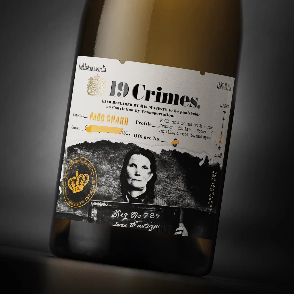
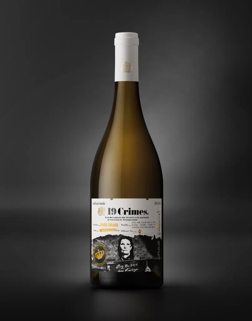
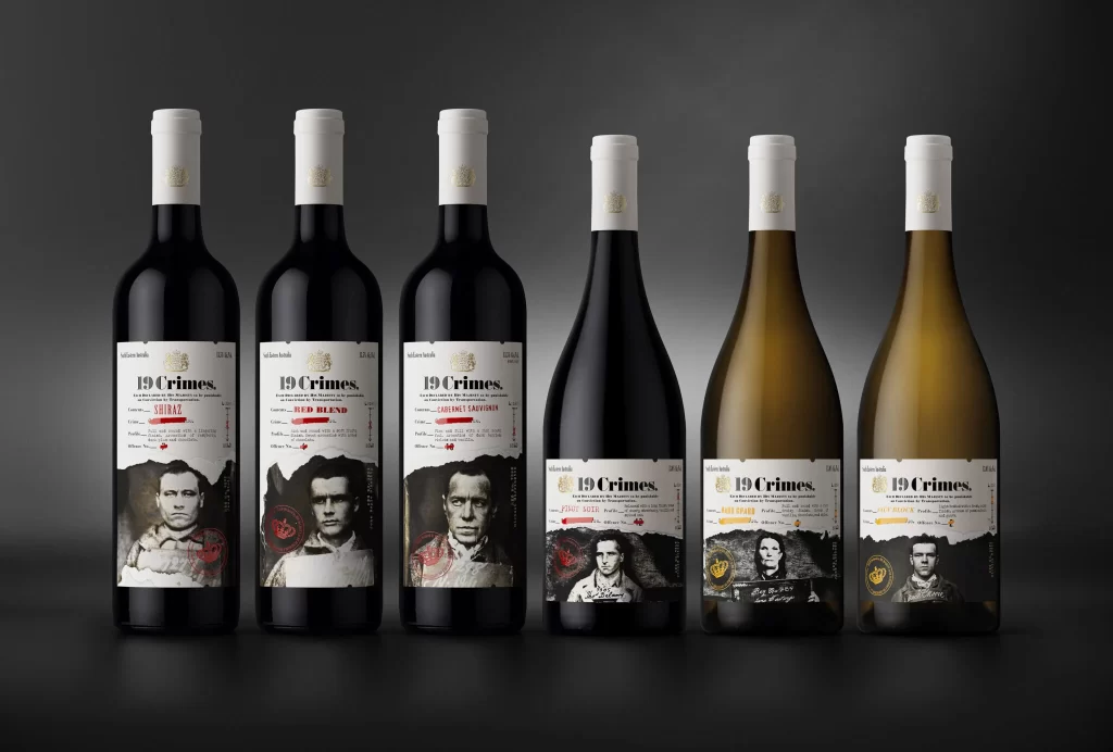
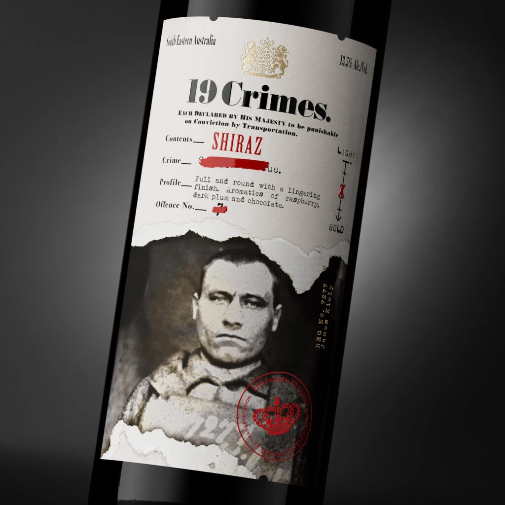
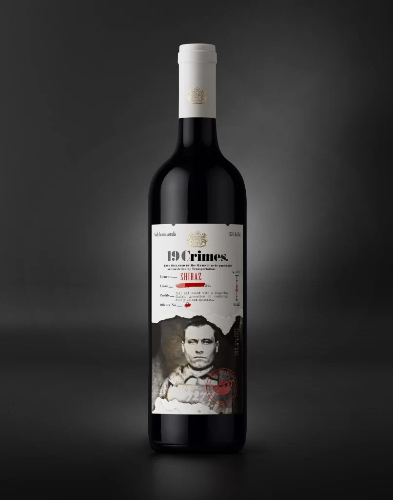
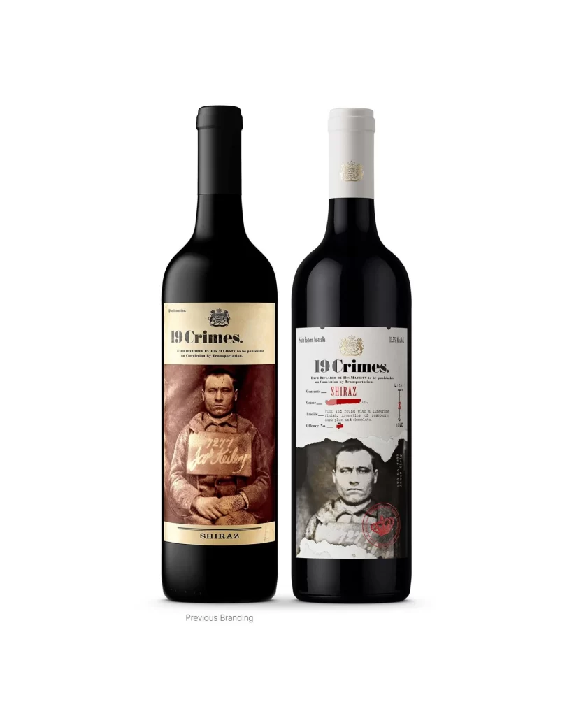
Set against a sterile white void, two dark glass bottles stand side-by-side, showcasing a stark evolution in visual identity. The left iteration features a black screw cap and a label dominated by a sepia-toned mugshot of a man holding a wooden placard reading '1871 Jno Kelly', framed by a cream header bearing the bold serif text '19 Crimes.' To its right, the updated version presents a white foil capsule and a more clinical layout where the vintage portrait is cropped tightly into the lower half, revealing technical tasting notes and a red circular seal that interrupts the monochrome palette.
Visual tension arises from the deliberate juxtaposition of historical grit against modern minimalism. While the older design relies on the full-body criminal photograph to convey its narrative of Australian penal history, the newer packaging fragments this imagery to prioritize typographic hierarchy and data visualization. This shift transforms the bottle from a mere vessel for alcohol into a curated artifact that balances the macabre curiosity of 19th-century justice records with contemporary wine-label aesthetics.
Brand strategists analyzing packaging longevity will find value in comparing how narrative elements are compressed or expanded across different market eras. Art directors tasked with reimagining heritage brands can study the specific cropping techniques used on the right-hand label to understand how to modernize vintage assets without losing their soul. Furthermore, historians of graphic design might utilize these side-by-side examples to trace the migration from maximalist storytelling to information-dense, utilitarian labeling in the beverage sector.