19 Crimes Wine Bottle
Topics
Details
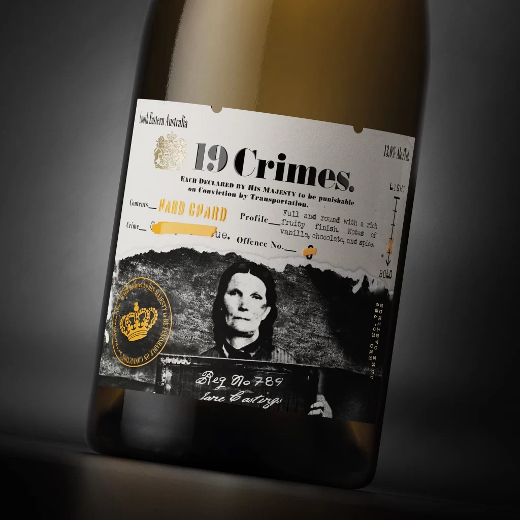
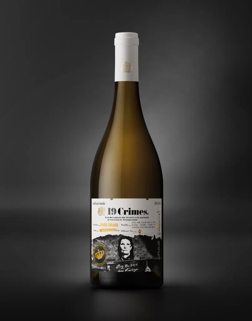
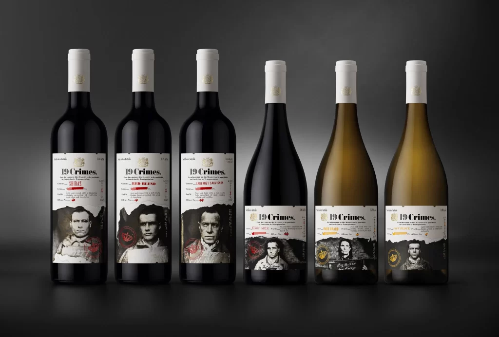
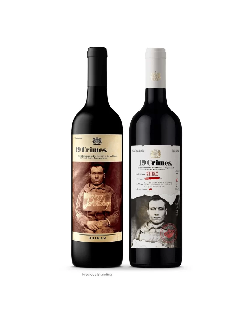
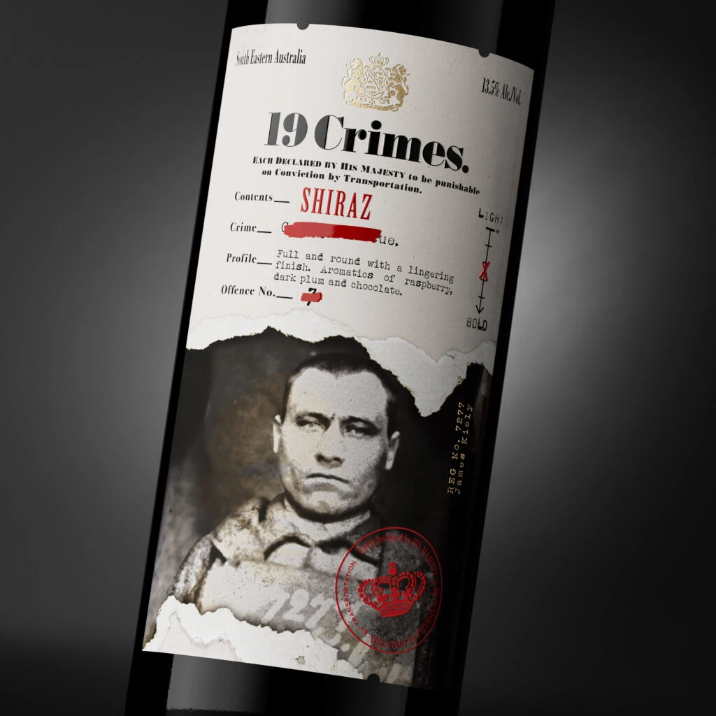
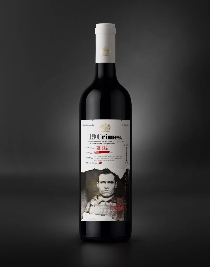
Against a dark, gradient background that fades from charcoal to black, a single bottle of 19 Crimes Shiraz stands illuminated by soft studio lighting. The dark glass container features a white screw cap adorned with a subtle gold crest, while the main label presents a stark white canvas with bold black typography. A torn-paper effect at the bottom reveals a vintage mugshot photograph of a man in heavy clothing, complete with a red circular stamp overlapping the image edge.
What sets this packaging apart is its clever blend of historical documentation and modern wine marketing aesthetics. The label mimics an official criminal record or wanted poster, with fields for 'Contents,' 'Crimes,' and 'Offence No.' filled in with red typewriter-style text that contrasts sharply against the monochrome palette. This juxtaposition of gritty, archival imagery with clean, contemporary layout creates immediate visual intrigue and narrative depth.
Packaging designers studying beverage branding would find this example particularly useful for analyzing how typography hierarchy guides the viewer's eye through complex information layers. Art directors working on historical or true-crime themed projects could reference the way photographic elements integrate with graphic text blocks without overwhelming the overall composition. Additionally, anyone exploring the use of texture and tactile qualities in print design might study the interplay between the smooth white paper look and the rough, torn edges of the photograph.