19 Crimes Wine Bottle View
Topics
Details
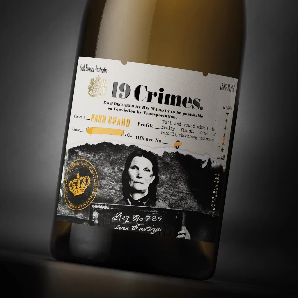
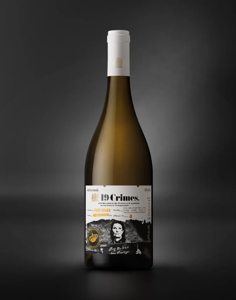
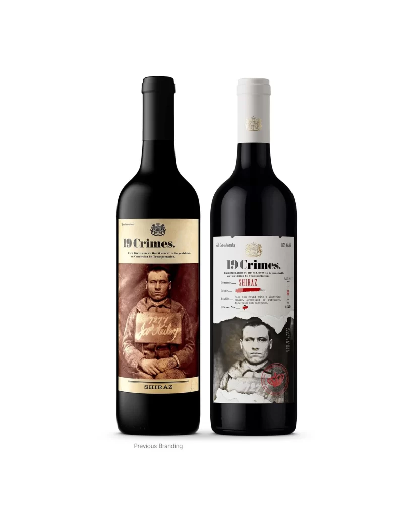
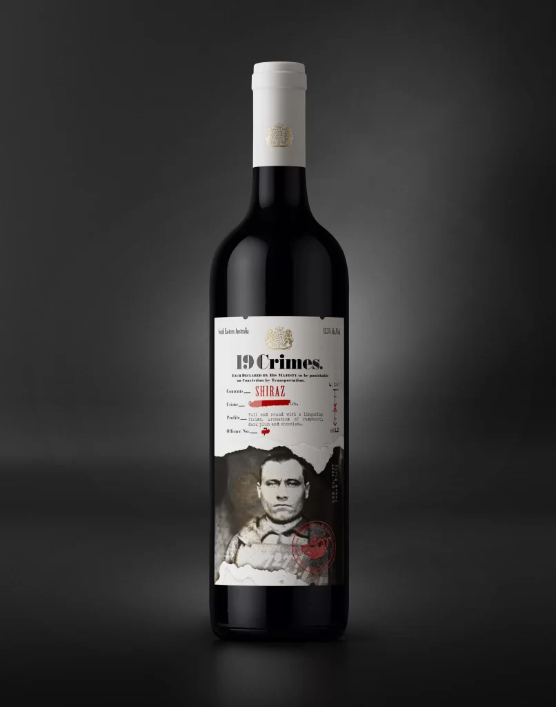
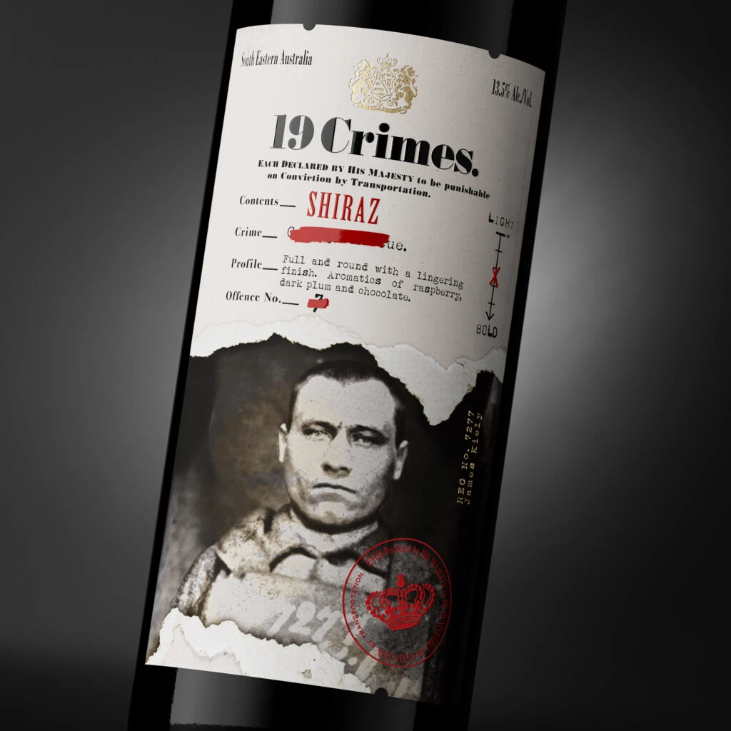
Set against a dark, gradient background that fades from charcoal to deep obsidian, the bottle is captured at a slight three-quarter angle, emphasizing the cylindrical curvature of the glass. The label itself features a stark, off-white paper texture with a jagged, torn lower edge revealing a sepia-toned mugshot of a man in heavy clothing beneath. Dominating the upper portion is the bold, black serif typography for "19 Crimes," positioned below a golden royal crest and above the vibrant red script identifying the varietal as Shiraz.
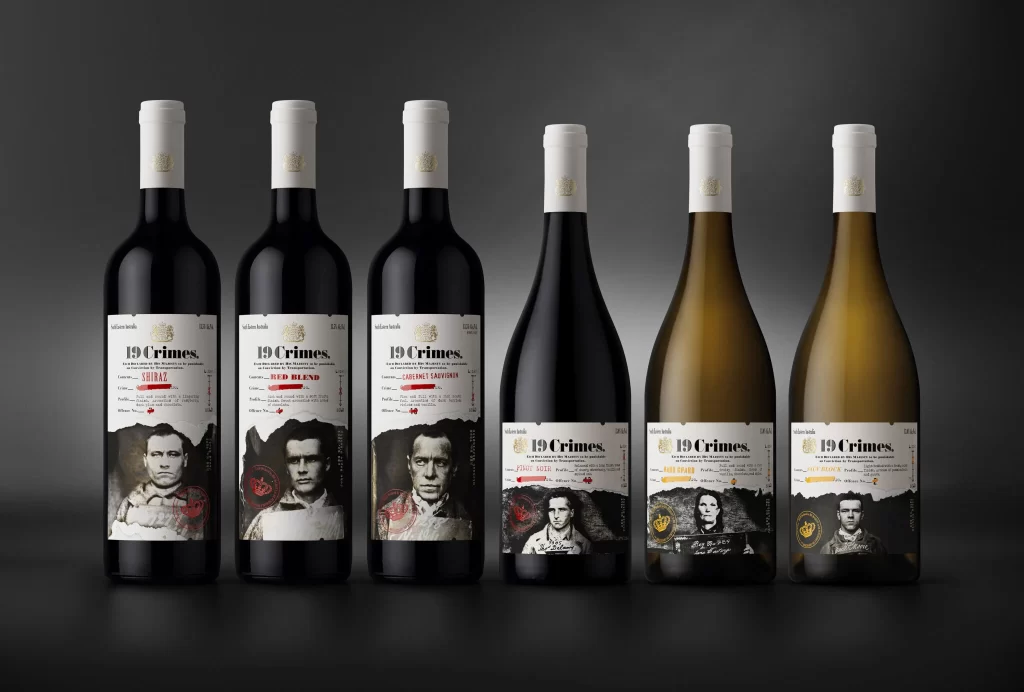
Visual interest is generated through the clever juxtaposition of formal legal documentation and rugged historical photography. The layout mimics a criminal record or transportation warrant, complete with redacted text blocks and specific fields for "Crime" and "Offence No.," which lends the packaging a gritty, narrative-driven authenticity. Furthermore, the inclusion of the red circular stamp with a crown icon anchors the bottom right, balancing the composition while reinforcing the theme of imperial authority and punishment.
Brand strategists and packaging designers would utilize this visual to study how typography hierarchy can convey historical weight and storytelling within modern consumer goods. Art directors working on thematic campaigns might reference the specific way photographic elements are integrated into print layouts to create depth. Additionally, students of graphic design could analyze the effective use of negative space and color contrast—specifically the interplay between the monochrome palette and strategic red accents—to understand how to guide a viewer's eye across a complex label surface.