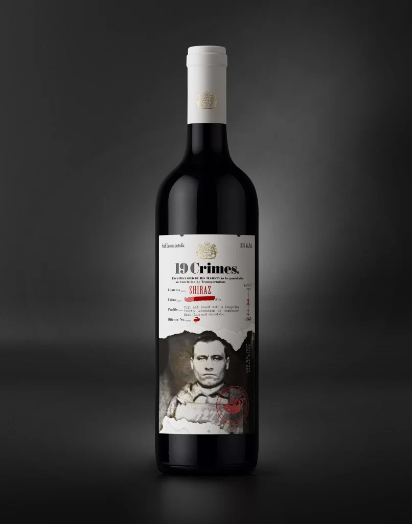
19 Crimes Wine Bottle Design
Topics
Details
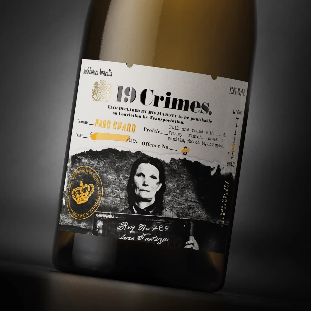
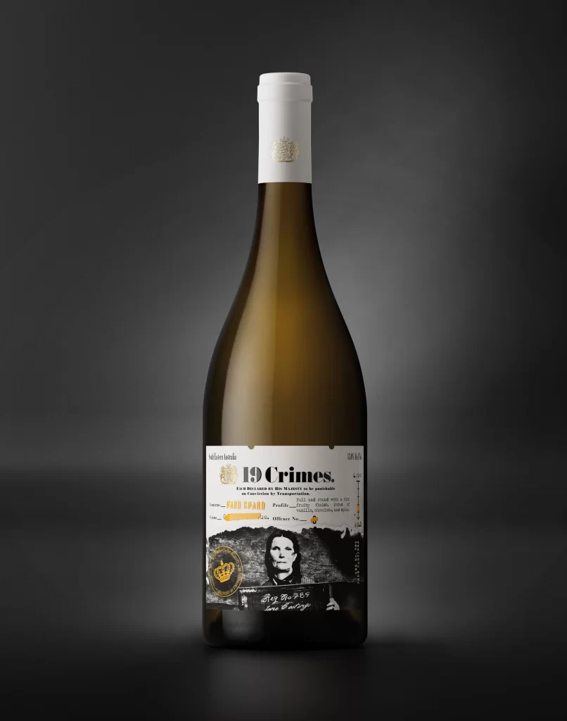
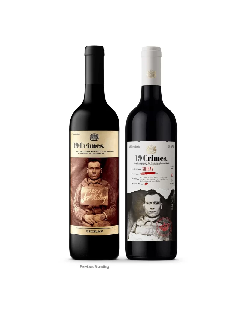
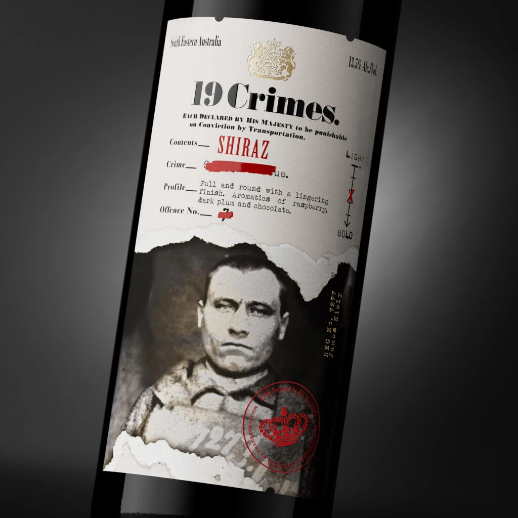
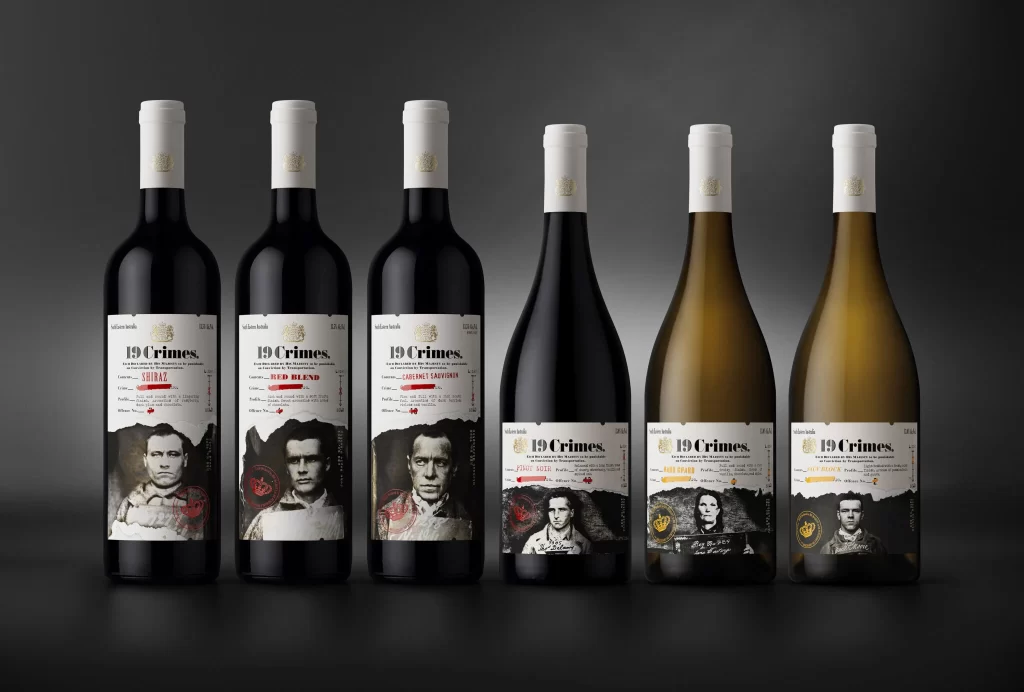
Six wine bottles stand in a linear arrangement against a dark, gradient background that transitions from charcoal to black. The first four containers hold dark red liquid, while the final two display a pale golden hue. Each vessel features a white screw cap adorned with a subtle gold emblem and a label dominated by a monochromatic portrait of a historical figure, overlaid with the bold serif text '19 Crimes.'
Visual distinction arises from the juxtaposition of gritty, mugshot-style photography against clean, modern typography. The torn paper effect at the bottom edge of the labels adds a tactile, archival quality that contrasts with the sleek glass surfaces. Specific varietal names like 'Shiraz' and 'Chardonnay' appear in small, colored accents, providing minimal but necessary color variation within the otherwise stark palette.
Brand strategists might examine this layout to understand how consistent visual systems can accommodate different product lines while maintaining a cohesive identity. Packaging engineers could study the balance between the portrait imagery and the informational text to optimize label real estate. Art directors working on historical or narrative-driven brands may look to this as a case study in integrating storytelling elements into physical product design.