Gatorade Zero Products Collection
Topics
Details
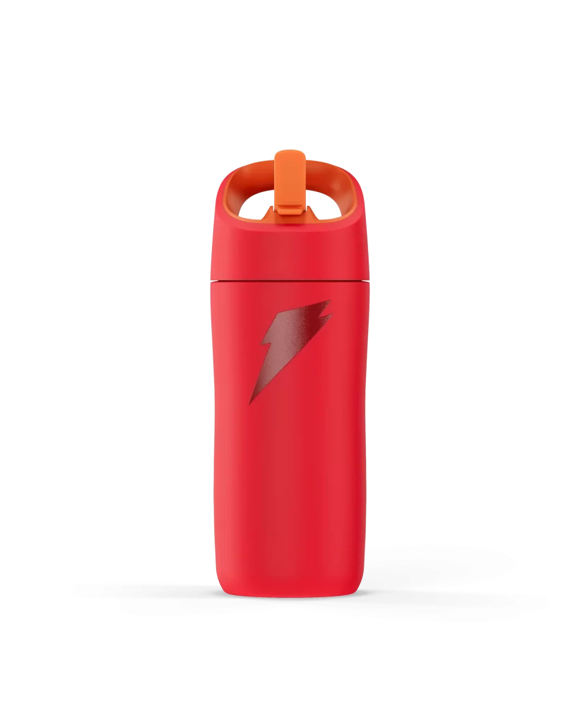
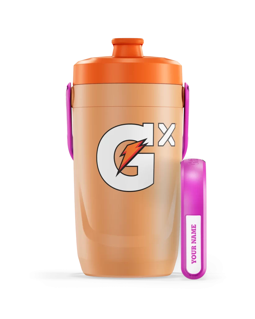
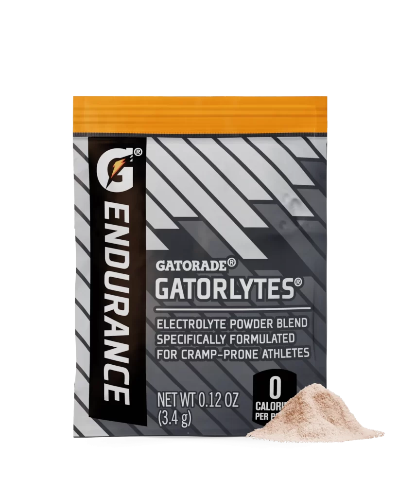
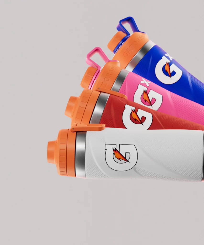
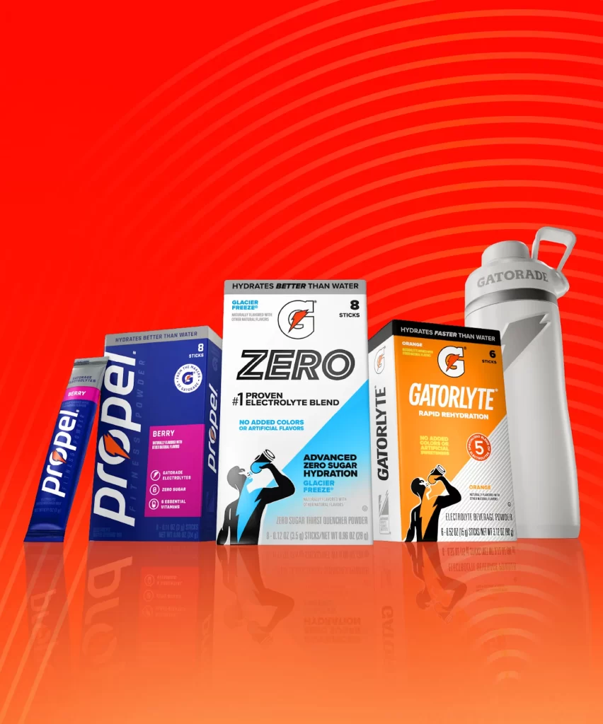
The image displays a lineup of Gatorade hydration products against a vibrant red background with concentric circular patterns. Featured items include a single Propel Berry stick pack, an 8-count Propel Berry box, an 8-count Gatorade Zero Glacier Freeze box, and a 6-count Gatorlyte Orange box, accompanied by a white Gatorade water bottle. Each package utilizes bold typography, distinct color coding—blue for Propel, white/light blue for Zero, and orange for Gatorlyte—and athletic silhouette graphics to emphasize performance.
These products target fitness enthusiasts and athletes requiring efficient electrolyte replenishment without excess sugar or calories. The branding emphasizes scientific backing with claims like '#1 Proven Electrolyte Blend' and 'Hydrates Faster Than Water,' appealing to health-conscious consumers who prioritize functional benefits. Visual cues such as the drinking figure icons and 'Zero Sugar' badges reinforce the active lifestyle positioning.
Packaging designers can study the effective use of color psychology to differentiate product lines within a unified brand family while maintaining shelf impact. The consistent placement of key nutritional information and benefit statements demonstrates how to communicate complex value propositions quickly to busy shoppers. Reflective surface treatment in the composition also highlights how premium finishes can elevate perceived product quality in retail environments.