Imayotsukasa Koi Beverage Packaging
Topics
Details
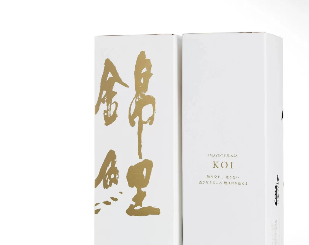
Two tall, rectangular cartons with a matte, paper-like texture stand side-by-side on a white surface. The left panel features bold, vertical calligraphy executed in metallic gold pigment, with the brushstrokes for 'Kanabun' and 'Koi' dominating the visual field through their expressive weight. On the right face, the brand name 'IMAYOTSUKASA' appears above the product name 'KOI', followed by smaller Japanese text describing the beverage's characteristics.
Visual hierarchy is established through the striking juxtaposition of traditional East Asian ink-wash aesthetics and modern minimalist layout principles. The generous use of negative space around the gilded characters creates a sense of luxury and restrained elegance, while the vertical orientation of the primary text reinforces the cultural authenticity of the product. Such a design approach balances artistic expression with commercial clarity, ensuring the packaging communicates both heritage and contemporary sophistication.
Brand strategists developing premium spirit or tea lines might study this composition to understand how calligraphic elements can function as central identity markers without overwhelming essential product information. Packaging engineers could analyze the structural simplicity of the tall box format to explore similar solutions for high-end gift sets requiring substantial presence on retail shelves. Art directors seeking to integrate traditional motifs into modern systems will find the scale relationship between the large gold script and the delicate roman typography particularly instructive.