iOS 18 Beta Wallpaper Orange Blue
Topics
Details
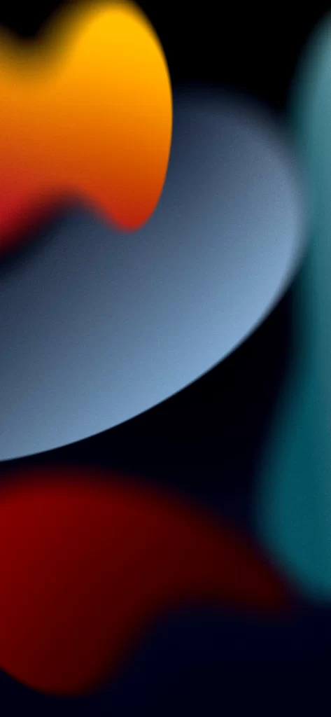
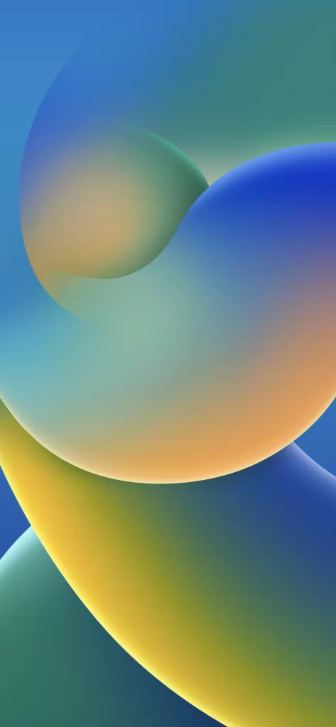
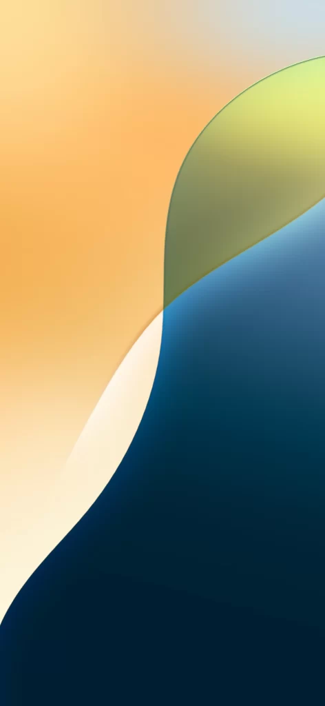
Warm peach gradients dominate the upper left quadrant, transitioning into a luminous cream channel that carves through the composition. A translucent lime-green arc sweeps from the upper right, overlapping a deep navy mass that anchors the lower right portion of the frame. Soft, diffused lighting creates subtle depth across the curved boundaries, suggesting a matte, almost fabric-like surface texture without any visible text or photographic elements.
Visual interest emerges from the interplay between the organic S-curve separating warm and cool tones and the sharp, clean edge of the green overlay. The deliberate color progression—from amber through ivory to midnight blue—creates a sophisticated tension that feels both calming and dynamic. Such careful balance between saturated and neutral zones distinguishes this particular iteration from more chaotic abstract patterns.
Interface designers might employ these specific color relationships when constructing dashboard backgrounds that require clear visual hierarchy without competing with foreground data. Color theorists could analyze the gradient transitions to understand how adjacent hues influence perceived depth in digital environments. Mobile UI developers often reference such compositions when prototyping ambient display modes that adapt to varying light conditions throughout the day.