iOS 18 Beta Wallpaper Red Blue
Topics
Details
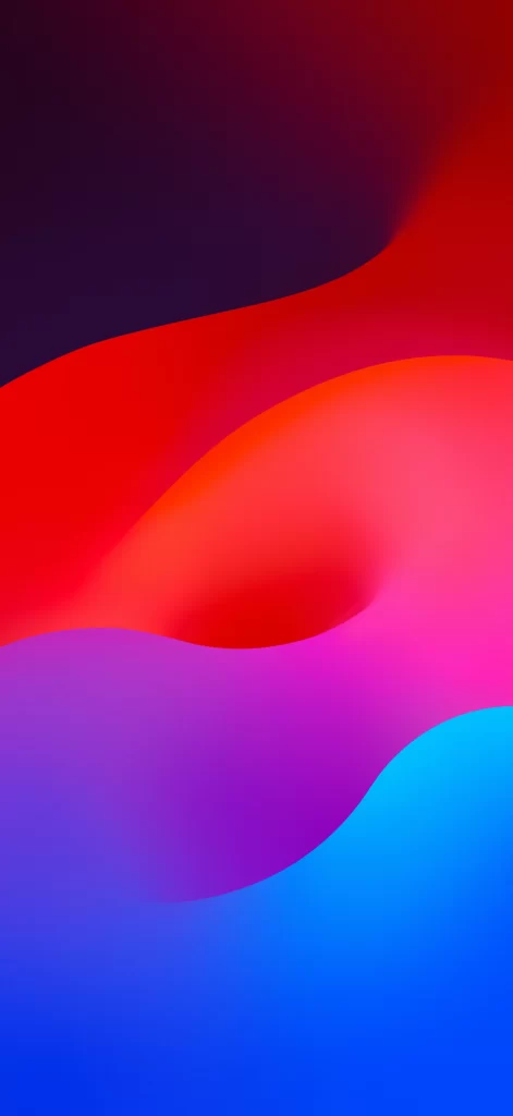
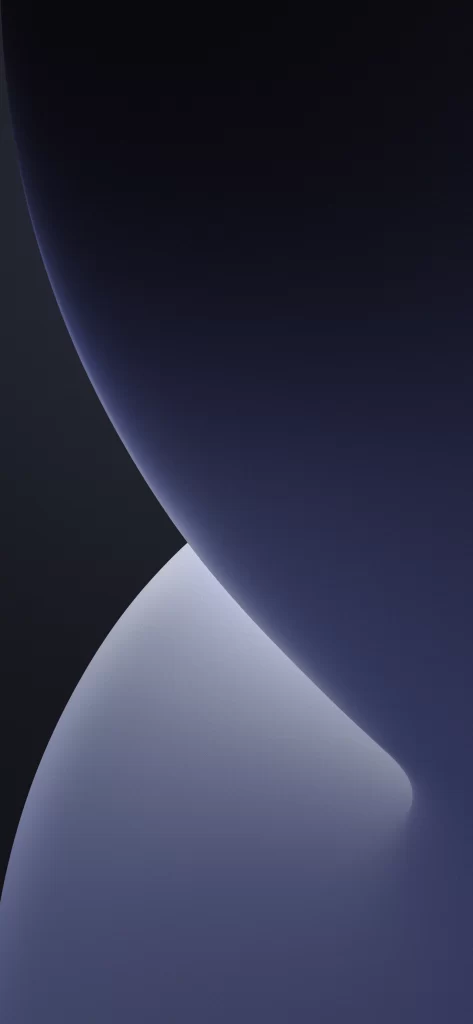
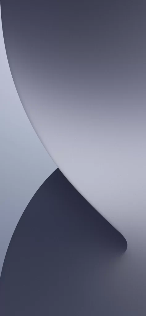
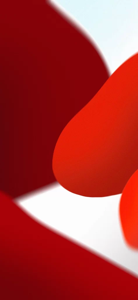
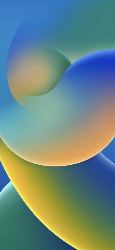
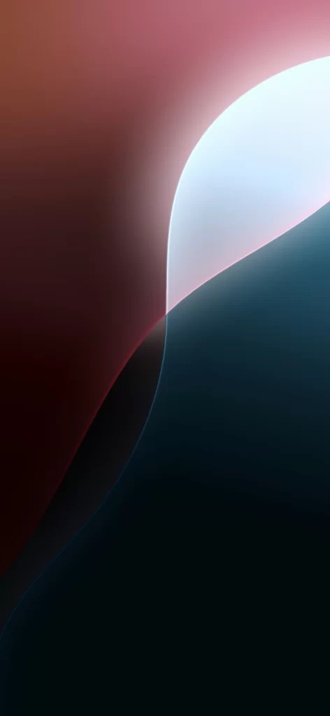
Deep burgundy tones dominate the left side of the frame, bleeding into a luminous white-blue crescent that arcs gracefully from the upper right. Below this glowing curve, a rich navy blue expanse creates a stark, velvety contrast against the lighter elements. The composition relies on smooth, organic gradients where the colors meet, suggesting a soft, matte material finish without any visible texture or text.
What sets this particular background apart is the dramatic interplay between shadow and light along that central S-curve. The transition from the warm, earthy reds to the cool, deep blues feels both modern and calming, offering a sense of depth that flat colors simply cannot achieve. It is a masterclass in minimalist abstraction, using fluid shapes to guide the eye across the screen.
Mobile interface designers often seek out these specific color palettes to ensure app icons remain legible while maintaining aesthetic appeal. UI developers might utilize the gradient values to replicate the lighting effects within custom application themes or widget backgrounds. Even digital artists could reference the way the light diffuses across the curve when painting atmospheric landscapes or futuristic environments.