LOccitane Body Spray Advertisement
Topics
Details
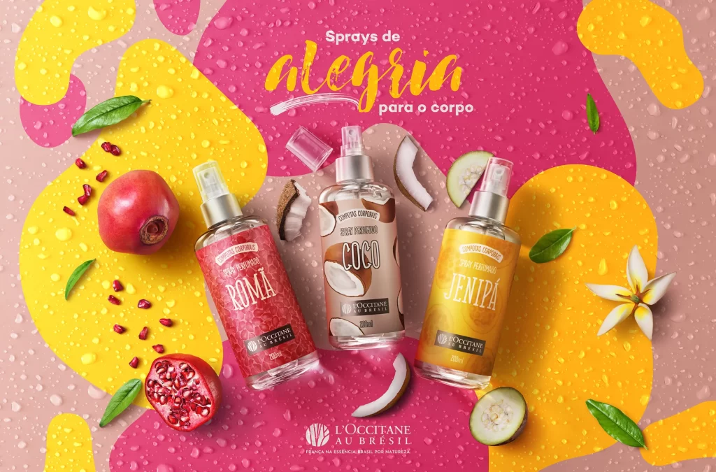
The advertisement displays three L'Occitane Au Brésil body sprays labeled Romã, Coco, and Jenipá, arranged against a vibrant backdrop of pink and yellow abstract shapes with water droplet textures. Portuguese text reading 'Sprays de alegria para o corpo' appears at the top in a golden script font, while the brand logo sits centered at the bottom. Surrounding the bottles are fresh ingredients including pomegranate, coconut slices, cucumber, green leaves, and a white plumeria flower that correspond to each fragrance variant.
Visual composition employs a flat-lay photography style with products positioned in a slight arc to guide the viewer's eye across the frame, complemented by organic props that suggest natural ingredients. The color palette combines energetic magenta and sunny yellow tones with the transparent glass packaging, creating a tropical, refreshing atmosphere typical of summer beauty campaigns. Typography contrasts playful handwritten lettering for the headline with clean sans-serif fonts on the product labels, balancing whimsy with premium branding aesthetics.
Marketing professionals and graphic design students analyze such layouts to understand how color psychology and prop styling reinforce product positioning in competitive retail environments. Packaging designers reference the bottle labeling hierarchy and cap treatments when developing similar personal care ranges for Brazilian or tropical-themed brands. Advertising agencies also utilize this campaign as a case study for integrating multicultural elements—specifically Brazilian biodiversity—into global luxury beauty narratives.