Minimalist Study Neutral Light Wood Simple Clean
DownloadTopics
Details
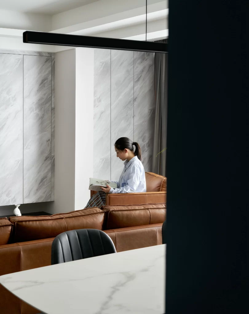
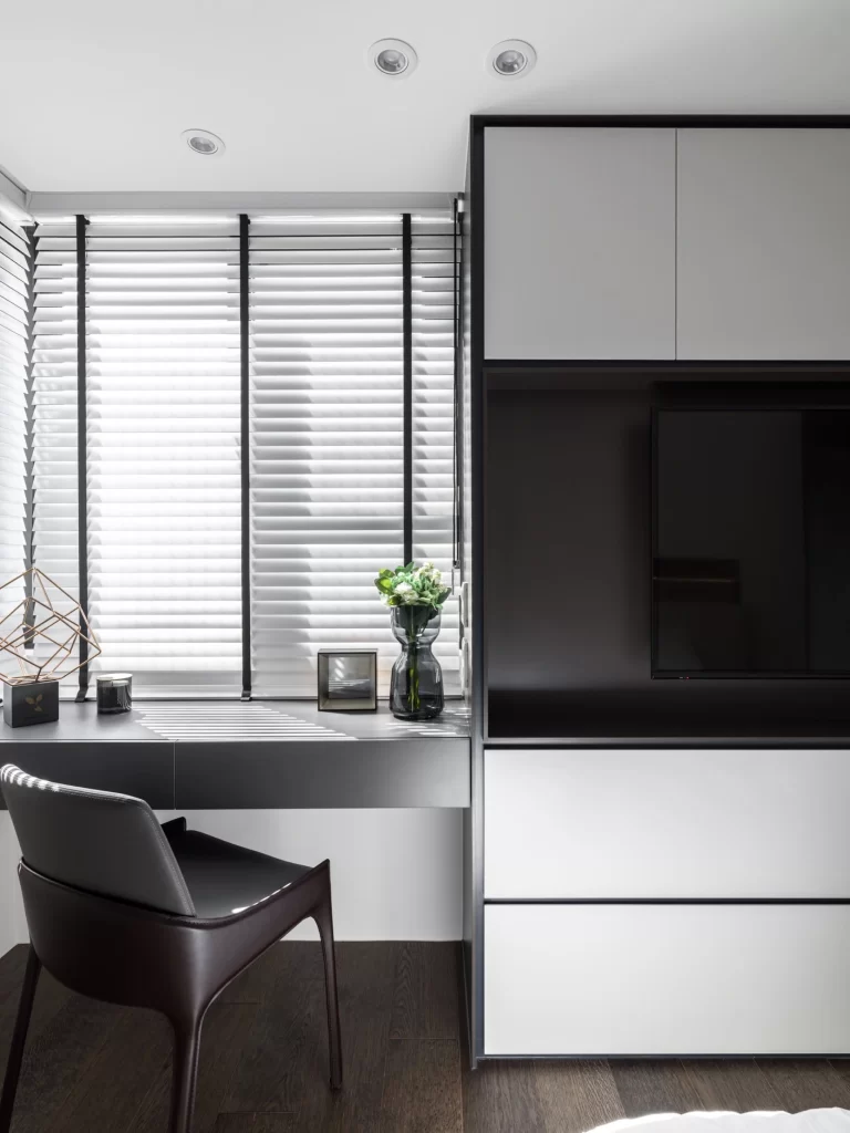
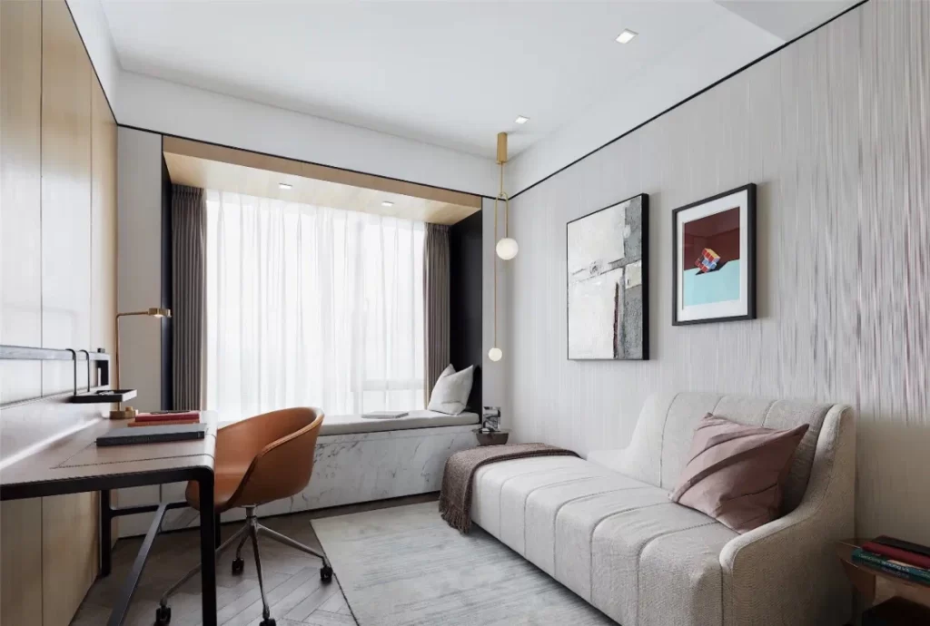
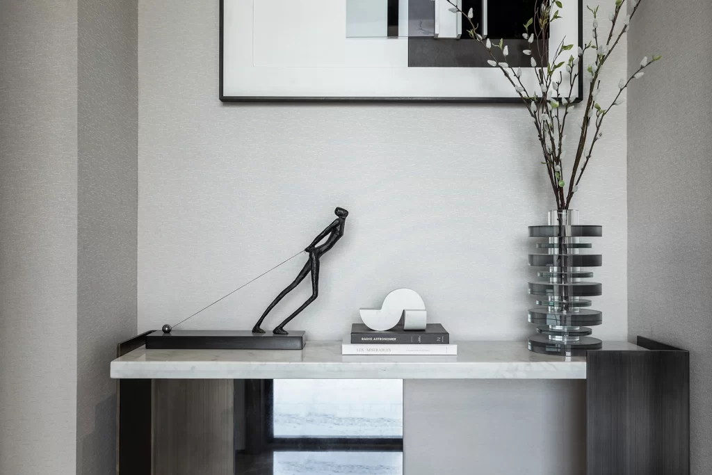
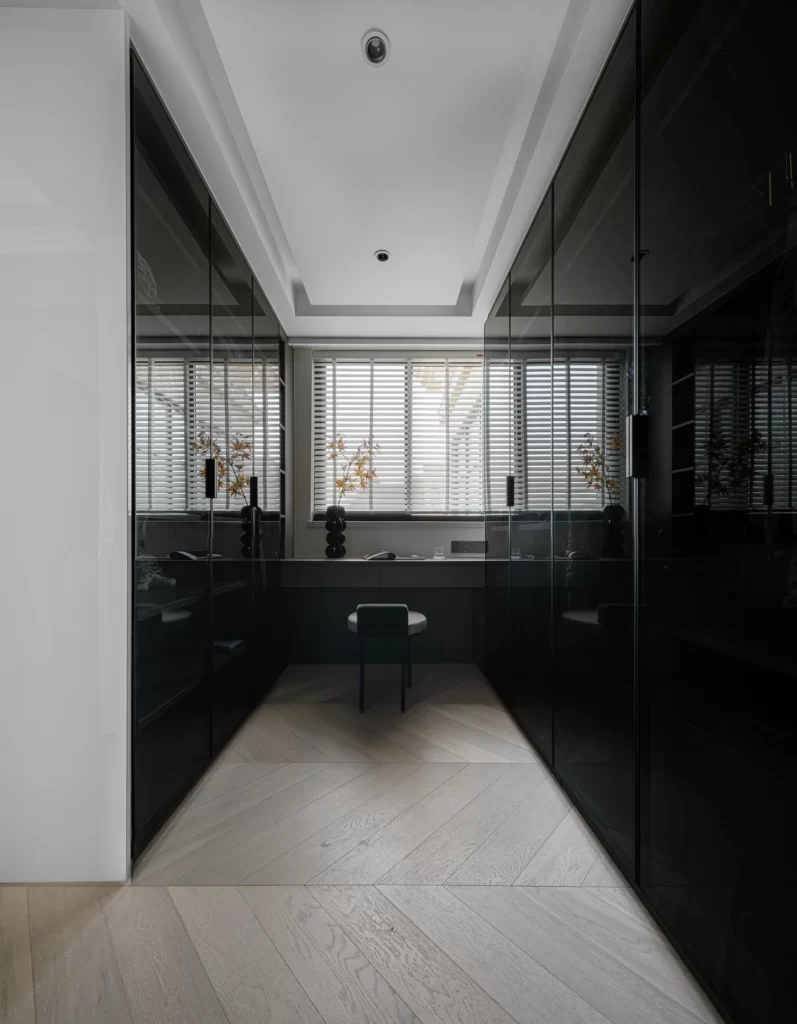
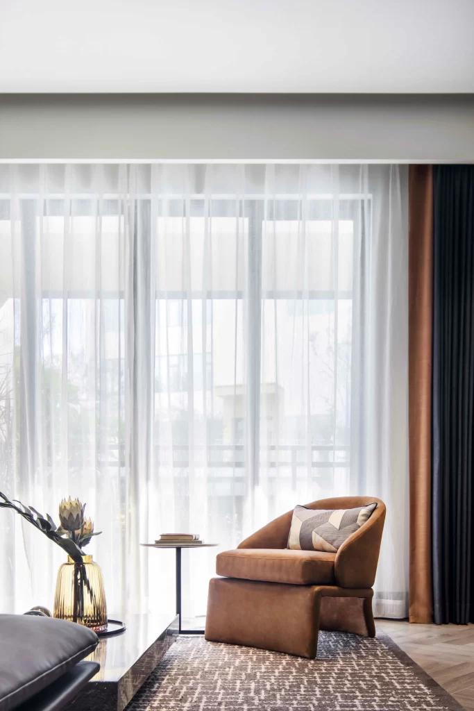
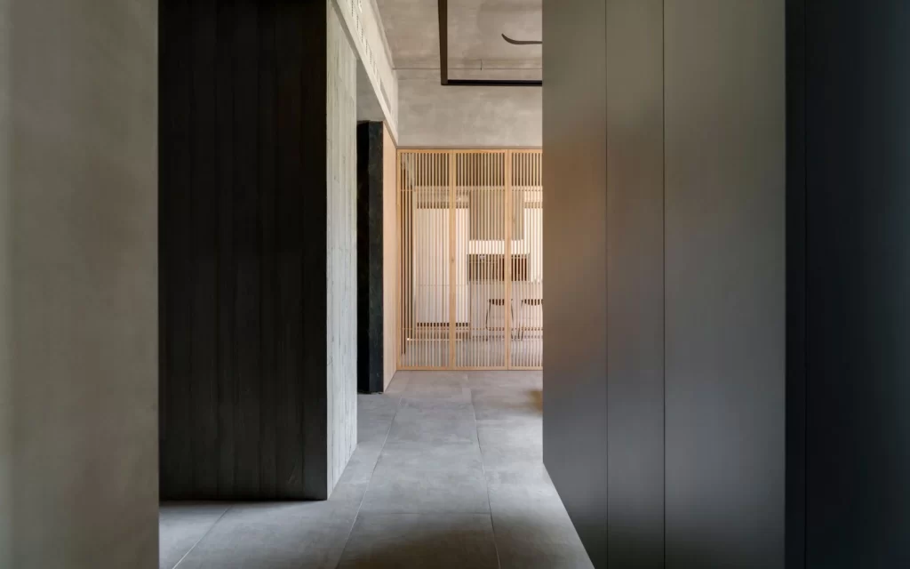
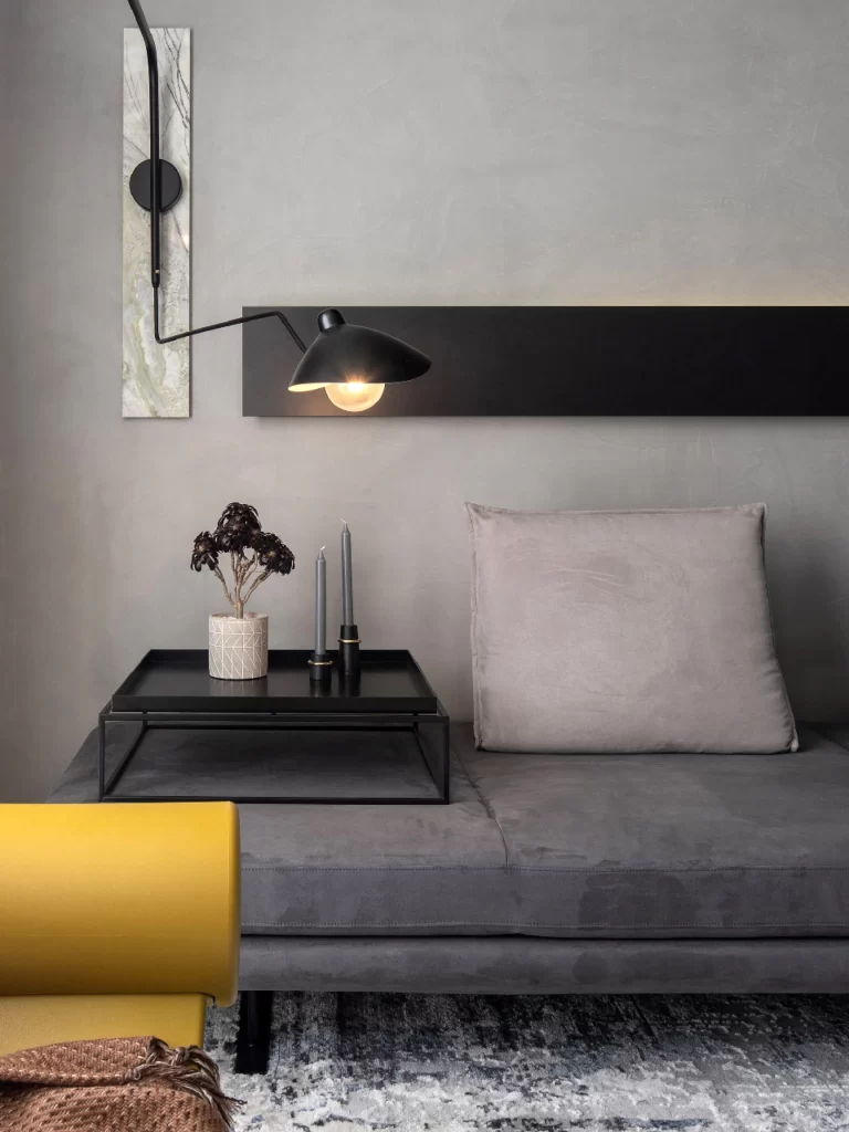
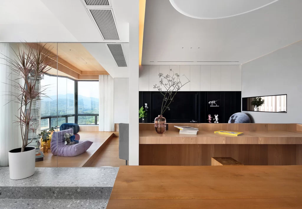
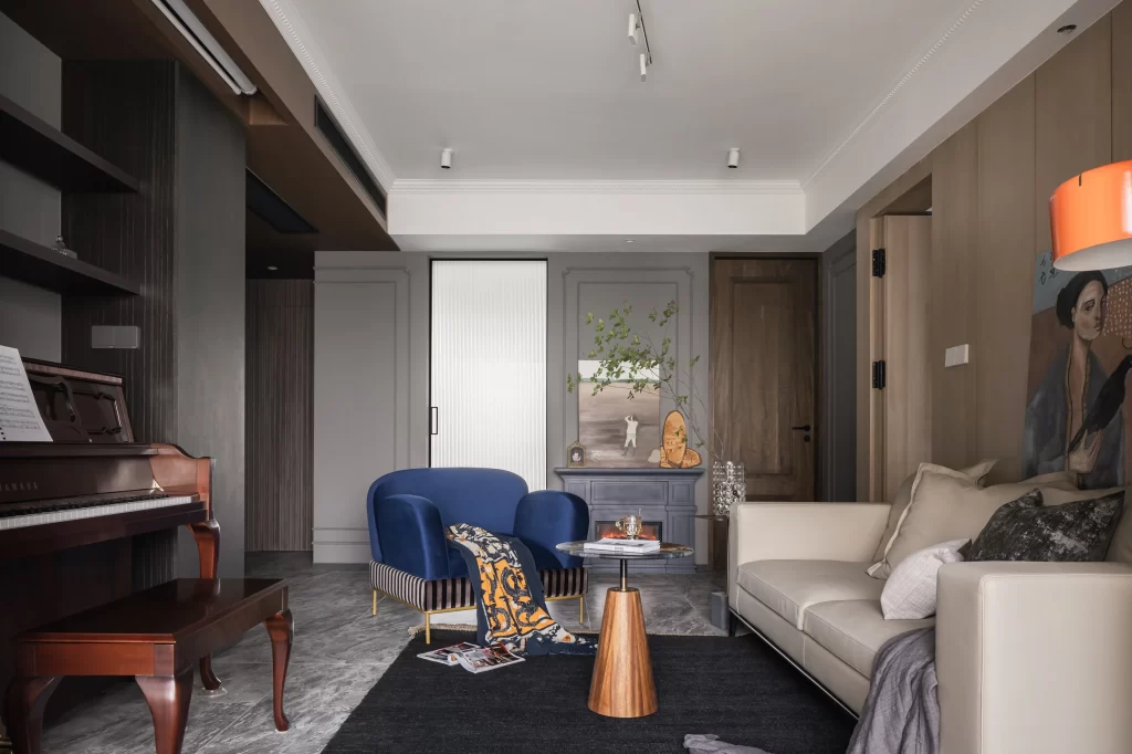
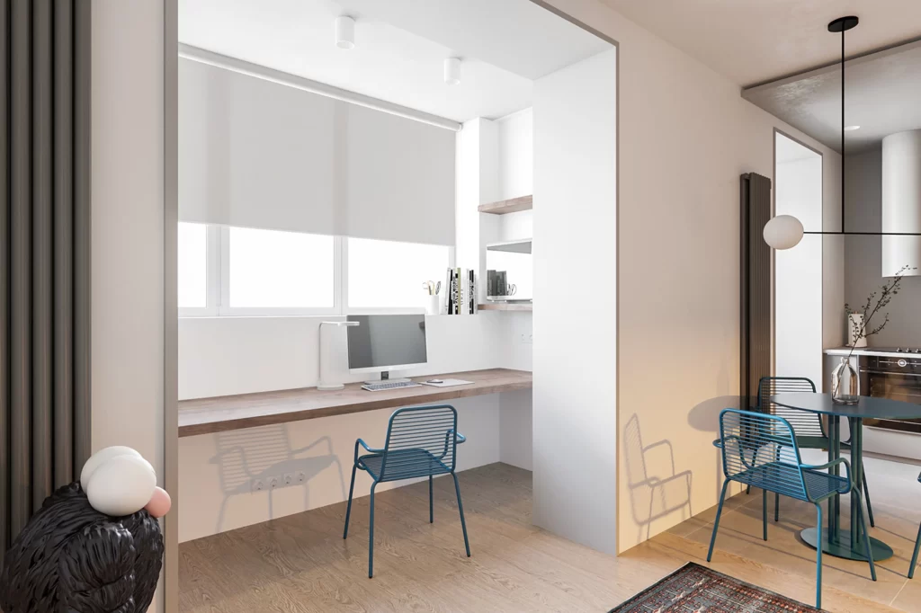
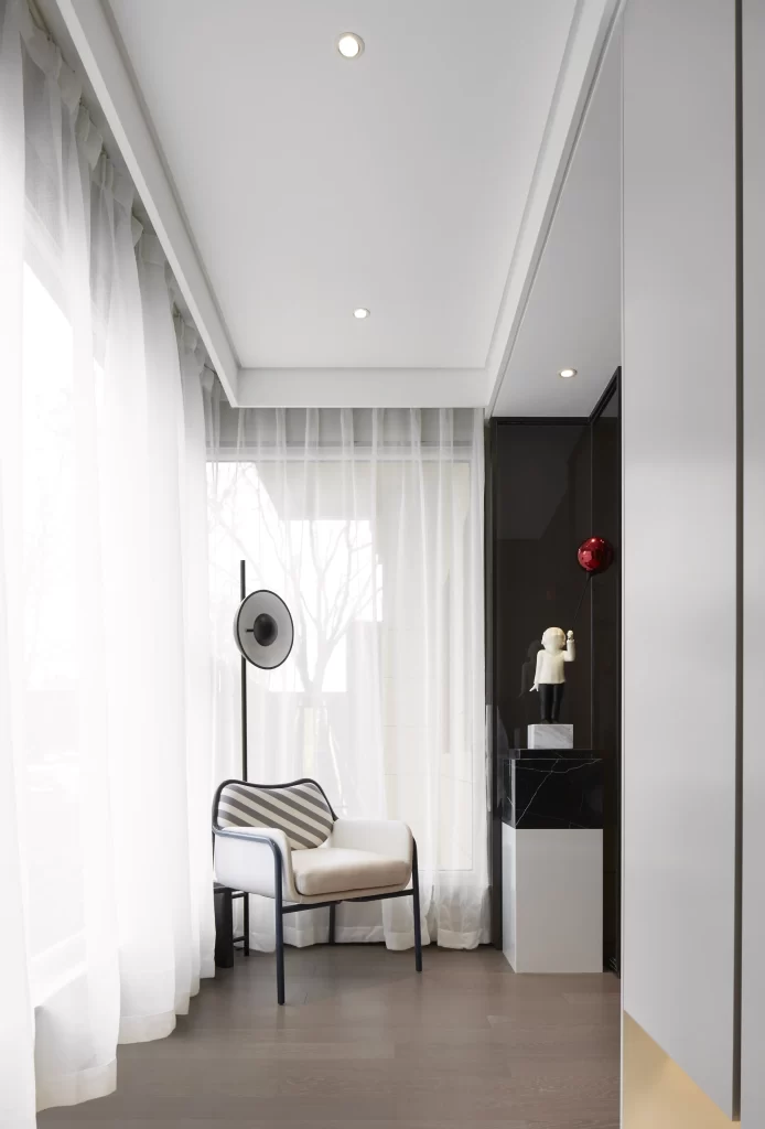
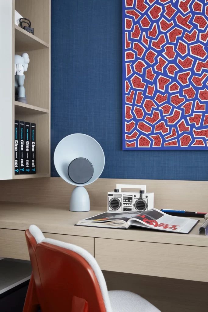
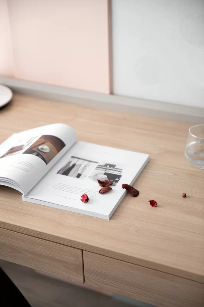
Pale oak grain stretches across the desk surface, catching soft diffused light that eliminates harsh shadows while highlighting the natural wood texture. An open magazine lies slightly off-center, its white pages displaying interior photography and blocks of small text, with scattered dried botanicals in deep crimson and rust tones resting casually on the right page. Behind the arrangement, a two-tone wall combines a muted blush panel with a cooler off-white section, while a clear glass tumbler sits partially visible at the right edge of the frame.
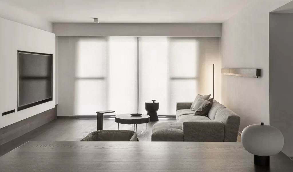
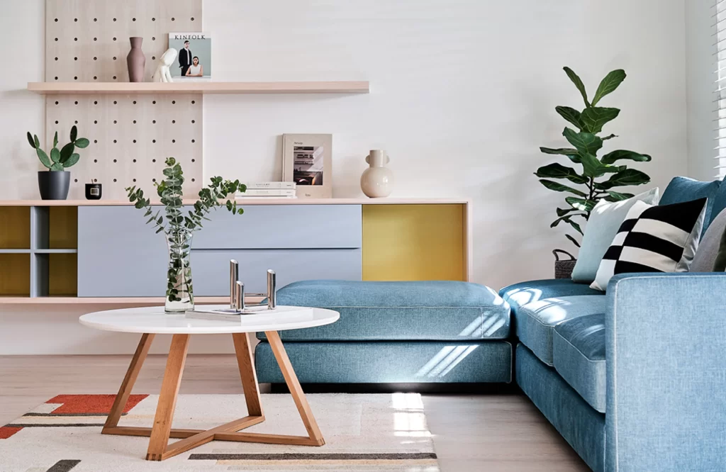
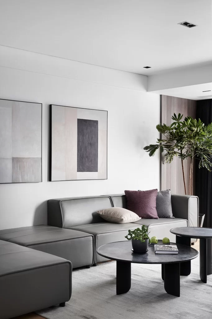
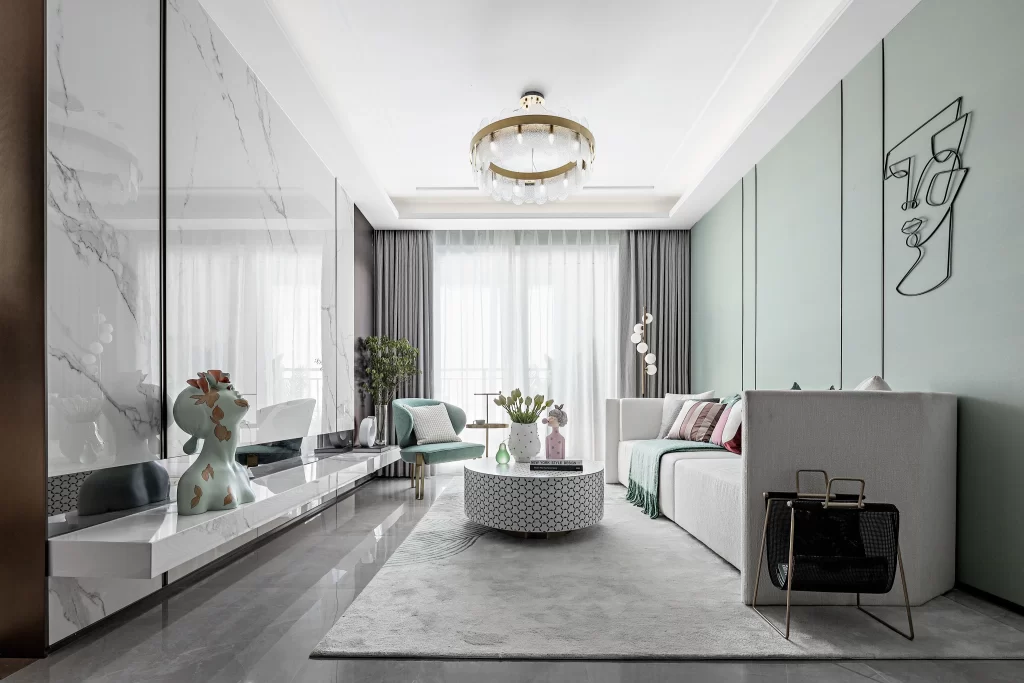
The visual appeal comes from the deliberate restraint in the composition, where the warm timber tones create a grounding presence without competing with the delicate paper and organic elements. This particular setup demonstrates how neutral palettes gain depth through subtle material contrasts—matte wood against glossy glass, crisp paper against textured petals—making it a masterclass in understated elegance. Designers can grab the full-resolution file at no cost to study the color balance and spatial relationships in greater detail.
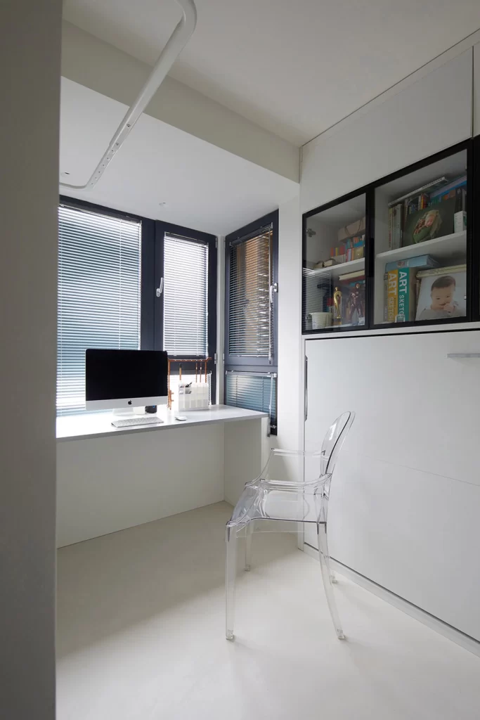
Interior stylists might reference this scene when planning mood boards for Scandinavian or Japandi-inspired spaces, particularly for home office or reading nook concepts. Content creators working on lifestyle branding could adapt the lighting approach and prop placement for product photography featuring stationery, books, or wellness items. The composition also serves architectural photographers studying how to frame furniture within residential environments without overwhelming the subject.