Montana Dog Food Co. Dog Food Pouch
Topics
Details
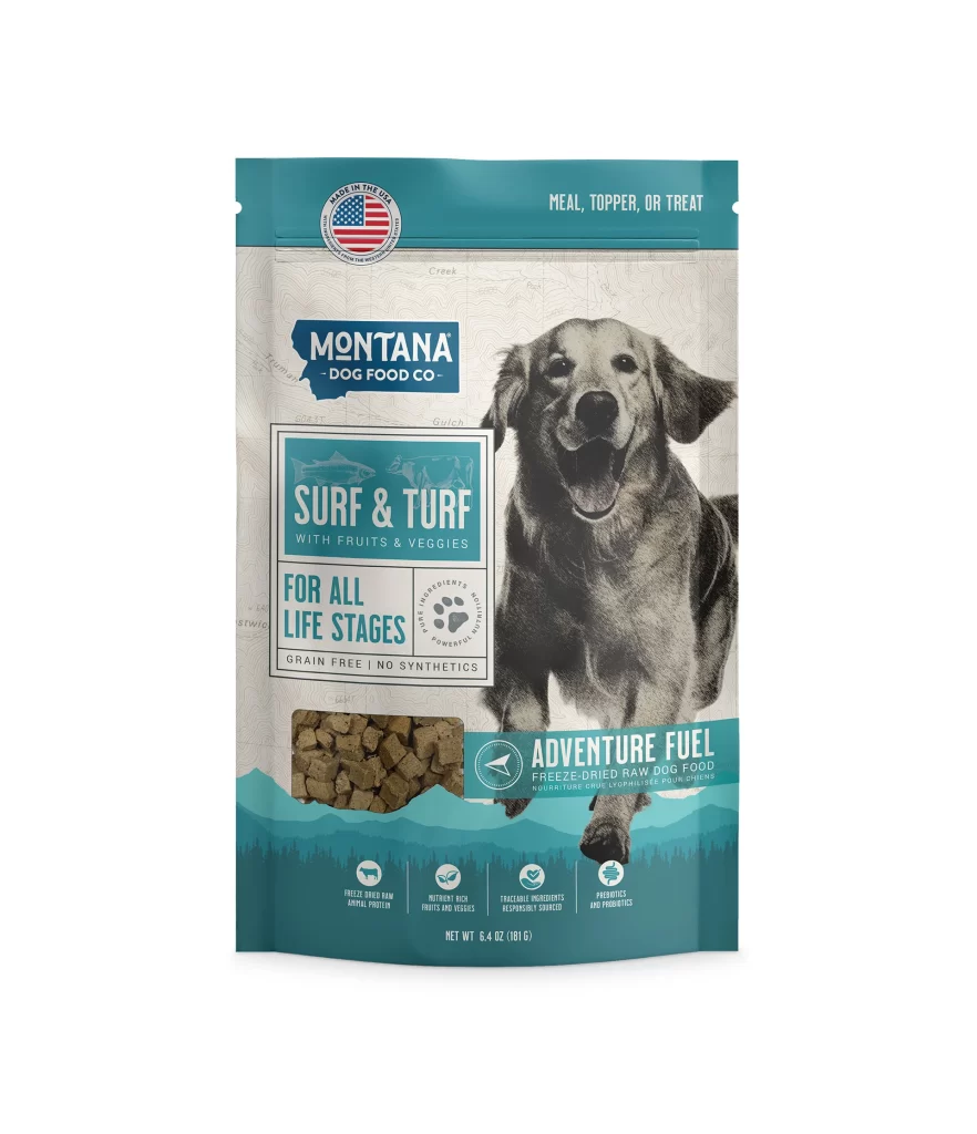
Teal and cream tones define the packaging of this Montana Dog Food Co. product, which features a prominent black-and-white photograph of a golden retriever in mid-stride. The layout balances the brand's blue state-shaped logo against a rectangular frame containing the 'Surf & Turf' flavor name, while a circular American flag emblem anchors the upper left corner above the text 'Meal, Topper, or Treat.' A transparent window near the bottom reveals the freeze-dried kibble inside, and the composition sits against a clean white background with even, shadowless lighting that emphasizes every typographic detail.
Visual hierarchy plays a crucial role here, as the monochromatic canine imagery creates an emotional anchor that contrasts sharply with the vibrant teal accents framing the package edges. The cartographic texture subtly visible behind the main elements adds a layer of rugged sophistication, suggesting outdoor adventure without overwhelming the primary product information. Such careful calibration between photographic realism and graphic structure makes this particular iteration stand out within the crowded pet nutrition market.
Brand strategists examining packaging trends would find value in analyzing how typography scales across different zones of this pouch, from the bold product name to the fine-print nutritional claims at the base. Packaging engineers might study the placement of the resealable notch and the strategic positioning of the ingredient window to optimize shelf appeal. Even illustrators could reference the way the dog's dynamic pose draws the eye toward the central branding elements, demonstrating effective use of figurative imagery in commercial design contexts.