Nongshim Original Potato Snack Packaging
Topics
Details
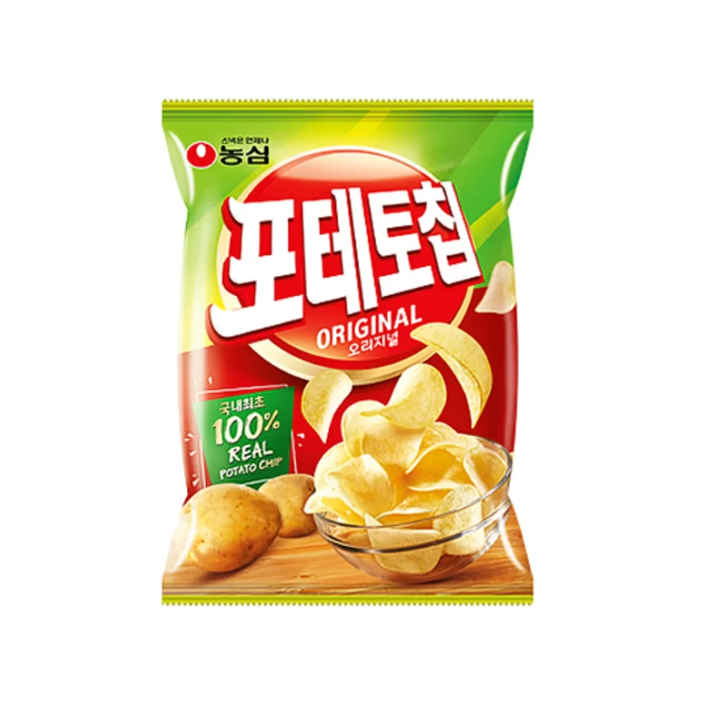
Vibrant lime green and deep crimson red dominate the visual field of this Nongshim potato chip package, creating a high-contrast backdrop for the central branding. A large, circular red emblem anchors the composition, housing the bold white Korean characters '포테토칩' above the English word 'ORIGINAL' and its Korean translation '오리지널'. Below this focal point, a clear glass bowl overflows with pale, curved chips, while two unpeeled potatoes rest on a wooden surface to the left, all captured from a straight-on camera angle under bright, even studio lighting.
The packaging leverages a classic snack-food color psychology, where the energetic green suggests freshness and the urgent red stimulates appetite. What distinguishes this specific design is the integration of a green badge on the lower left proclaiming '100% REAL POTATO CHIP' in both English and Korean, which serves to authenticate the product's quality claims visually. The dynamic arrangement of the flying chips adds a sense of motion and crunchiness that static product shots often lack.
Food photographers might study this layout to understand how to effectively balance typography with food styling in a confined vertical space. Brand strategists could analyze the hierarchy of bilingual text to see how global brands maintain local relevance through script placement. Additionally, illustrators looking to render realistic snack textures would find the highlights on the oil-coated chips and the matte skin of the raw potatoes particularly instructive for their own work.