Nongshim Potato Noodle Potato Snack Packaging
Topics
Details
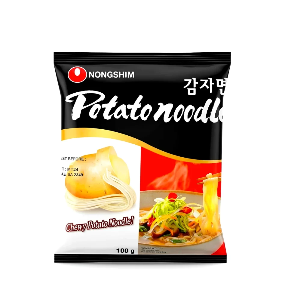
A bold black background anchors the composition, featuring the red Nongshim logo and white 'Potato noodle' script at the top. A golden wave divides the upper branding from a split-panel display below, where a pale yellow potato and coiled noodles sit against white space on the left. The right side bursts with a vivid red backdrop showcasing a steaming bowl of prepared noodles with green vegetables and chopsticks lifting a strand.
Visual tension arises from the stark contrast between the sophisticated black header and the energetic food photography below. The curved gold accent creates dynamic movement across the package, while the bilingual typography balances modern English cursive with traditional Korean characters. This particular layout effectively merges ingredient transparency with appetite appeal through its dual-image strategy.
Food packaging students could analyze how color psychology drives hunger response in this snack design case study. Brand strategists might reference the logo placement hierarchy when developing their own international product lines. Illustrators seeking to render realistic steam effects or glossy vegetable textures will find the cooked-noodle panel particularly instructive for technique practice.