ORIGINS Body Care Product Box
Topics
Details
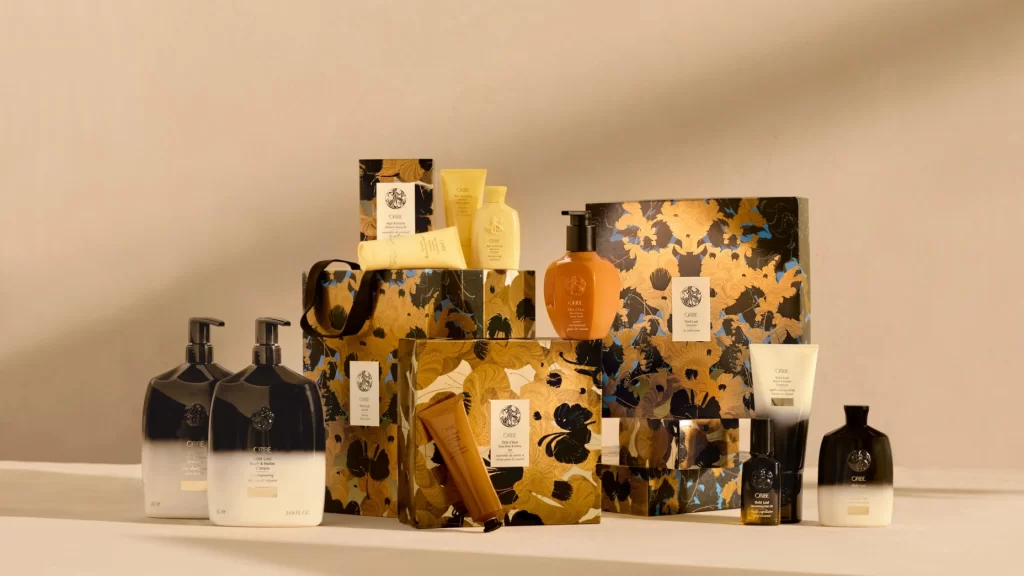
Set against a warm, neutral beige backdrop, this curated collection of Origins body care items presents a study in textural and chromatic contrast. The arrangement features glossy black pump bottles with white gradient bases alongside matte yellow tubes and a singular amber dispenser with a black pump. Ornate gift boxes wrapped in gold and black floral patterns anchor the composition, displaying the brand's circular logo on white rectangular labels, while soft directional lighting from the right casts gentle shadows across the pale surface below.
Visual intrigue emerges from the deliberate juxtaposition of minimalist bottle silhouettes against the maximalist, almost baroque floral motifs adorning the packaging. The color palette balances deep obsidian and metallic gold with creamy yellows and translucent amber, creating a luxurious yet organic aesthetic that feels both modern and artisanal. Such careful coordination between container finishes—ranging from high-gloss to soft-touch matte—and the intricate paper textures demonstrates sophisticated brand cohesion.
Product photographers might analyze this setup to understand how to style multiple SKUs within a unified narrative while maintaining individual item visibility. Packaging designers could examine the interplay between the bold graphic patterns and the restrained typography to inform their own luxury beauty concepts. Art directors planning holiday campaigns or gift-set promotions would find the spatial layering and prop selection particularly instructive for creating depth without visual clutter.