Pasta Colorful Illustration Typography Modern
DownloadTopics
Details
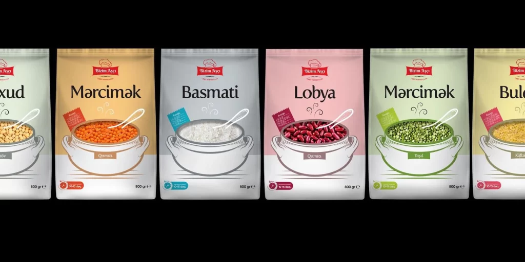
Six vertical pouches of legumes and rice stand in a precise row, each featuring a distinct pastel backdrop ranging from pale cream to soft pink. The packaging displays the brand name 'Birin Aya' in a red rectangular logo at the top, with bold black typography identifying each variety: Noxud, Marcimak, Basmati, Lobya, and a second Marcimak variant. A white ceramic pot illustration dominates the center of every bag, filled with the actual product—yellow peas, orange lentils, white rice, or green mung beans—and accompanied by a delicate spoon resting inside. Small colored tags in red, blue, purple, and green indicate cooking times like '10-15 dəq', while 800g weight markings anchor the bottom corners against an absolute black void.
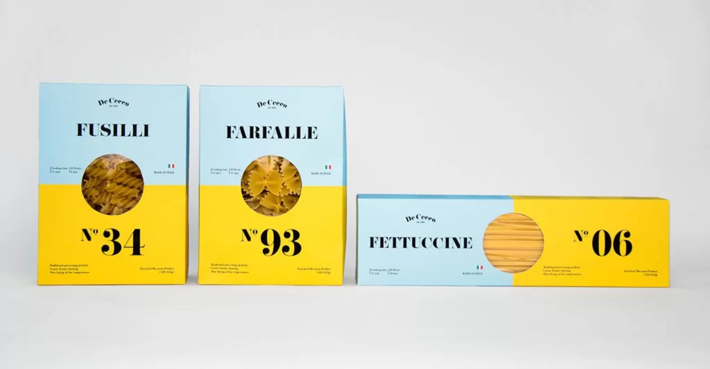
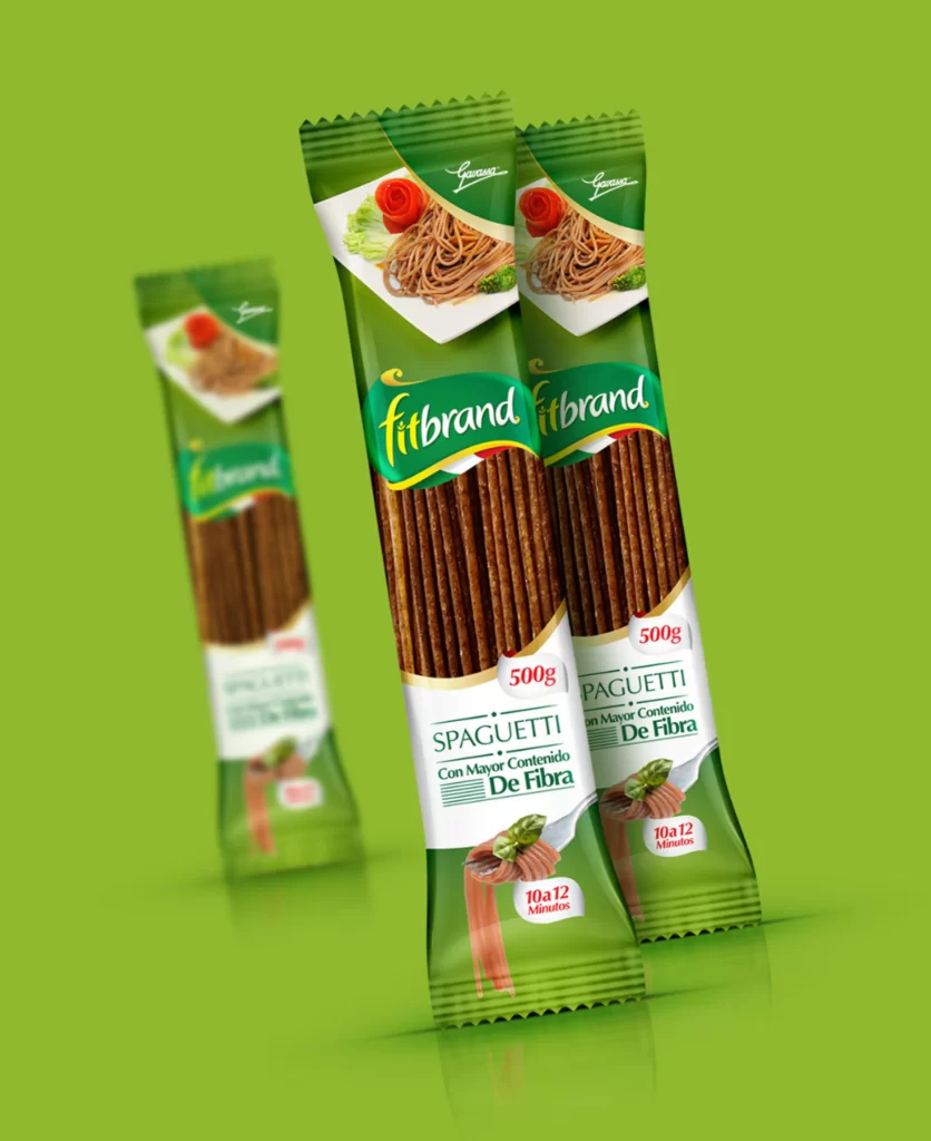
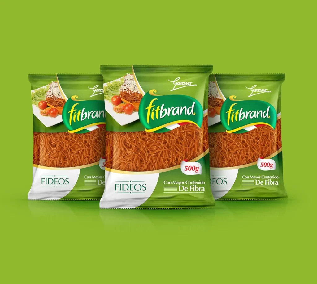
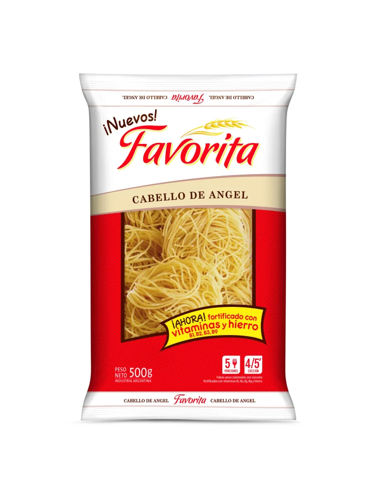
Color coding creates immediate visual differentiation between varieties, allowing shoppers to identify products from a distance without reading text. The consistent pot-and-spoon motif unifies the collection while the varying fill colors provide organic texture that contrasts with the clean geometric bag shapes. Designers studying this layout will appreciate how the steam wisps and subtle shadows add depth to otherwise flat illustrations, creating a cohesive yet varied product family aesthetic. Anyone needing these assets for commercial mockups can access the full-resolution file at no cost through our resource library.
Packaging engineers and brand identity specialists would examine this arrangement to understand how color psychology influences consumer perception of food products. Illustrators might reference the ceramic rendering technique to develop their own culinary artwork styles, particularly the way light interacts with the spoon's metallic surface. Marketing teams could analyze the typographic hierarchy to plan their own label systems, noting how the product name dominates while secondary information remains legible but subordinate. E-commerce photographers might use this as a benchmark for arranging multiple SKUs in promotional banners where uniformity matters as much as individual appeal.