Pasta Colorful Modern Minimalist Typography Photo
DownloadTopics
Details
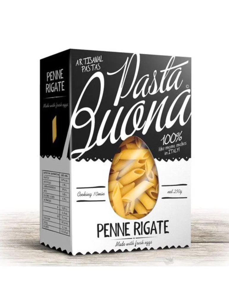
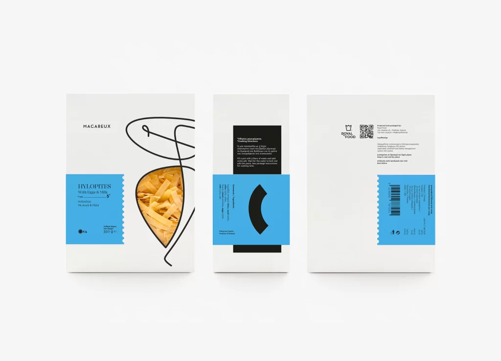
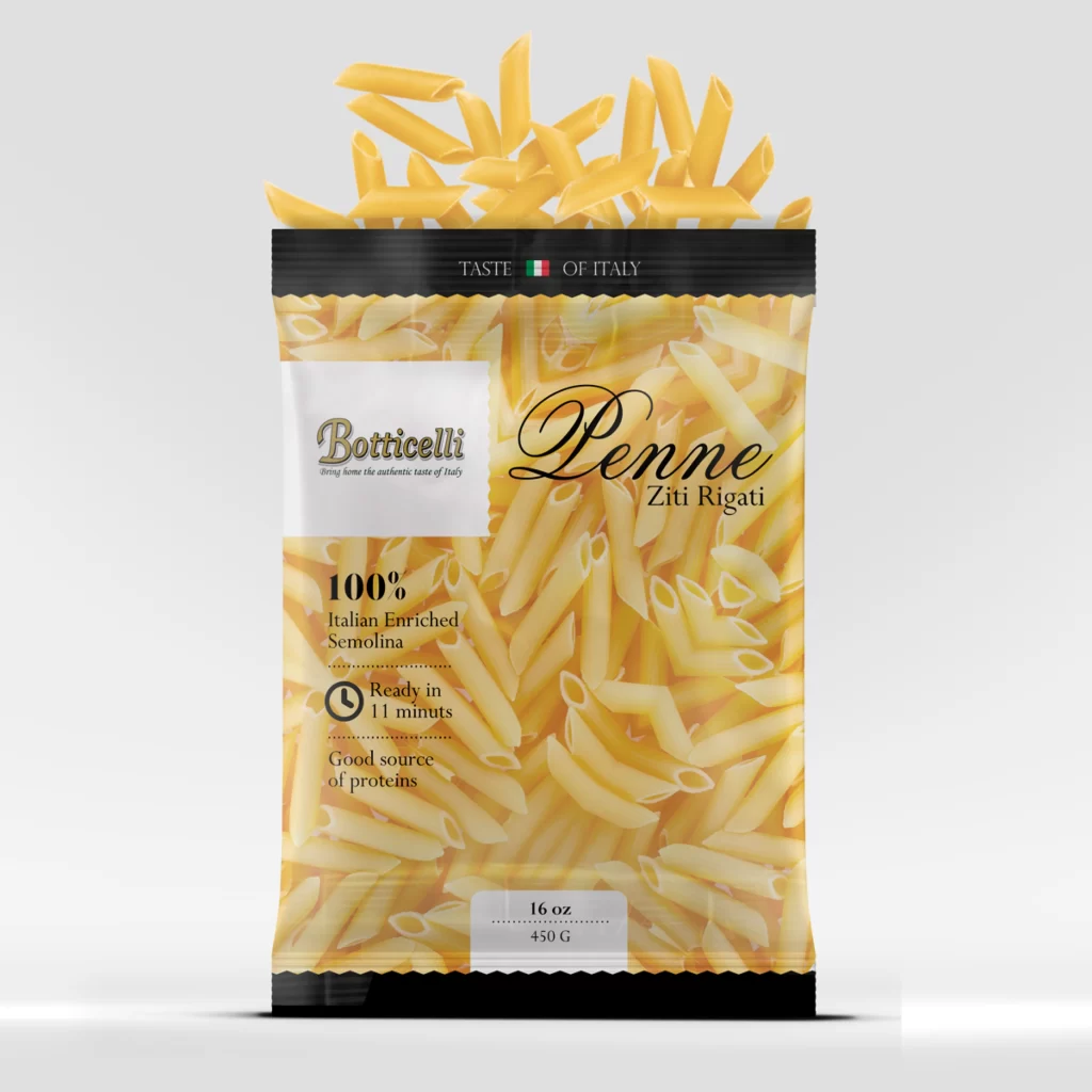
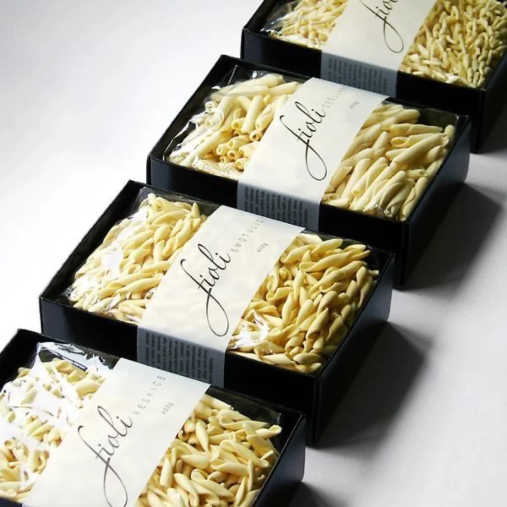
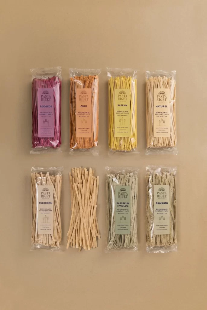
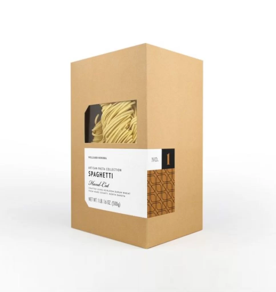
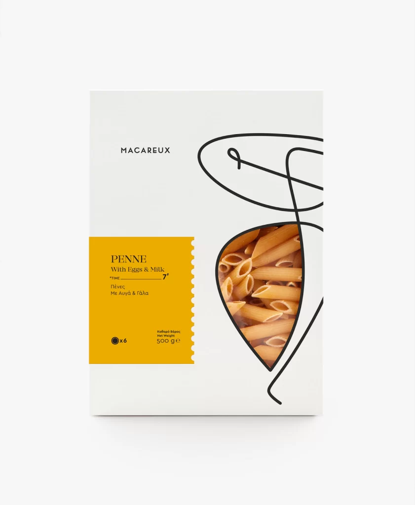
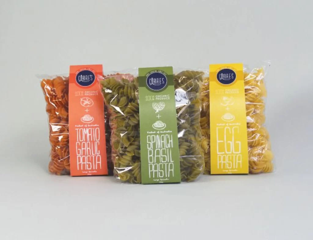
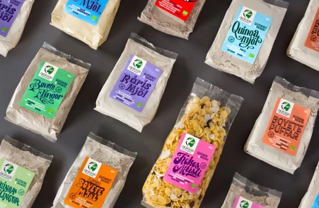
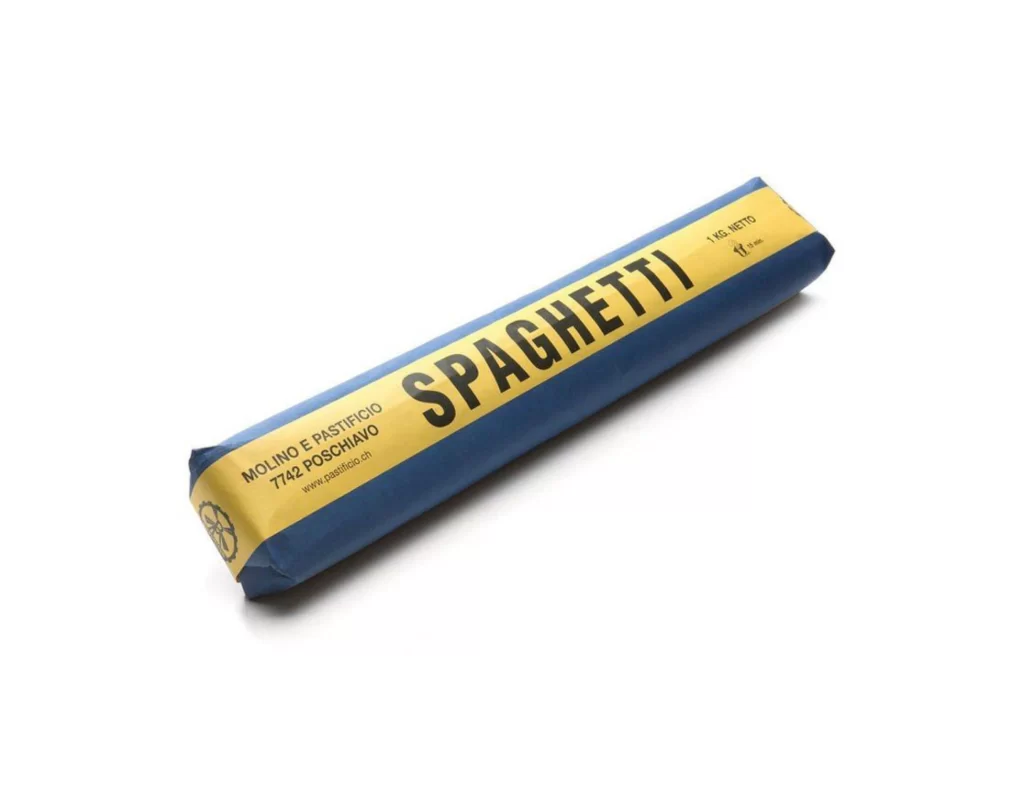
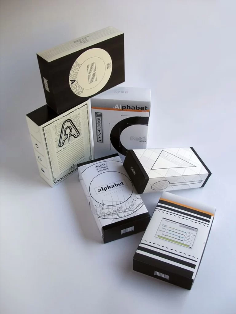
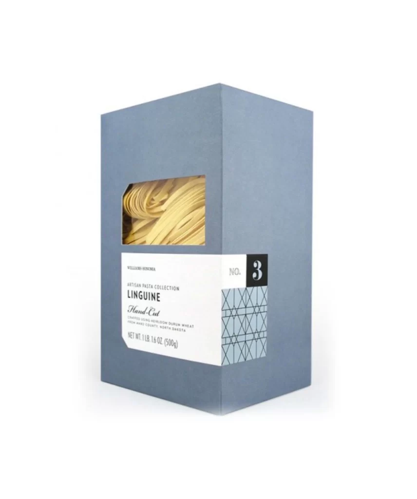
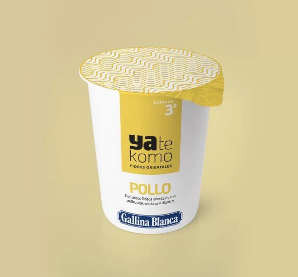
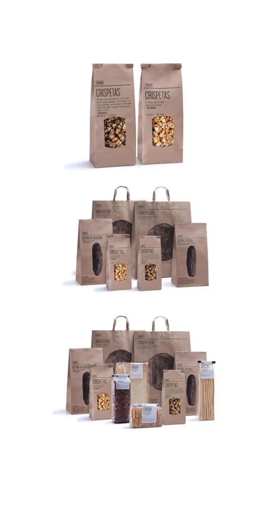
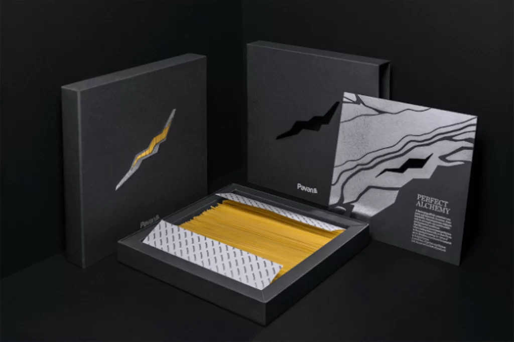
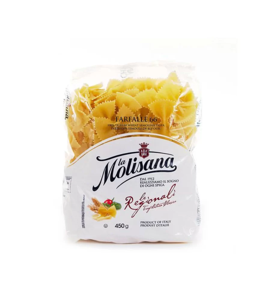
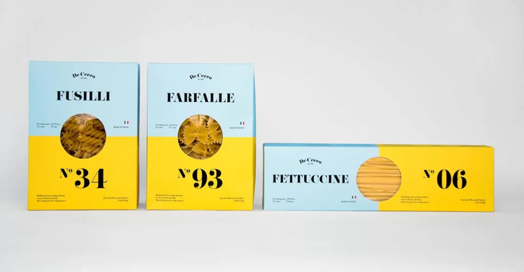
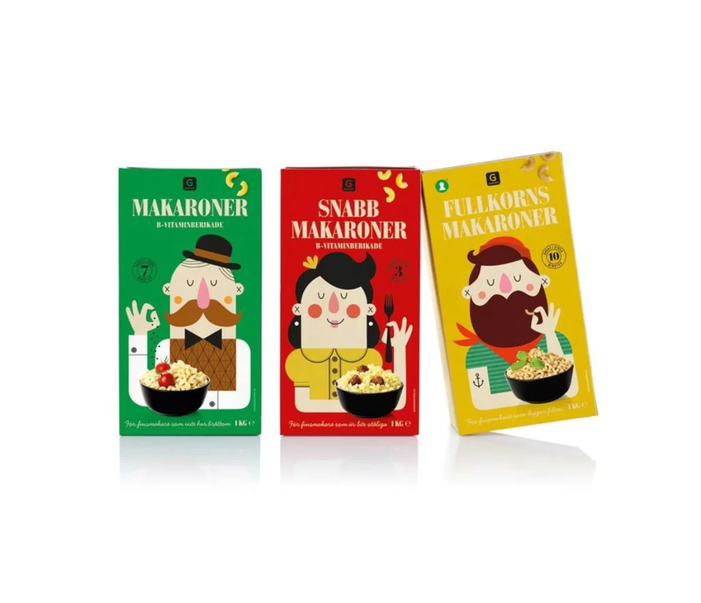
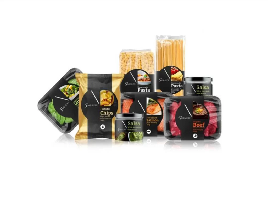
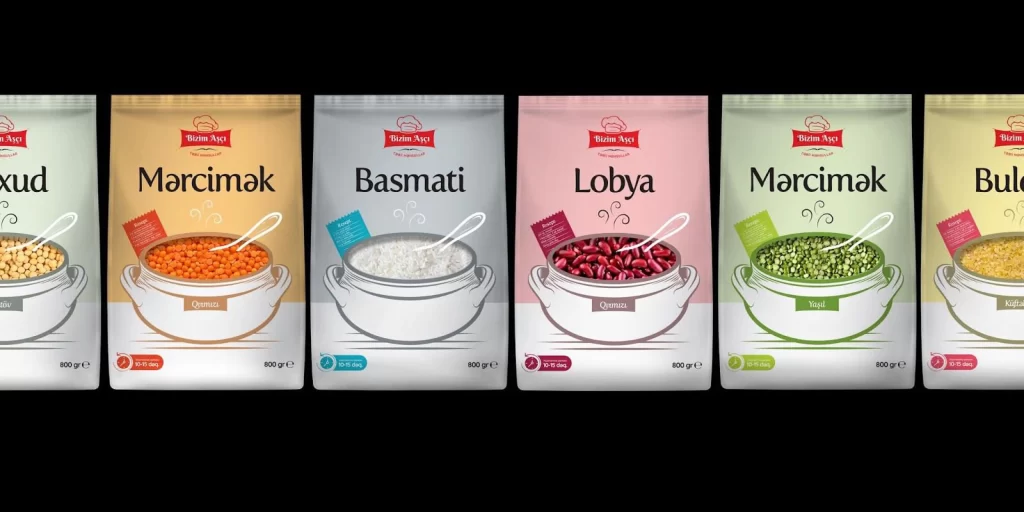
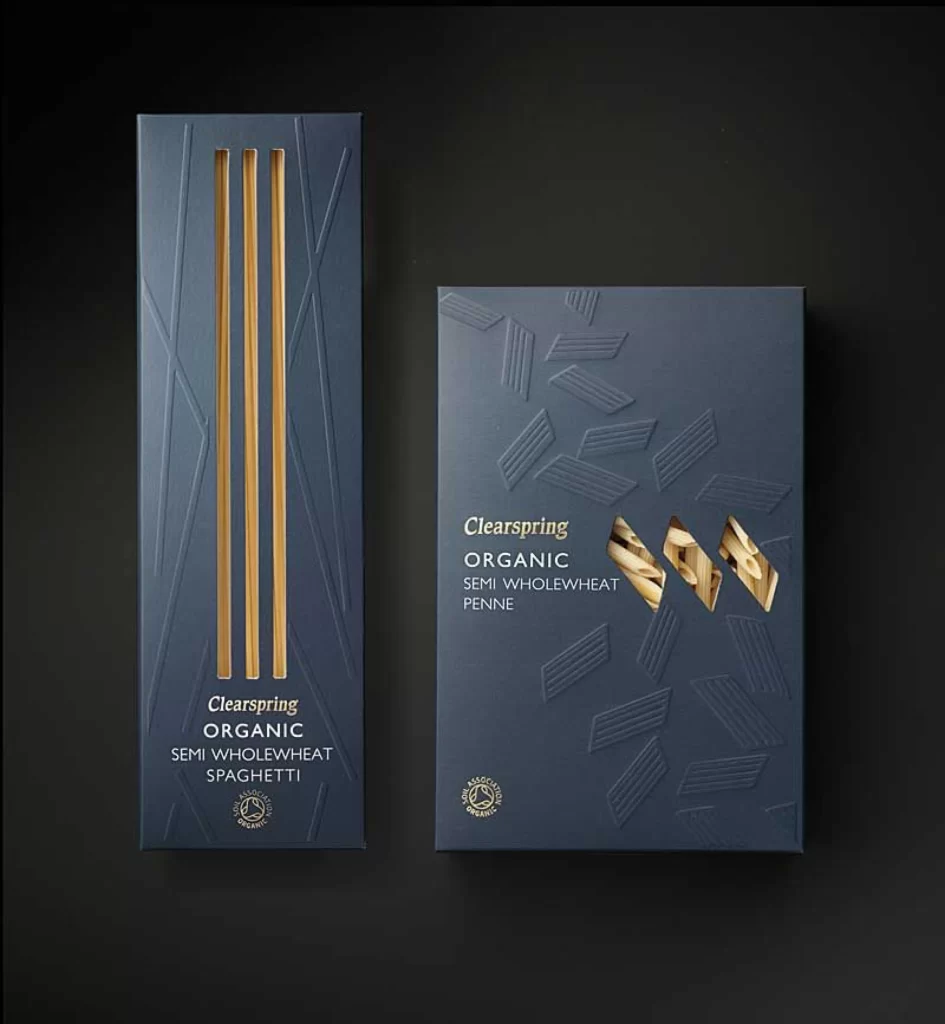
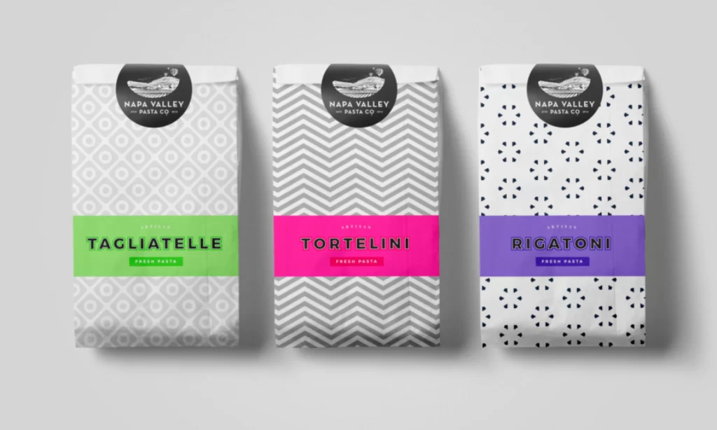
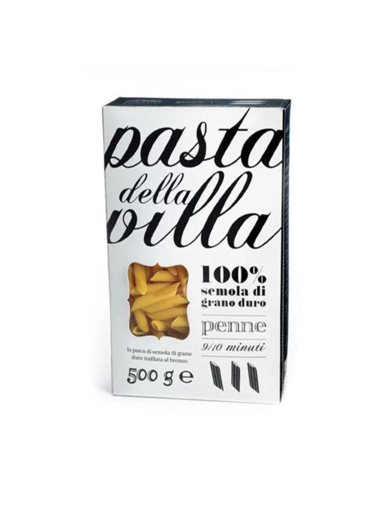
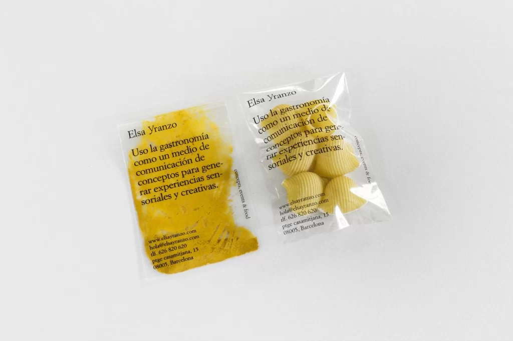
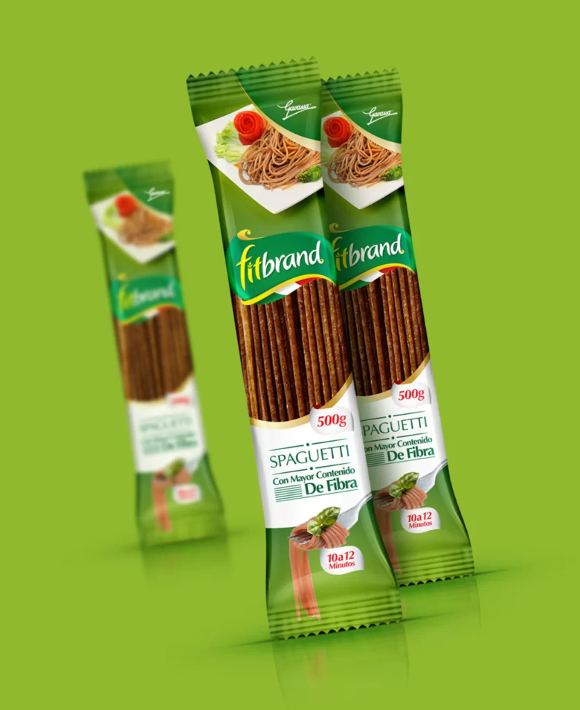
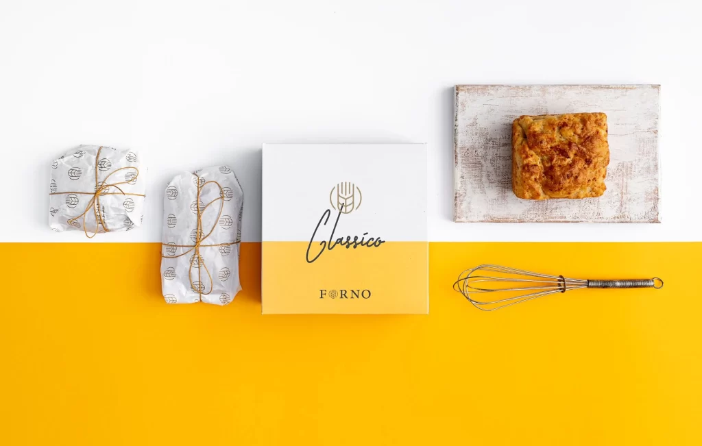
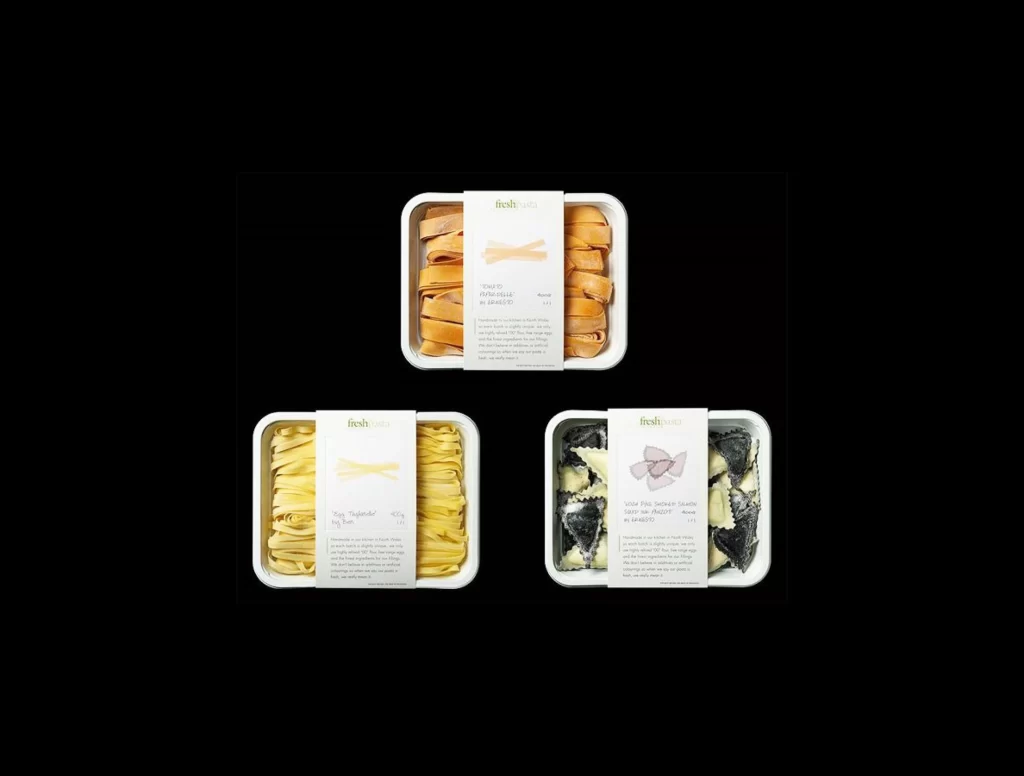
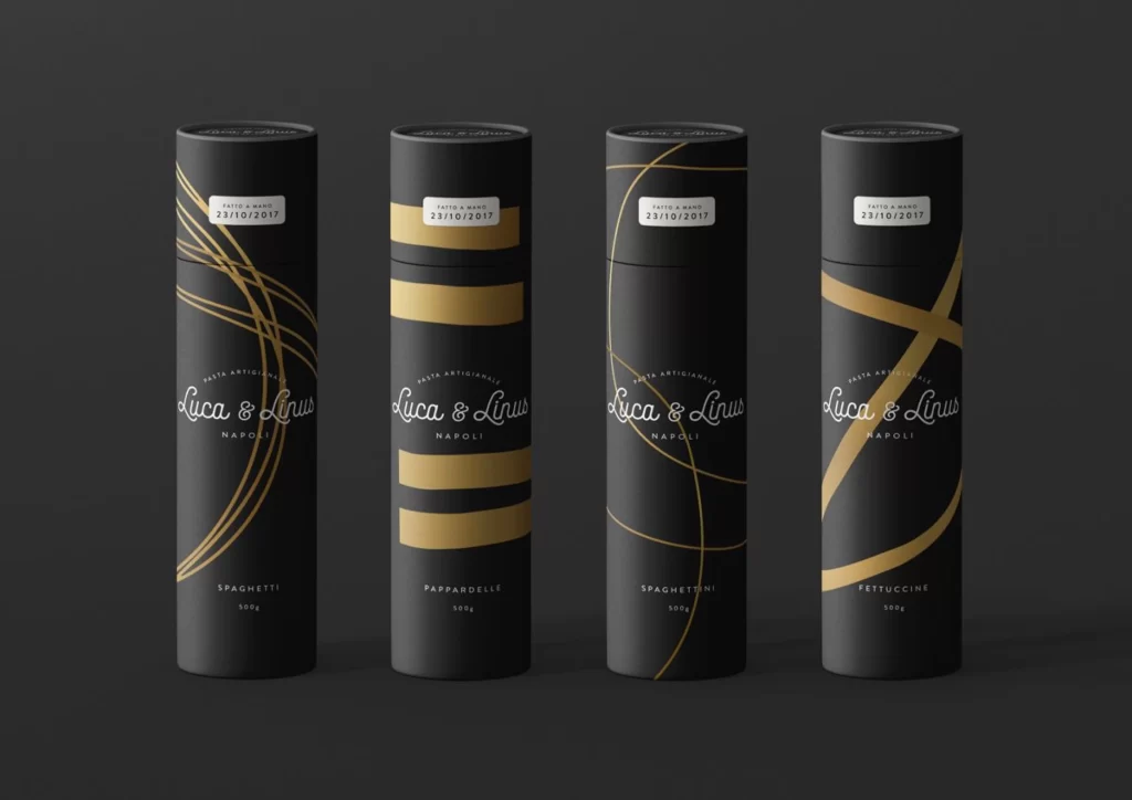
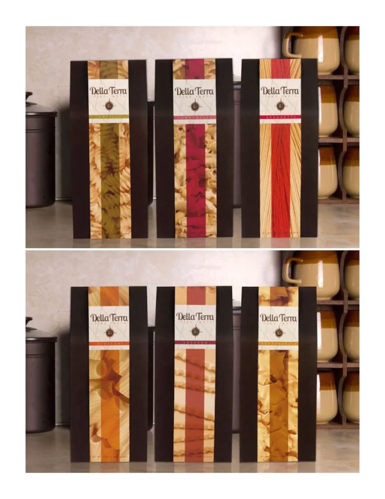
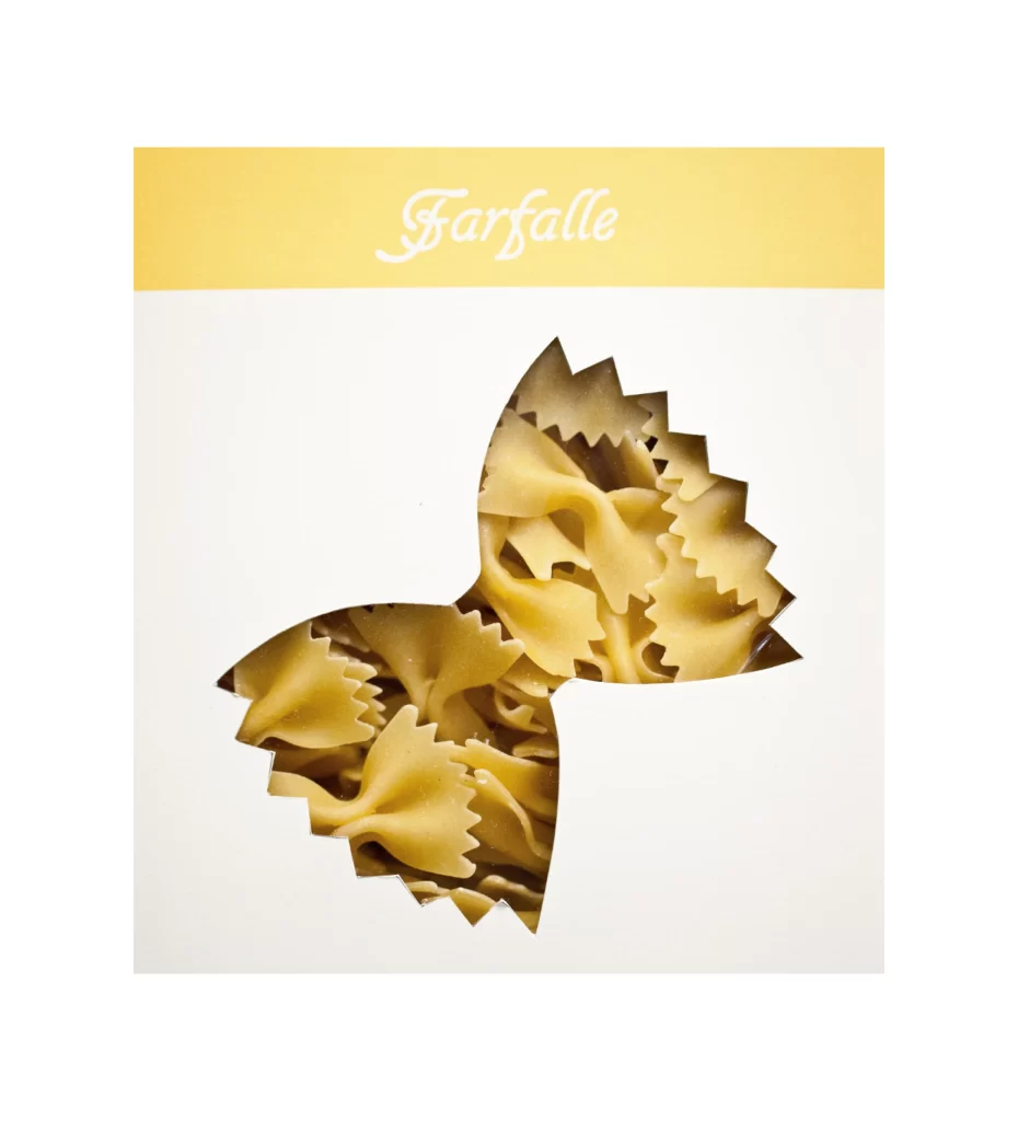
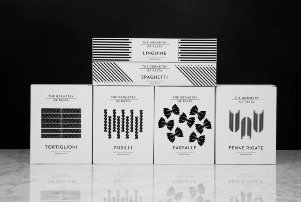
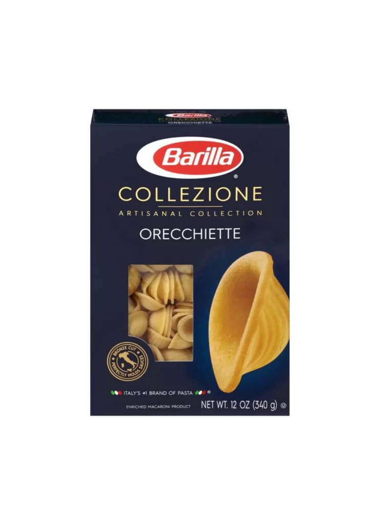
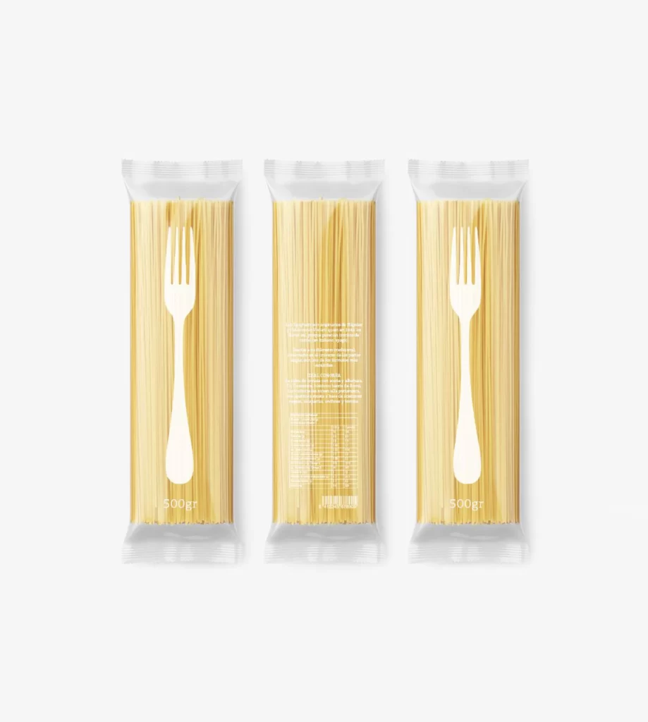
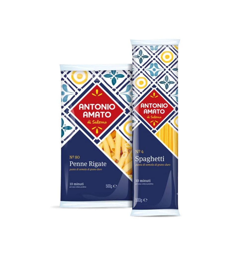
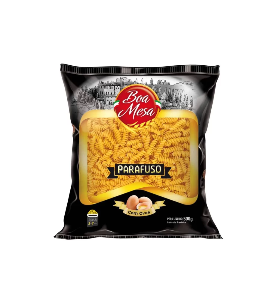
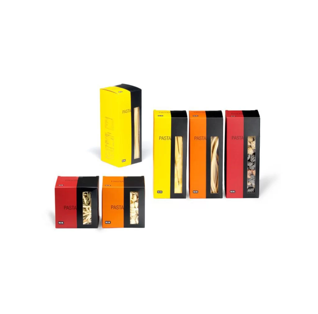
Six rectangular pasta boxes in vibrant yellow, orange, and red hues stand arranged on a clean white surface, each featuring a bold black side panel that creates a striking two-tone contrast. The packaging displays the word "PASTA" in clean sans-serif typography alongside a small blue "NIK" logo, while transparent windows reveal the distinct shapes of spaghetti, fettuccine, and shell pasta inside. Soft studio lighting casts subtle shadows beneath the containers, which are positioned at varying heights to form a dynamic yet orderly composition.
The visual power of this packaging lies in its disciplined color-blocking strategy, where saturated primary and secondary tones meet deep black in a sharp vertical divide that commands attention. This minimalist approach strips away decorative clutter to let the product itself become the hero, visible through the precisely placed clear panels that break up the solid color fields. Designers studying this arrangement will appreciate how the limited palette and geometric rigor create a cohesive family look across different pasta varieties. You can grab the full-resolution file at no cost if you need to examine these details more closely for your own projects.
Brand strategists developing premium food product lines would find this reference particularly useful when exploring how color coding can differentiate SKU variants while maintaining visual unity. Packaging engineers might study the structural proportions and window placement to understand how transparency affects perceived value in dry goods retail contexts. Art directors working on editorial spreads could also mine the composition for ideas about grouping products asymmetrically without sacrificing balance or legibility.