Safe Catch Tuna Can
Topics
Details
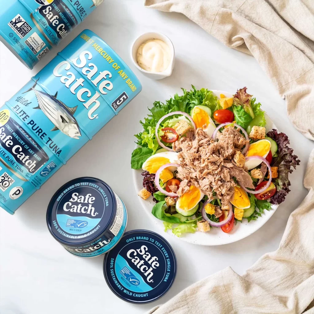
Overhead lighting illuminates a white marble surface where four cylindrical Safe Catch tuna cans rest beside a ceramic bowl of salad. The packaging features a distinctive turquoise blue body with bold white serif typography, a detailed black-and-white fish illustration, and yellow accent text highlighting mercury testing claims. A small white ramekin containing pale cream dressing sits near the upper center, while folded beige linen fabric drapes across the right edge of the composition.
Visual hierarchy emerges through the contrast between the vibrant cyan containers and the organic greens and yellows of the mixed salad, which includes halved hard-boiled eggs, red onion rings, cherry tomatoes, and croutons. The brand's commitment to transparency manifests in the dense typographic details covering the can surfaces—certification logos, sustainability marks, and nutritional information create a textured informational landscape that balances commercial branding with scientific credibility.
Food photographers studying prop arrangement for seafood product launches will find the spatial relationships between packaged goods and prepared dishes instructive here. Packaging designers analyzing how health-conscious consumers respond to color-coded safety messaging can examine the specific placement of certification badges relative to the primary logo. Culinary stylists developing mood boards for clean-eating editorial spreads might reference the interplay between raw ingredients and finished meal presentation.