Salt Jar Glass Brown Blue Green Minimalist Design
Topics
Details
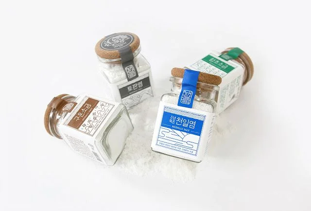
Four square glass salt jars with cork stoppers rest on a white surface, each featuring a distinct label color—brown, black, blue, and green. The Korean text "천일염" (Sun-dried Salt) appears prominently on the blue label, while the brown label displays "고운소금" (Fine Salt). Soft, diffused lighting casts gentle shadows beneath the containers, which are arranged in a loose, staggered cluster from a slightly elevated perspective.
Visual interest stems from the restrained palette of natural cork, clear glass, and muted label tones that evoke a coastal, artisanal aesthetic. The line-art illustrations of waves and landscapes on the labels add subtle texture without overwhelming the minimalist form. Each jar's unique color-coded tag creates a cohesive yet differentiated system suitable for product line variations.
Brand designers developing packaging for gourmet food products might study the balance between typography and illustrative elements here. Art directors planning e-commerce photography could reference the arrangement for showcasing multiple SKUs in a single frame. Packaging engineers evaluating closure mechanisms would note how the cork stopper integrates with the glass neck while maintaining visual simplicity.