Servadei Packaging A
Topics
Details
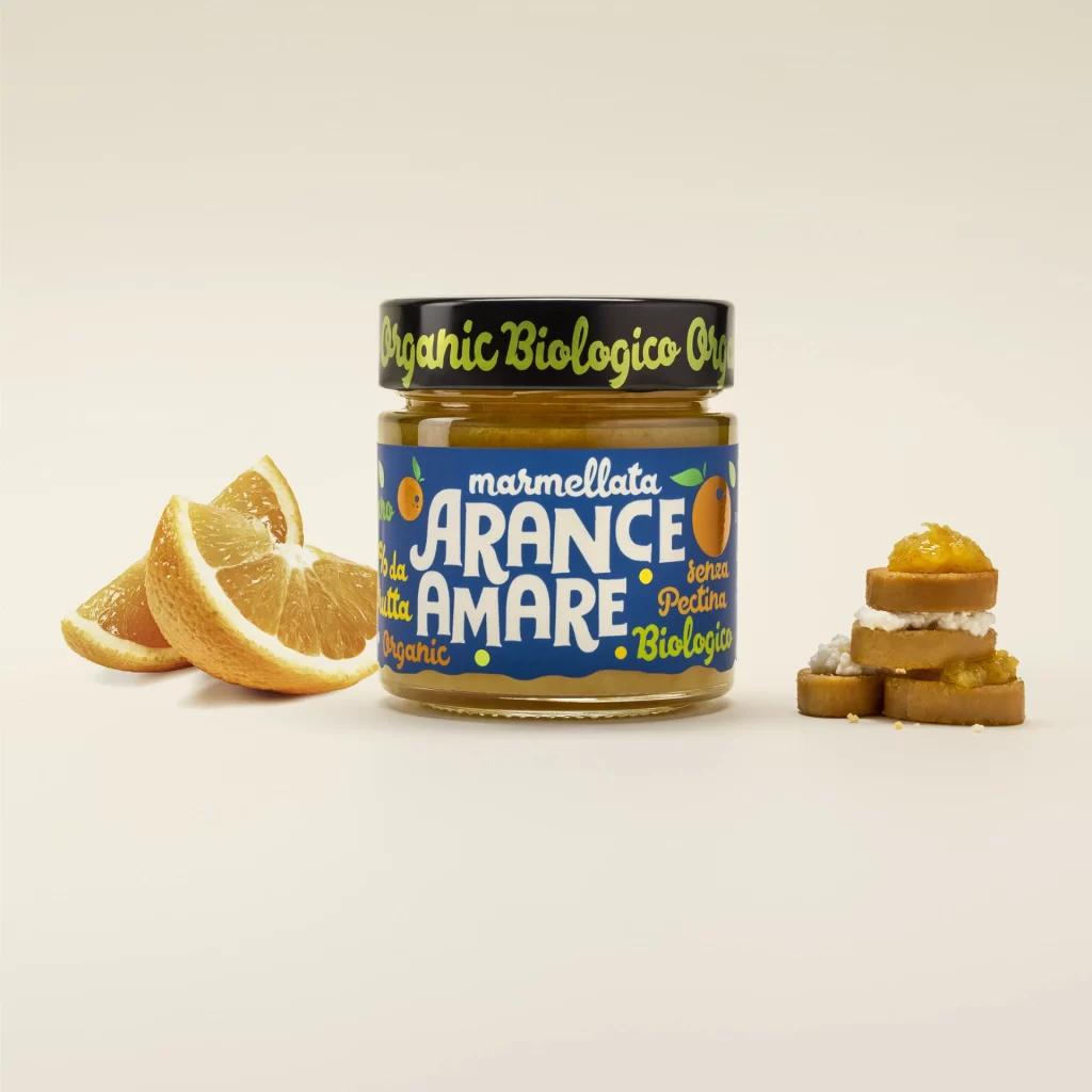
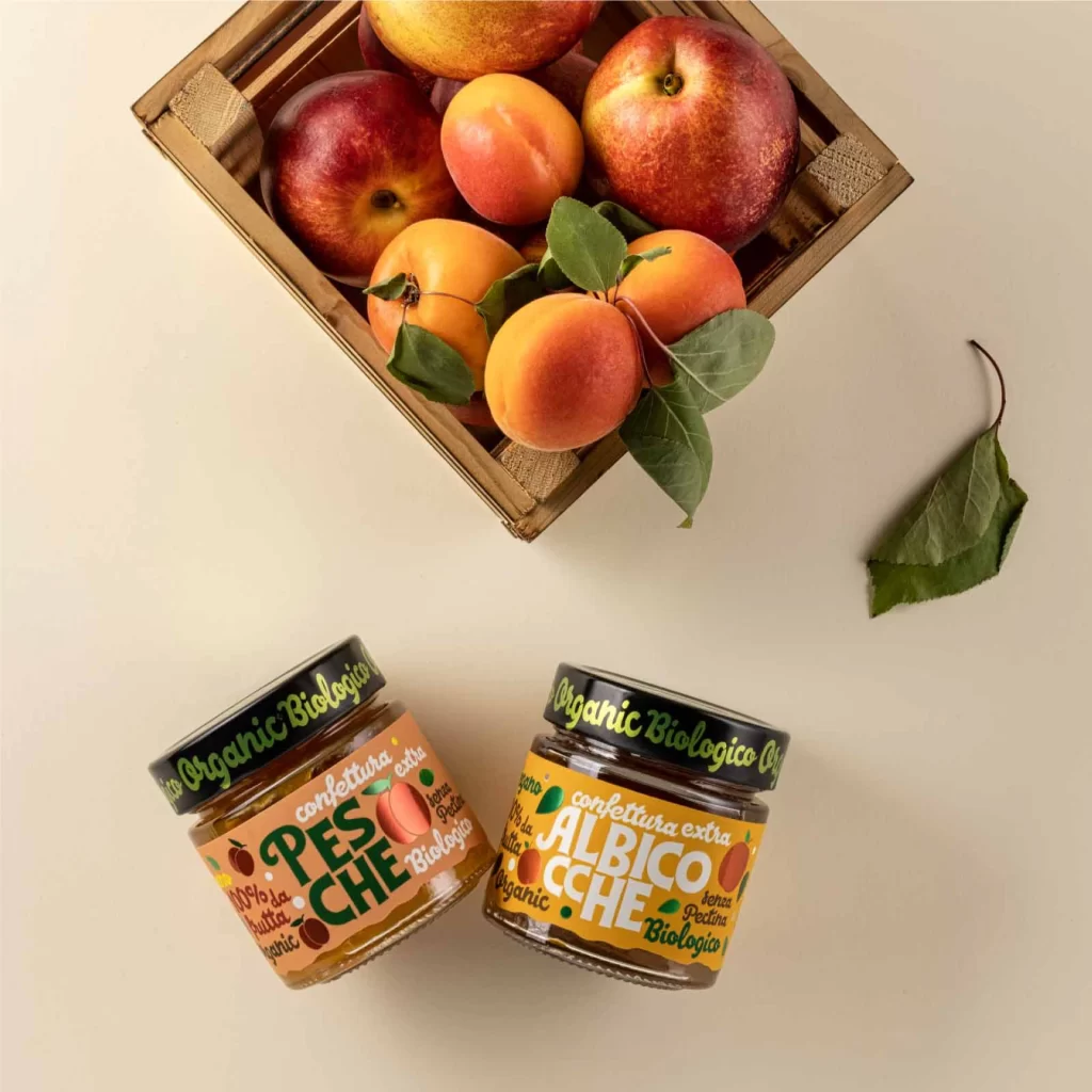
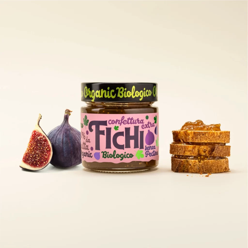
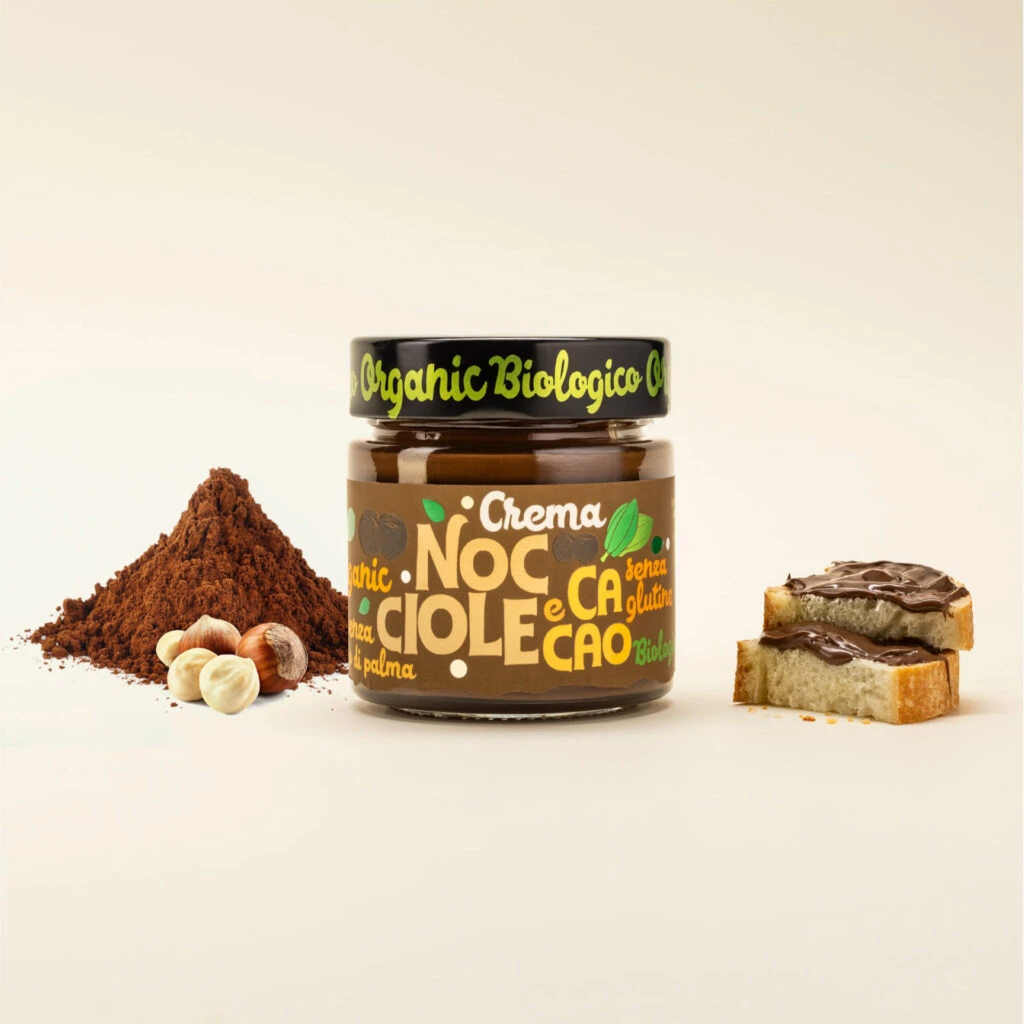
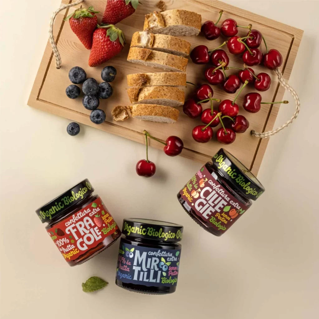
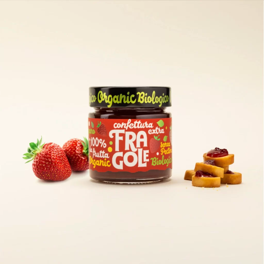
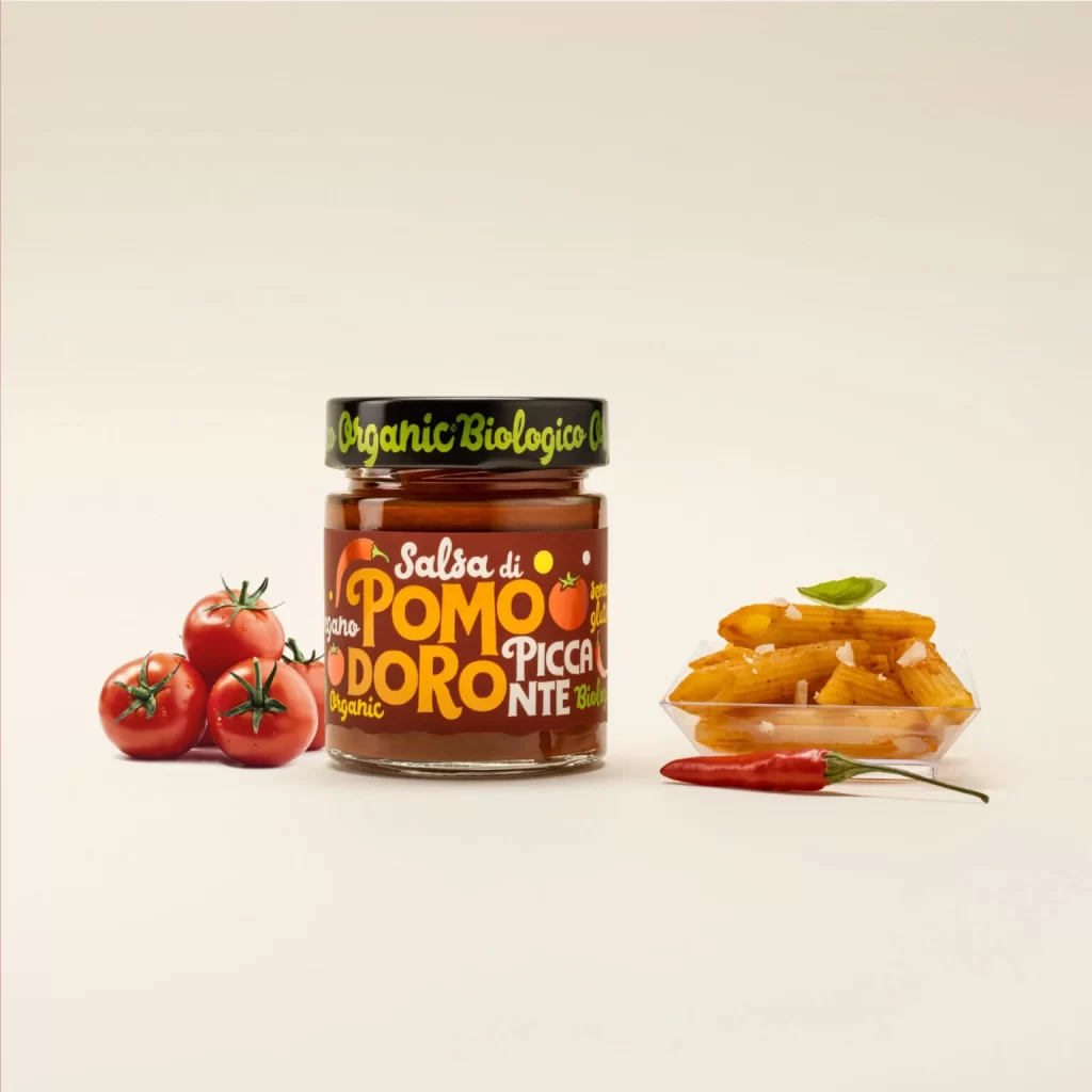
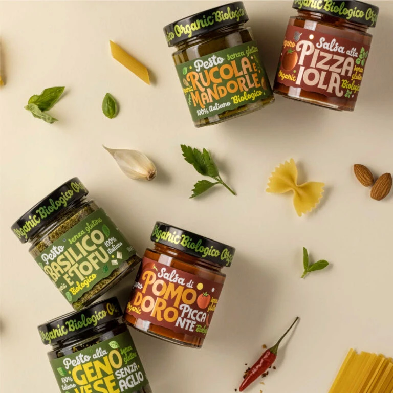
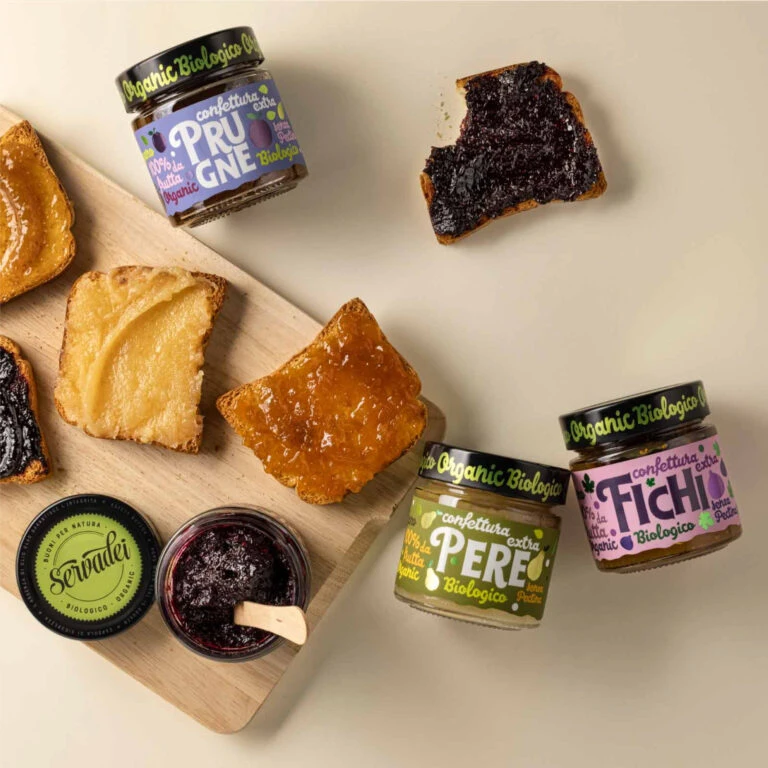
Over a neutral cream surface, three glass jars of organic fruit preserves sit alongside toasted bread slices arranged on a light wooden cutting board. The jars feature distinct color-coded labels—purple for Prugne (plum), green for Pere (pear), and pink for Fichi (fig)—each displaying 'Organic Biologico' in lime-green script against black lids. One jar lies open with its wooden spreader resting inside, revealing dark purple jam, while the bread displays varying textures from golden-brown toast to dark fruit-spread coverage under soft, diffused overhead lighting.
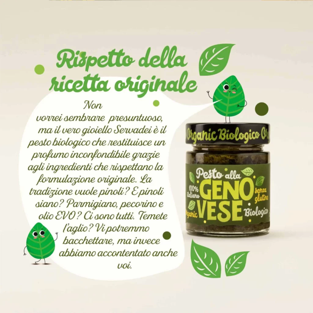
Visual hierarchy emerges through the strategic use of vibrant label colors against the muted background, creating immediate product differentiation without overwhelming the organic aesthetic. The typography balances playful rounded lettering for fruit names with authoritative serif fonts for certification claims, establishing both artisanal charm and consumer trust. Compositionally, the diagonal arrangement of the cutting board creates dynamic negative space that guides the eye naturally between product variants while maintaining a cohesive breakfast-table narrative.
Brand strategists developing eco-conscious food packaging could analyze this color-coding system to inform their own SKU differentiation strategies across product lines. Food photographers might study the lighting ratios and prop placement to replicate this appetizing yet minimalist aesthetic for editorial spreads or e-commerce catalogs. Packaging designers examining the label hierarchy could extract principles for balancing regulatory text requirements with expressive brand personality in confined circular spaces.