Servadei Packaging G
Topics
Details
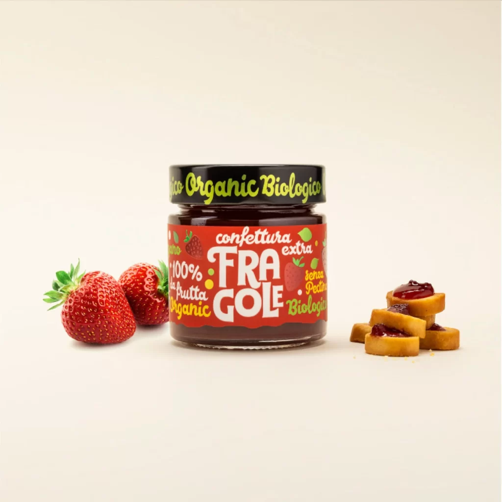
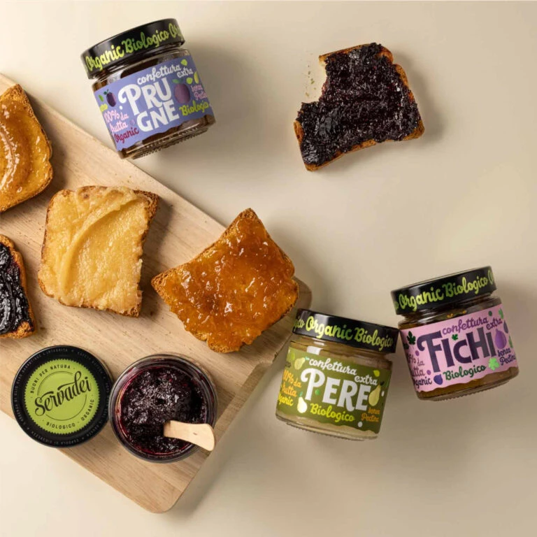
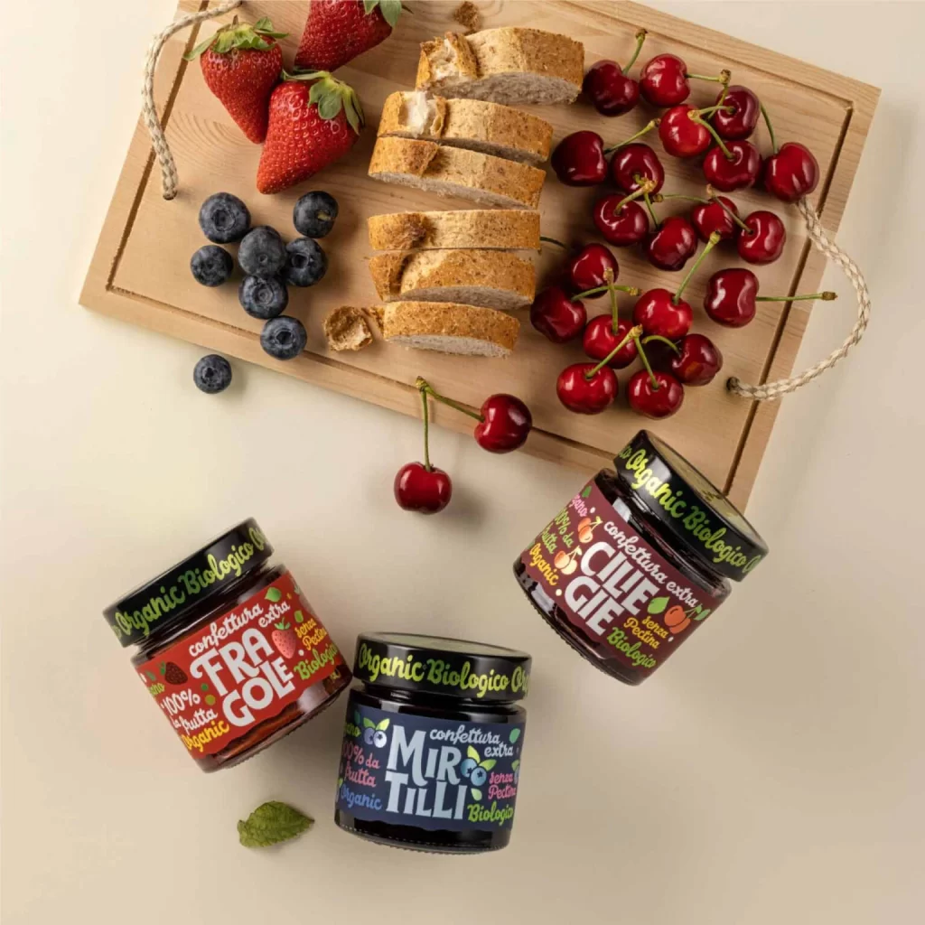
Over a pale cream backdrop, a light wooden cutting board with rope handles displays sliced whole-grain bread alongside fresh strawberries, blueberries, and glossy red cherries. Three glass jars of organic jam sit in the foreground, each featuring bold typography on colorful labels: red for strawberry (Fragole), dark blue for blueberry (Mirtillo), and burgundy for cherry (Ciliegie). The composition is captured from a direct overhead perspective under soft, even lighting that highlights the natural textures of the fruit and the matte finish of the packaging.
What makes this arrangement visually compelling is the deliberate color coordination between the fresh produce and the corresponding jar labels, creating an immediate visual link between the product and its source ingredients. The mix of organic shapes from the berries and the geometric lines of the bread slices provides a pleasing contrast against the rigid rectangular form of the cutting board. Furthermore, the playful yet legible font choices on the lids and labels demonstrate how branding can feel both artisanal and modern without sacrificing readability.
Food photographers might study this setup to understand how to balance multiple elements in a flat-lay composition while maintaining a clear focal point. Brand designers working in the organic food sector could analyze how the specific palette of earthy tones and vibrant fruit colors communicates freshness and quality to the consumer. Additionally, social media content creators could adapt this aesthetic for lifestyle posts that emphasize healthy eating and premium pantry staples.