Servadei Packaging H
Topics
Details
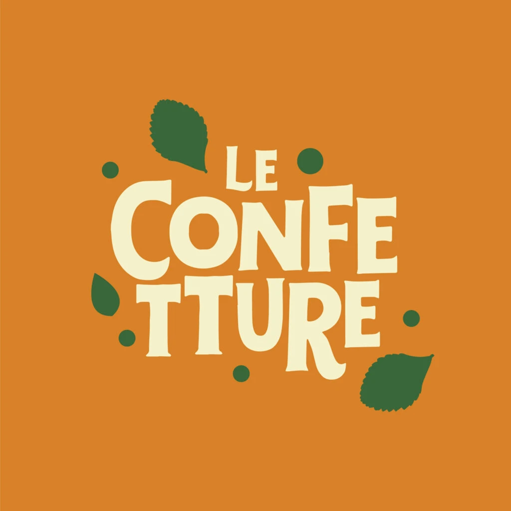
Bold, cream-colored typography spelling 'LE CONFETTURE' dominates the composition in a heavy, rounded sans-serif typeface. Three dark green leaves with serrated edges occupy the upper left, lower left, and lower right areas around the text block, while six solid green dots of varying sizes fill the remaining negative space on a saturated orange field.
Visual interest derives from the deliberate tension between the rigid typographic weight and the organic irregularity of the leaf silhouettes. The cream hue sits in high-contrast relief against the orange ground, while the darker green elements provide a secondary chromatic anchor that prevents the palette from feeling overly sweet or monolithic. Spatially, the arrangement balances asymmetry through careful distribution of mass, ensuring that no single quadrant feels visually heavier than its counterpart despite the uneven placement of decorative motifs.
Brand strategists developing identity systems for artisanal food producers might study this layout to understand how organic shapes can soften industrial typography without compromising legibility. Color theorists could reference this specific triad when constructing palettes for packaging that must convey both warmth and natural authenticity. Additionally, illustrators working on editorial covers for culinary publications might adapt this compositional logic to integrate hand-drawn botanical elements within bold headline treatments.