Servadei Packaging M
Topics
Details
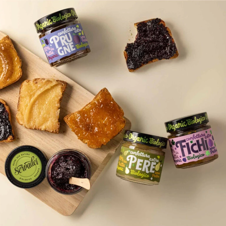
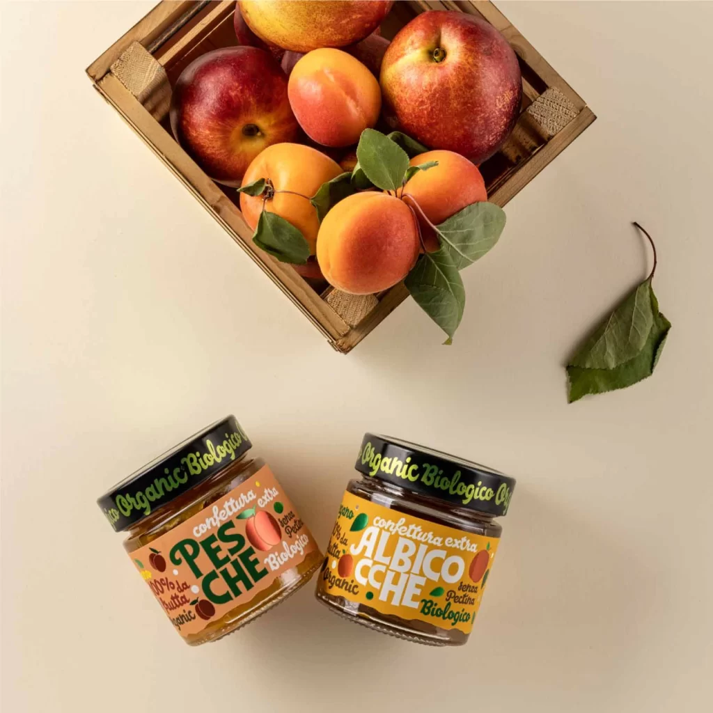
A rustic wooden crate overflows with ripe nectarines and apricots, their skins glowing in deep crimson and soft orange hues, atop a pale cream surface. Two glass jars of organic fruit preserves sit at a slight angle below the crate, featuring bold, playful typography that spells out 'PESCHE' on a peach-toned label and 'ALBICOCCHE' against a vibrant yellow background. Black lids bearing the text 'Organic Biologico' crown each jar, while scattered green leaves add organic texture to the composition.
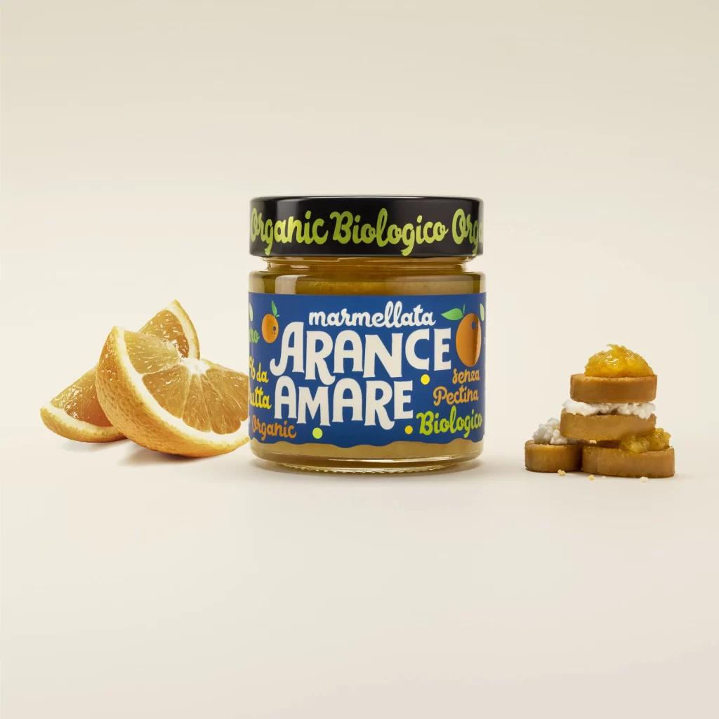
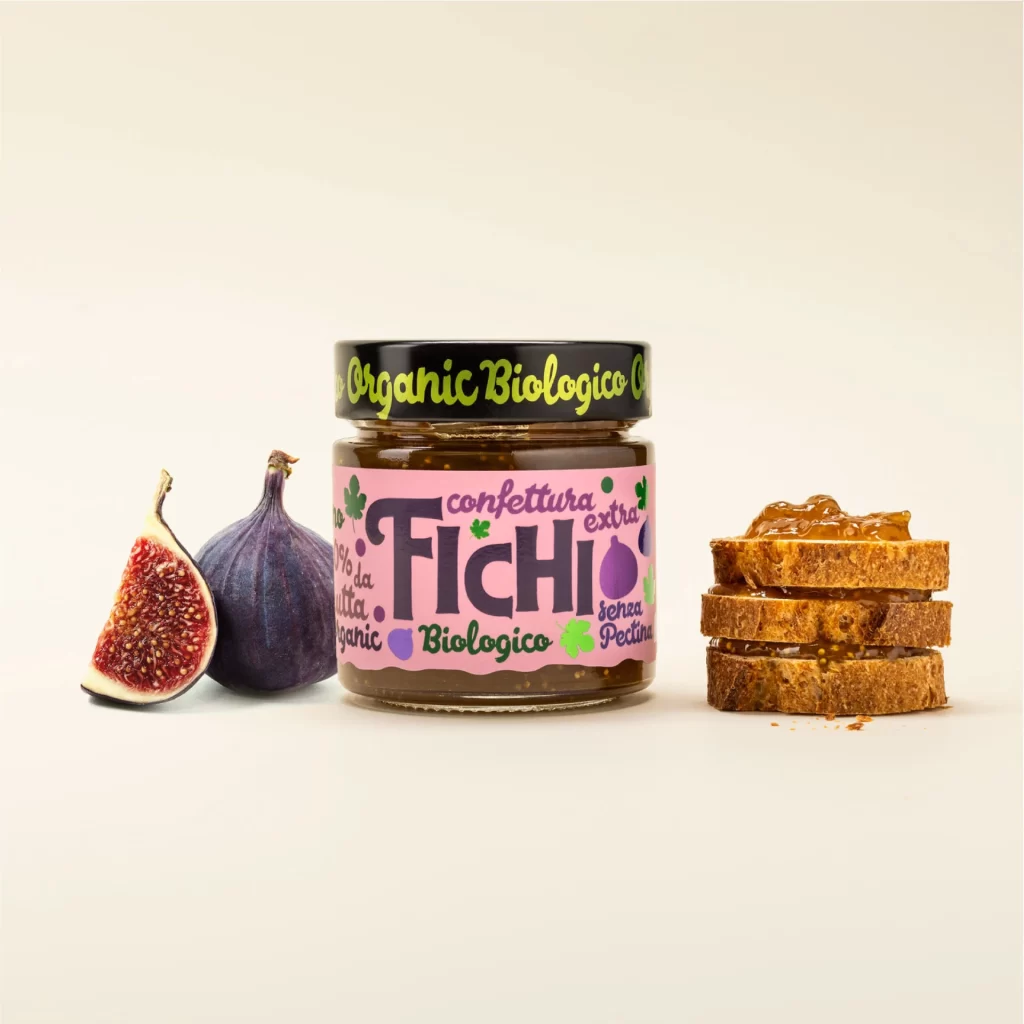
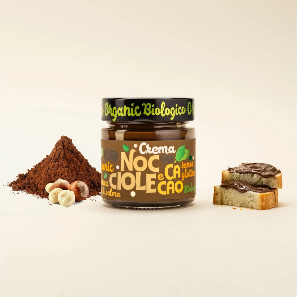
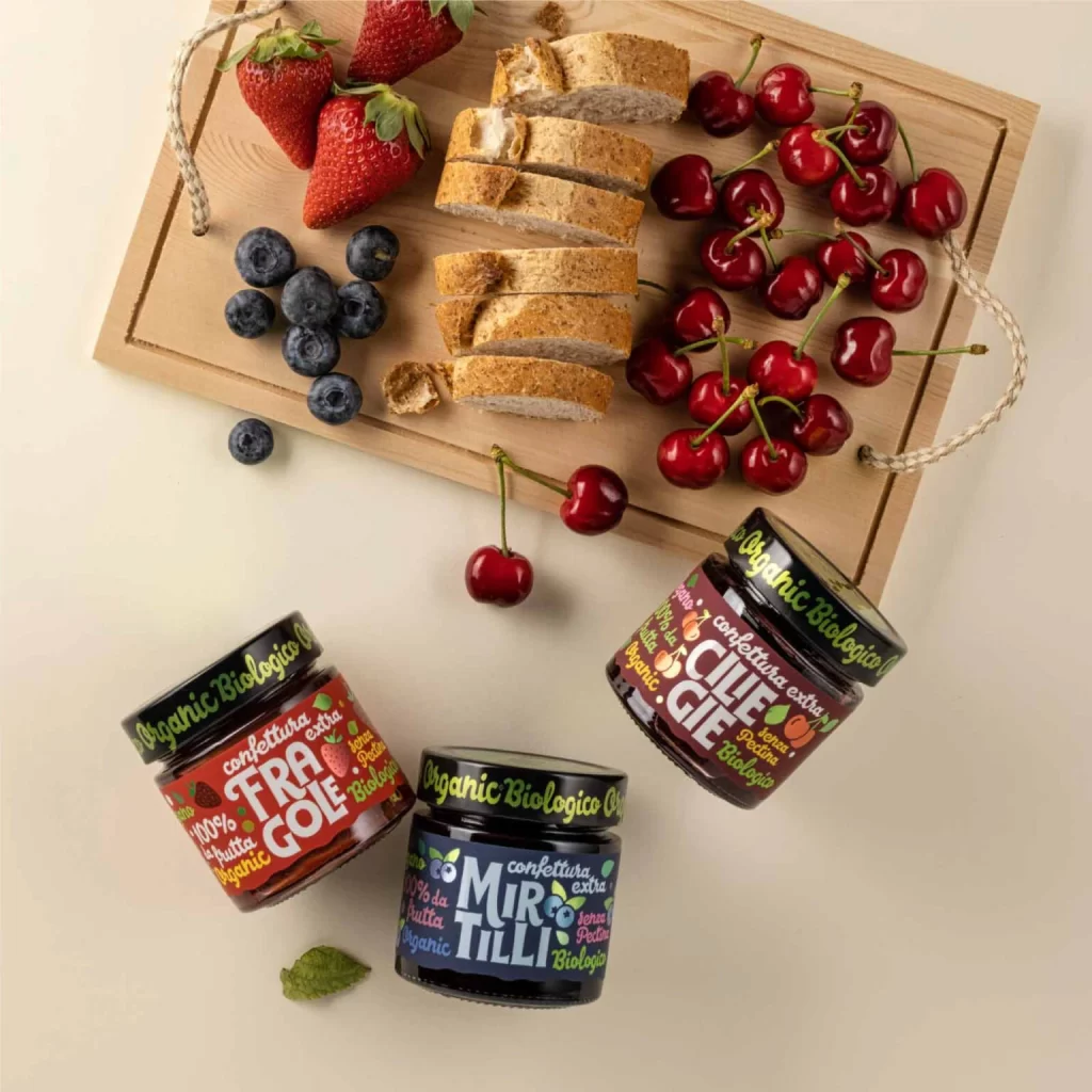
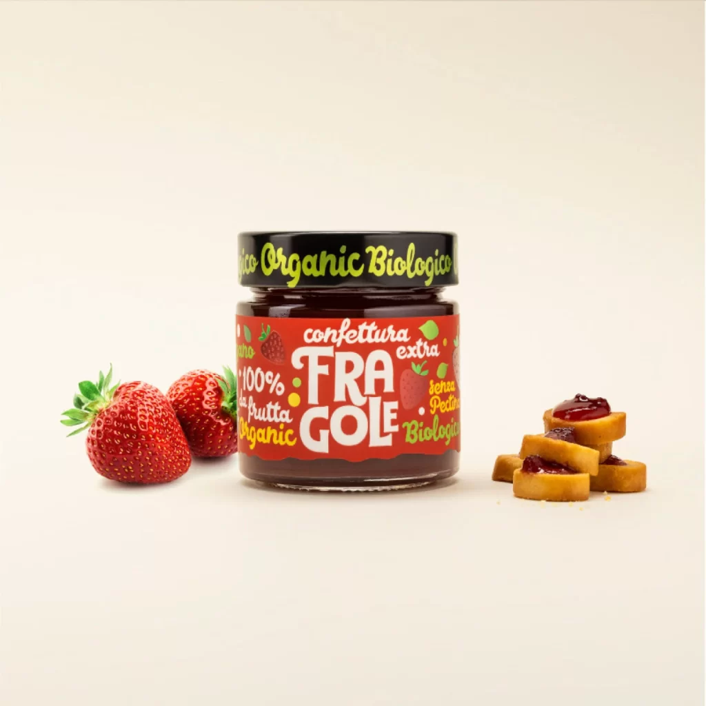
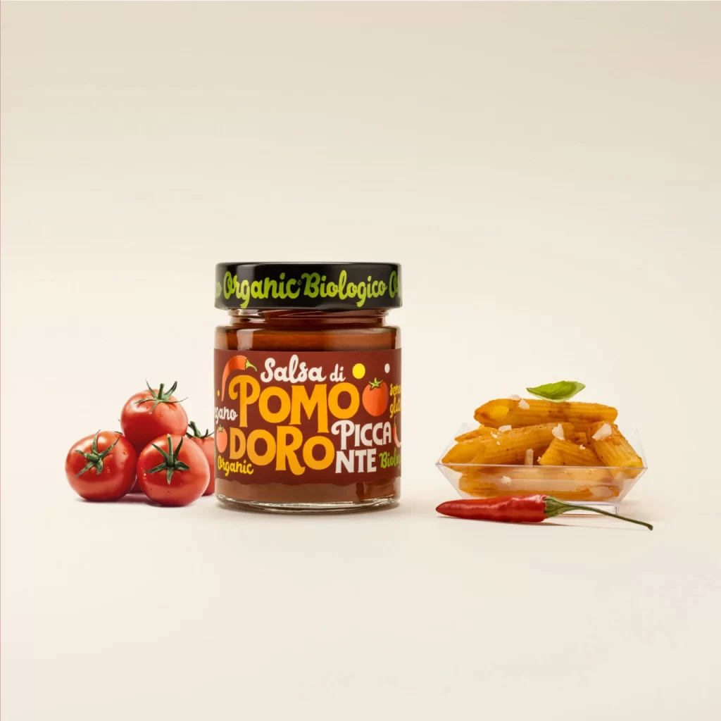
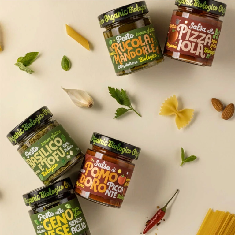
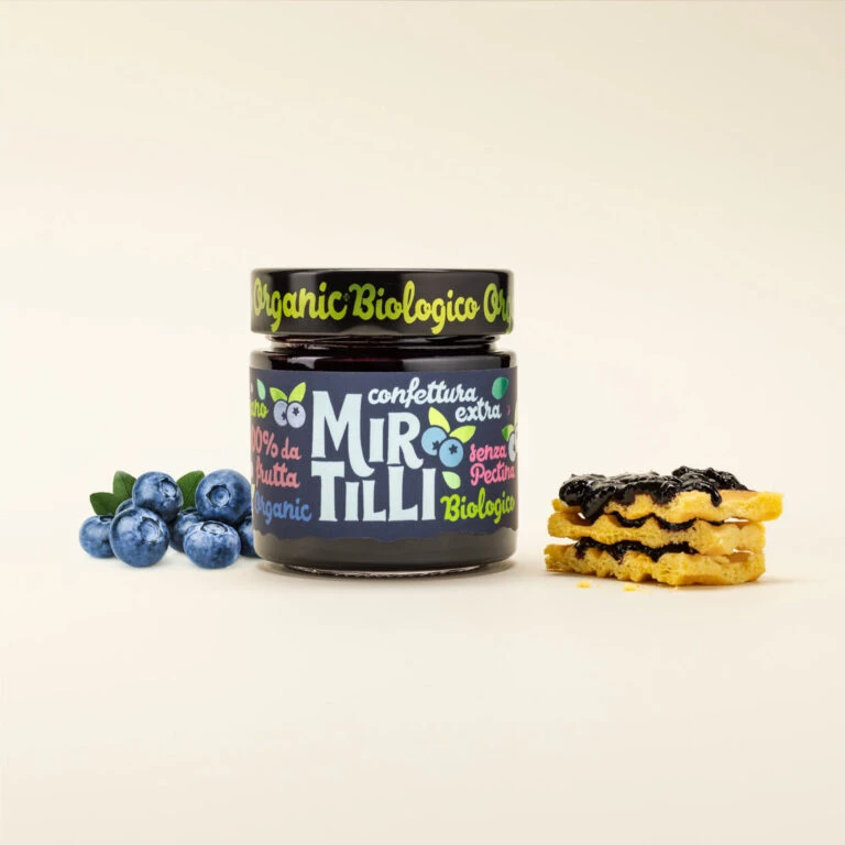
Visual distinction emerges from the deliberate contrast between the raw, textured wood of the fruit container and the sleek, glossy finish of the preserve jars. The labeling employs a whimsical, hand-drawn aesthetic with mixed font weights and colors—forest greens, burnt oranges, and crisp whites—that immediately communicate artisanal quality and biological certification. Such a cohesive color palette bridges the gap between the fresh ingredients and their processed counterparts, creating a narrative of farm-to-jar authenticity through thoughtful graphic elements.
Brand strategists developing identity systems for gourmet food lines would find this arrangement particularly useful for studying how packaging interacts with raw product photography. Art directors planning editorial spreads for lifestyle magazines could reference the spatial balance between the heavy wooden texture and the lightweight glass elements. Additionally, packaging designers seeking to emulate organic, approachable aesthetics might analyze the specific typographic hierarchy and color choices used to convey premium yet accessible branding.