Servadei Packaging L
Topics
Details
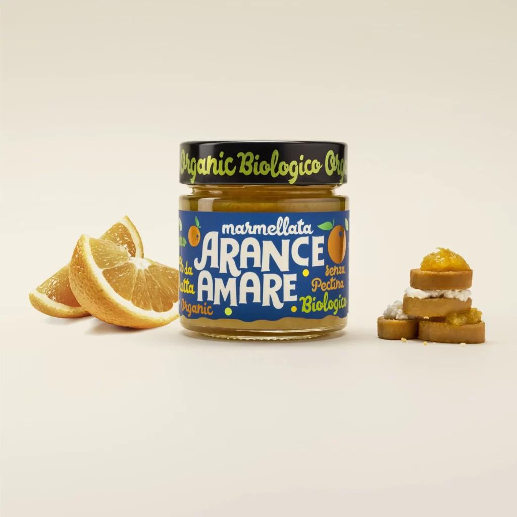
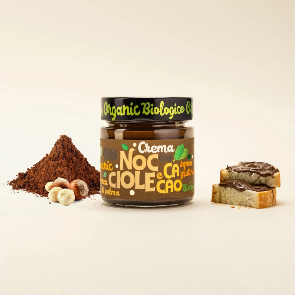
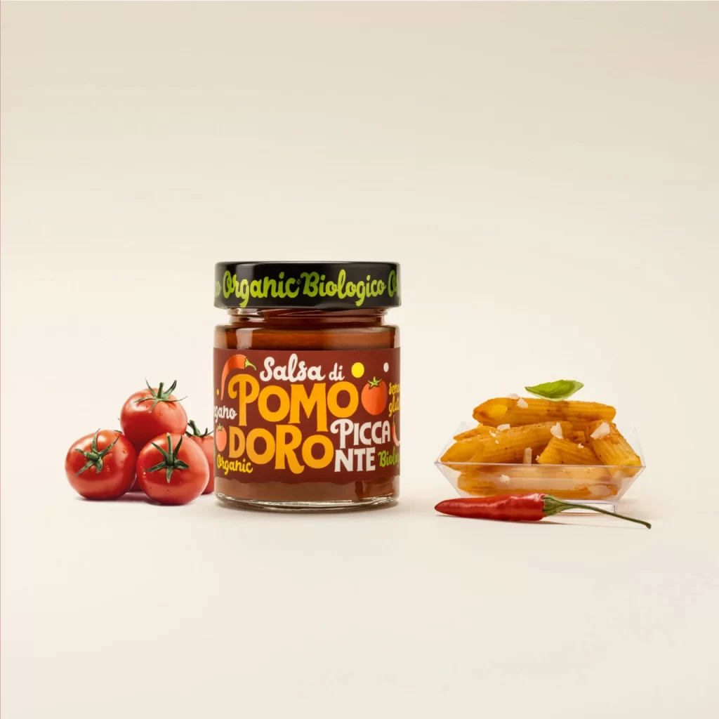
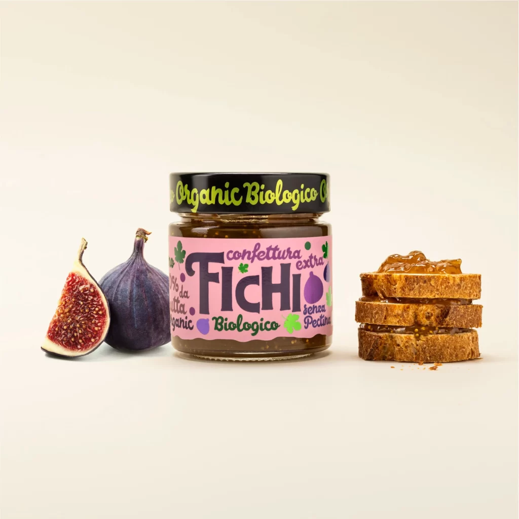
A glass jar of fig jam stands between a halved purple fig and a stack of toasted bread slices, its black lid bearing lime-green cursive script that reads 'Organic Biologico.' The main label features a vibrant magenta ground with 'FICHI' in oversized dark purple lettering, surrounded by smaller text including 'confettura extra' and 'Biologico.' The composition rests on a plain off-white surface, with the fresh fruit to the left revealing its seeded red interior while the bread on the right shows a thick layer of amber spread.
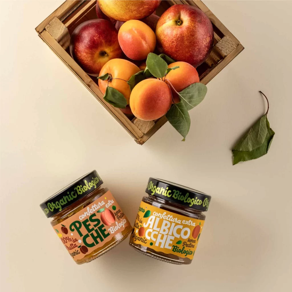
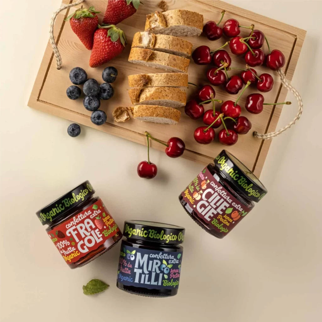
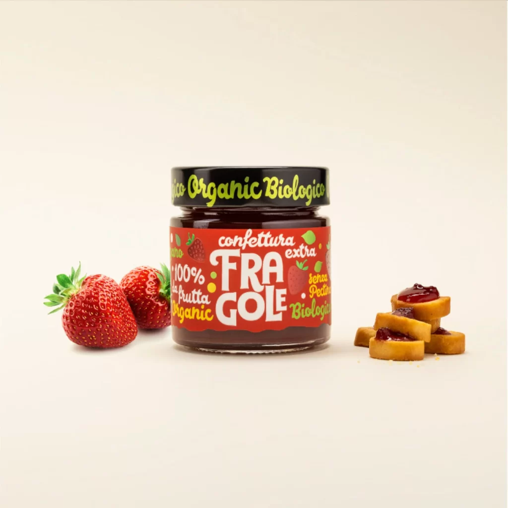
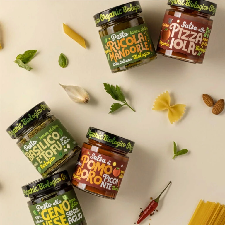
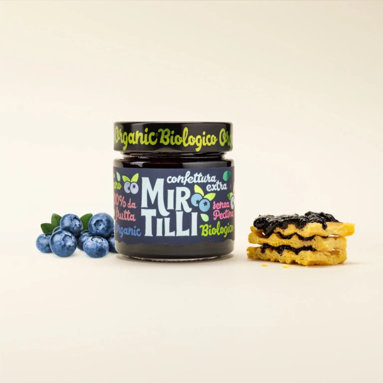
Visual distinction emerges from the playful typographic hierarchy and unconventional color palette applied to an otherwise traditional food item. The juxtaposition of bold, rounded sans-serif characters against delicate organic motifs like clovers and fruit silhouettes creates a contemporary artisanal aesthetic. Furthermore, the bilingual labeling strategy—blending Italian terminology with English organic certifications—signals a modern European market positioning that appeals to health-conscious consumers seeking premium pantry staples.
Brand strategists developing identity systems for boutique food producers would examine this composition to understand how packaging color psychology influences perceived flavor profiles. Art directors planning e-commerce photography for gourmet grocery platforms could study the arrangement of raw ingredients alongside finished products to enhance appetite appeal. Additionally, packaging engineers might reference the material contrast between matte paper labels and glossy glass surfaces when specifying print finishes for similar condiment lines.