Servadei Packaging N
Topics
Details
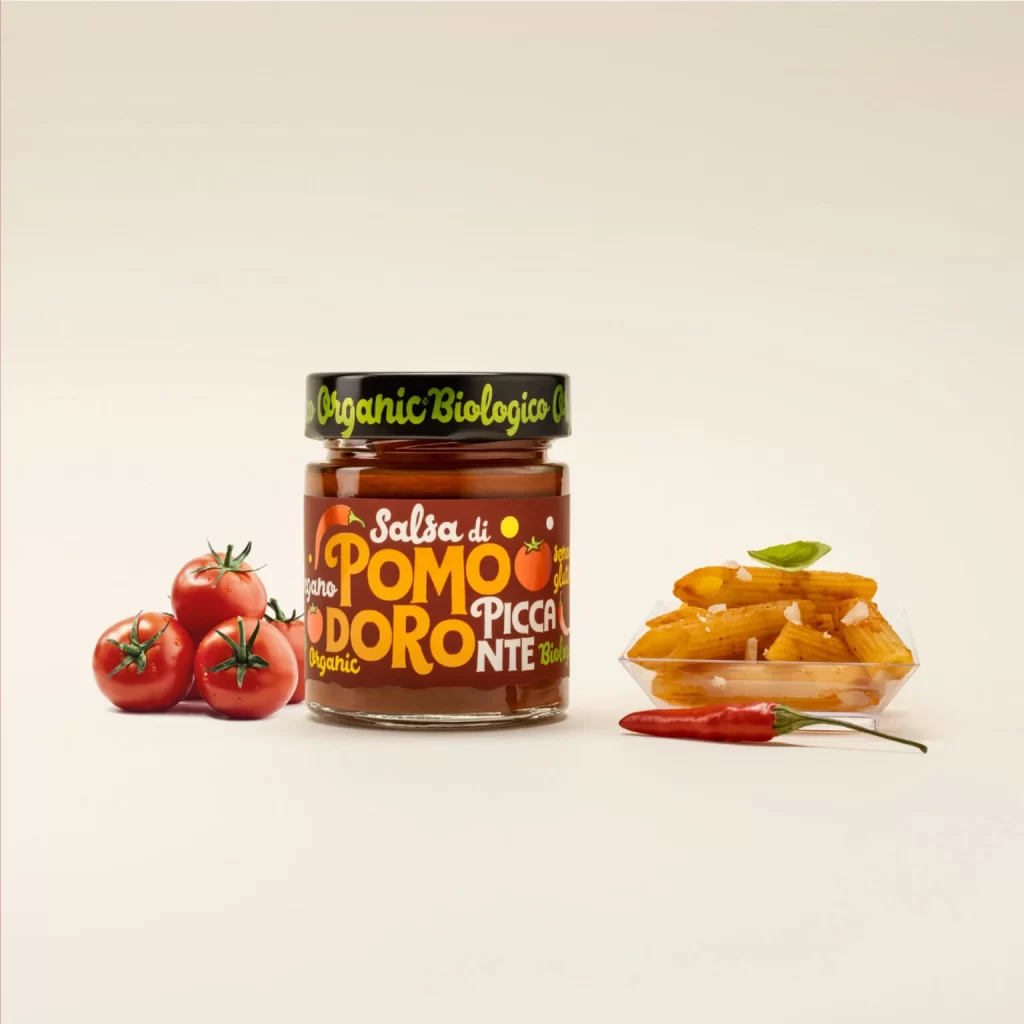
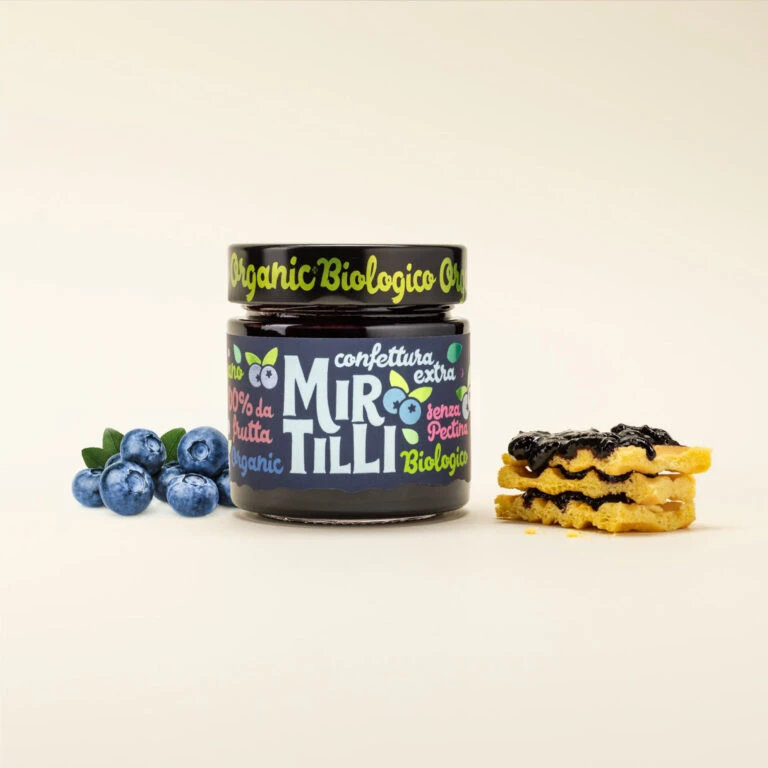
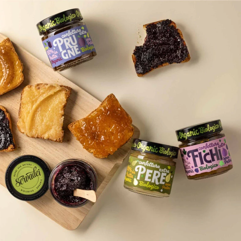
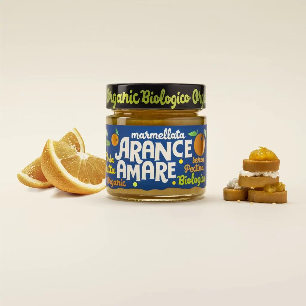
A glass jar of organic bitter orange marmalade anchors the composition with its deep cobalt blue label and black lid, sitting on a white surface. The label features bold, white, hand-drawn typography spelling out 'marmellata ARANCE AMARE' alongside smaller text indicating 'senza Pectina' and 'Organic Biologico,' while the lid repeats the organic certification in lime-green script. Fresh orange slices flank the jar to the left, while a stack of small round biscuits topped with cream and marmalade sits to the right.
Visual distinction emerges from the deliberate collision between the retro-inspired, slightly irregular letterforms and the clinical precision of the product photography. The saturated blue field creates an aggressive chromatic contrast against the amber contents and citrus tones, forcing the eye to prioritize the brand name while the surrounding food elements provide immediate contextual flavor cues. This particular iteration balances artisanal authenticity through its textured type treatment with commercial clarity via the clean spatial arrangement of ingredients and finished application.
Food photographers studying prop styling would examine how the biscuit stack introduces vertical dynamism to an otherwise horizontal layout, while packaging designers might analyze the legibility trade-offs inherent in decorative script fonts. Art directors planning organic grocery campaigns could reference this specific color palette to evoke premium yet approachable positioning, and illustration students practicing still-life composition would benefit from deconstructing how negative space isolates each element without sacrificing visual cohesion.