Snack Japanese Minimalist White Brown
DownloadTopics
Details
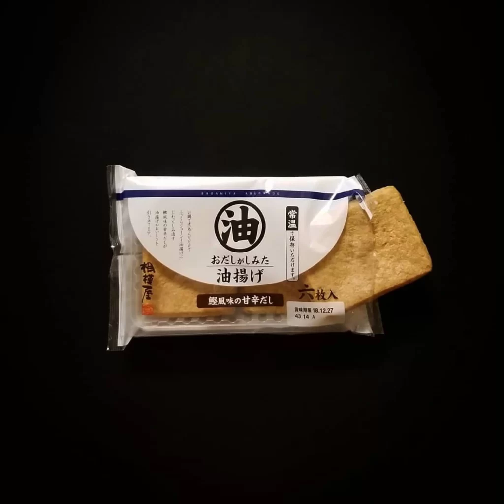
A translucent plastic package holds six rectangular golden-brown crackers, with one piece protruding from the right side to reveal its porous, baked texture. The wrapper features a crisp white label dominated by bold black Japanese characters, including the prominent circular kanji for oil and vertical text detailing the product as a savory, non-fried fried snack. Deep blue horizontal stripes frame the top edge of the packaging, while smaller brown and black text blocks indicate flavor notes and manufacturing dates against an unlit black void that makes every detail pop.
What sets this composition apart is the deliberate tension between traditional East Asian typography and modern industrial food packaging aesthetics. The oversized circular emblem creates a strong focal point that balances the clean negative space of the white label area, while the exposed cracker adds a tactile three-dimensional element that breaks the flat plane of the wrapper. Designers studying this shot will appreciate how the limited palette of white, black, gold, and blue achieves visual sophistication without clutter. You can grab the full-resolution file at no cost if you need to examine the finer typographic details or texture work up close.
Food photographers and packaging designers would find this reference particularly valuable when planning e-commerce shoots for artisanal snack brands or minimalist product catalogs. The lighting setup demonstrates effective techniques for making transparent materials readable while keeping printed text legible and colors accurate. Art directors working on Japanese-market campaigns could also mine this for layout inspiration regarding hierarchy between logo marks and descriptive copy. Anyone building mood boards for contemporary Asian grocery branding would benefit from having this specific example on hand during concept development phases.