Snack Japanese Traditional Colorful Patterns
DownloadTopics
Details
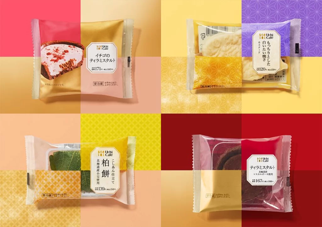
Four individually wrapped Japanese confections occupy a 2x2 grid, each sealed in crinkled transparent plastic that reveals the product within. The upper-left package displays a pink and gold wrapper containing a cheesecake tart with a dark crust, while the upper-right features purple and yellow packaging around a white mochi-like sweet. Below these, the lower-left shows yellow and orange packaging with green leaf-wrapped items visible inside, and the lower-right presents red and gold wrapping concealing a dark chocolate cake. Each package bears vertical Japanese text including brand names like 'Uchi Gate' alongside calorie counts ranging from 120 to 171 kcal, all set against a patchwork background of solid pink, yellow, orange, and red squares with subtle geometric patterns.
The visual distinction lies in the deliberate color-blocking strategy where each package's wrapper is split into contrasting hues that complement both the snack type and its background quadrant. Typography follows a strict vertical orientation with clean sans-serif characters framed by rectangular borders, creating a cohesive system across all four variants despite their different flavor profiles. Designers studying this composition will note how the metallic gold accents on each package create visual continuity while the varied background colors establish individual product identities. The complete high-resolution file can be accessed at no cost for detailed examination of these packaging techniques.
Packaging engineers developing premium snack lines would reference this layout to understand how color psychology influences perceived product value across different taste categories. Brand identity specialists might analyze the consistent logo placement and information hierarchy to maintain recognition while allowing for seasonal or flavor-based variations. Food photographers could study the lighting setup that eliminates harsh reflections on the plastic surfaces while maintaining texture visibility in the baked goods. Print production teams would benefit from examining how the patterned backgrounds interact with the product photography to create depth without overwhelming the main subject.