a’ coffee Bag
Topics
Details
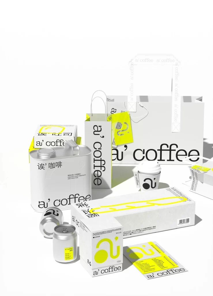
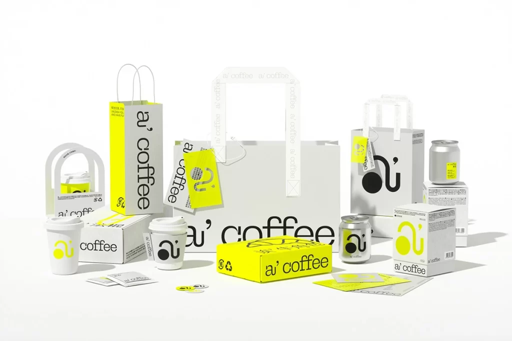
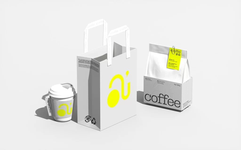
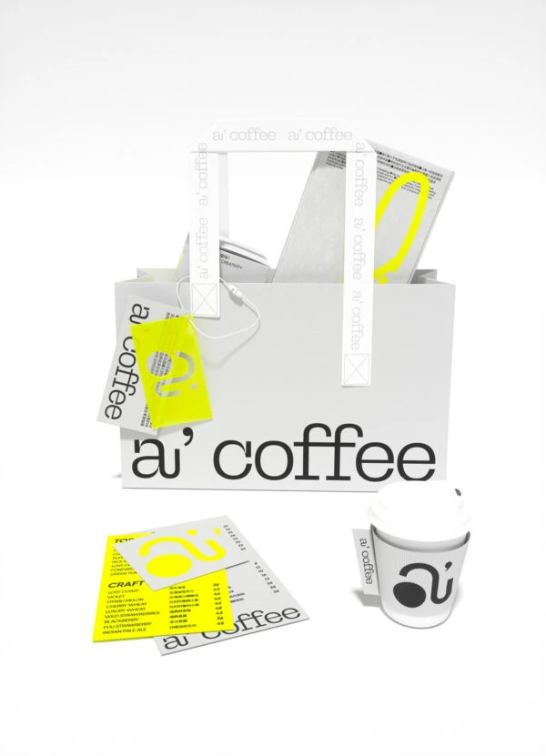
A white paper shopping bag dominates the center of the frame, emblazoned with the bold black text 'a' coffee' and supported by handles repeating the brand name in smaller type. Bright yellow accents punctuate the monochromatic palette, appearing on a square tag, a stylized circular logo on a takeout cup, and printed menu cards scattered in the foreground. Soft, even lighting illuminates the matte paper textures and clean geometric forms from a straight-on perspective.
Visual interest stems from the strategic use of high-contrast color blocking, where the vivid yellow accents punctuate an otherwise monochromatic palette. The typographic hierarchy cleverly plays with scale, contrasting the large lowercase brand name on the bag against the smaller repeated text on the handles. This restrained yet memorable identity system demonstrates how subtle variations in logo application can create cohesive branding across different touchpoints.
Brand strategists might analyze this composition to understand how physical packaging translates to digital presence. Retail designers could study the material choices and tag placement for their own takeaway concepts. Marketing teams examining visual consistency would find this useful when planning photoshoots that require balancing multiple branded elements within a single frame.