a’ coffee Label
Topics
Details
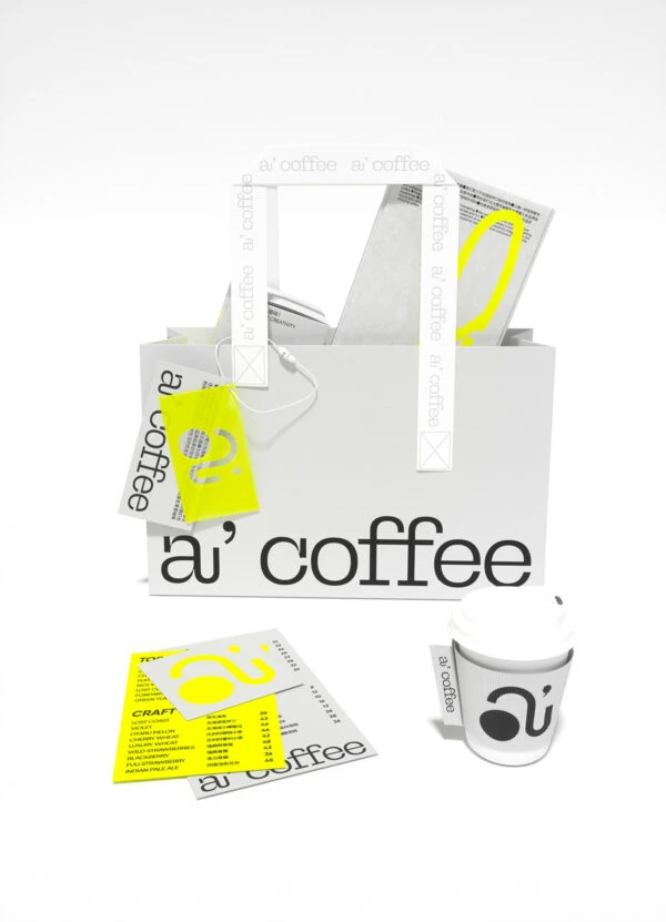
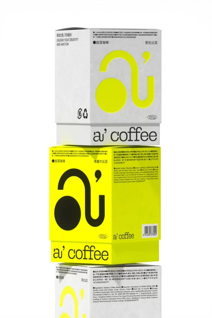
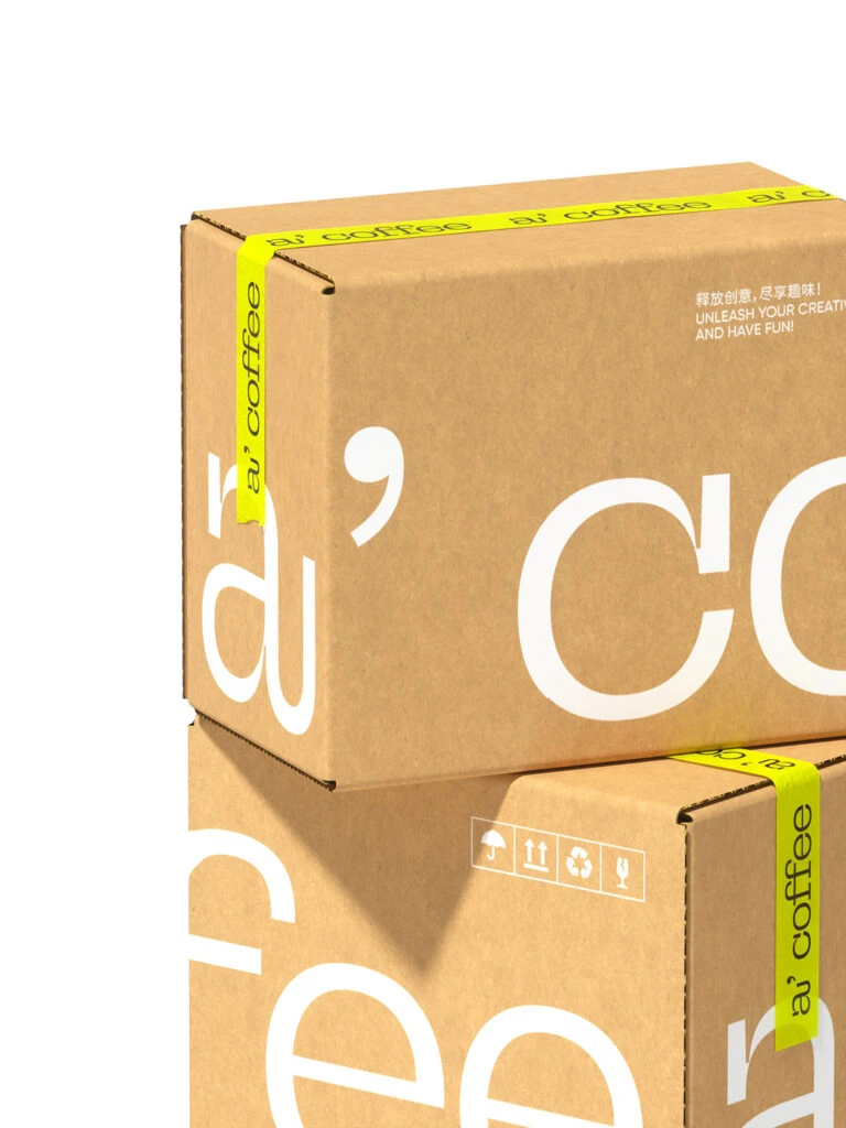
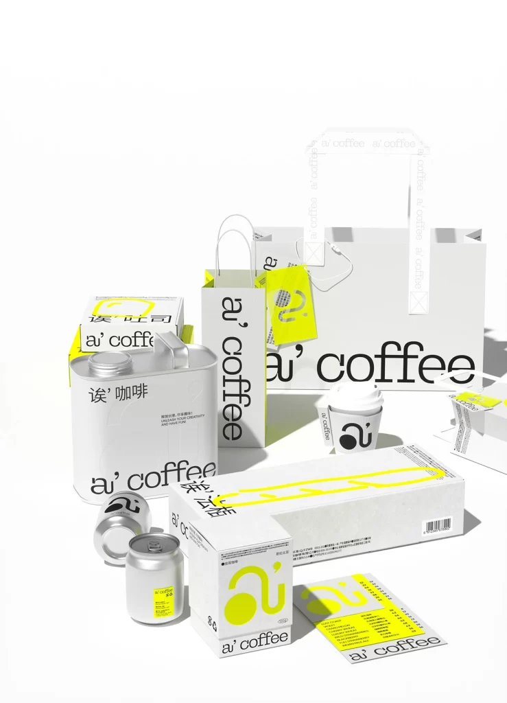
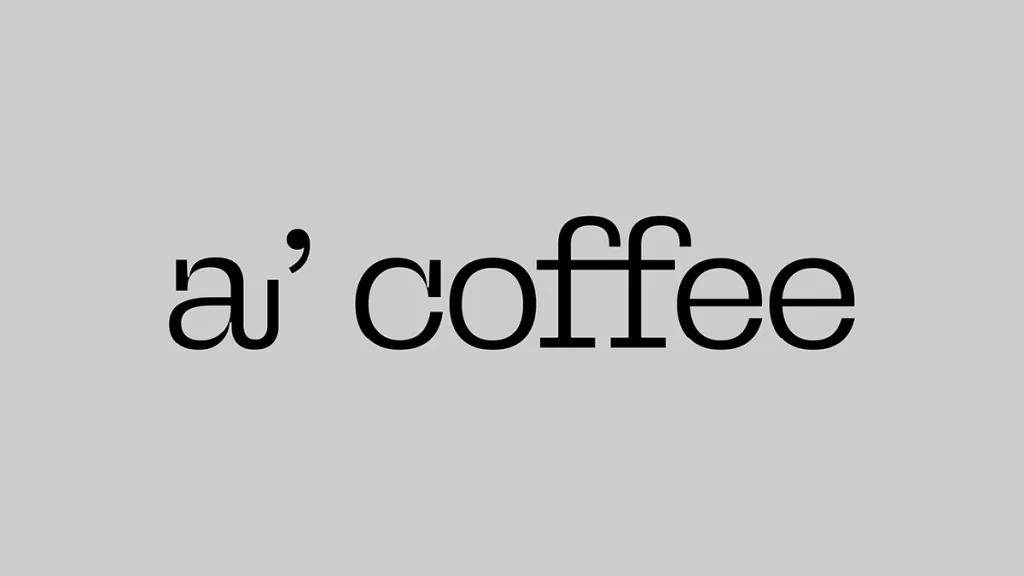
Against a uniform field of medium-light gray, the typographic composition presents the phrase "a' coffee" in a stark, unmodulated black. The lowercase 'a' is immediately followed by a single closing quotation mark, creating an unusual apostrophic gesture before the word "coffee" appears in a classic serif typeface. Centered within the frame and photographed from a direct, orthogonal perspective, the text exhibits no shadow or dimensional depth, suggesting a purely digital or flat-print origin with even, diffuse illumination across the entire surface.
Visual interest derives primarily from the anomalous punctuation placement, where the quotation mark functions as a graphic interrupter rather than a standard grammatical tool. The serif letterforms of "coffee" provide a traditional, almost editorial counterweight to the more utilitarian and slightly irregular geometry of the preceding "a'" sequence. This juxtaposition creates a subtle tension between casual shorthand and formal typesetting, while the high-contrast monochrome palette eliminates any chromatic distraction from the letterform relationships themselves.
Typography researchers might employ this specimen to analyze non-standard apostrophe usage in contemporary branding or to study the optical balance between abbreviated particles and full lexical items. Brand identity developers could reference the specific weight and spacing of these characters when constructing similar minimalist logomarks for hospitality ventures. Additionally, educators in visual communication might present this example during lectures on punctuation as a design element rather than merely a syntactic necessity.