a’ coffee Bean Box View
Topics
Details
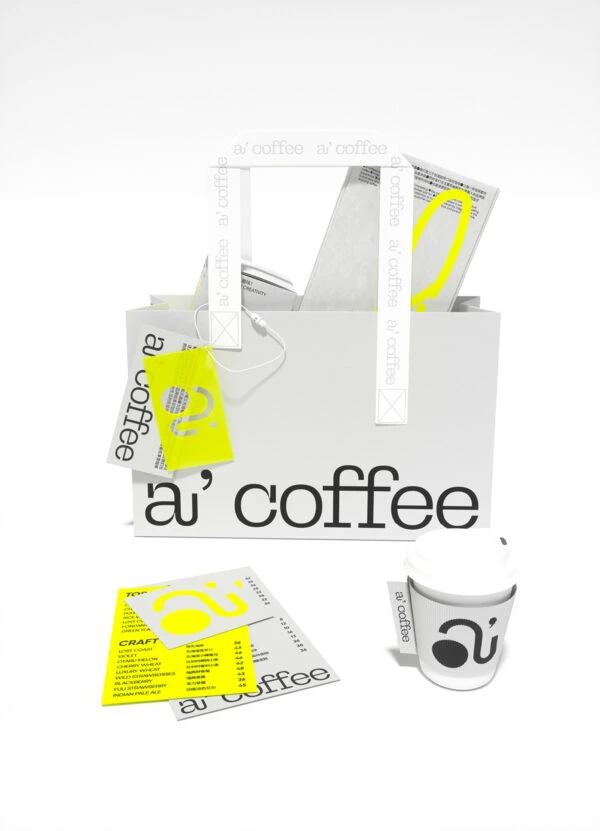
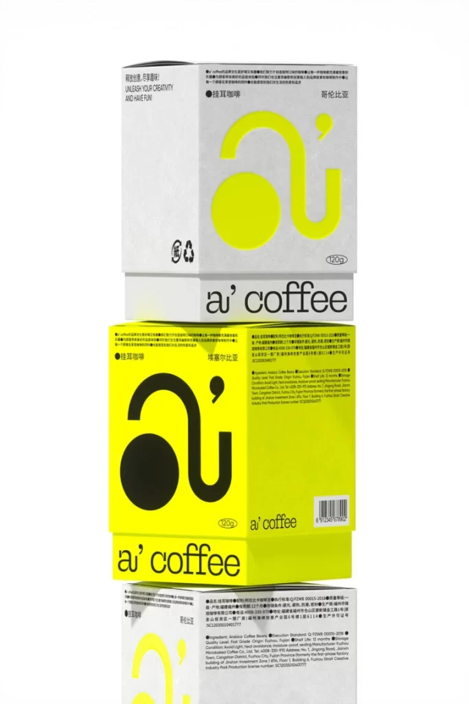
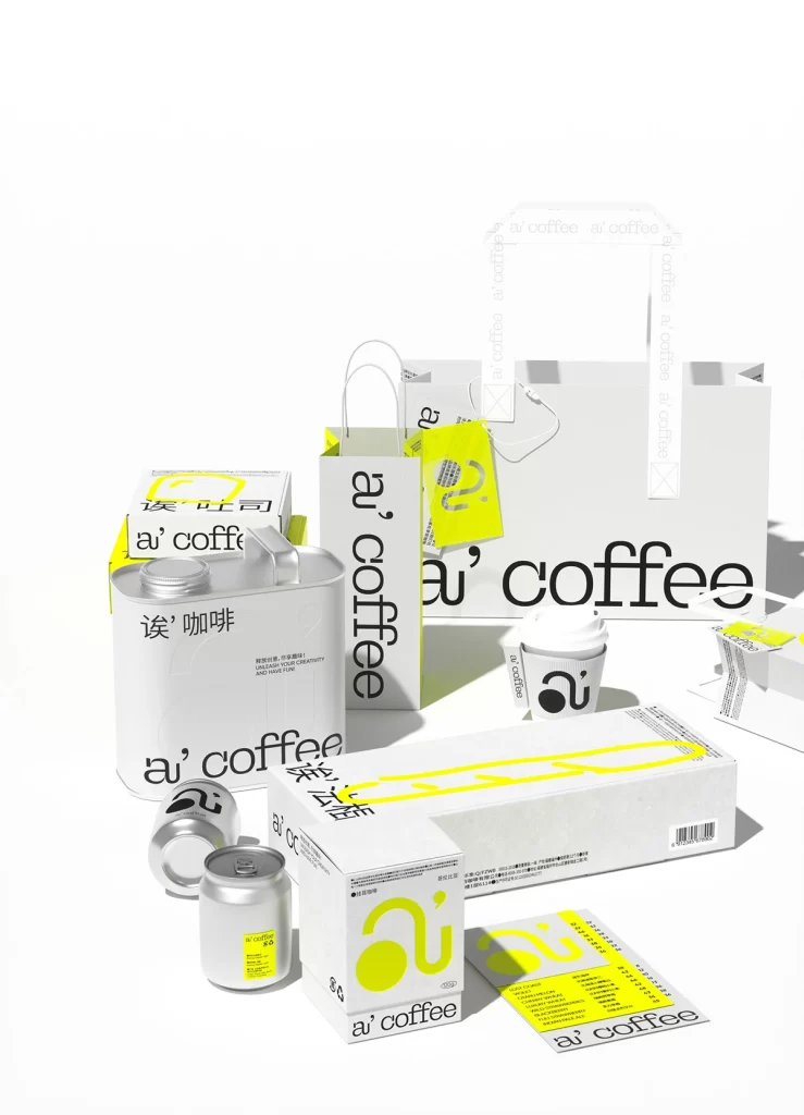
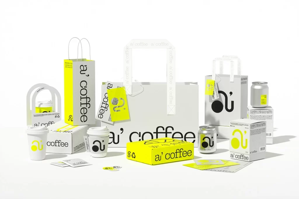
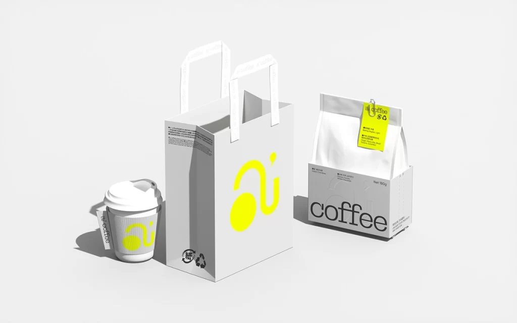
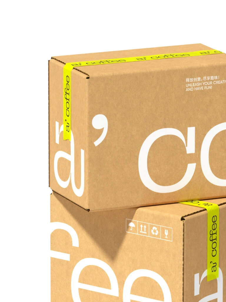
Stacked against a sterile white void, two kraft-fiber cartons occupy the frame at a slight three-quarter elevation, revealing their top flaps and side panels. A vibrant, almost neon yellow adhesive tape wraps the horizontal seams, bearing the repeating typographic mark 'a' coffee' in a clean sans-serif. The cardboard surfaces display oversized white letterforms—specifically a lowercase 'a' with a floating comma and a massive 'Co'—alongside smaller instructional text in both English and Chinese characters regarding creativity.
Visual tension arises from the deliberate juxtaposition of raw, unbleached paper textures against the synthetic saturation of the sealing tape. The typography employs a bold, modernist scale that breaks across the box edges, treating the packaging architecture as a canvas rather than a mere container. Such a composition leverages negative space effectively, allowing the high-contrast white glyphs to dominate while the yellow strip acts as a linear accent that guides the eye around the object's volume.
Brand strategists might deconstruct this arrangement to study how color blocking can elevate standard shipping materials into premium touchpoints. Packaging engineers could utilize this view to analyze structural seam placement and the integration of handling icons on the lower unit's face. Furthermore, art directors seeking to balance industrial utility with playful aesthetics will find the scale of the graphics a compelling case study in contemporary identity systems.