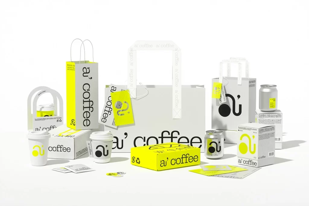
a’ coffee Various Coffee Packaging Items
Topics
Details
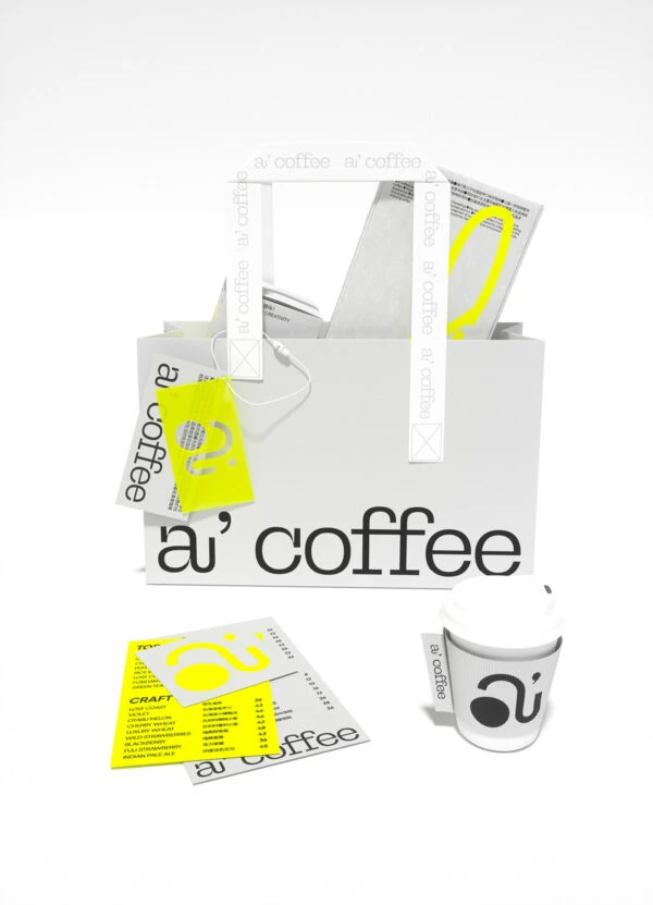
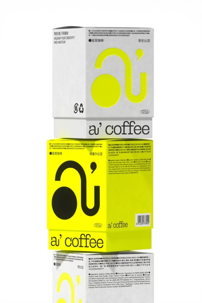
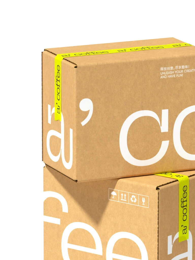
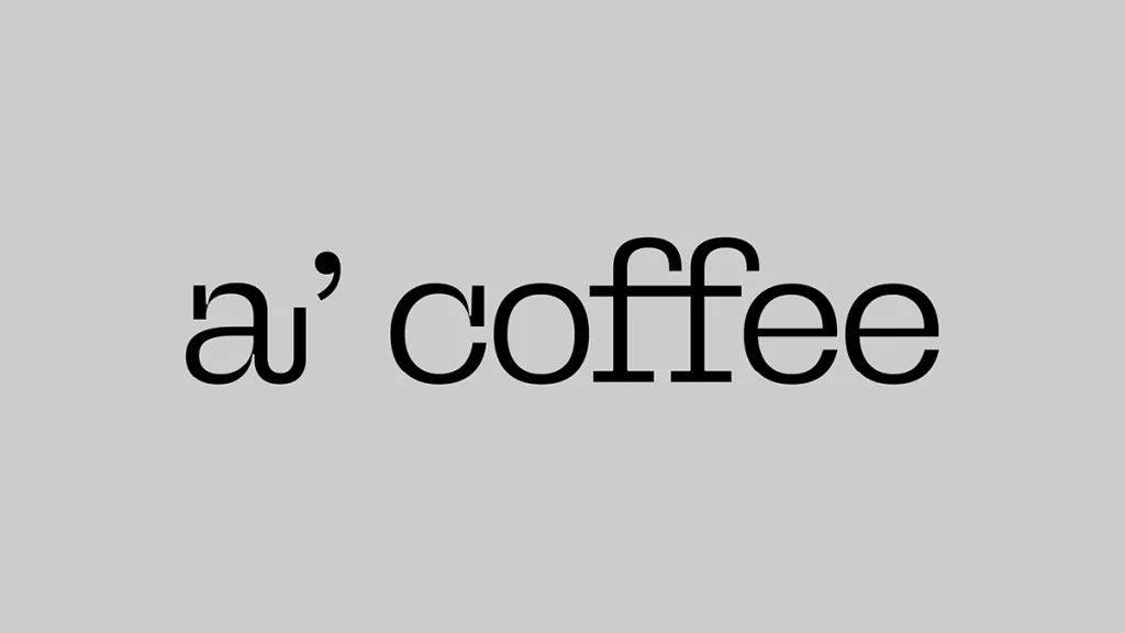
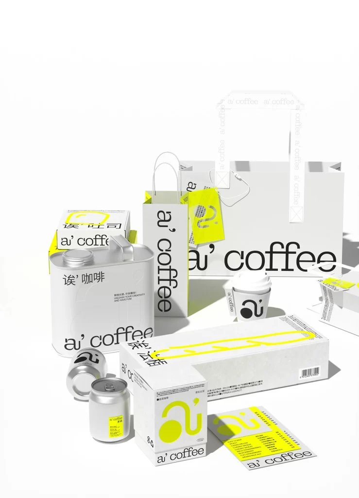
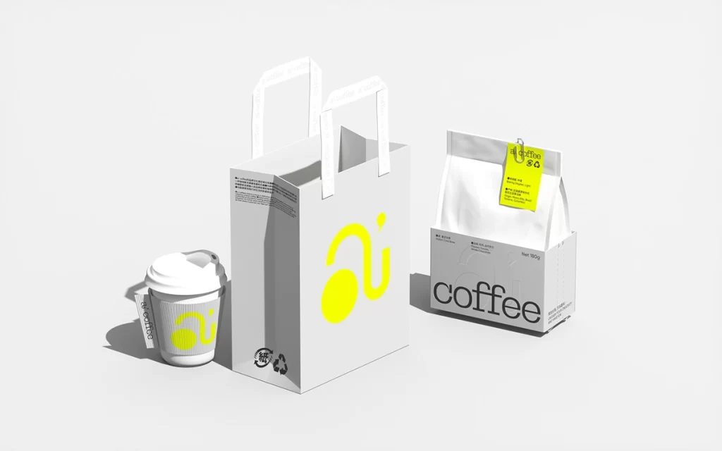
Bright lemon yellow and crisp white dominate the scene, creating a high-contrast visual field that immediately draws the eye to the collection of coffee packaging. Various items, including paper shopping bags, cardboard boxes, aluminum cans, and disposable cups, are arranged in a loose, organic cluster across a seamless white surface. The composition features the brand name 'a' coffee' in a clean sans-serif typeface alongside a distinctive abstract logo consisting of a solid circle connected by a curved line. Soft studio lighting casts gentle shadows beneath each object, while a straight-on camera angle ensures every detail of the matte and glossy textures remains clearly visible.
What sets this particular branding system apart is its masterful use of limited color palette combined with bold typographic scale variations across different form factors. The logo cleverly transforms between versions—appearing as a black graphic on white backgrounds and as a vibrant yellow element on darker surfaces—demonstrating remarkable flexibility in visual identity application. Subtle details like the repeating text pattern on bag handles and the consistent placement of recycling symbols show how minimal elements can create a cohesive ecosystem without cluttering the design.
Brand strategists developing retail identity systems would find this arrangement particularly useful for studying how logos adapt across three-dimensional packaging formats. Packaging designers could reference the specific material choices and print finishes shown here when planning product lines that require both premium feel and production efficiency. Art directors assembling mood boards for modern café concepts might also pull specific elements from this spread to communicate desired aesthetic directions to their teams.