a’ coffee Bean Box
Topics
Details
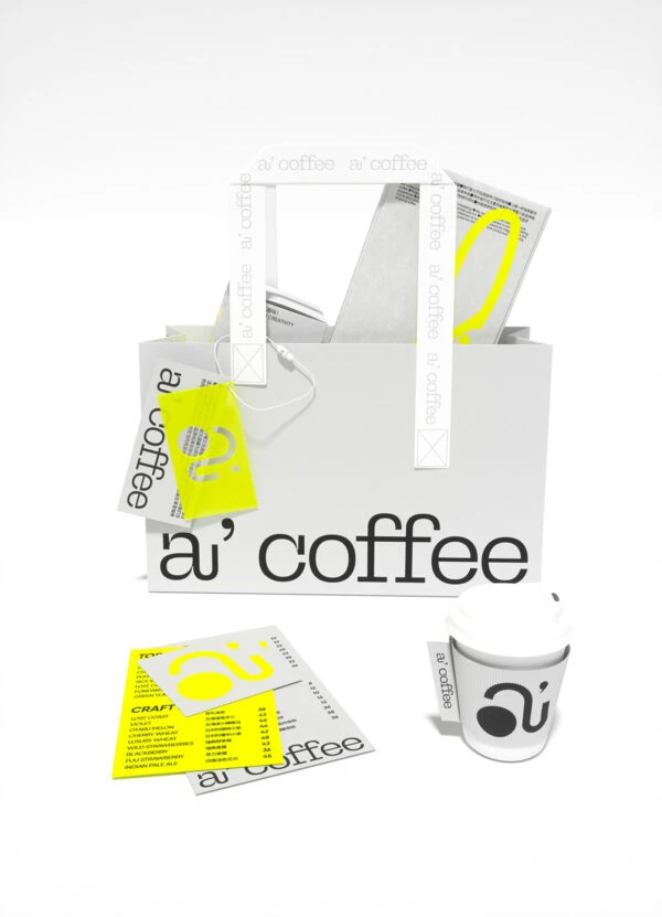
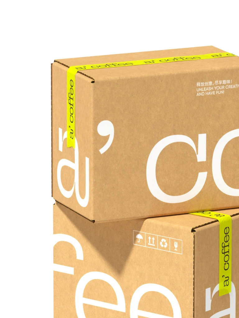
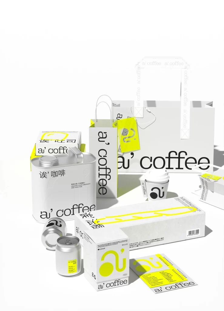
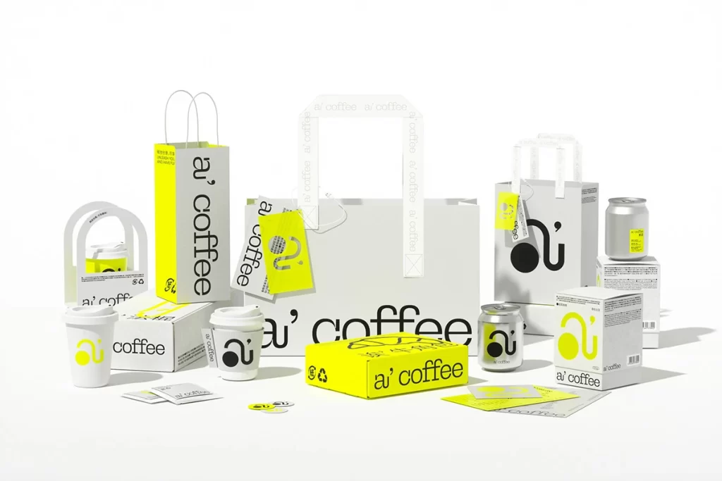
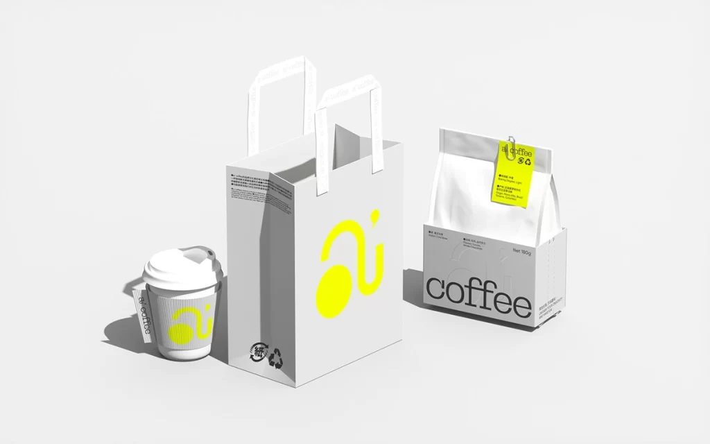
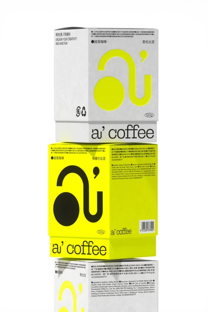
Stacked vertically against a seamless white background, three rectangular coffee boxes display a striking interplay of color and typography. The top and bottom containers feature a matte light gray finish, while the middle box bursts with a vivid, high-saturation lemon yellow that dominates the visual field. Each package is anchored by a massive, stylized graphic resembling a headphone or the letter 'a' with an integrated apostrophe, rendered in contrasting lime green or solid black depending on the background hue.
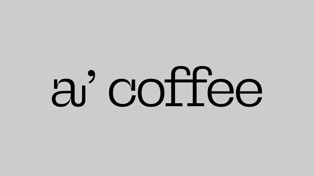
Visual interest stems from the bold, minimalist logo system that merges audio equipment silhouettes with punctuation marks to create a memorable brand mark. The typographic hierarchy cleverly balances dense blocks of Chinese product information with clean, lowercase Latin script for the 'a’ coffee' brand name. Such a restrained yet vibrant palette demonstrates how a single accent color can completely transform the perceived energy of identical packaging structures.
Brand strategists might study this composition to understand how consistent iconography adapts across different colorways while maintaining recognition. Packaging engineers could analyze the structural layout of text elements to optimize their own box designs for both aesthetic appeal and informational clarity. Art directors seeking examples of modern Asian coffee branding will find the juxtaposition of English and Chinese typography particularly instructive for international market projects.