a’ coffee Can
Topics
Details
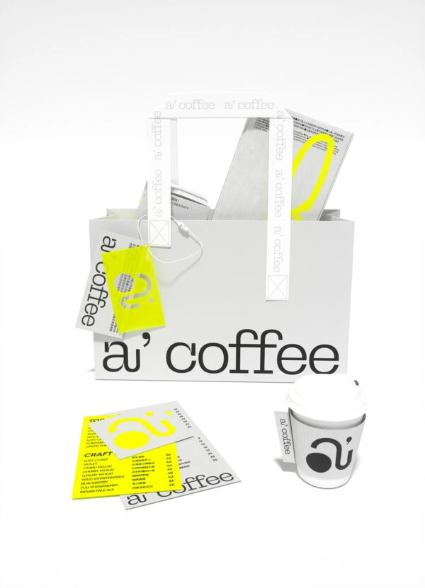
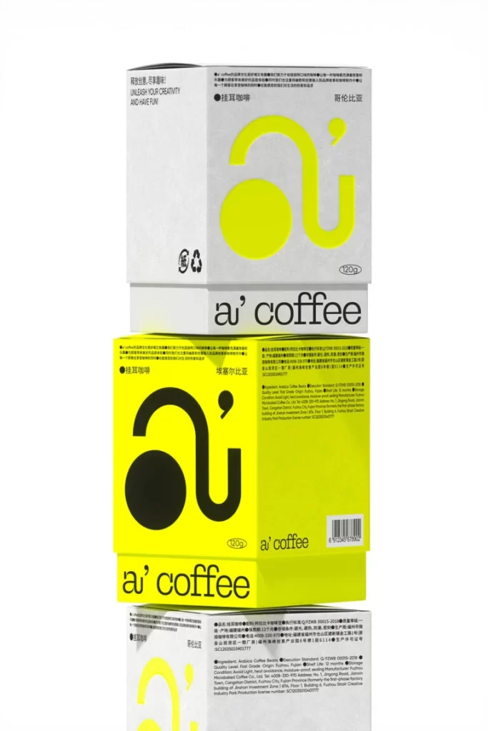
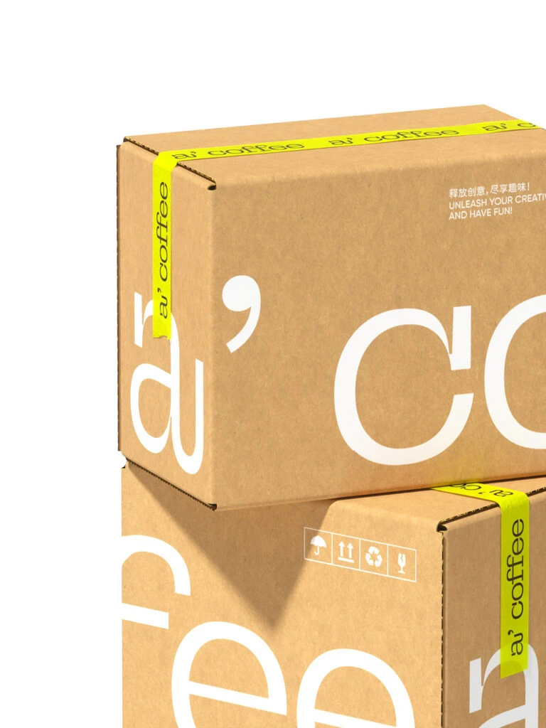
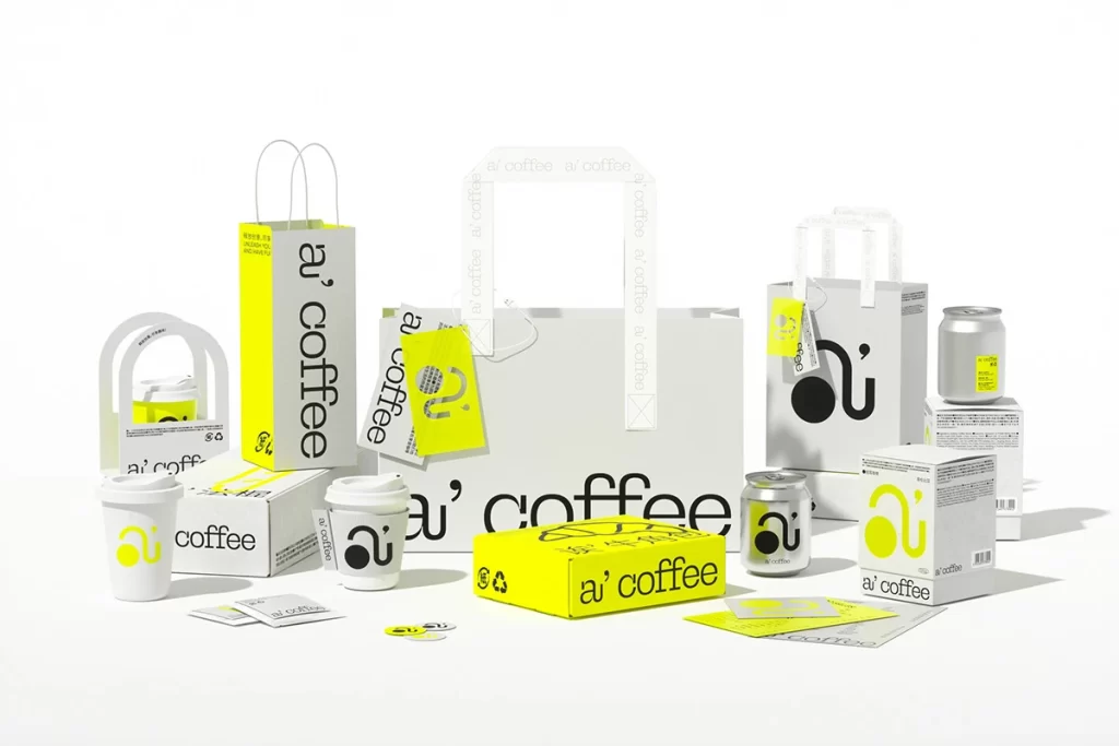
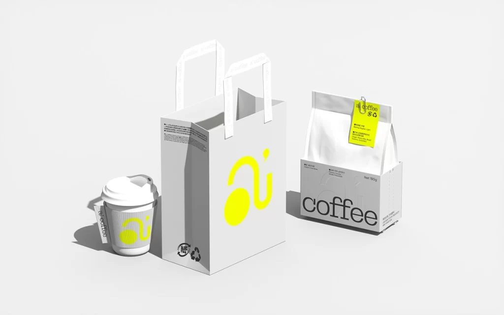
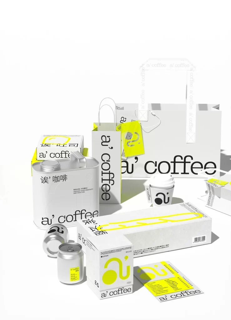
Rendered in matte silver aluminum, the cylindrical can sits slightly left of center within a comprehensive brand ecosystem. Bold black typography spelling 'a' coffee' and the Chinese characters '诶 咖啡' wrap around its curved surface, contrasting sharply with the metallic finish. Soft studio lighting casts gentle shadows across the seamless white background, while surrounding packaging elements—including paper bags, boxes, and smaller cans—create a layered, three-dimensional composition viewed from a slight downward angle.
Visual interest stems from the deliberate interplay between industrial metal textures and minimalist graphic elements. The oversized lowercase lettering creates an immediate typographic statement that balances modern aesthetics with functional labeling. Bright yellow accents appearing on adjacent packaging provide a sharp chromatic counterpoint to the monochromatic silver and black scheme, establishing a cohesive yet dynamic visual language across different material substrates.
Product photographers might study this arrangement to understand how to style multiple SKUs within a single frame without visual clutter. Brand identity developers could examine how typography scales across curved versus flat surfaces to maintain legibility. Packaging engineers may reference the specific proportions of the can relative to its lid and handle attachments when planning similar beverage container designs.