Amoy Xiyi Yogurt Drink
Topics
Details
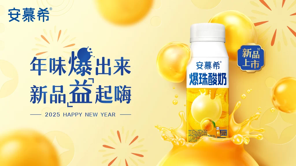
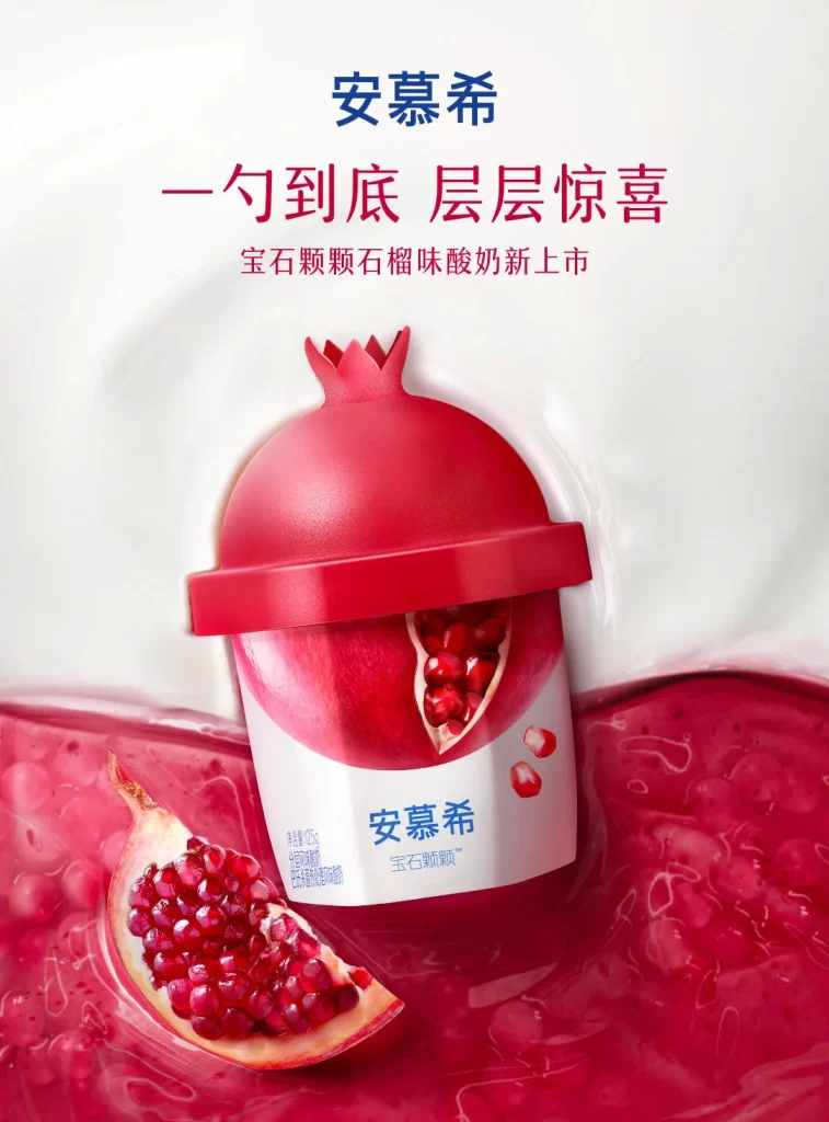
Textured fabric layers are not present in this design; instead, the poster features the Amoy Xiyi (安慕希) brand name in bold blue Chinese characters at the top, followed by a red tagline reading ‘一勺到底 层层惊喜’ (Spoon to the bottom, layer by layer surprise). Below this, smaller text announces the ‘宝石颗颗石榴味酸奶新上市’ (Jewel-like pomegranate flavor yogurt new launch), while the central visual displays a yogurt cup with a red pomegranate-shaped lid set against a creamy white background with vibrant red juice splashing at the base.
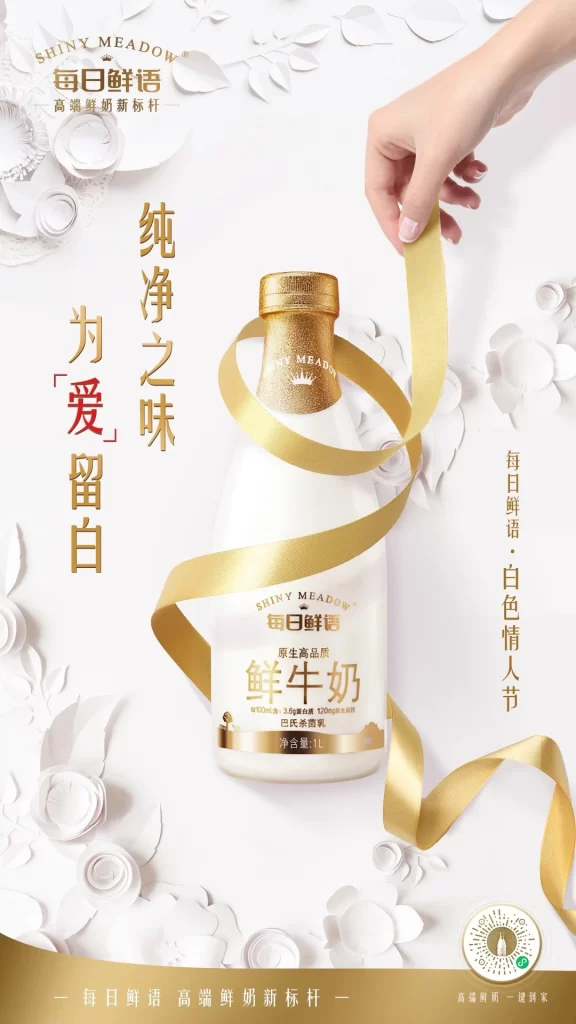
The layout employs a clean, centered composition that draws immediate focus to the product through strategic use of negative space. Typography contrasts deep blue for brand authority against vivid red for appetite appeal, while photography utilizes high-gloss lighting to emphasize the juicy texture of pomegranate arils and the smooth plastic finish of the packaging. Color palette restricts itself to crimson, cream, and navy, creating a cohesive visual identity that reinforces the fruit flavor profile.
Advertising professionals examine such layouts to understand how product photography integrates with liquid splash effects for dynamic impact. Marketing students analyze the hierarchical text placement and color psychology used to drive purchase intent for new flavor launches. Packaging designers reference the way the lid shape mimics the fruit source material as a case study in form-factor branding.