Mengniu Low Fat Milk Advertisement
Topics
Details
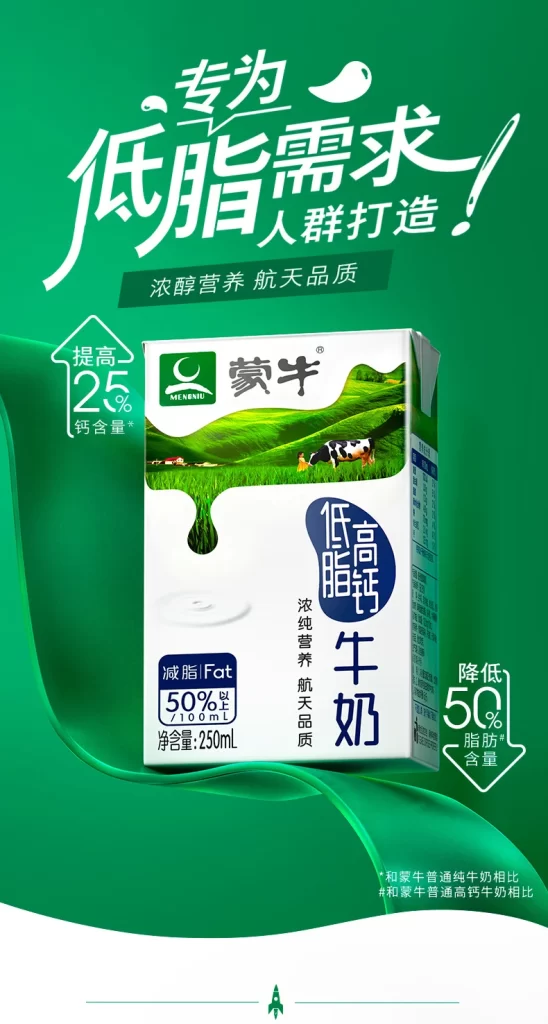
Kinetic motion lines define the vibrant, fluid green gradient background of the image, which features large white calligraphy at the top reading "Specially made for low-fat needs" flanked by icons highlighting a 25% calcium increase and 50% fat reduction. Centered within this dynamic frame is a 250ml carton of Mengniu Low Fat High Calcium Milk, showcasing a white base adorned with green pastoral imagery of rolling hills and cows. The packaging prominently displays the Chinese text for "Mengniu" and "Low Fat High Calcium," alongside a badge indicating 50% reduced fat.
The visual hierarchy relies on dynamic, hand-drawn brush typography that conveys energy and health, contrasting with the clean, sans-serif fonts used on the product packaging itself. A monochromatic green palette dominates the composition, utilizing varying saturations to create depth and associate the brand with nature and freshness. The layout balances the central physical product with floating graphical elements, such as the milk drop motif and statistical arrows, to guide the viewer’s eye through the key nutritional benefits efficiently.
Marketing professionals utilize this specific layout as a case study for integrating nutritional data points into lifestyle-oriented advertising without cluttering the visual field. Graphic design students often reference the poster’s use of negative space and color theory when learning how to emphasize specific product attributes like ‘low fat’ or ‘high calcium.’ Additionally, packaging designers examine the interplay between the carton’s realistic photography and the surrounding illustrative elements to understand how to present physical goods within a conceptual campaign setting.