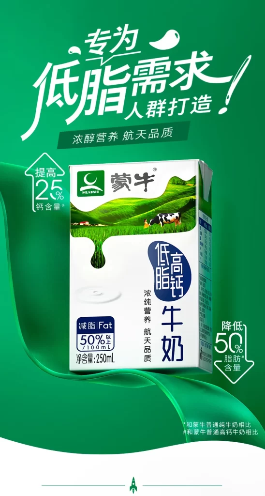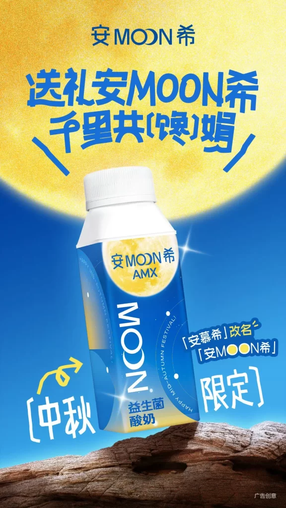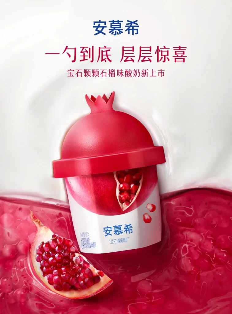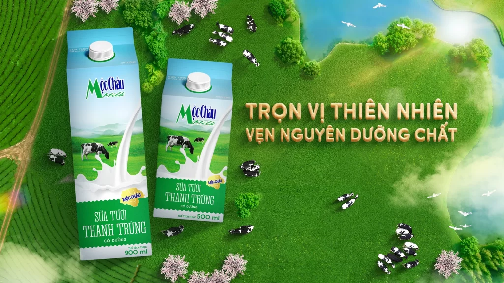
Ubeest Milk New Product
Topics
Details
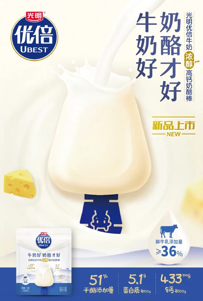
Ultrathin profiles define the Bright Dairy Ubest brand logo, which sits in a blue oval at the top left and centers on a large, pale yellow cheese stick with a dark blue cow-head base. Large vertical Chinese characters on the right declare ‘Milk is good, cheese is better,’ while smaller text highlights it as a high-calcium new product. The bottom section displays product packaging and nutritional statistics like 51% cheese content and 433mg of calcium per 100g against a deep blue background.
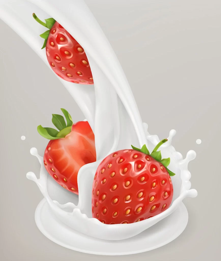
Visual hierarchy relies on bold, dark blue typography set against a creamy white backdrop to emphasize product purity and premium quality. The composition uses dynamic milk splashes and soft lighting effects to create a sense of freshness and rich texture. A limited color palette of navy blue, cream, and gold accents directs focus toward the central product shape and key selling points.
Advertising professionals utilize this layout as a case study for balancing dense nutritional information with clean visual aesthetics. Marketing students analyze the specific typographic choices used to establish brand authority in the dairy sector. Packaging designers reference the integration of mascot elements into physical product forms for future campaign development.