Mengniu Olympic Packaging
Topics
Details
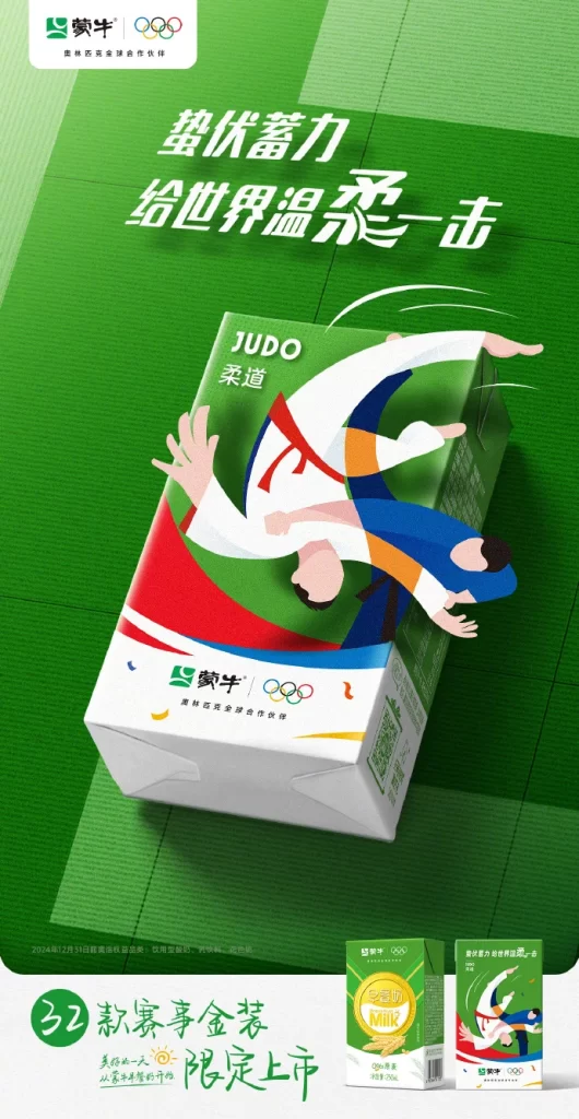
A Mengniu milk carton stands at a dynamic angle against a green grid background, featuring an illustration of two judo athletes in mid-throw. The packaging displays the brand's logo alongside Olympic rings, with the word 'JUDO' and Chinese characters for 'Judo' printed above the graphic. Large white text at the top reads '蛰伏蓄力 给世界温柔一击' (Accumulate strength, strike the world gently), while smaller text at the bottom announces '32款赛事金装限定上市' (32 competition gold editions limited release).
The layout employs a strong diagonal composition that guides the eye from the headline down to the product, creating a sense of motion and energy. Bold sans-serif typography contrasts sharply against the vibrant green backdrop, while the flat vector illustration style uses clean lines and a limited palette of white, blue, red, and orange. Color psychology leverages green to represent both the judo mat and health vitality, with the athletes' uniforms echoing national team colors.
Advertising professionals examine this campaign to understand how sports licensing integrates with FMCG packaging design. Marketing students analyze the copywriting strategy that balances competitive aggression with gentle wordplay. Packaging designers reference the structural layout and illustrative approach when developing limited-edition promotional materials for major sporting events.