Bones Coffee Highland Grog Decaf Coffee Bag Packaging
Topics
Details
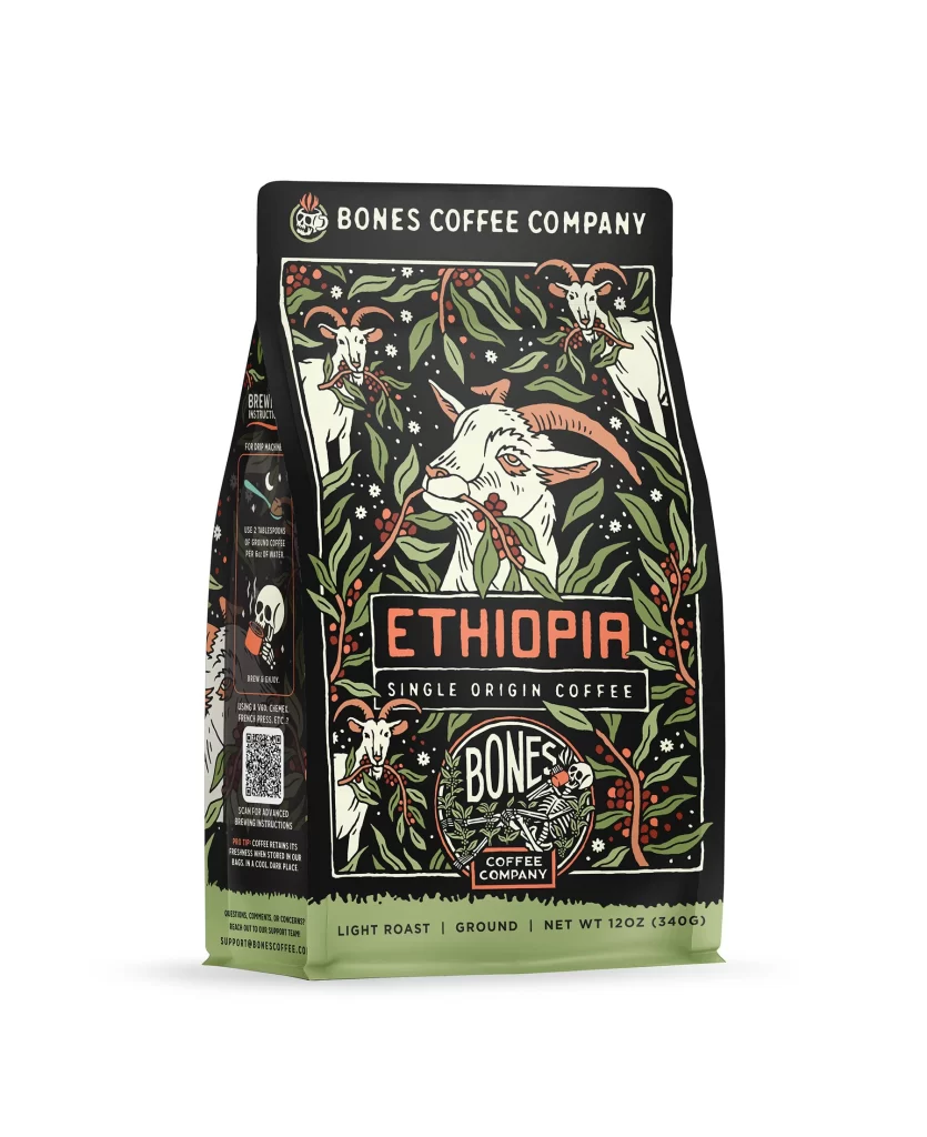
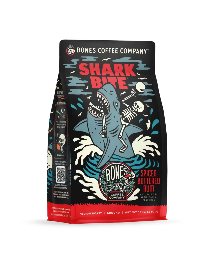
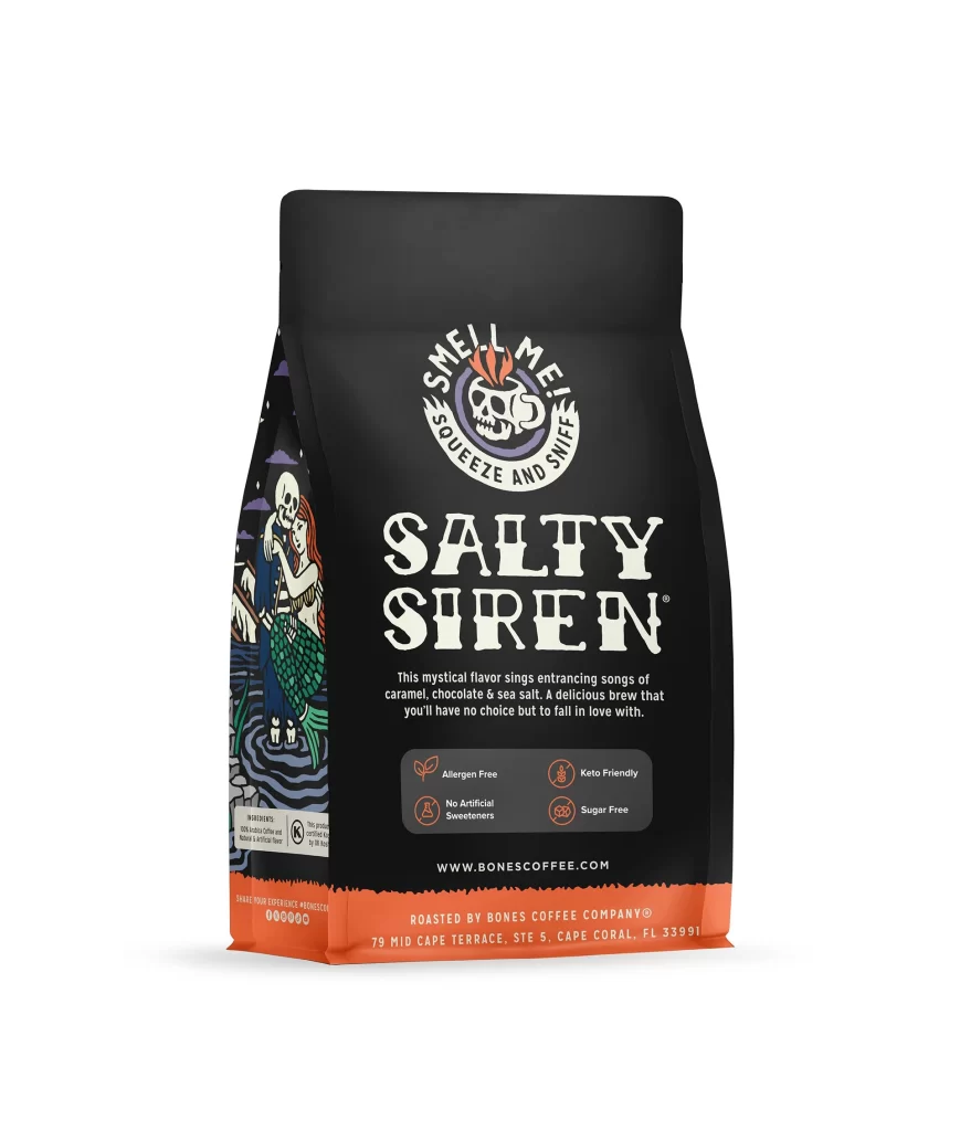
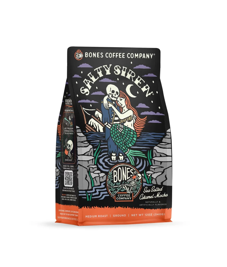
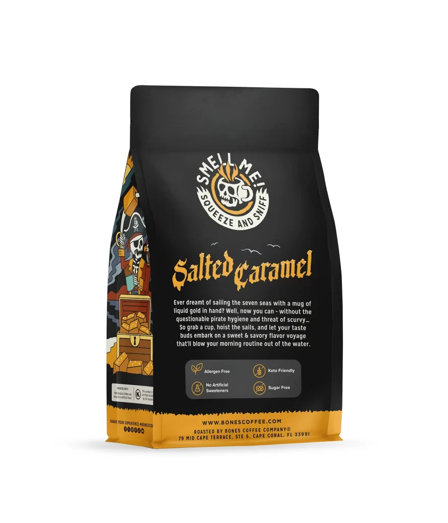
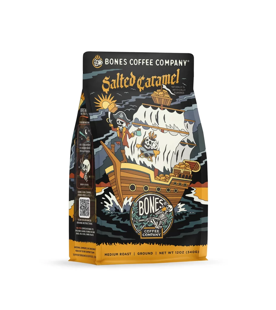
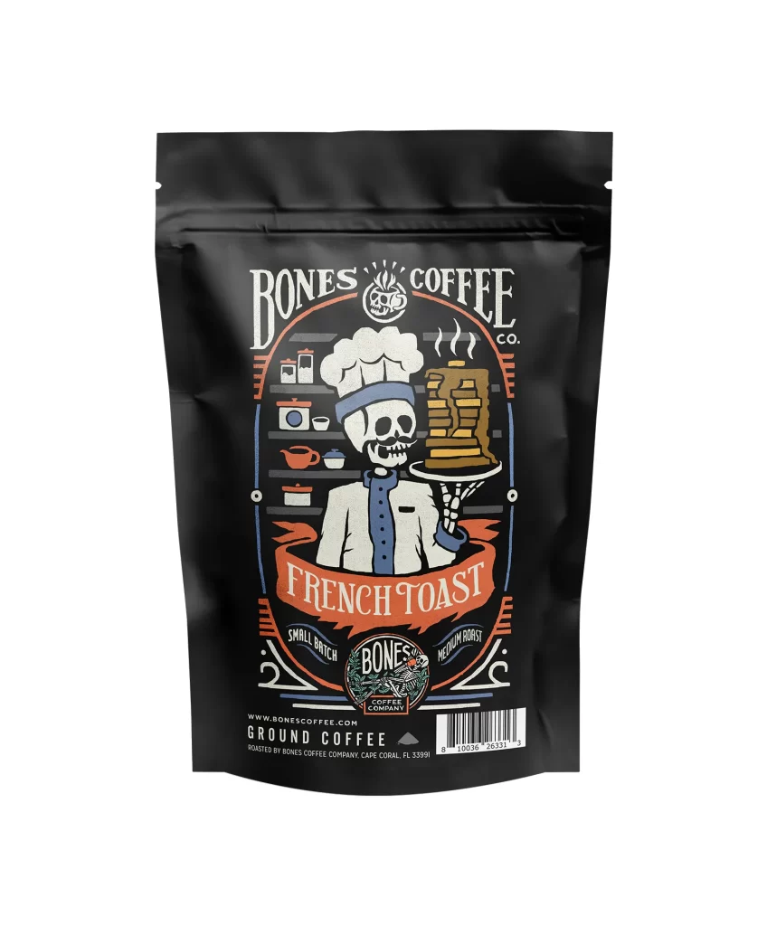
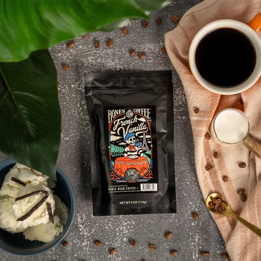
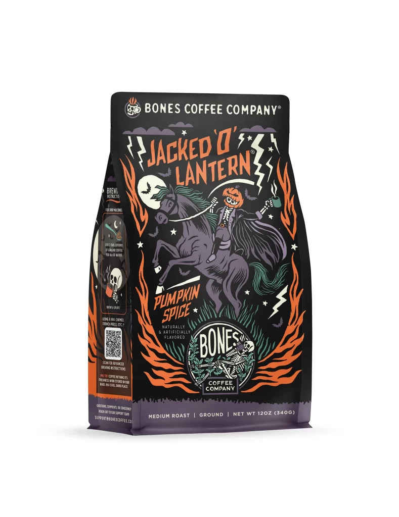
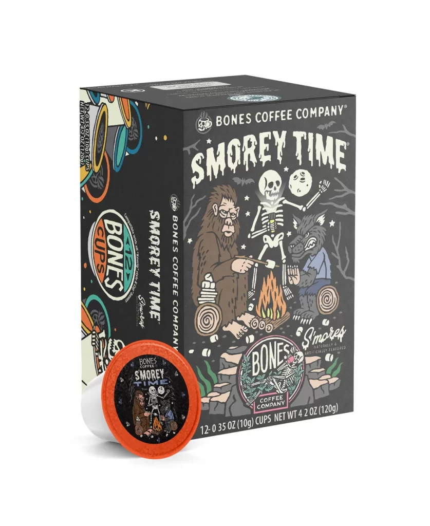
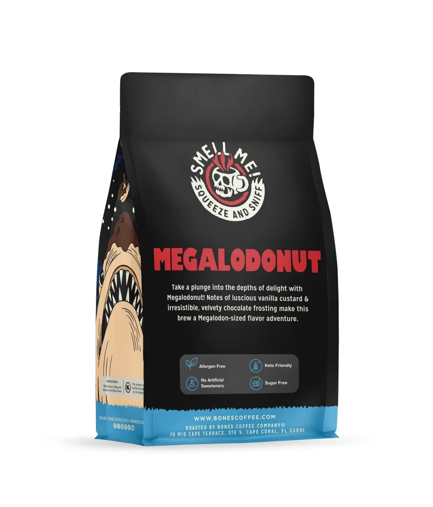
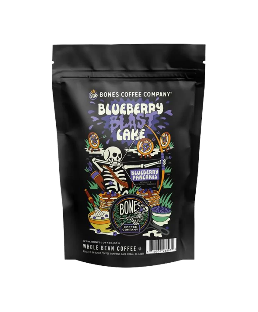
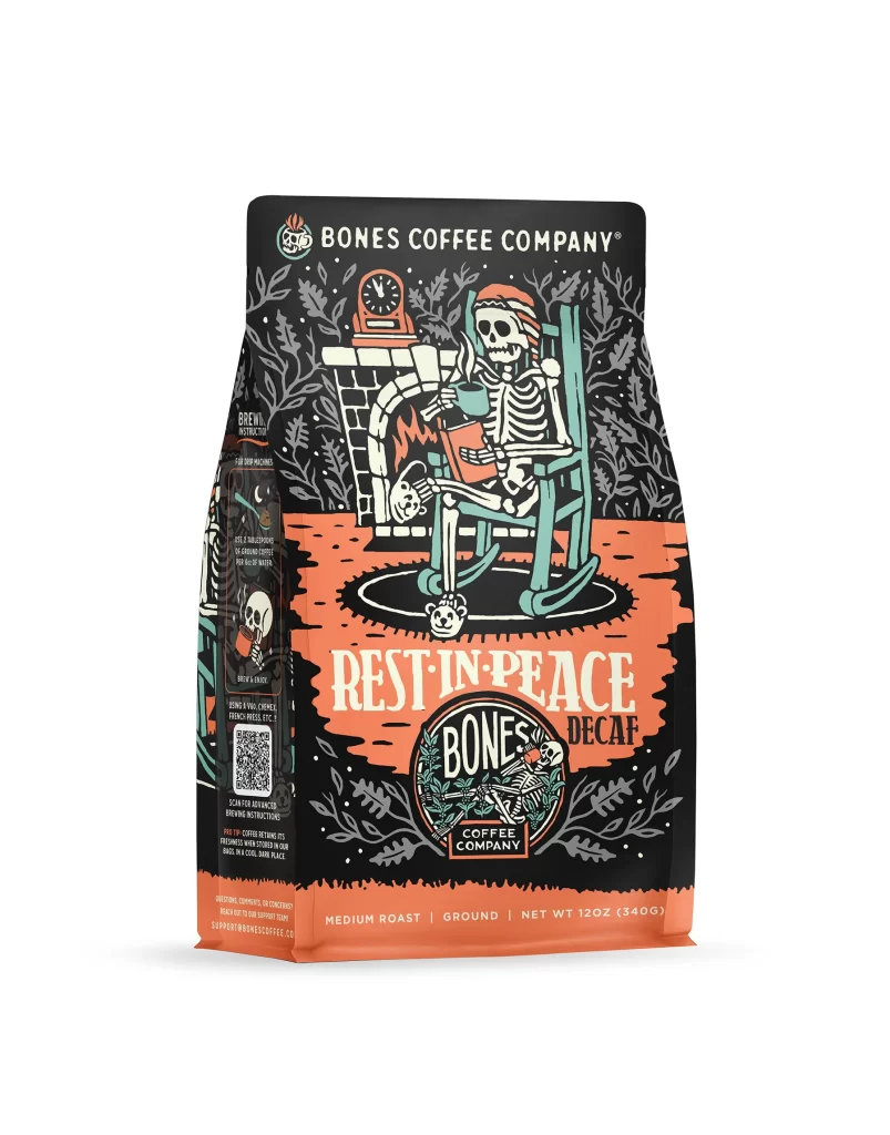
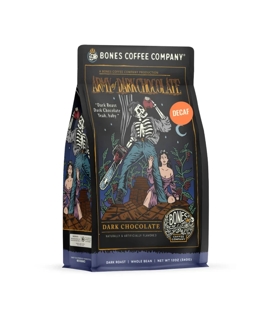
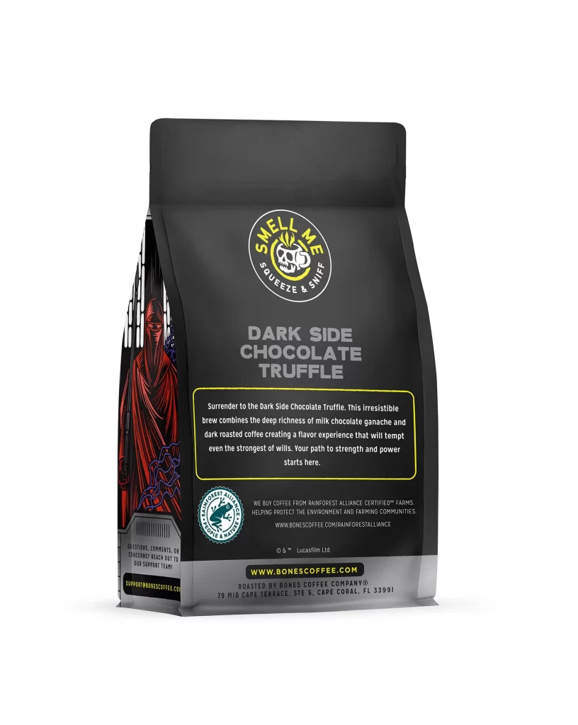
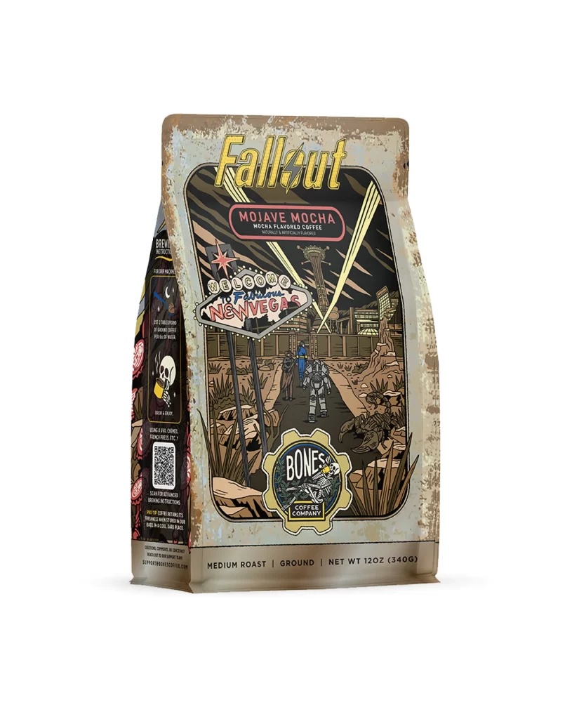
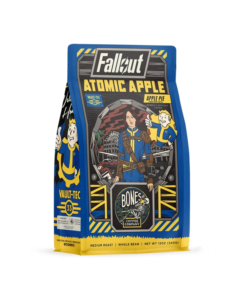
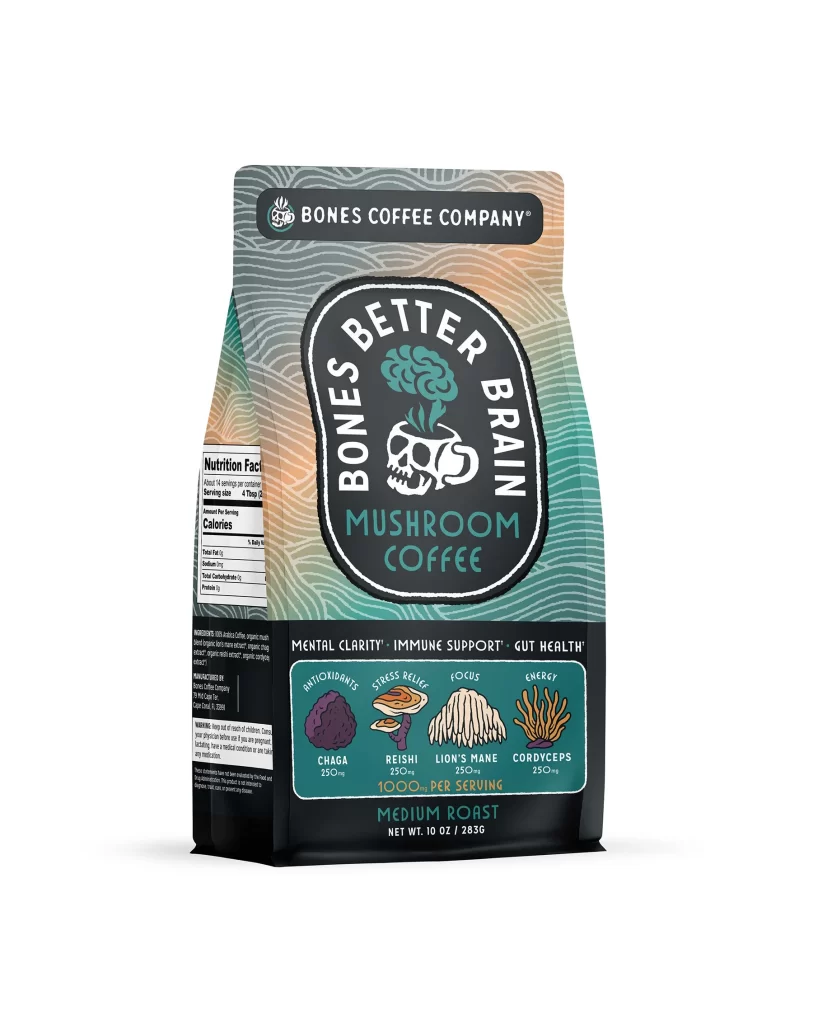
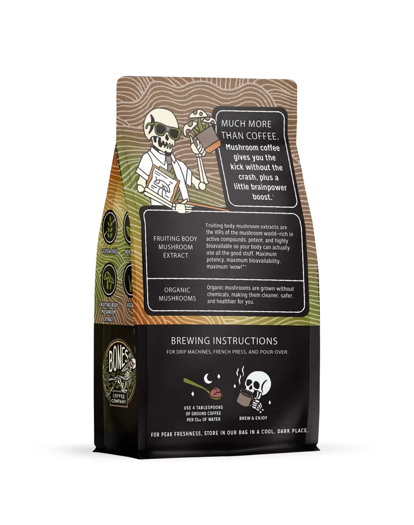
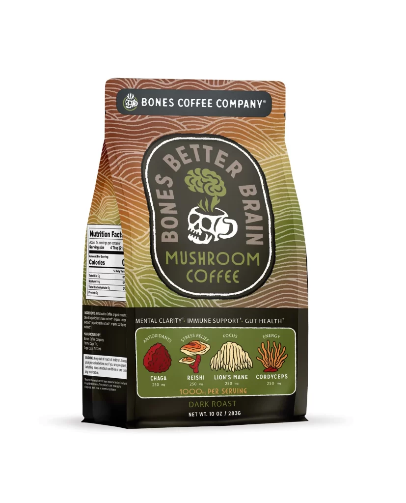
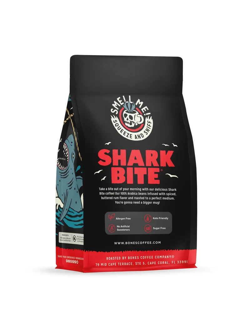
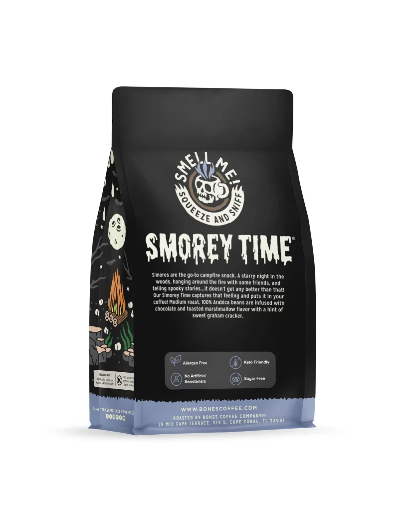
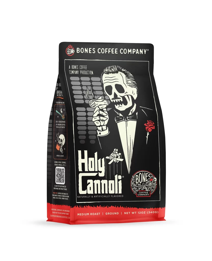
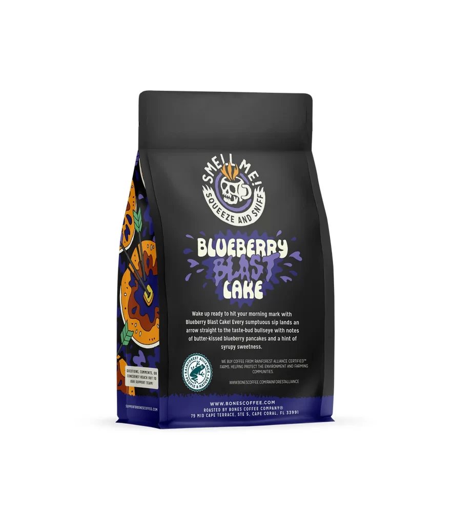
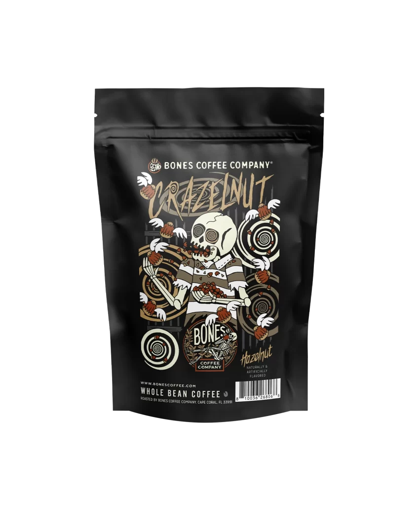
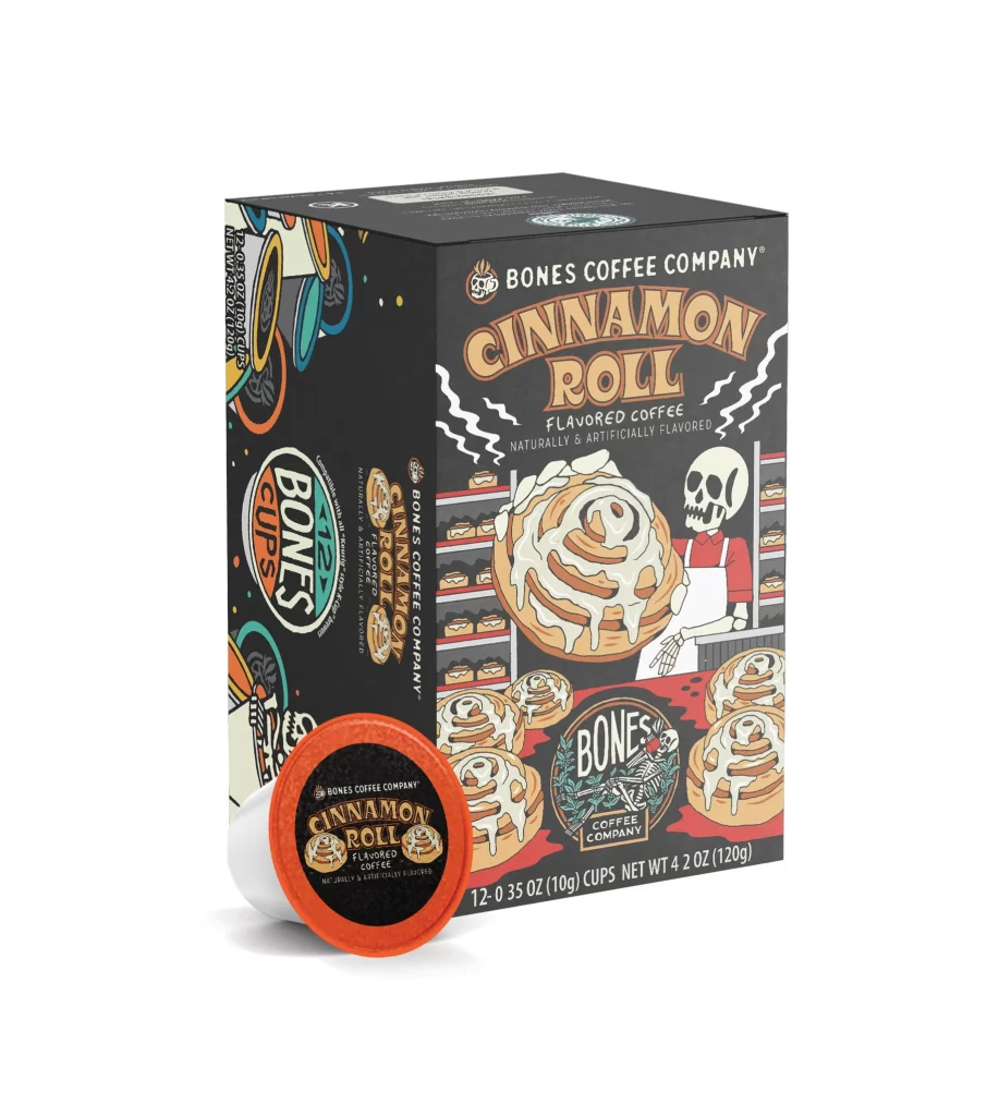
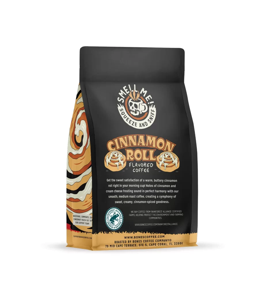
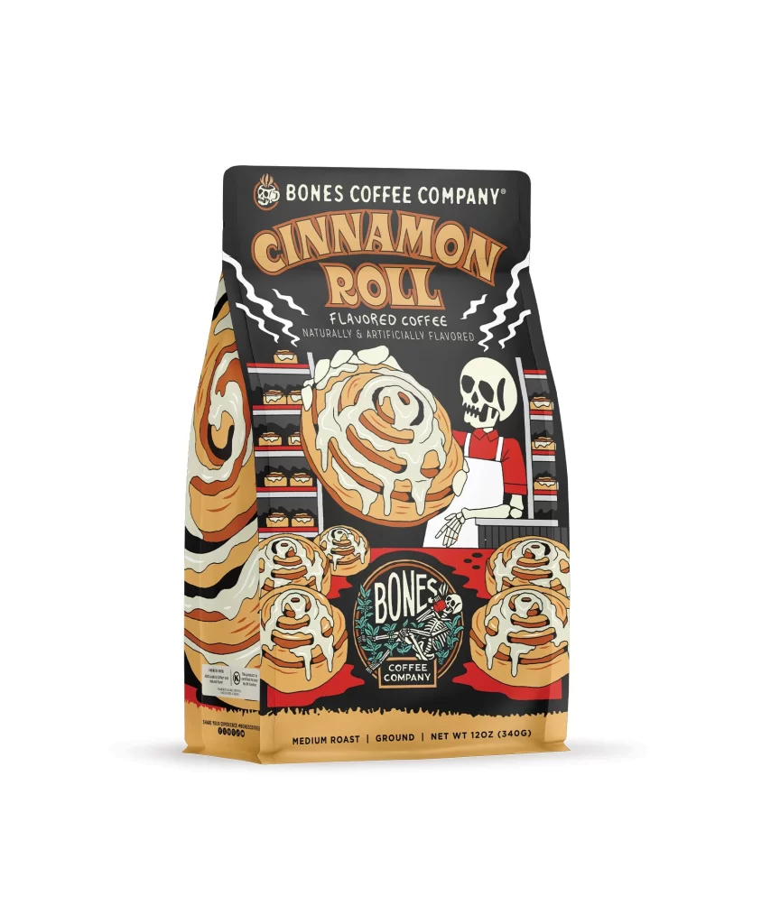
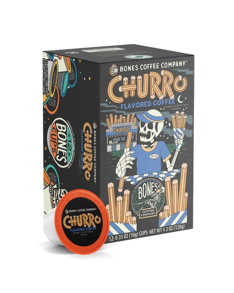
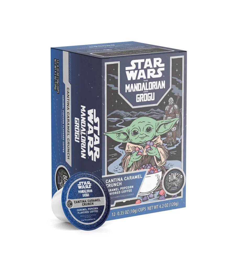
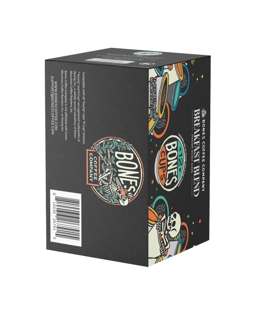
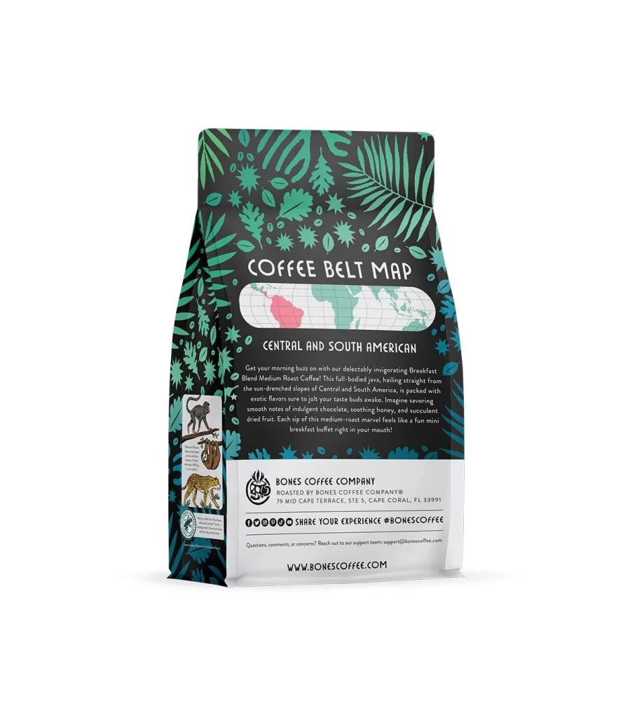
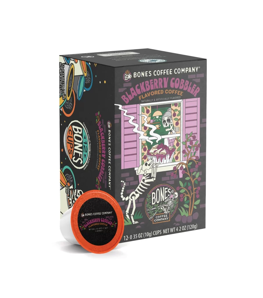
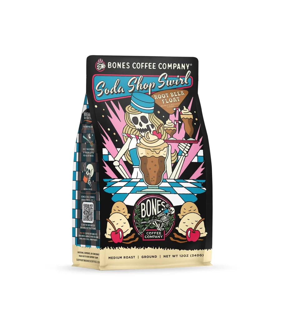
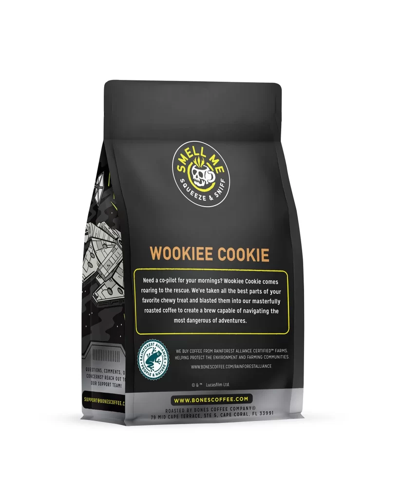
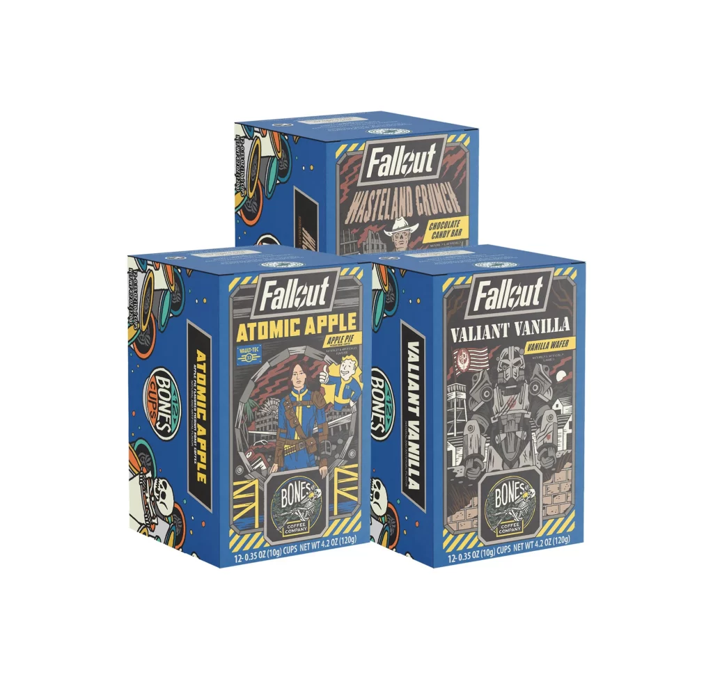
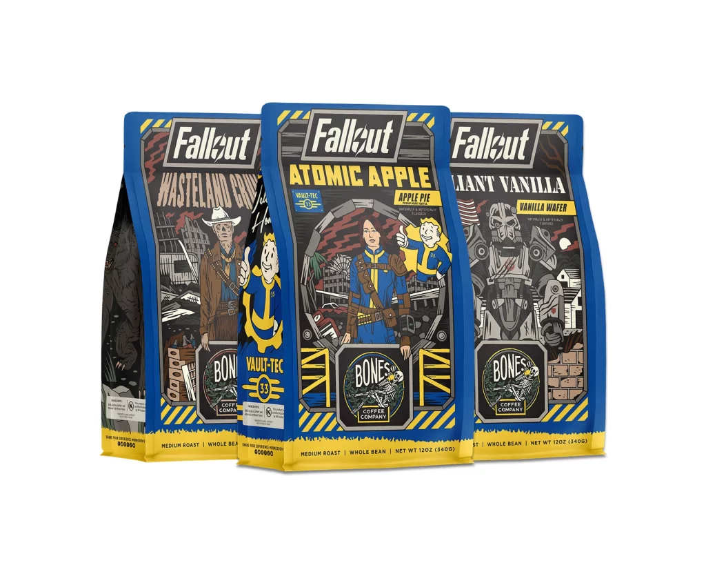
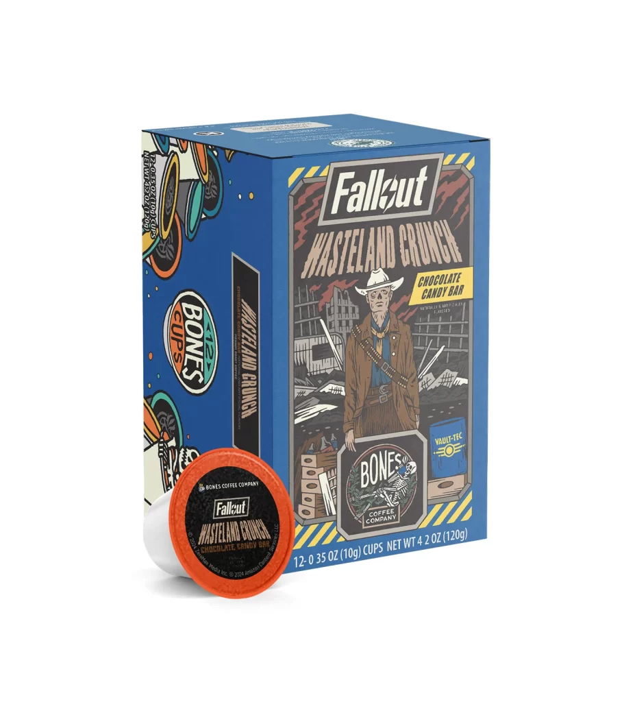
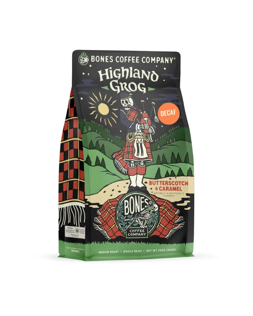
The front design layout features a clean white studio product photo of the physical package. The decaf variant is clearly marked on the main panel. A central illustration highlights the butterscotch and caramel notes, using golden syrup and candy shapes to communicate the flavor profile. The 12 oz 340 g net weight is placed at the bottom, balancing the visual hierarchy of the bag.
Typography uses a bold serif font for the brand name, paired with a clean sans serif for the flavor text. Warm amber and gold colors dominate the label, creating strong appetite appeal. This bright color palette stands out against the matte background, giving the bag excellent shelf presence. The text remains highly legible, ensuring shoppers can easily identify the coffee variant.
Designers should note how the minimalist background forces attention onto the flavor art. The clear labeling of the decaf variant prevents consumer confusion while maintaining visual interest. Using warm tones to suggest butterscotch and caramel notes is a smart strategy for food packaging. The precise placement of the 12 oz 340 g weight information anchors the composition, offering a balanced layout for retail success.