Bones Coffee Rest in Peace Decaf Coffee Bag Packaging
Topics
Details
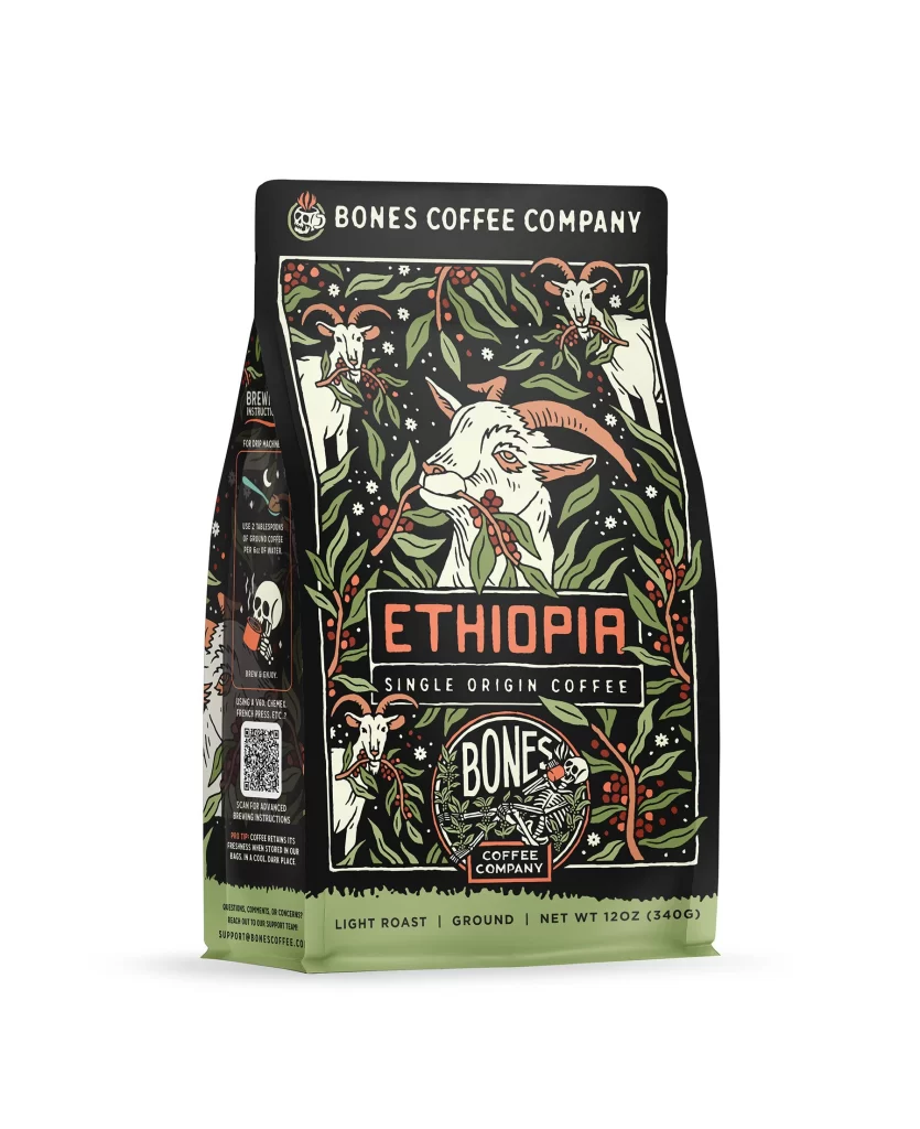
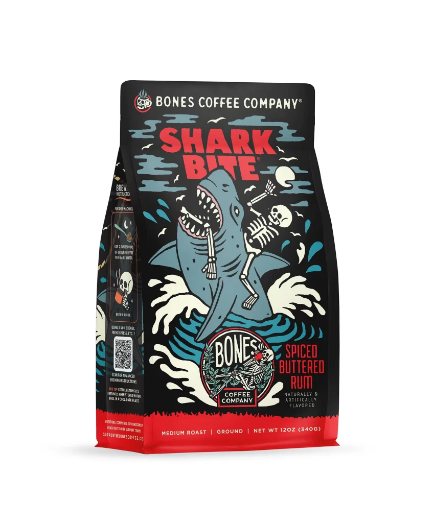
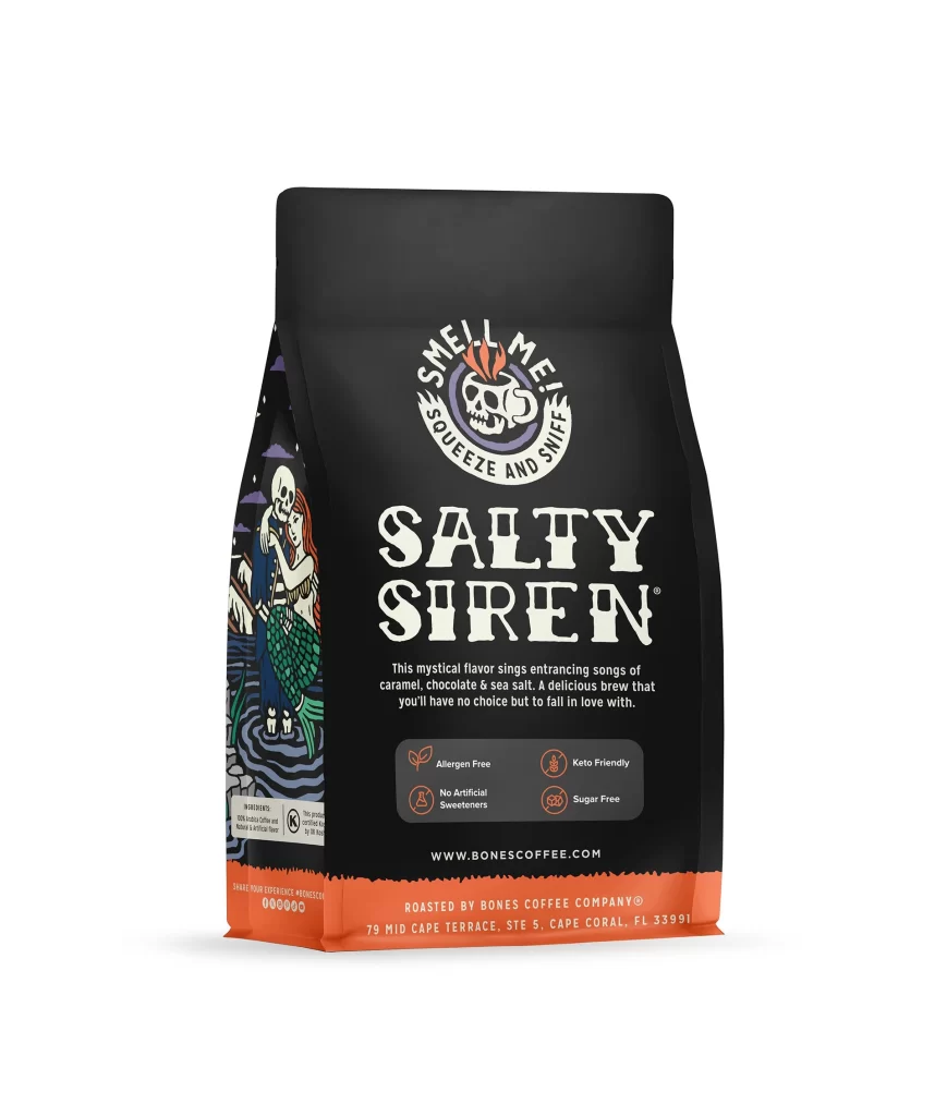
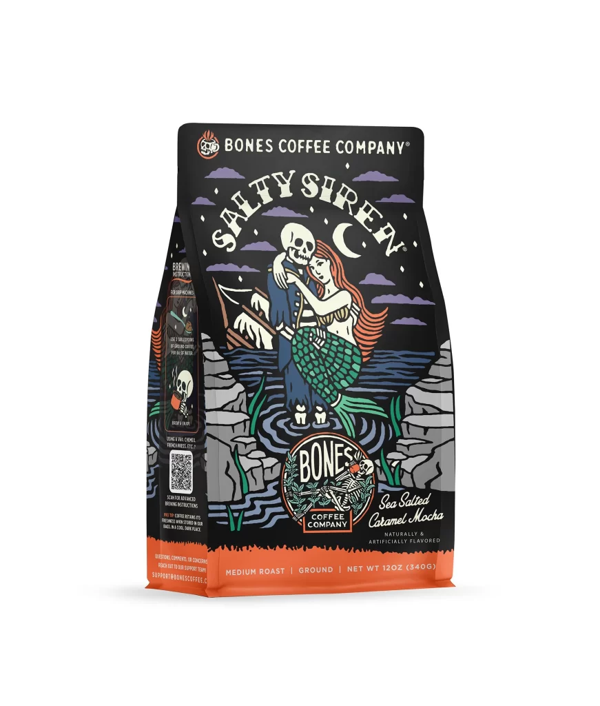
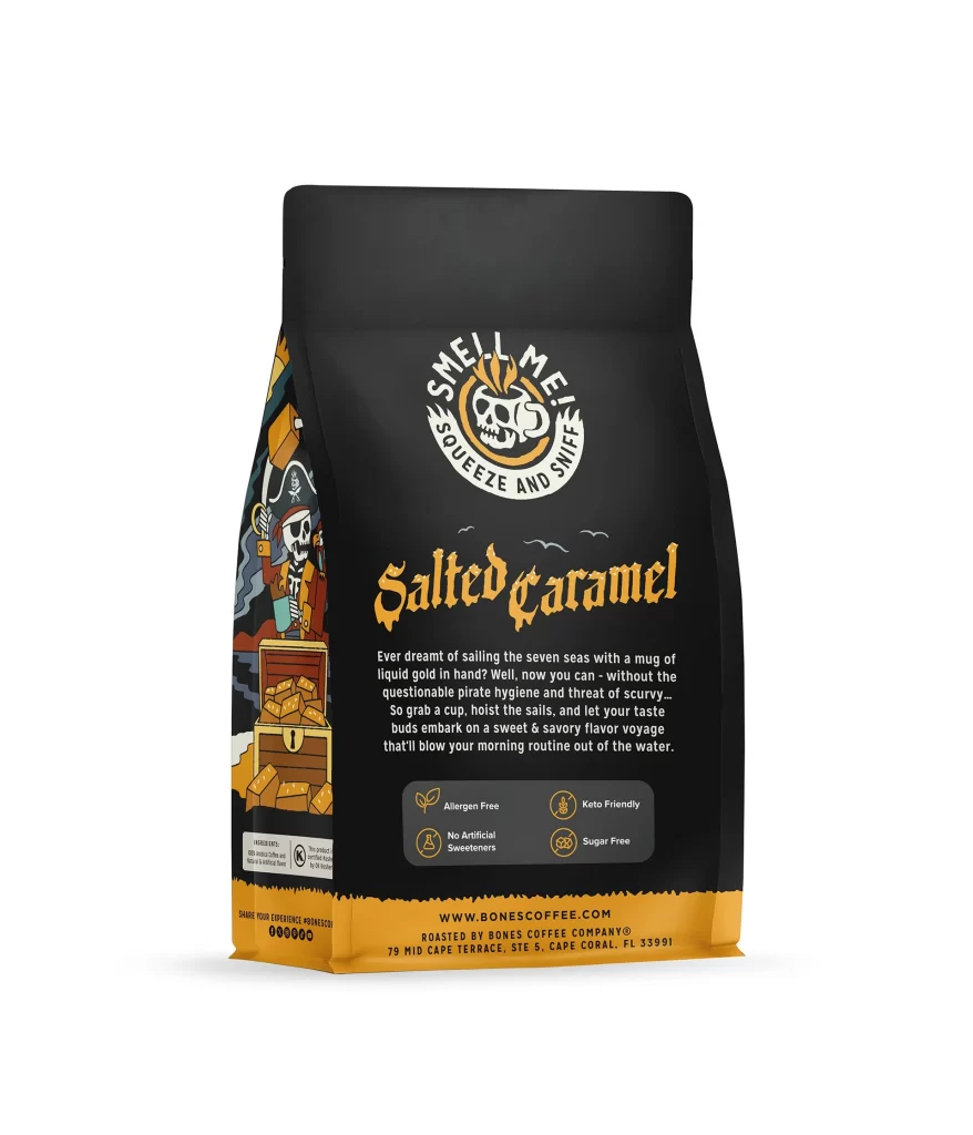
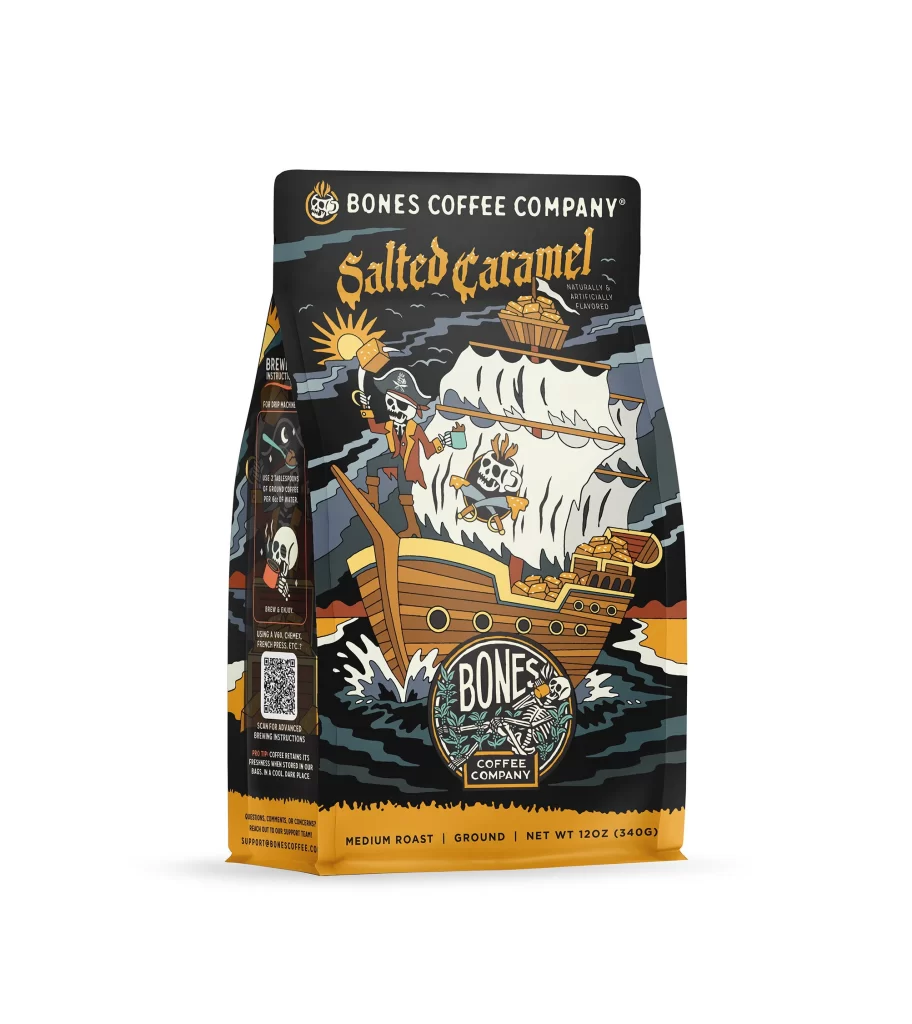
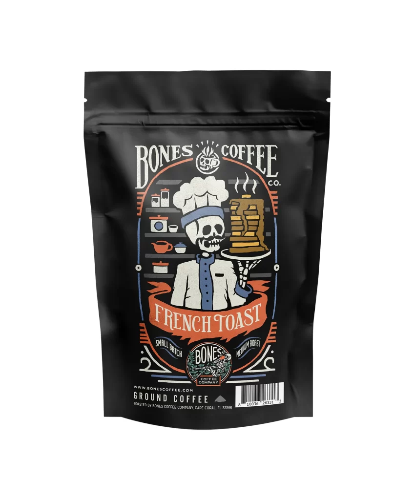
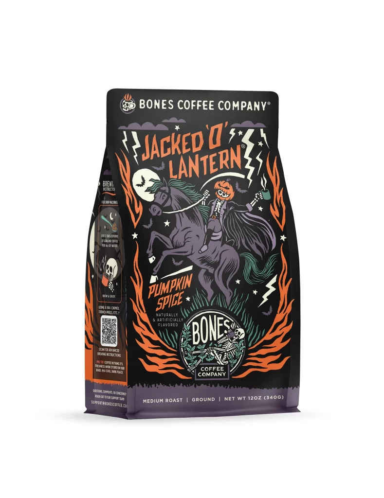
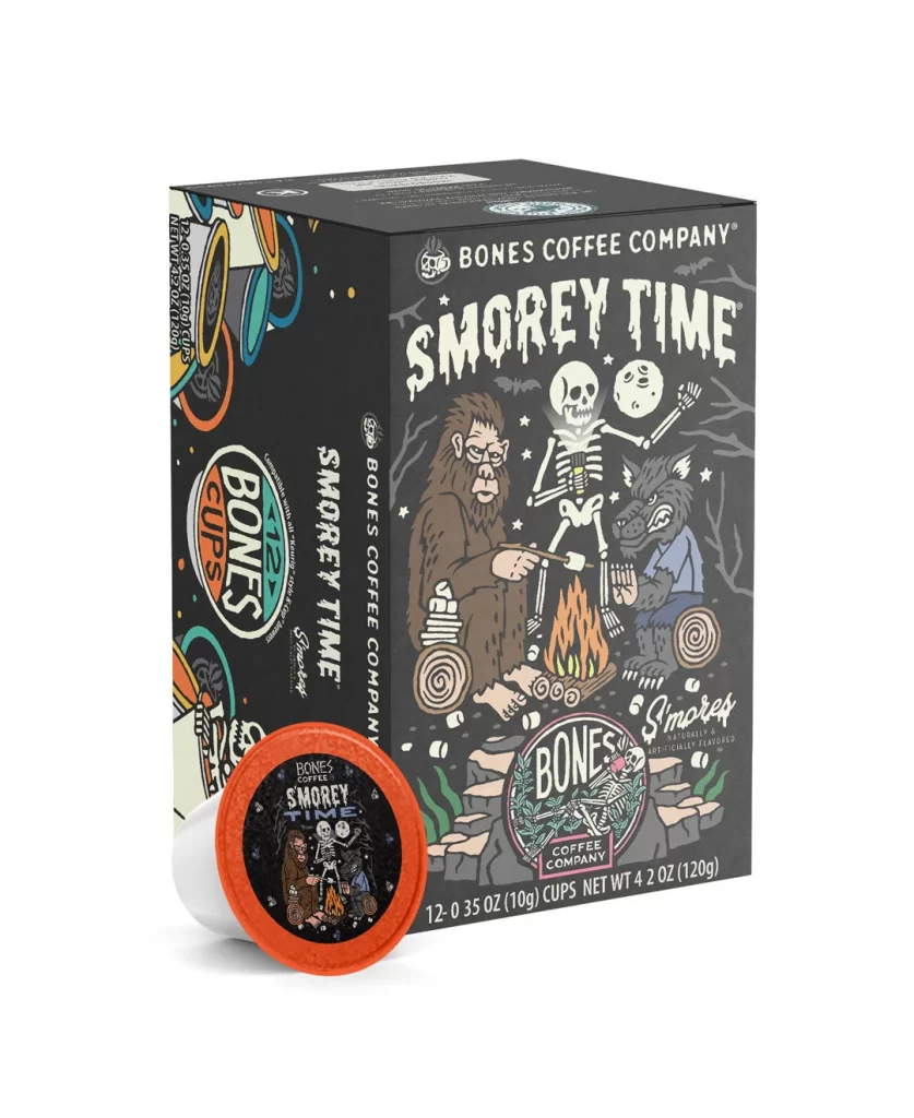
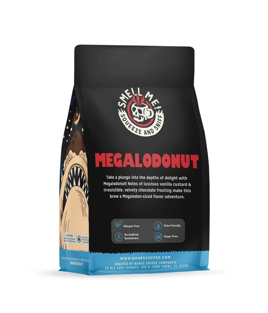
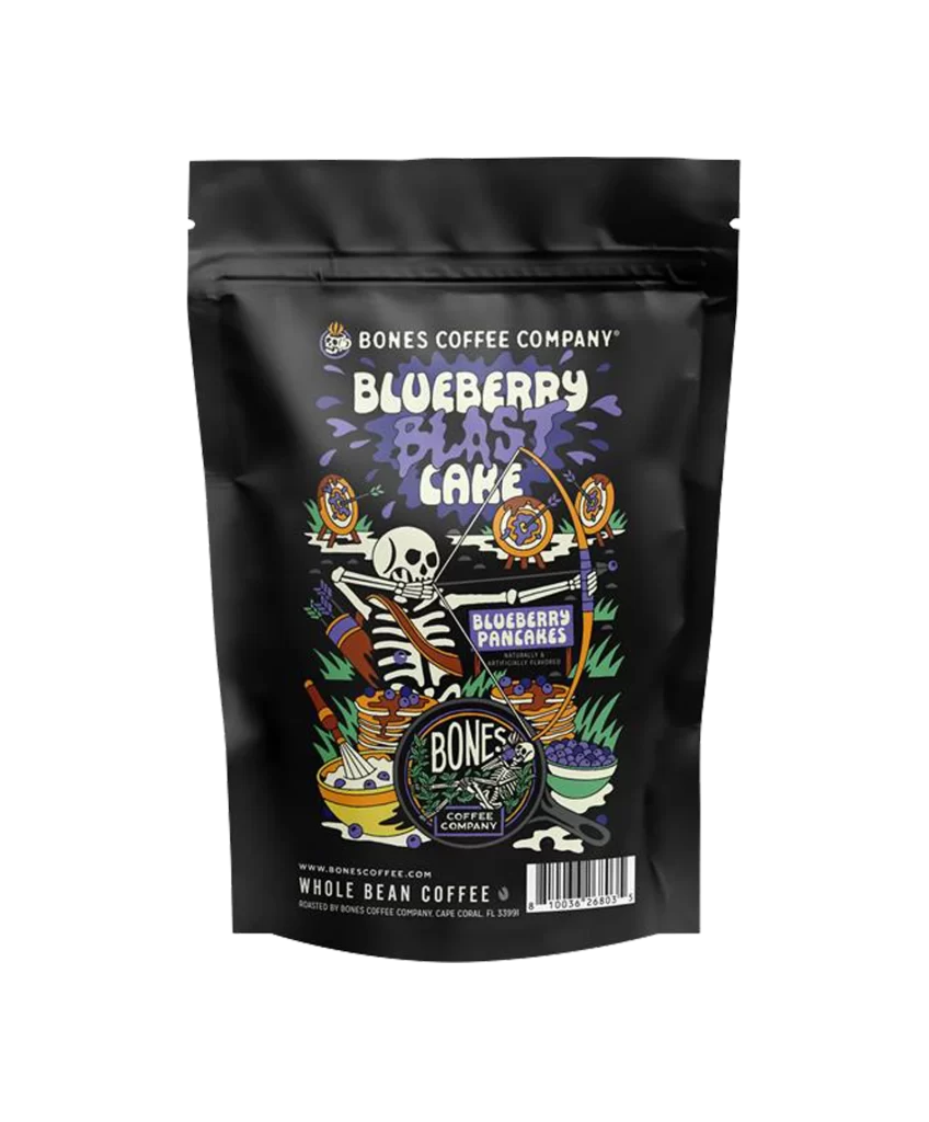
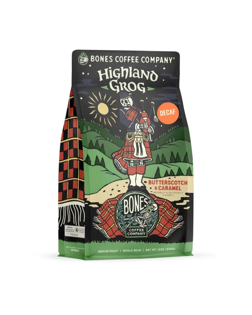
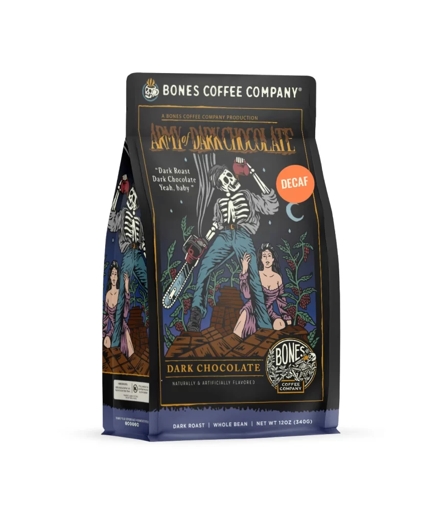
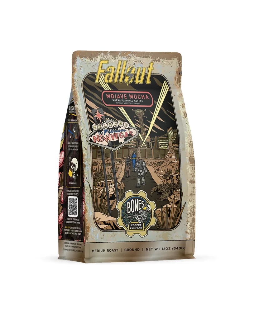
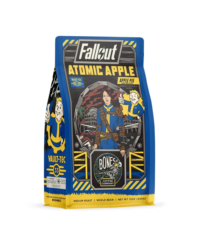
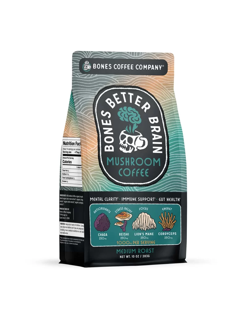
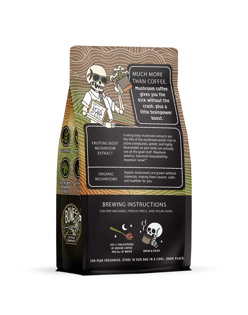
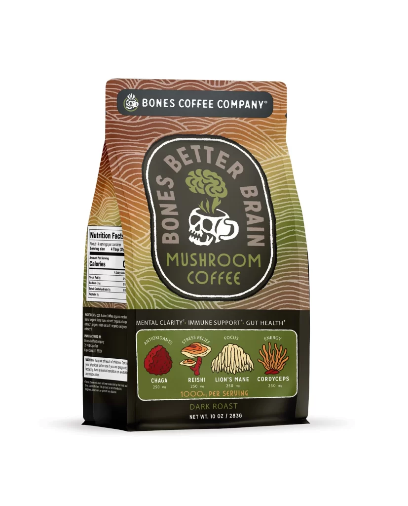
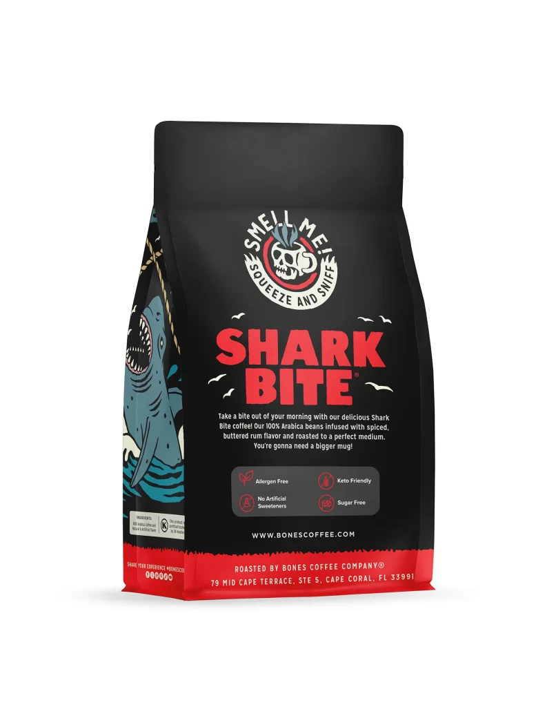
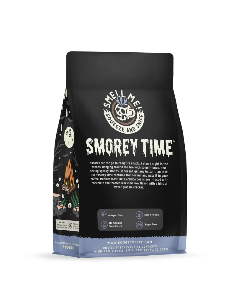
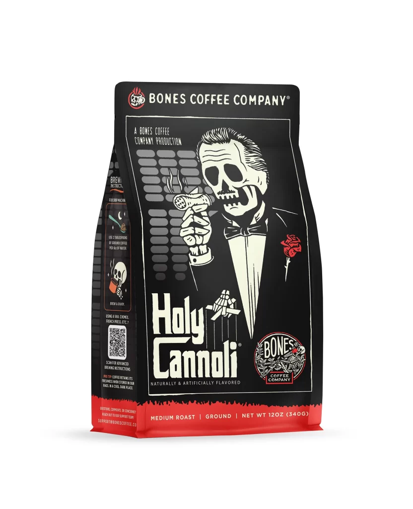
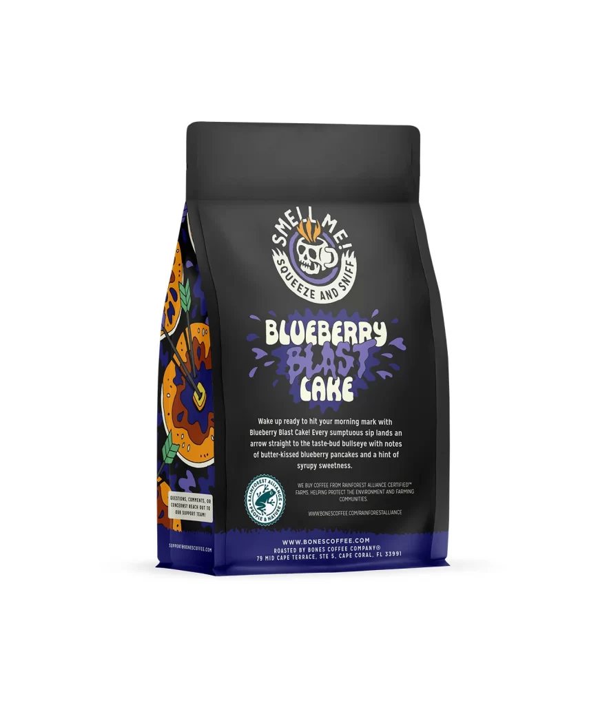
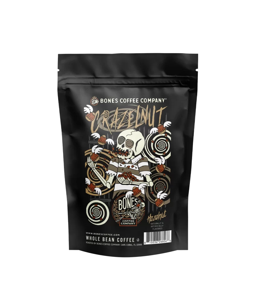
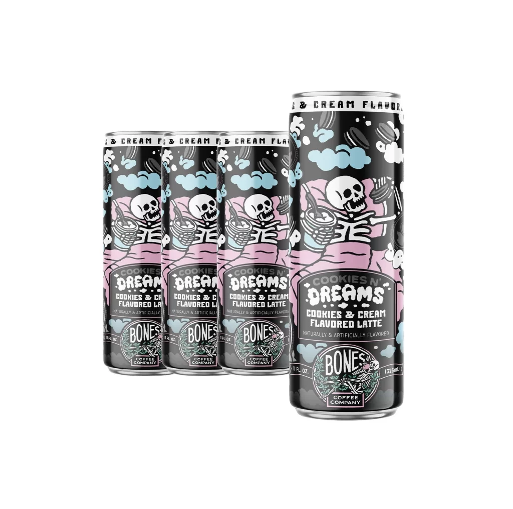
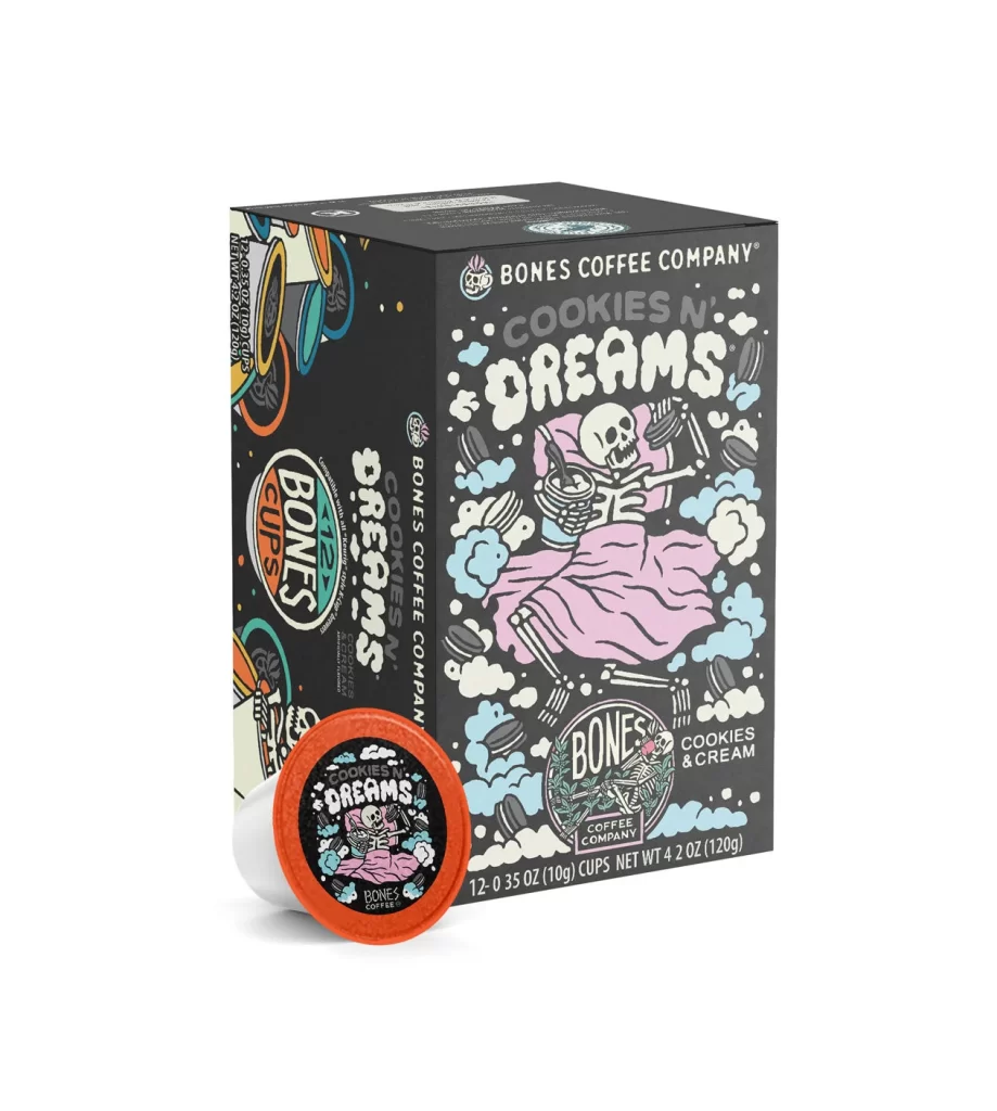
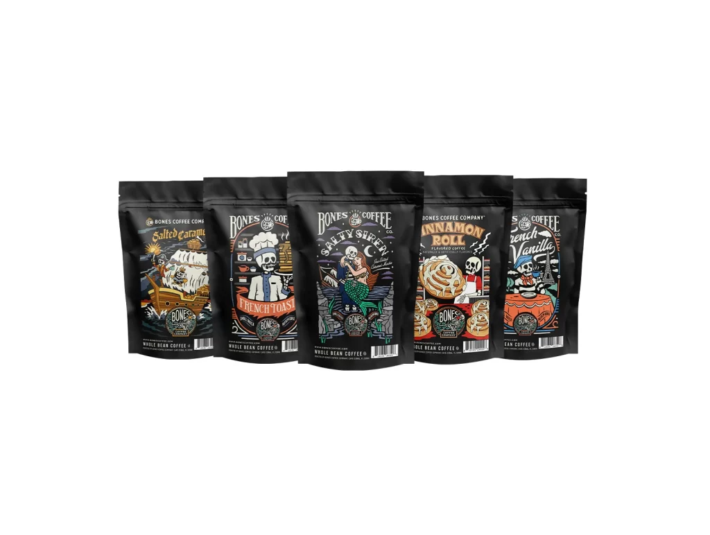
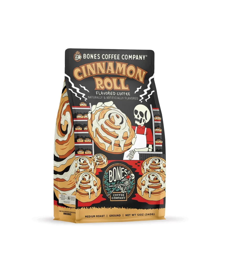
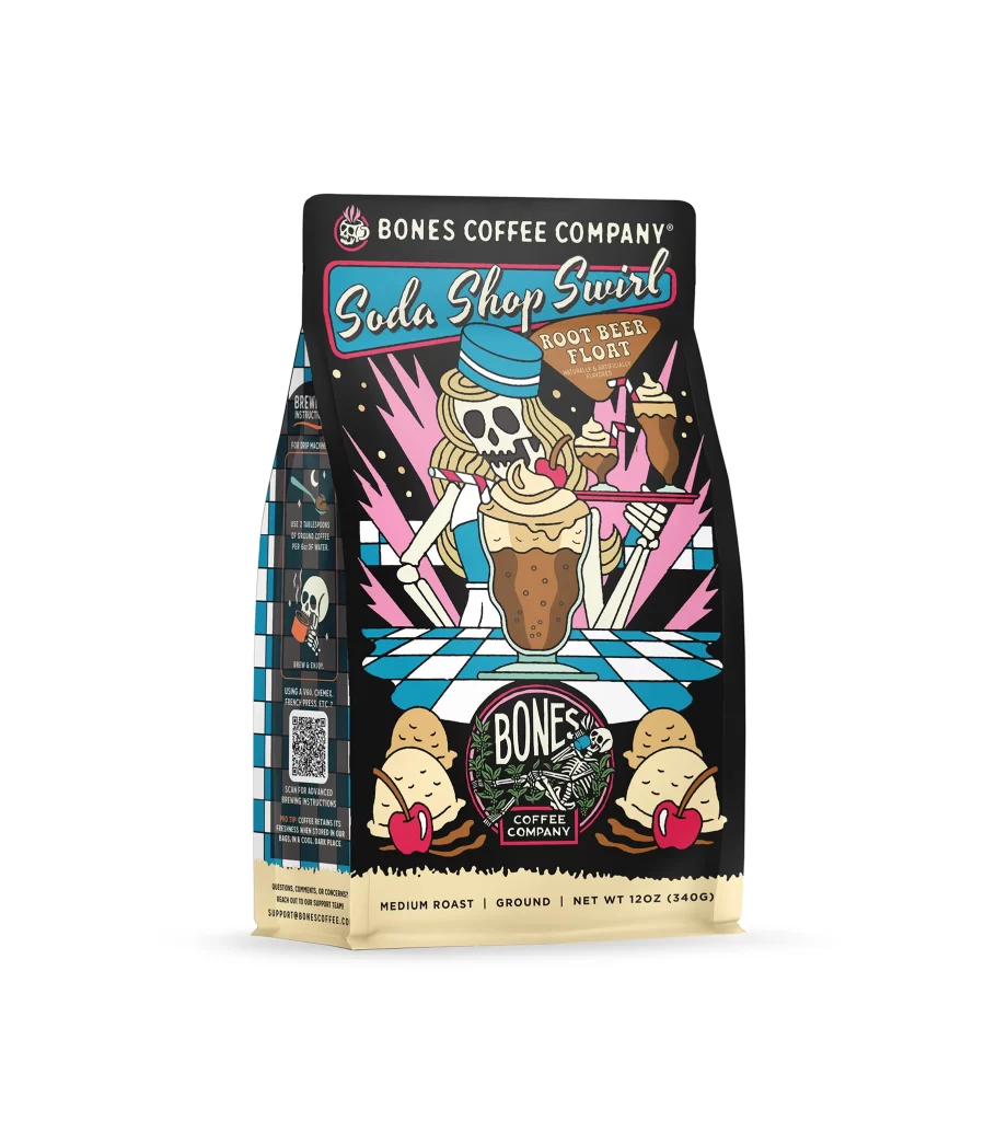
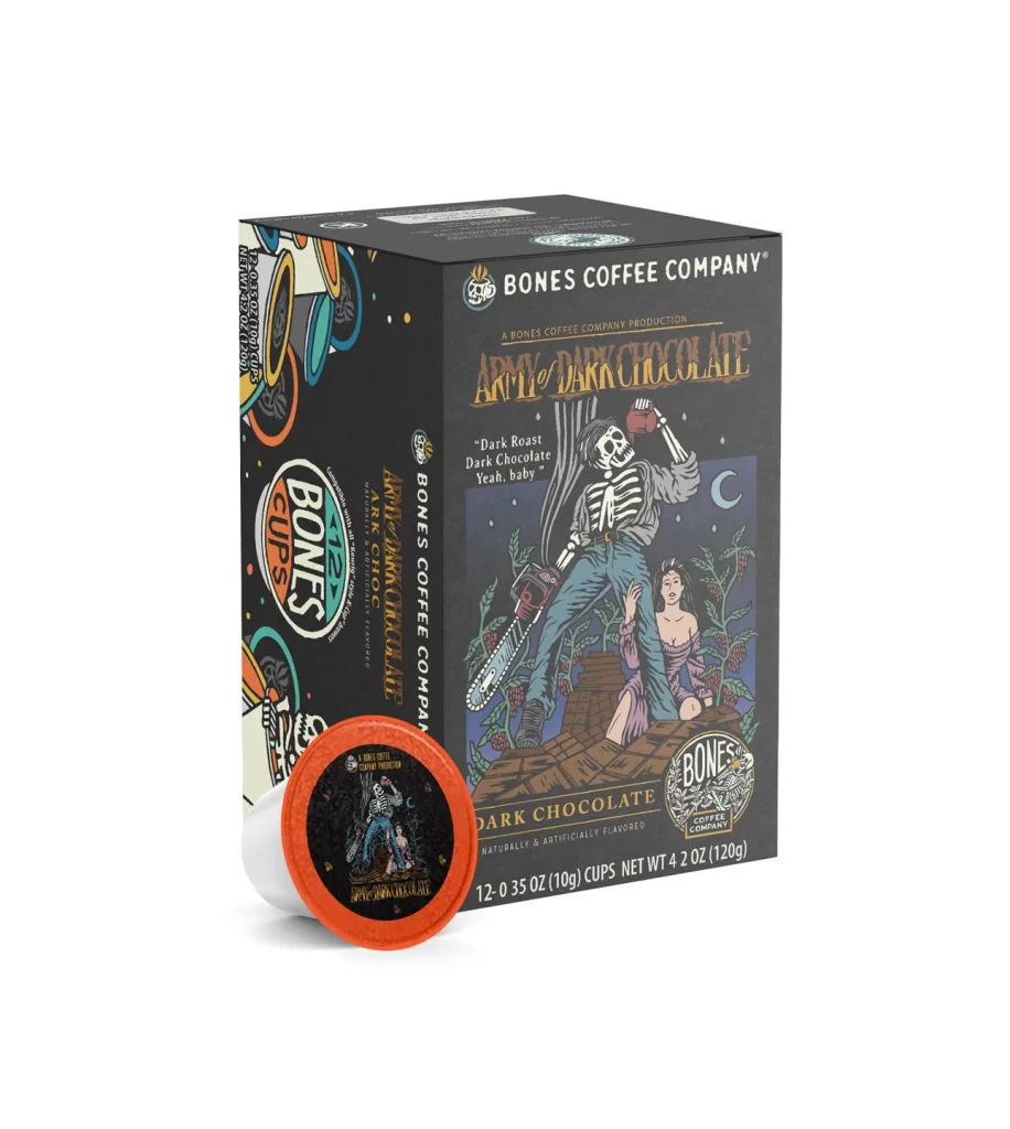
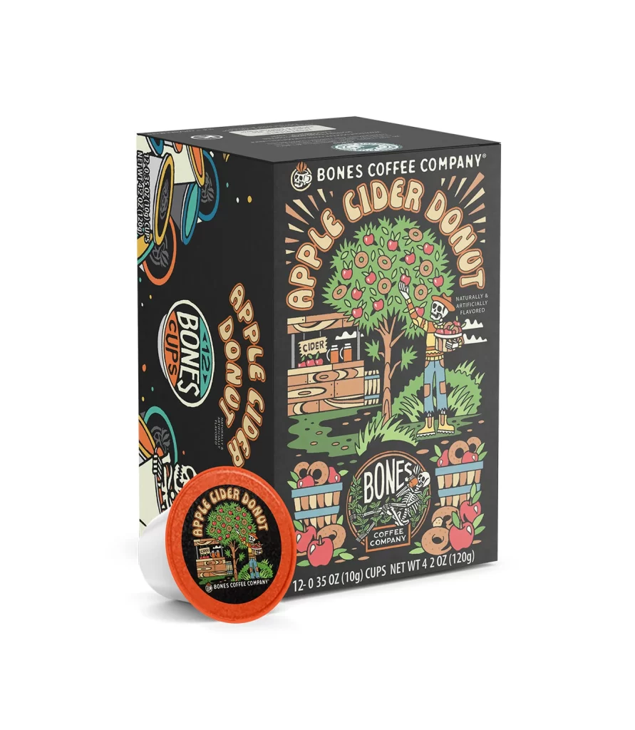
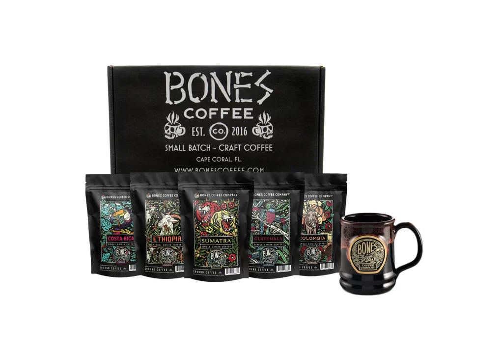
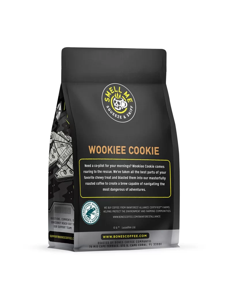
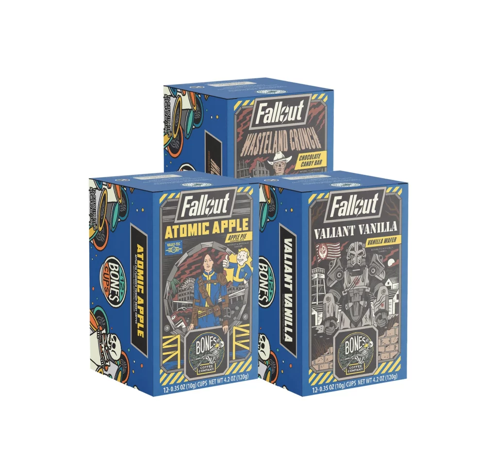
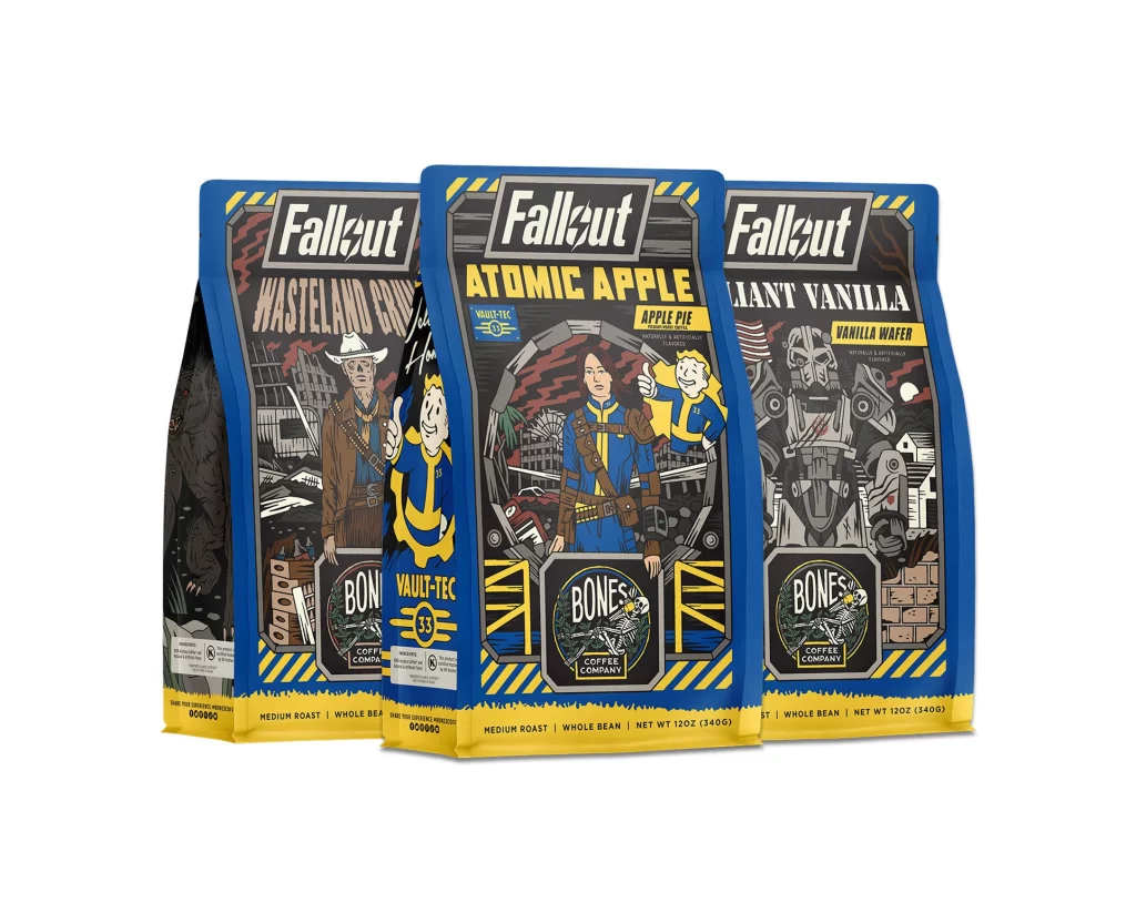
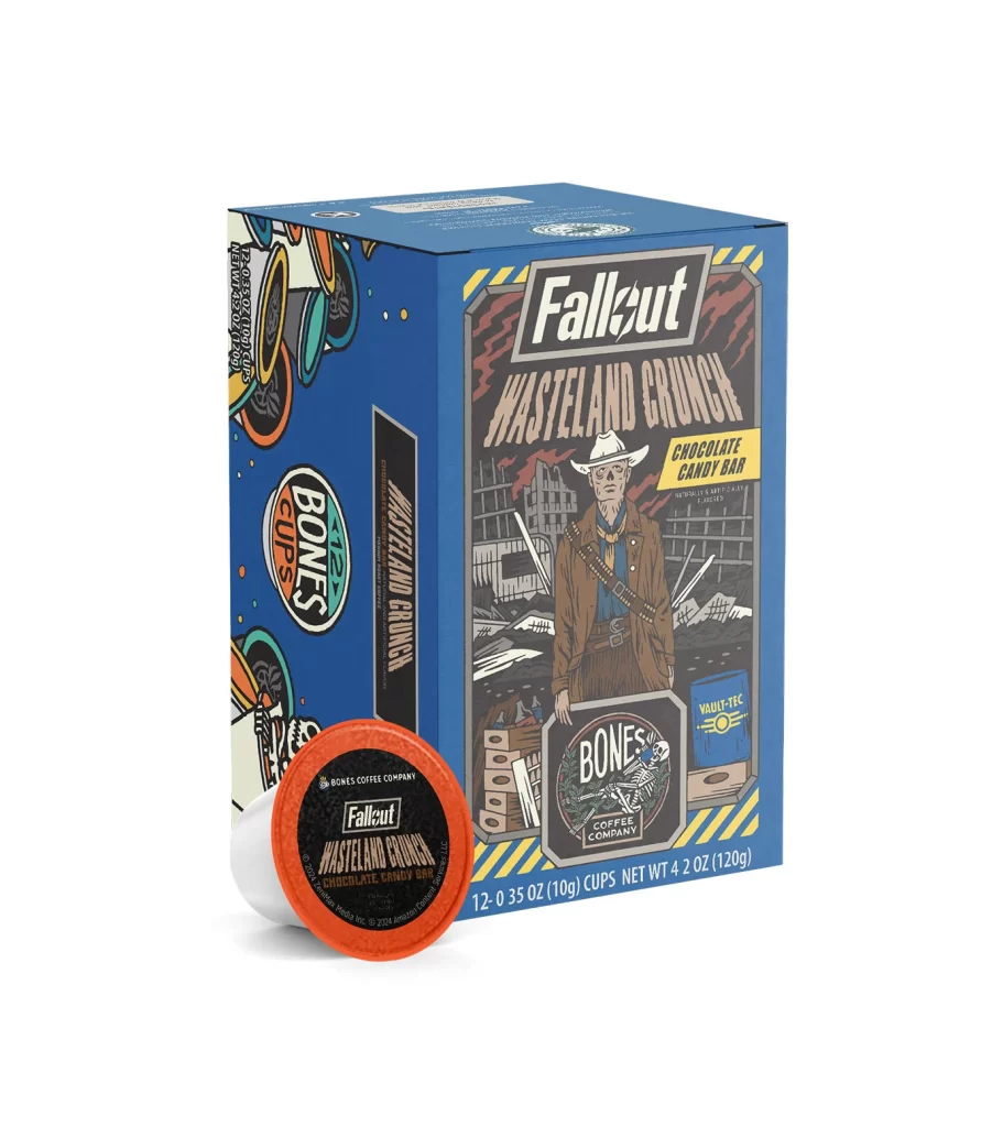
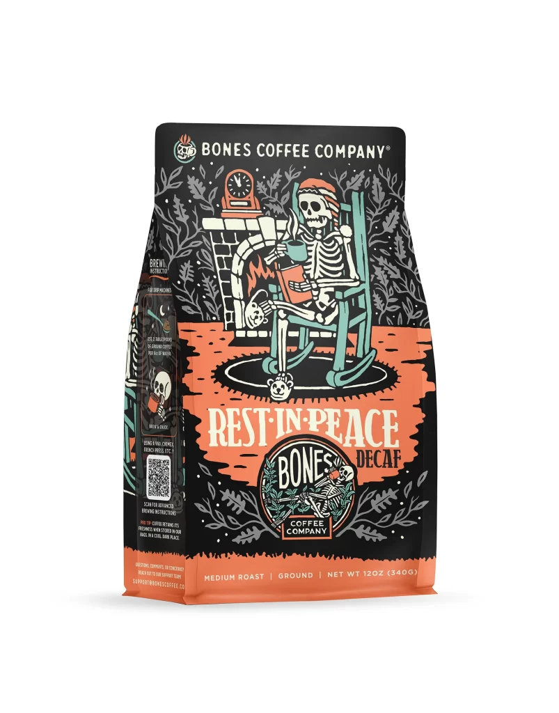
The front design layout features a matte black background with a central skull motif adorned with floral elements. The decaf variant is clearly marked on the front panel. A white studio product photo of the physical package highlights the matte finish and vibrant floral art. The 12 oz 340 g net weight is displayed at the bottom. The overall composition is balanced and striking.
Typography uses bold white sans serif fonts for the brand name, ensuring high contrast against the dark background. The flavor name is in a slightly smaller but equally legible font. This color scheme creates strong shelf appeal by standing out among typical coffee bags. The dark theme paired with bright text and art evokes a premium feel while maintaining appetite appeal through clean design.
Designers can take away the value of high contrast and thematic consistency. The use of a dark background with bright typography and art creates a memorable brand identity. The clear labeling of the decaf variant and weight shows the importance of informative design. This packaging successfully blends aesthetic appeal with functional product information, making it an excellent reference for bold branding strategies.