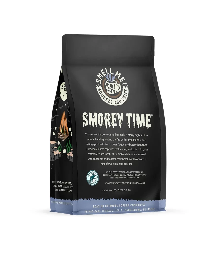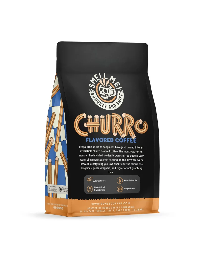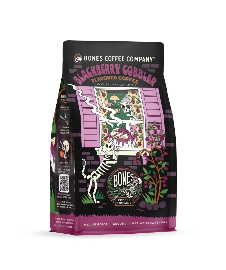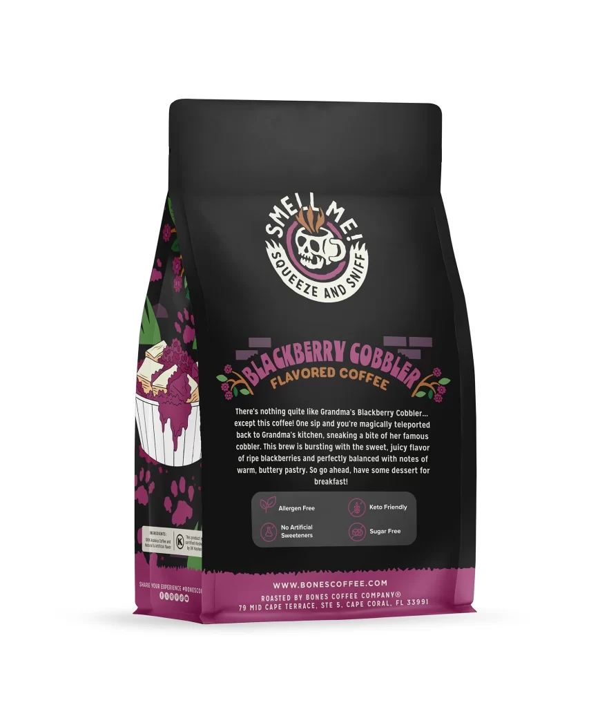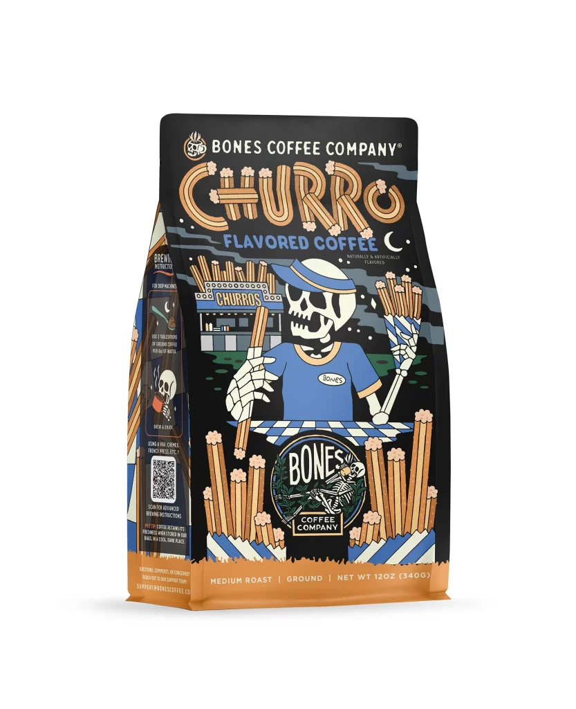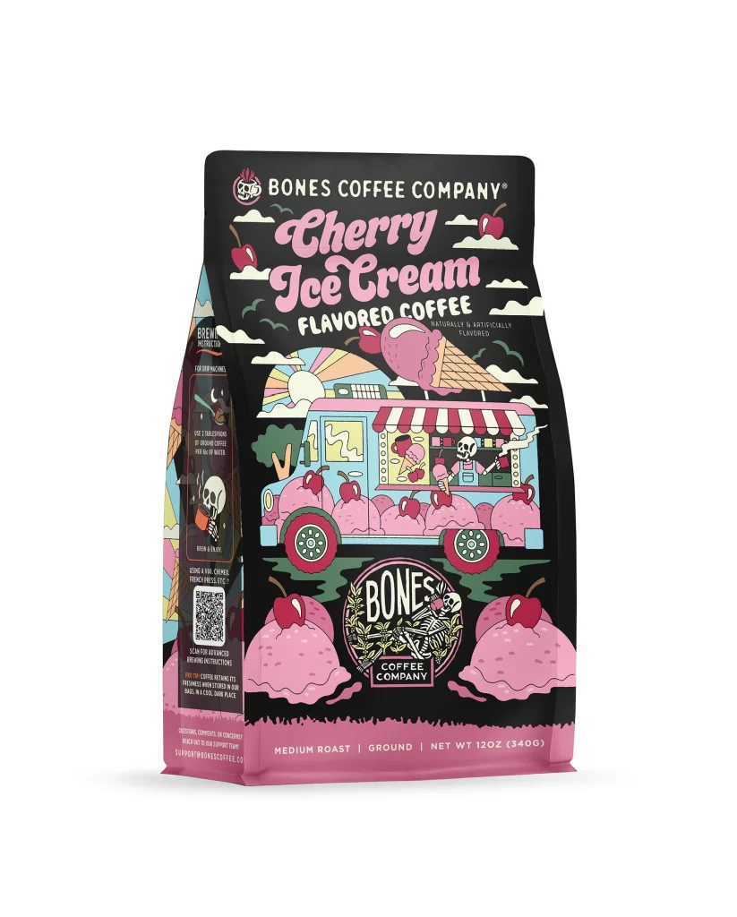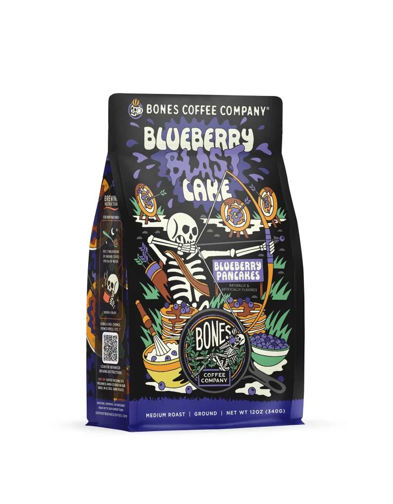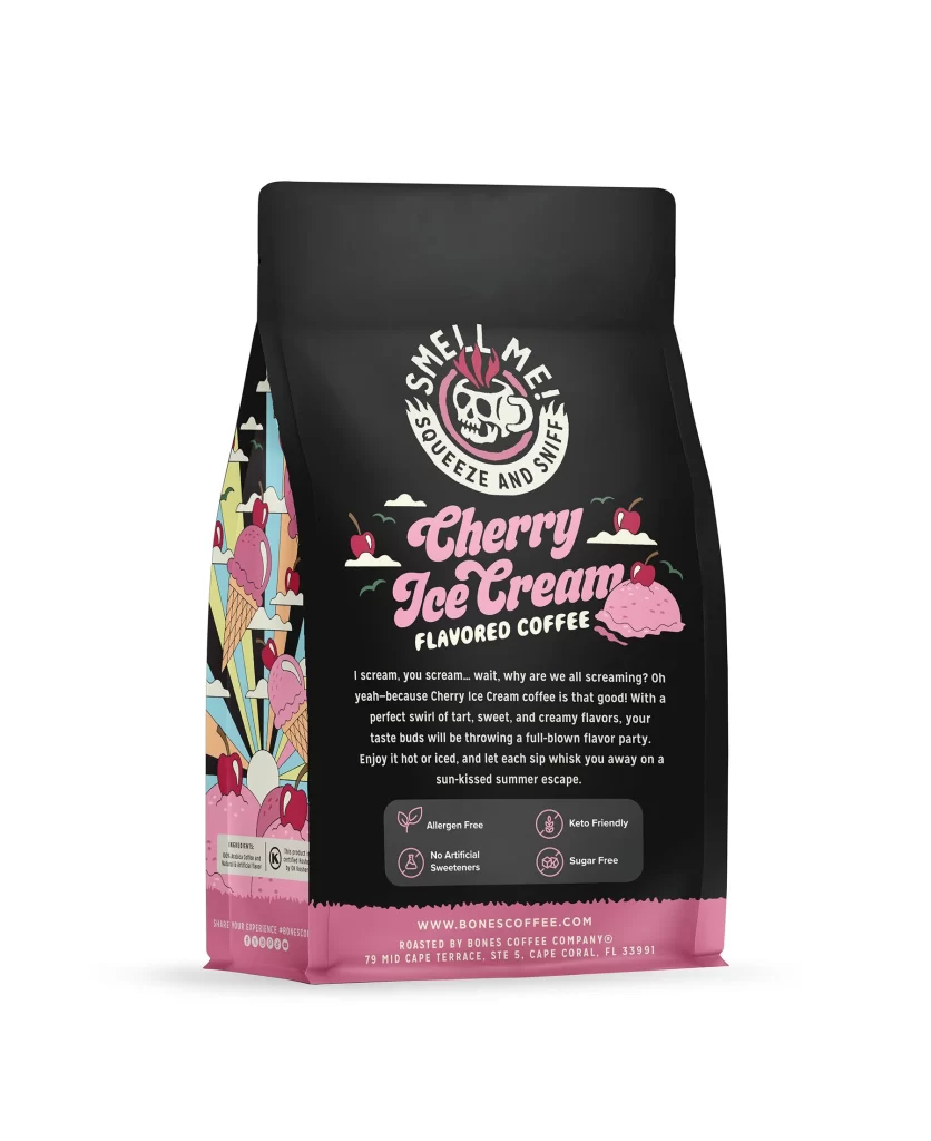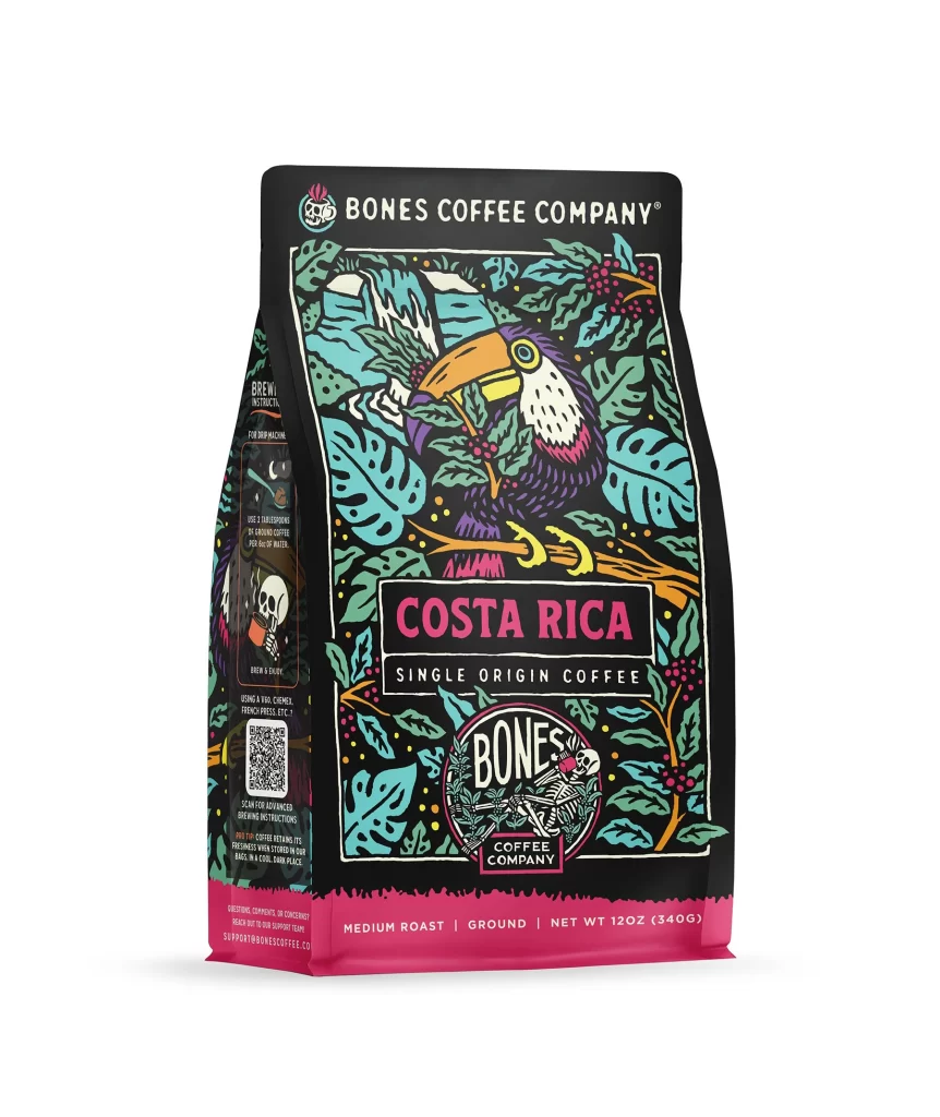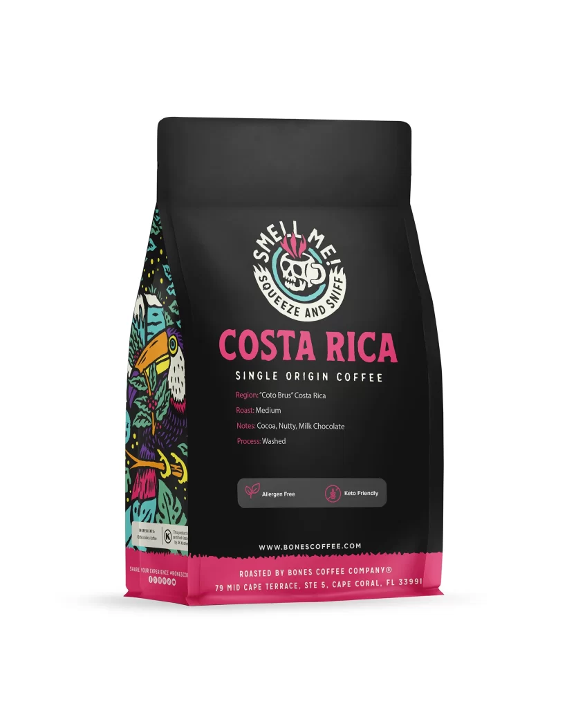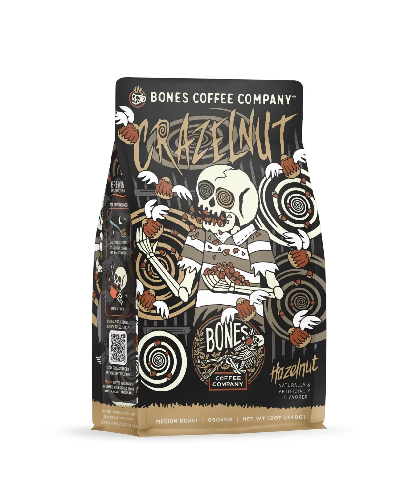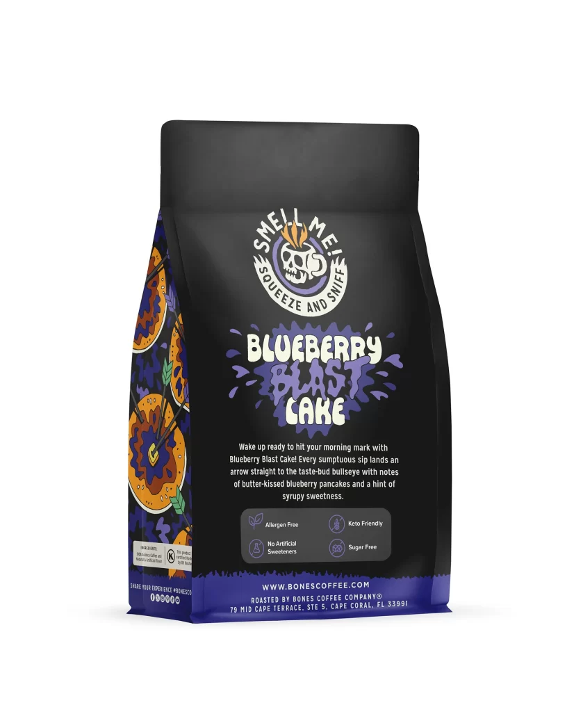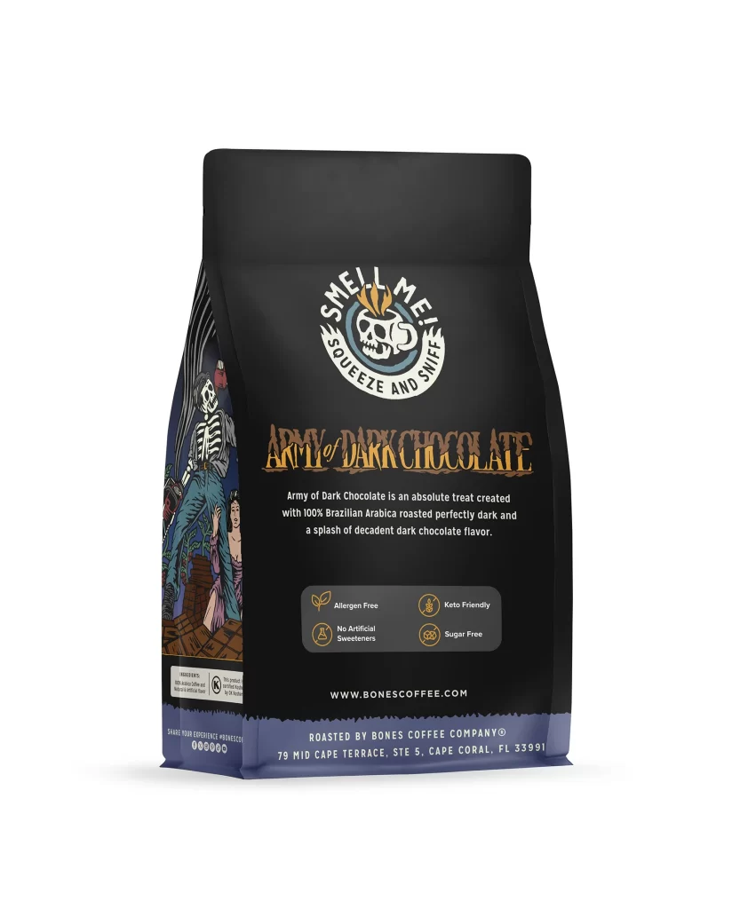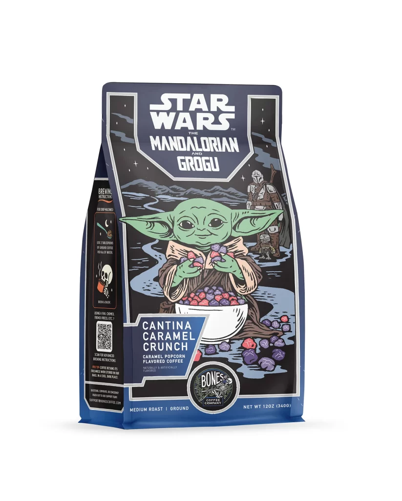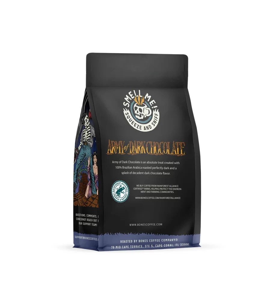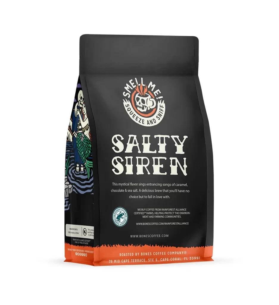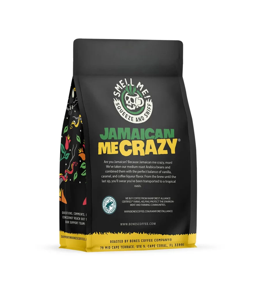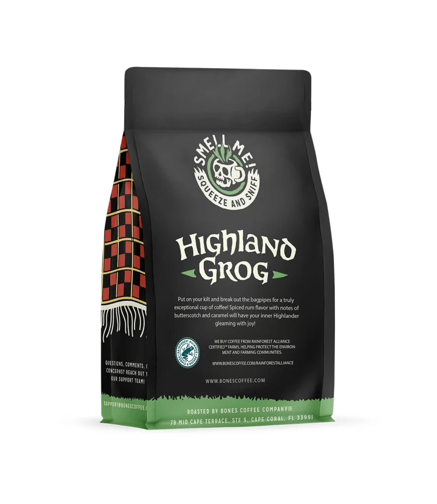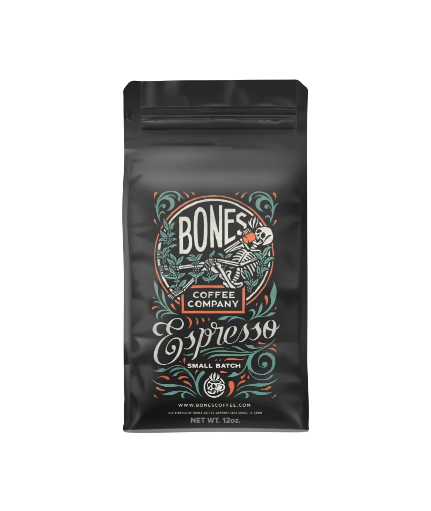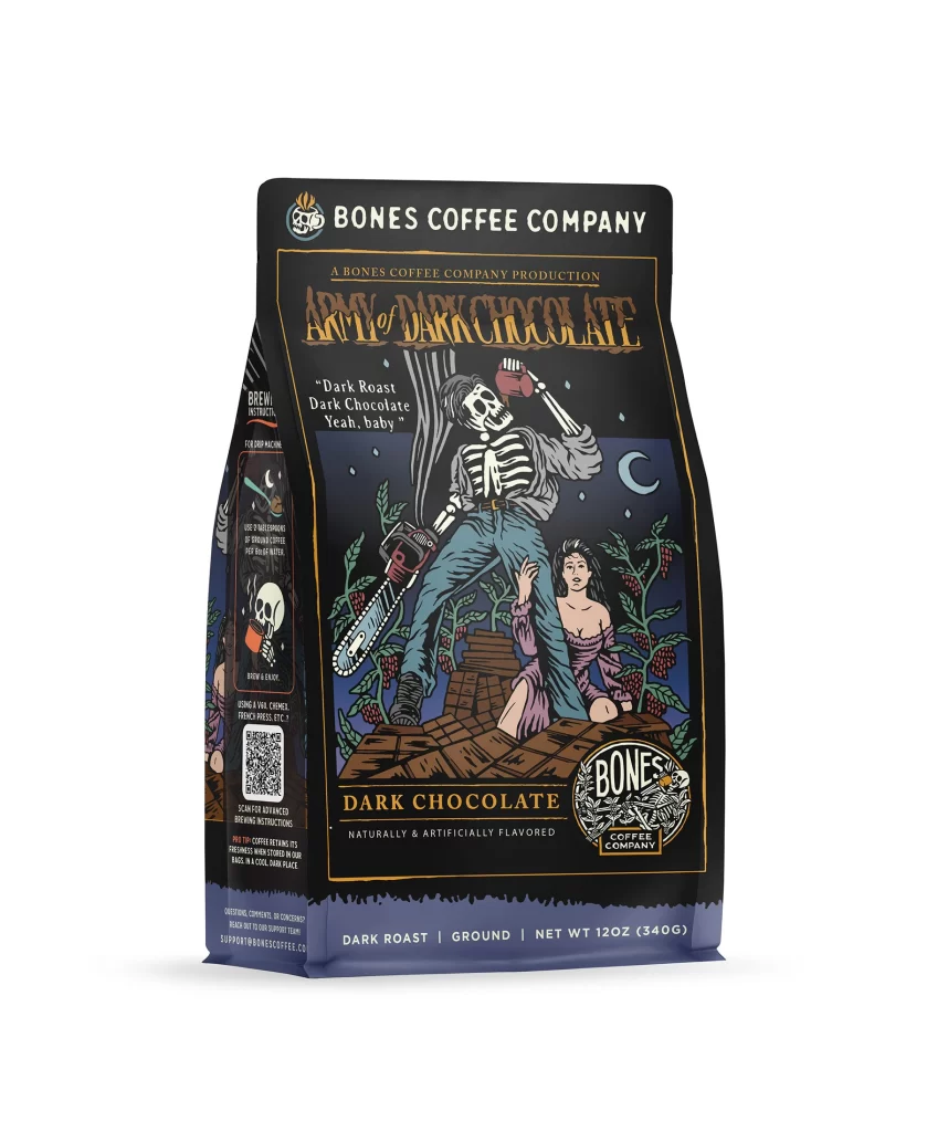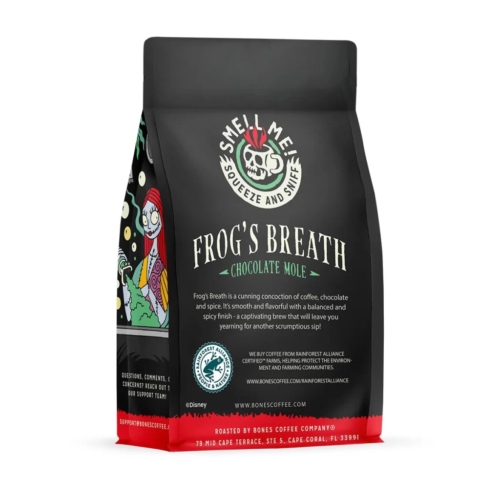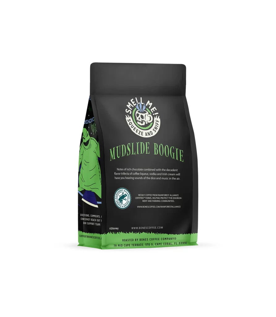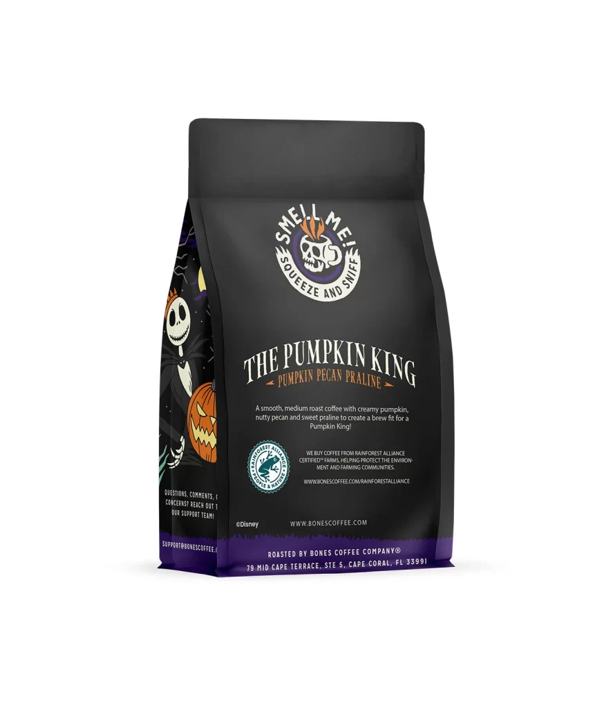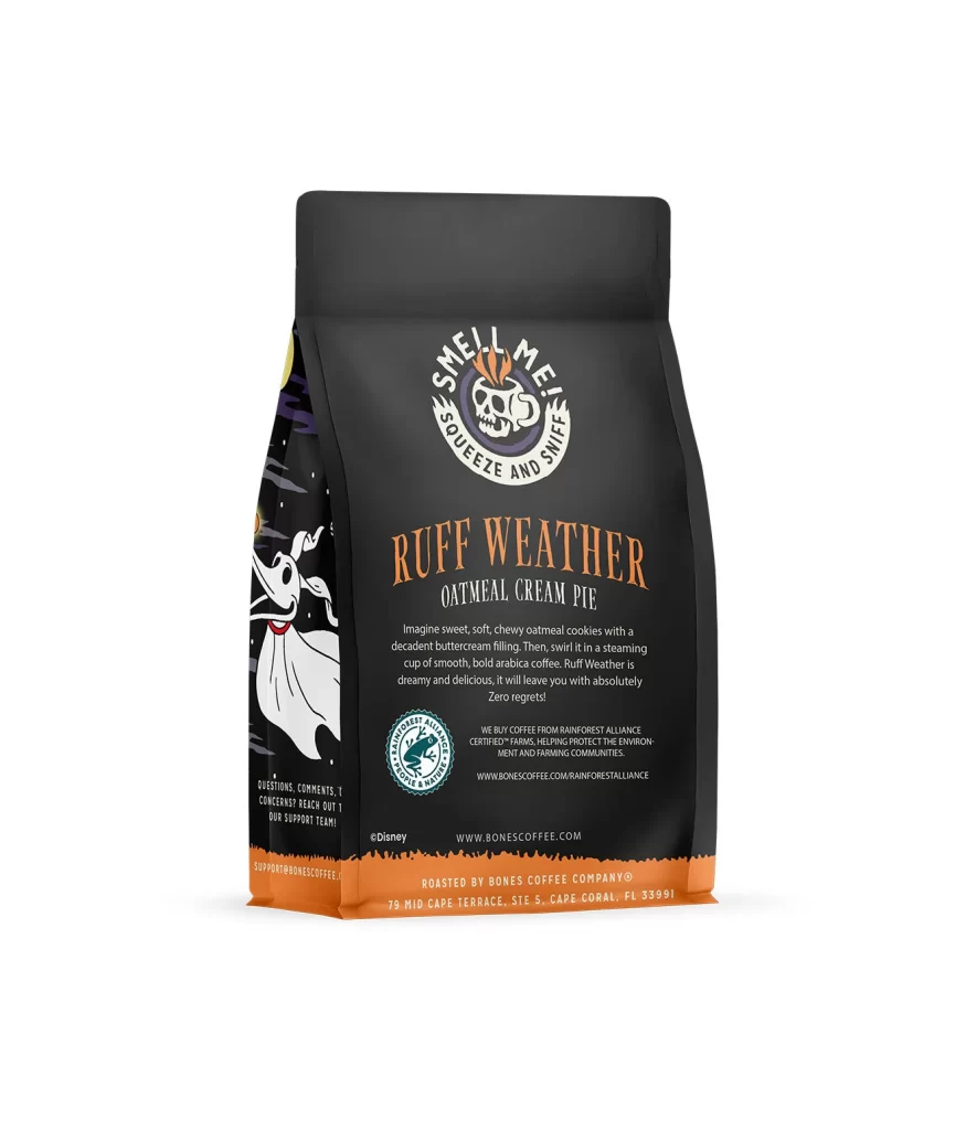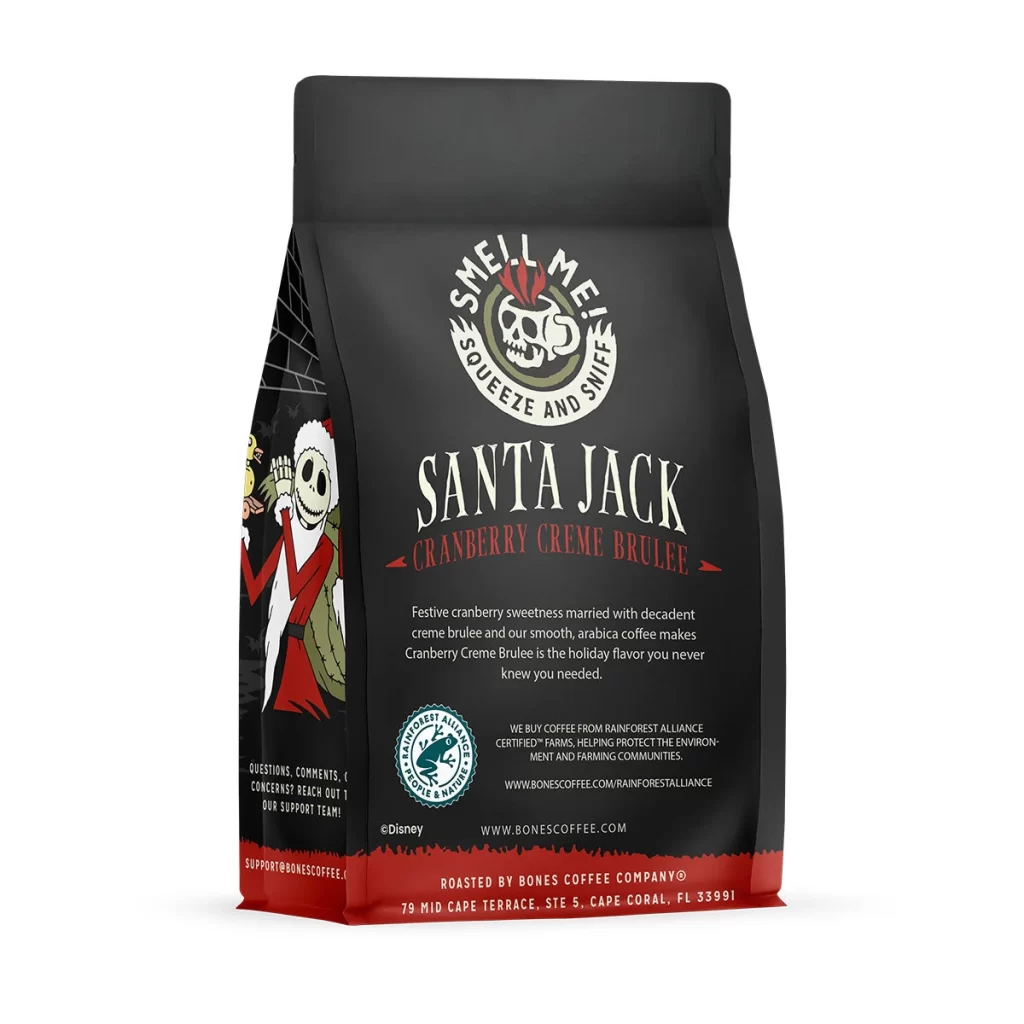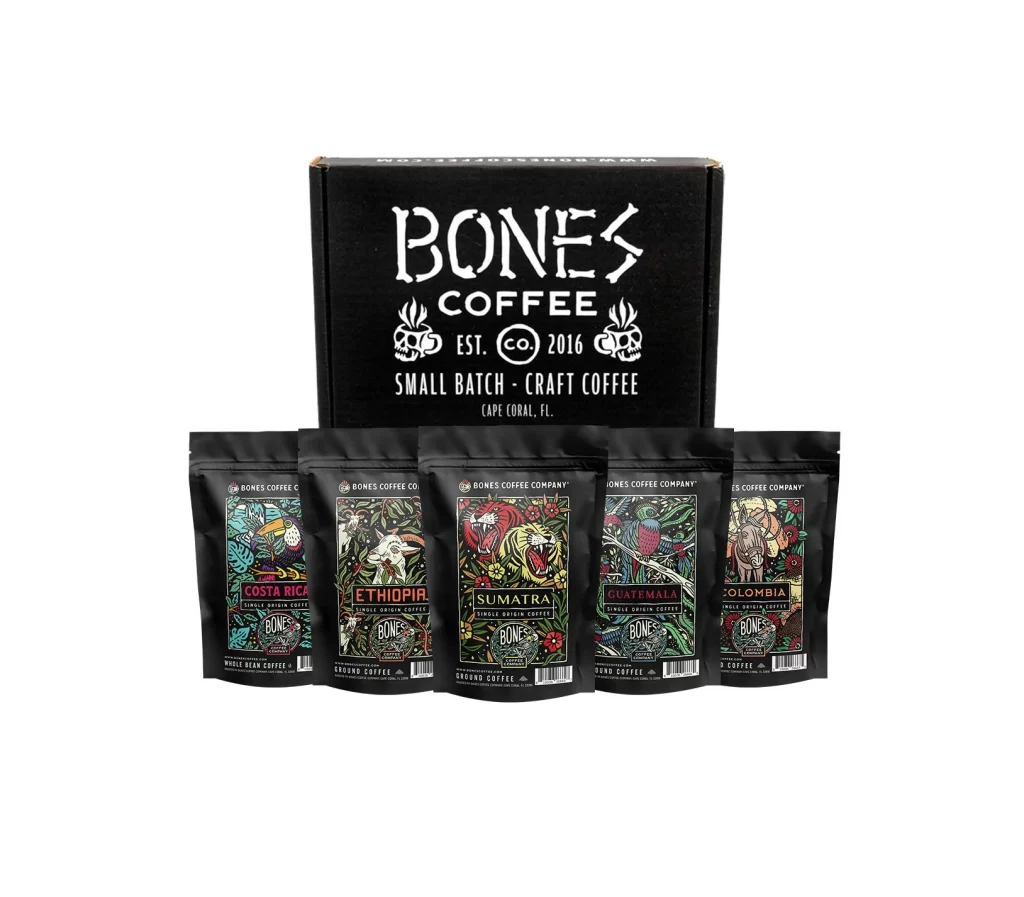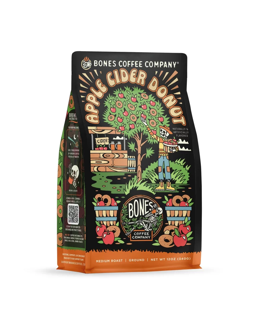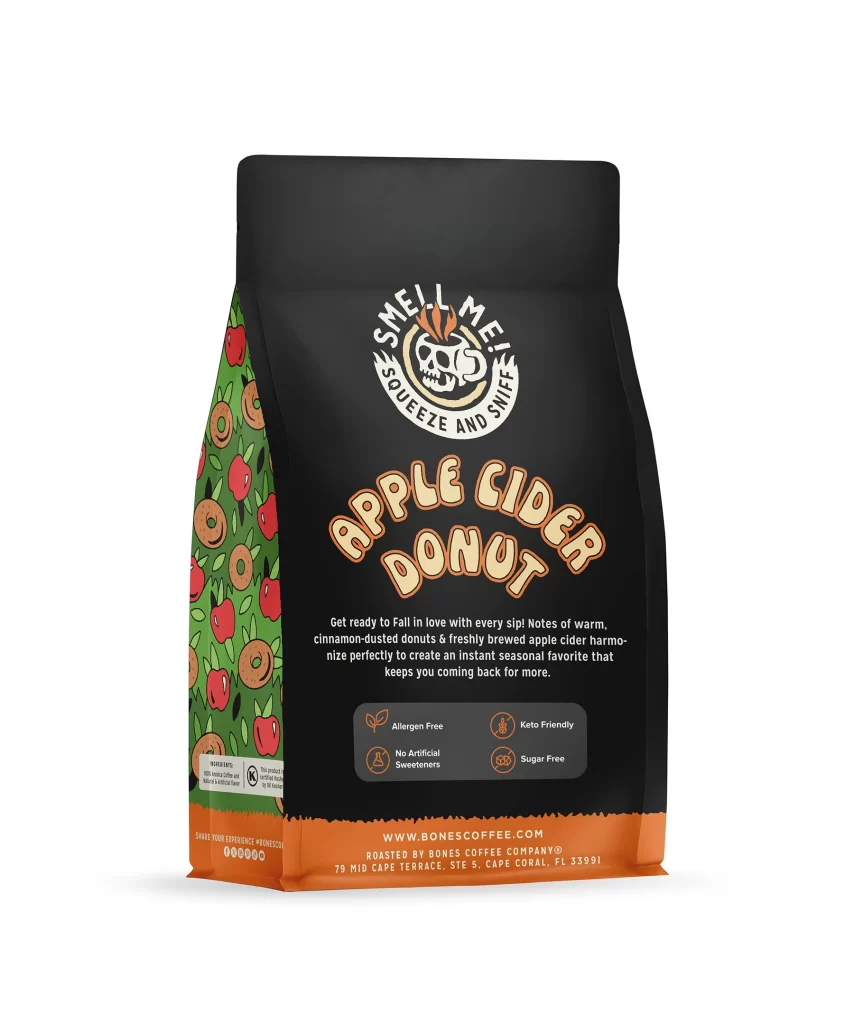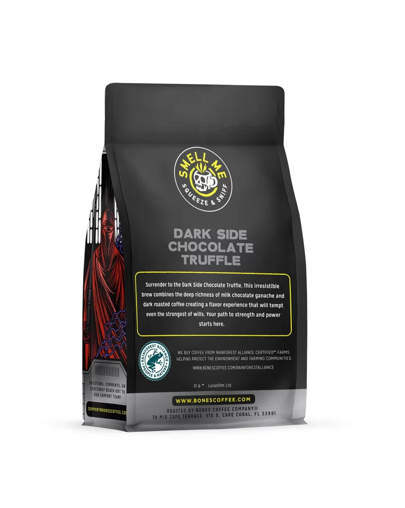
Bones Coffee Dark Side Chocolate Truffle Coffee Bag Back Packaging
Topics
Details
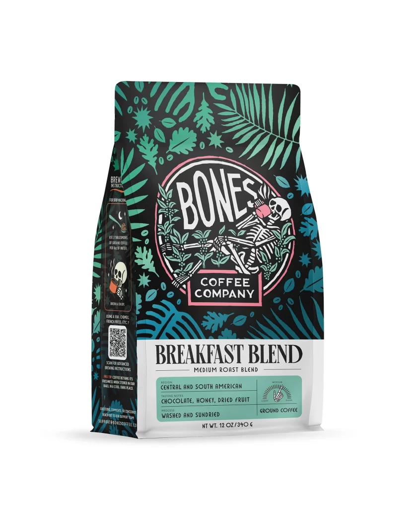
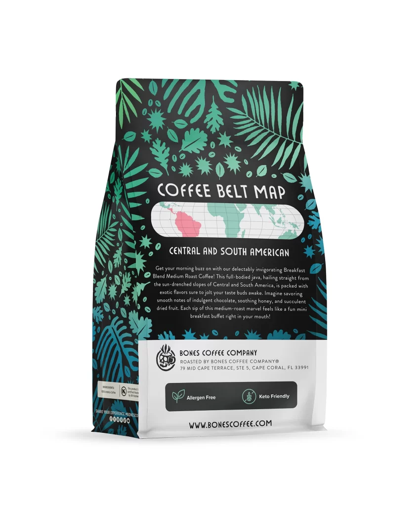
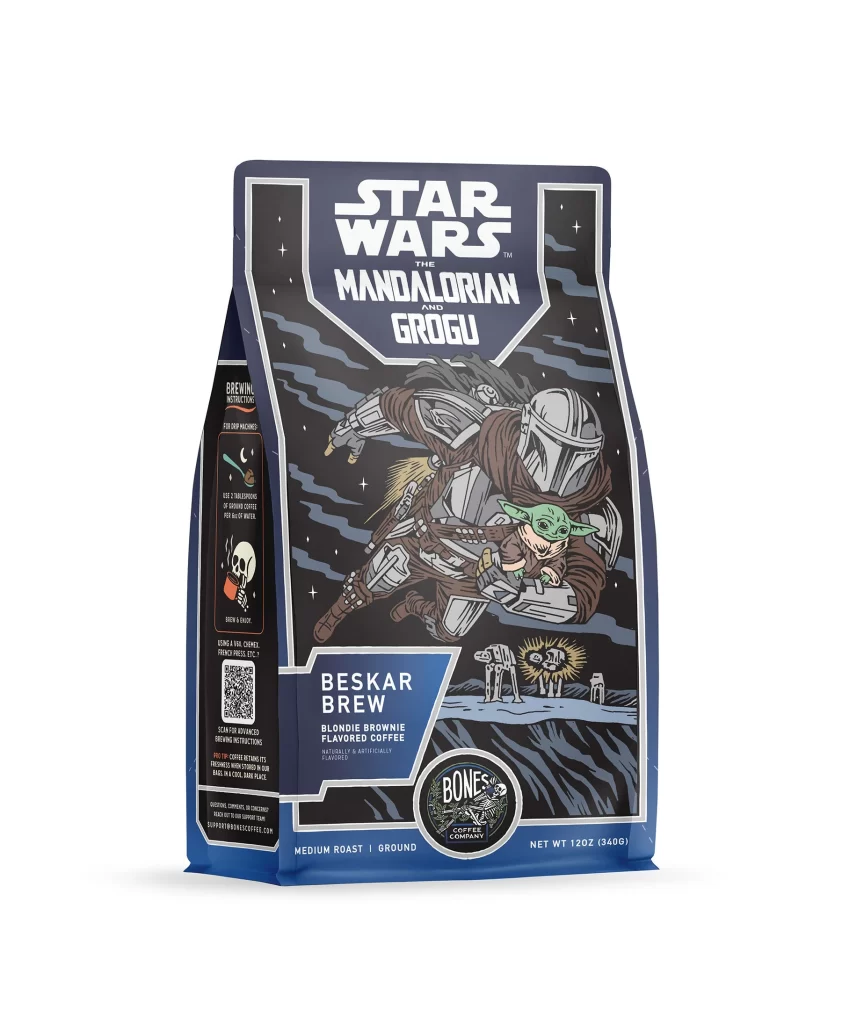
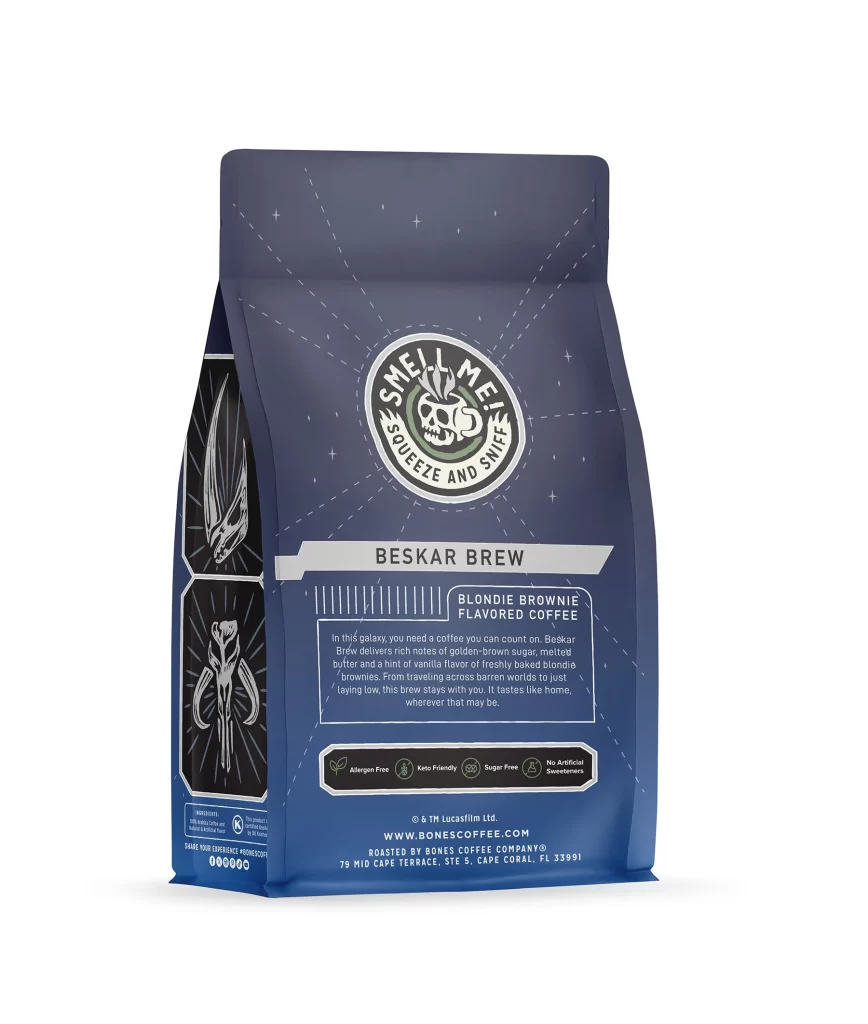
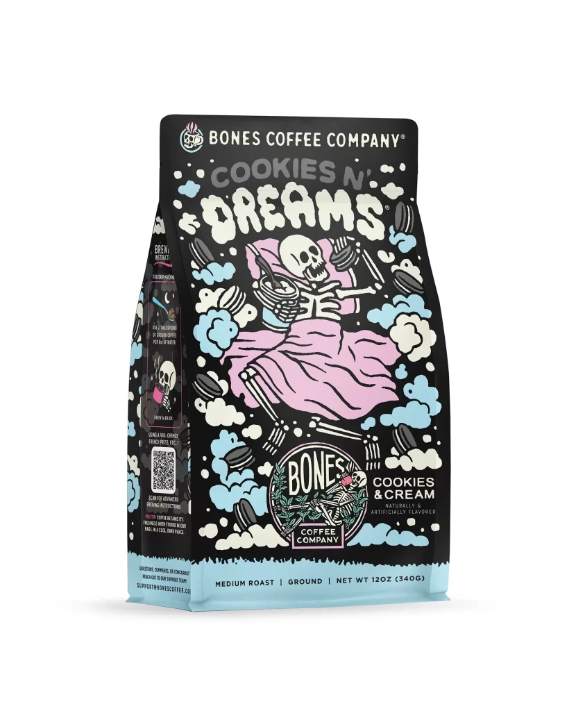
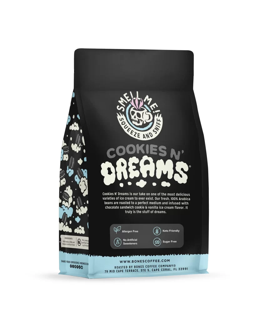
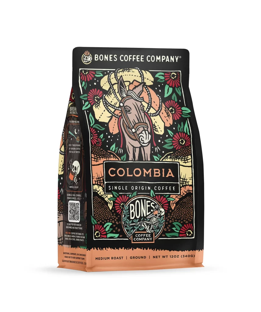
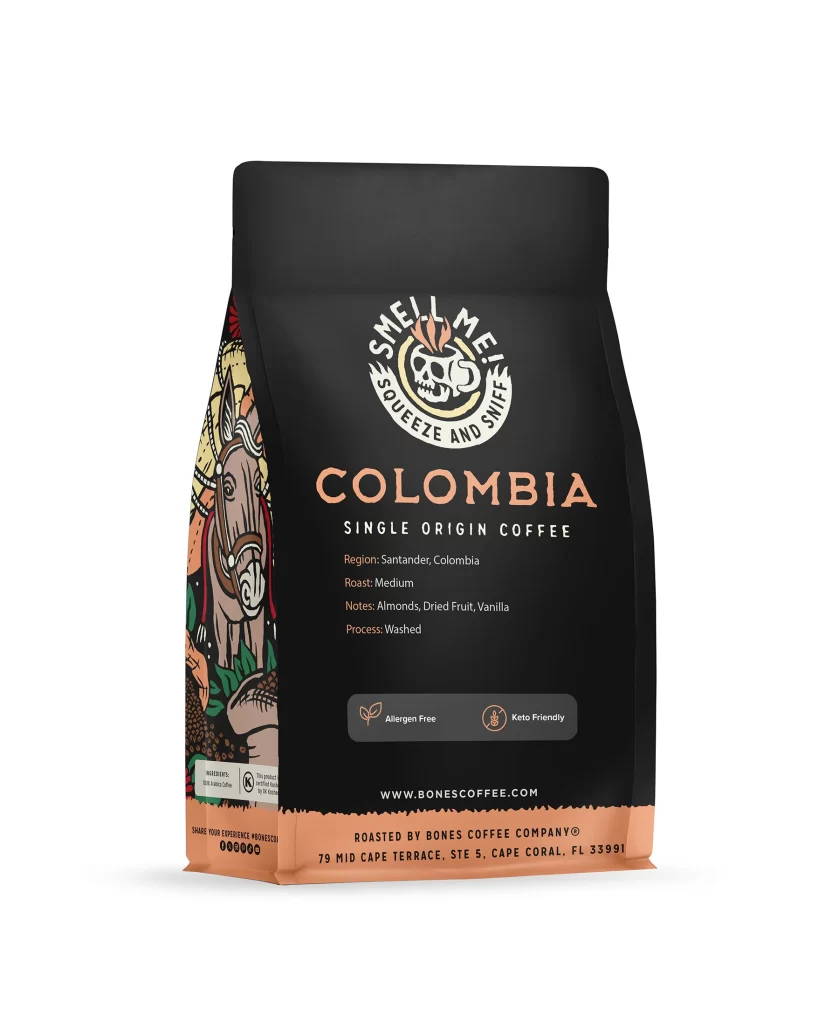
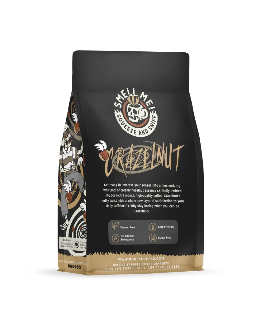
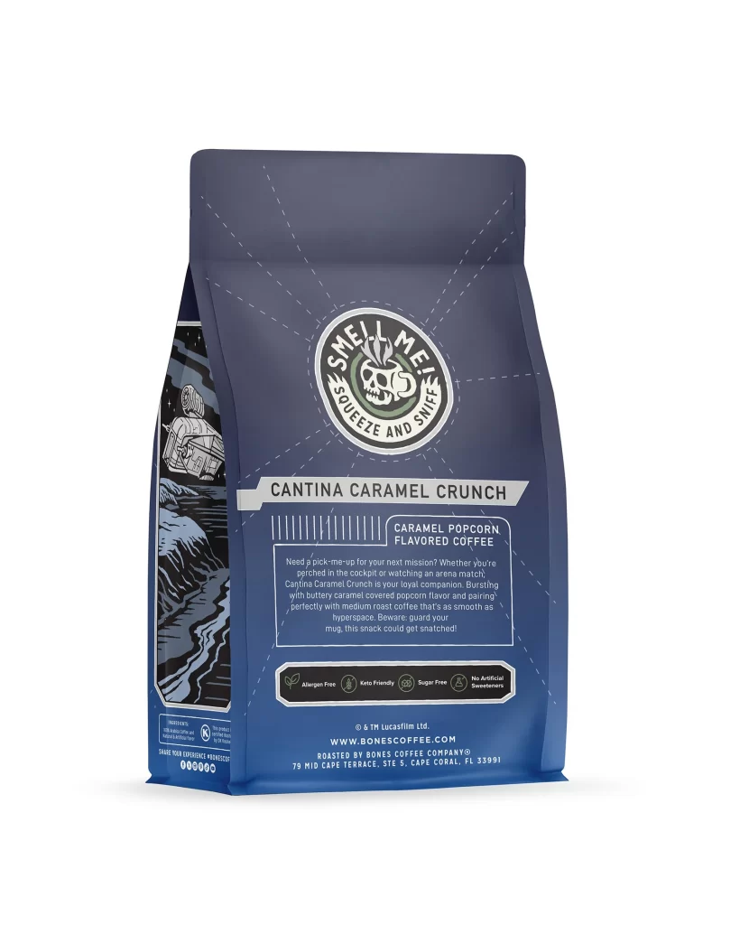
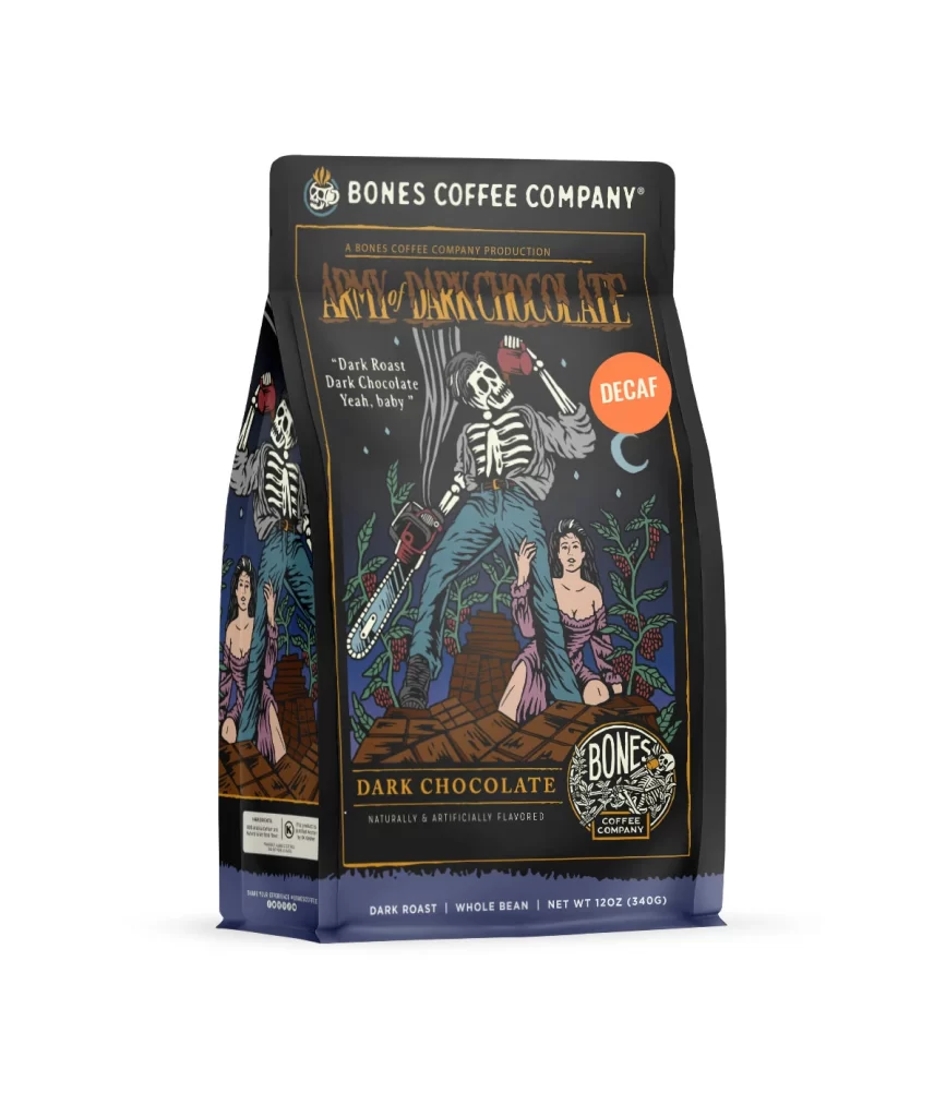
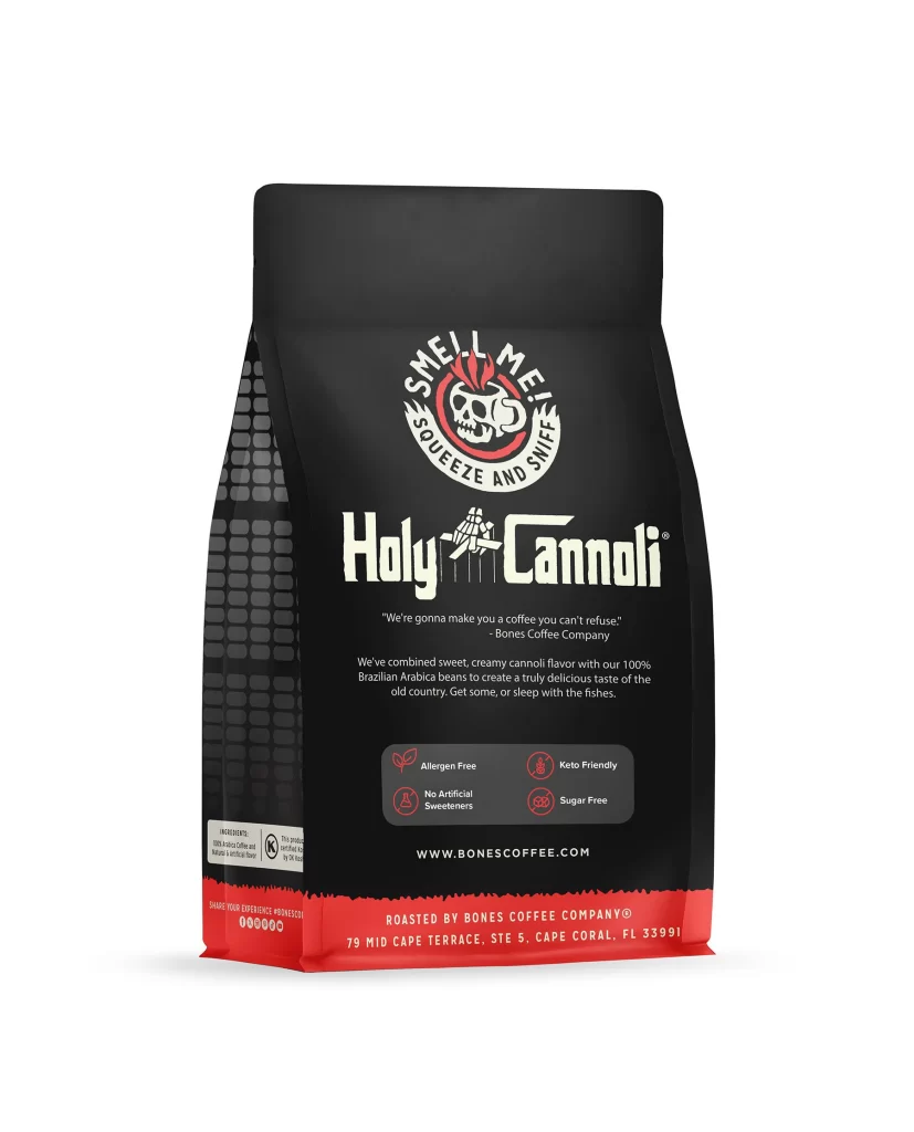
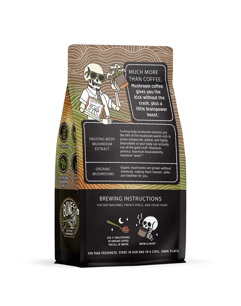
The back panel of the bag features a clean layout with a centered chocolate truffle graphic. Rich brown cocoa elements contrast against the matte black background. A white studio product photo highlights the physical package texture and material finish. The visual arrangement guides the eye downward, balancing the detailed flavor art with the required legal text and brewing instructions for the twelve ounce coffee.
Typography uses bright white sans serif fonts to ensure high legibility on the dark background. This color choice creates strong shelf appeal by evoking premium chocolate indulgence. The contrast between the dark packaging and the creamy truffle imagery stimulates appetite appeal. Minimalist text blocks keep the design uncluttered, allowing the rich flavor description to stand out clearly to consumers browsing store shelves.
Designers can learn from this effective use of negative space and high contrast imagery. The composition balances regulatory information with enticing visual cues. Using a limited color palette focused on dark tones and white text maintains a premium aesthetic. This reference shows how to integrate flavor art seamlessly into functional packaging while preserving brand identity and ensuring consumer readability.