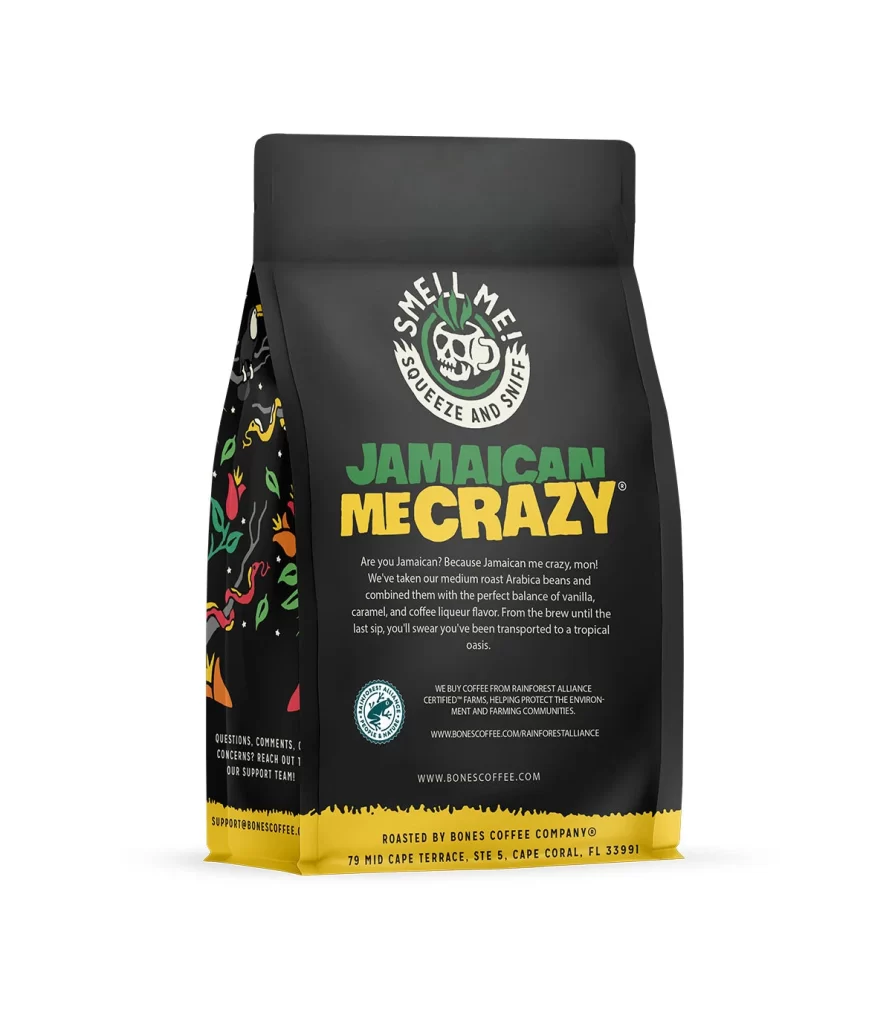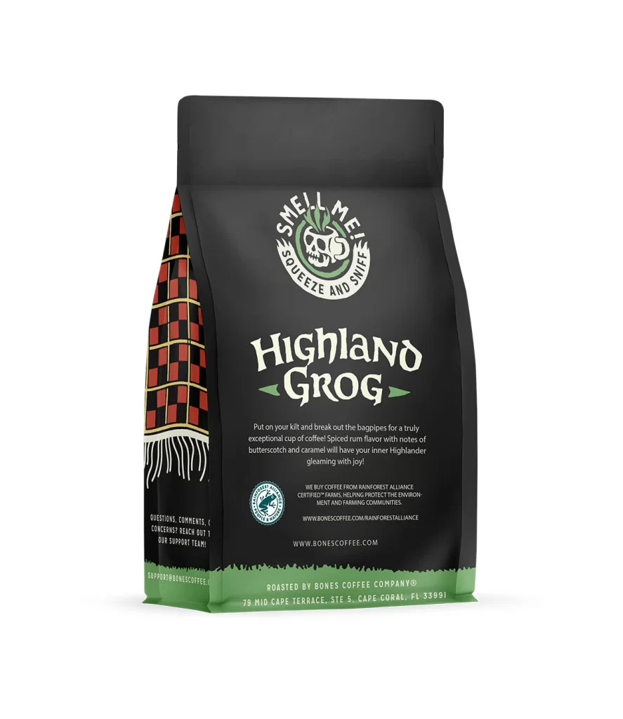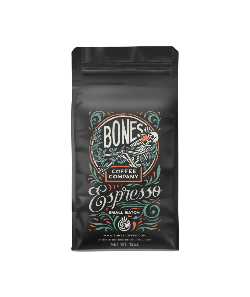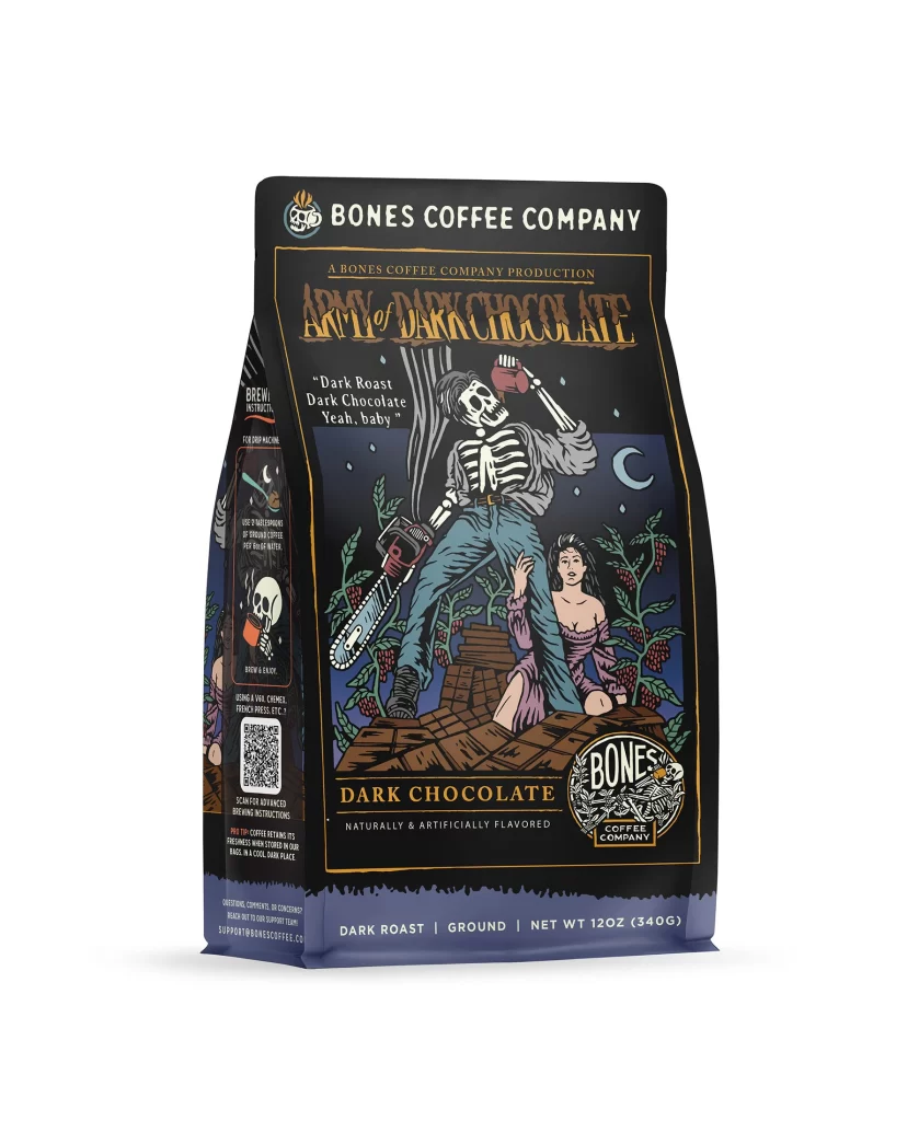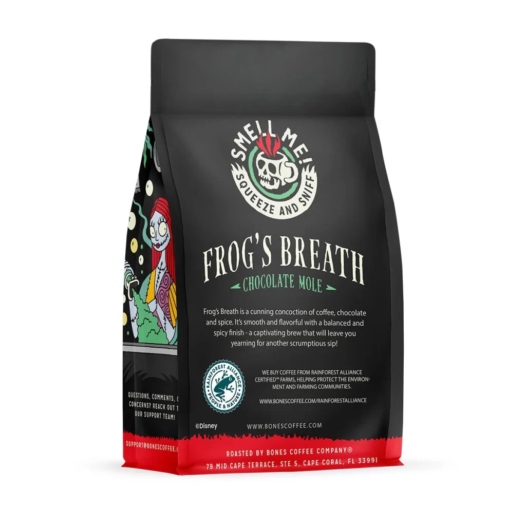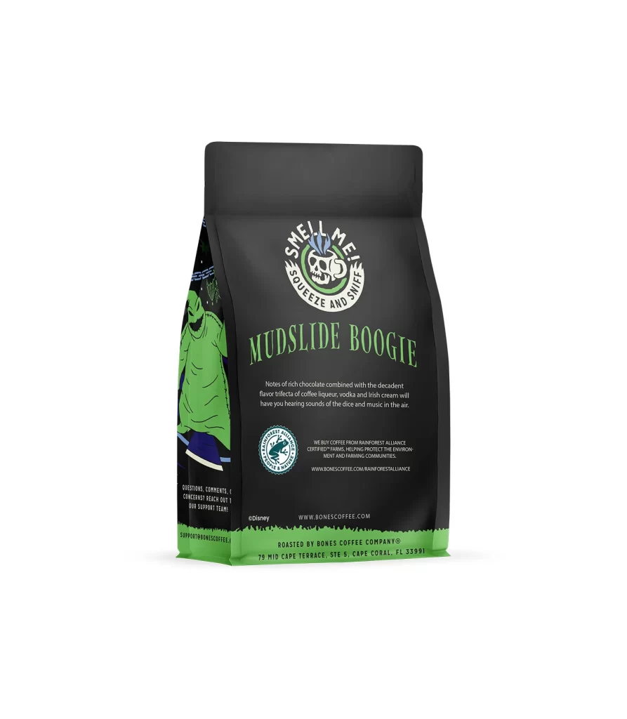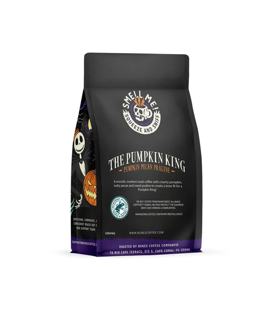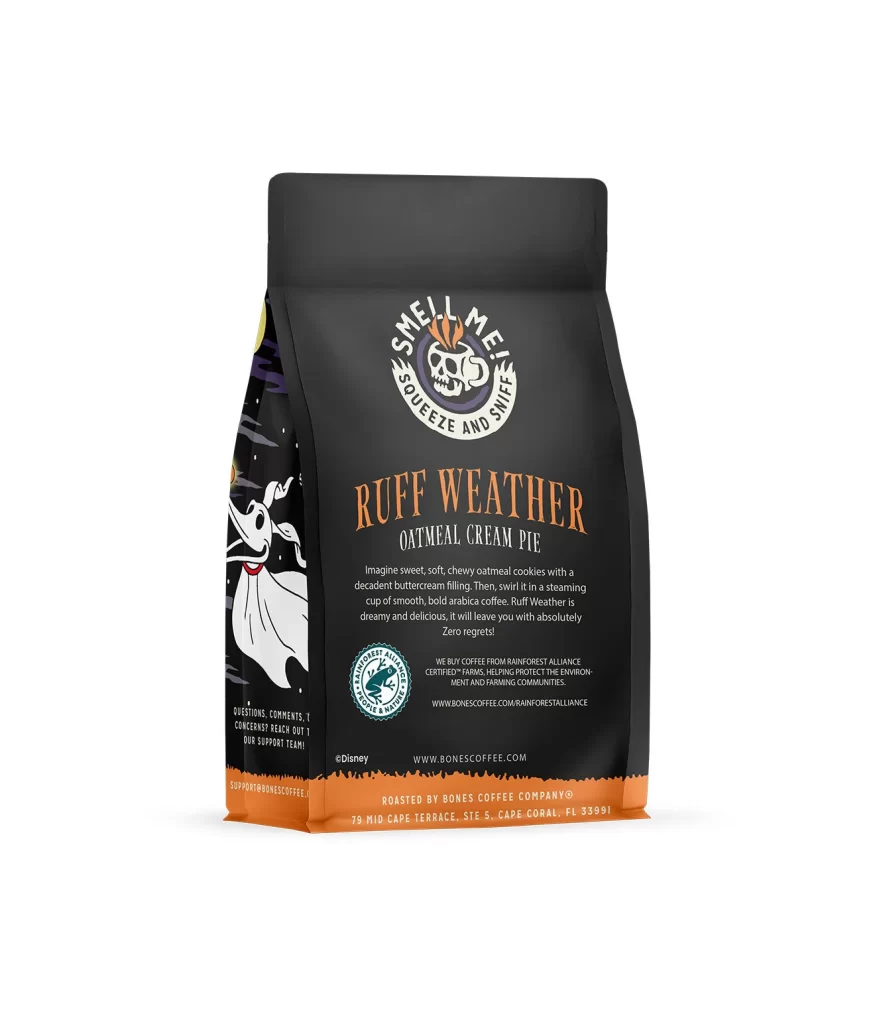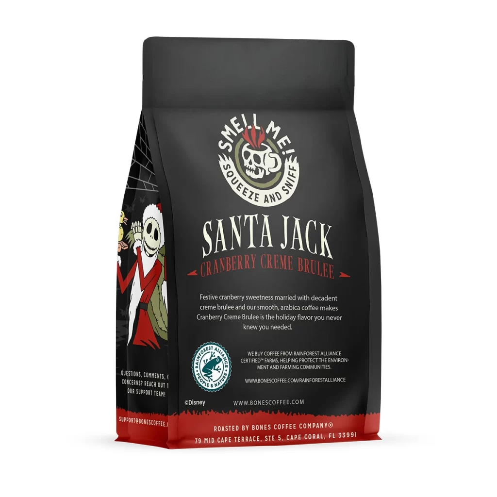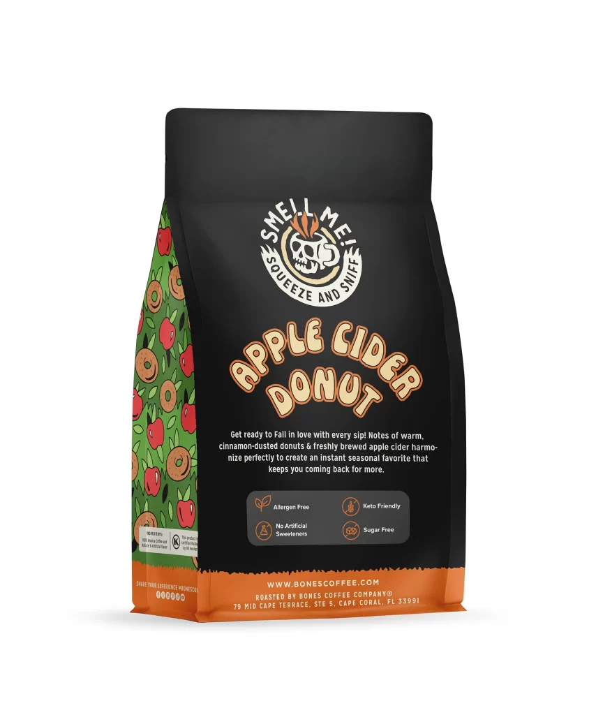
Bones Coffee Breakfast Blend Medium Roast Coffee Bag Back Packaging
Topics
Details
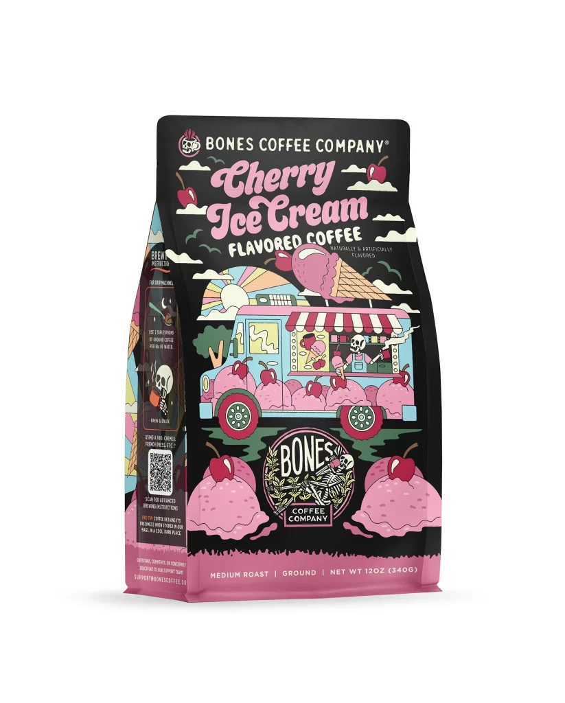
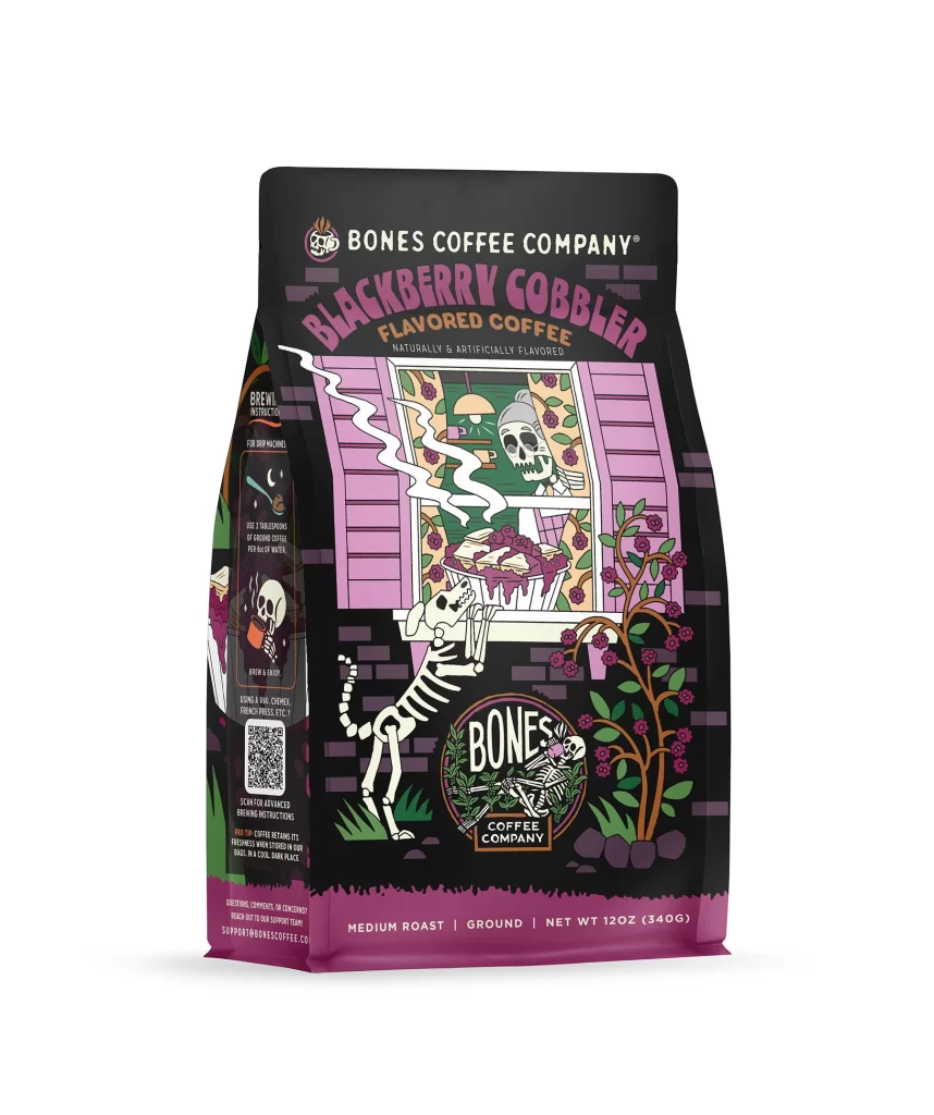
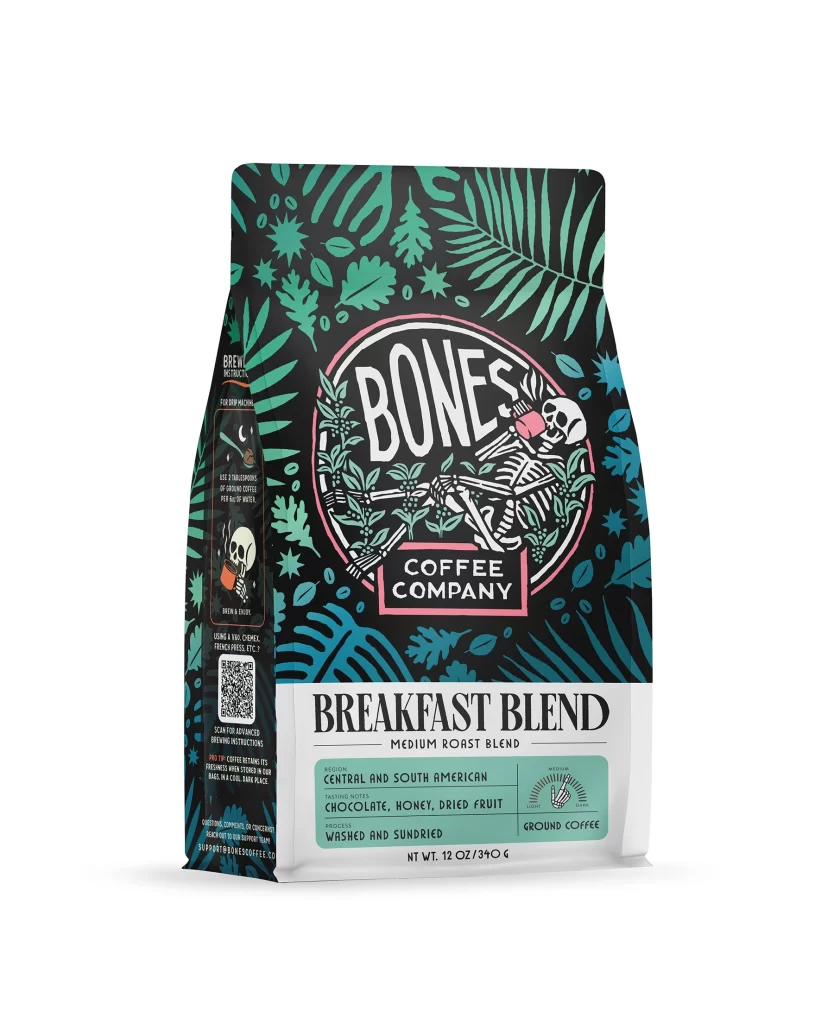
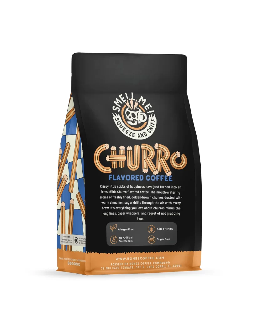
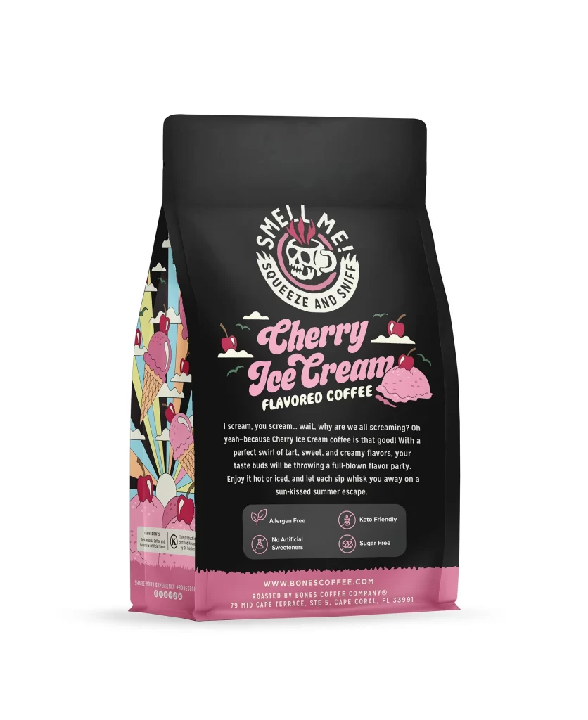
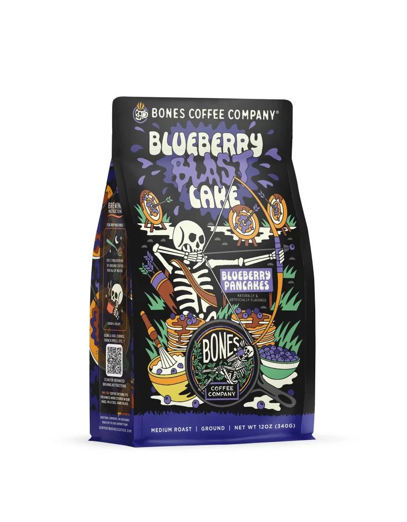
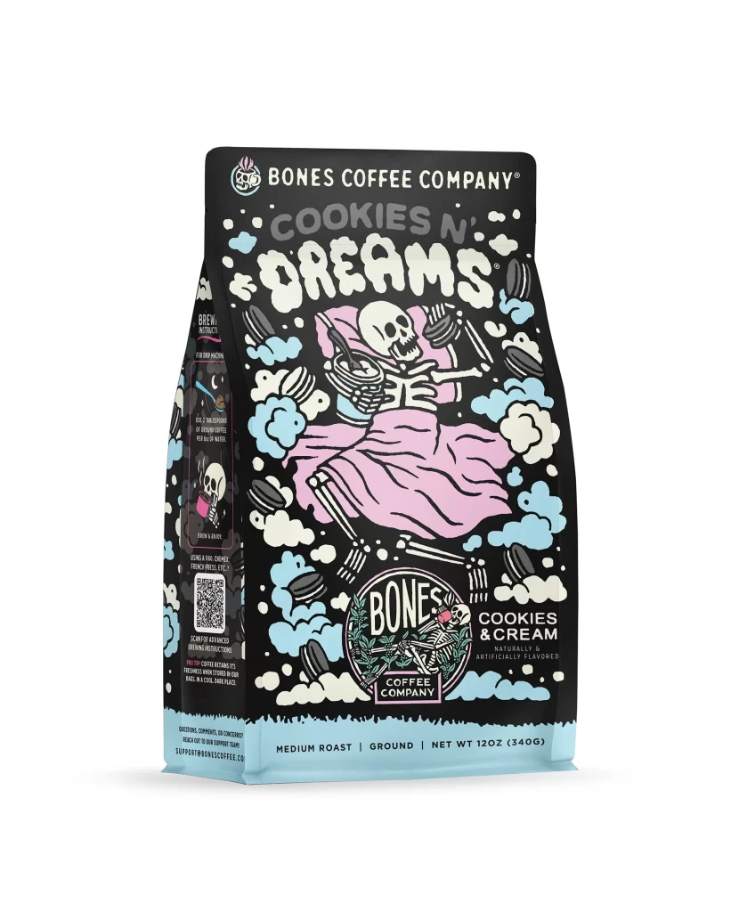
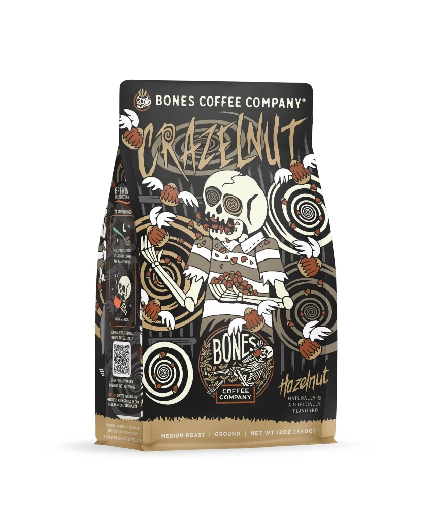
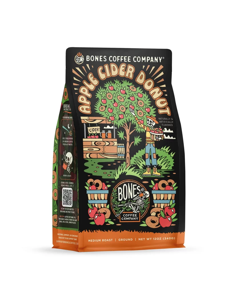
The front layout centers on a clean white background with a bold brand logo at the top. Below it sits a vibrant illustration of a classic morning meal, featuring a sunny egg and bacon. This appetizing flavor art immediately communicates the breakfast theme. The overall composition feels balanced, guiding the eye downward to the product name and weight details.
Typography uses a strong sans serif font in dark brown to evoke rich coffee beans. This color choice enhances shelf appeal by contrasting sharply with the bright background. The warm hues of the morning meal art stimulate appetite and create a welcoming vibe. Clear text hierarchy ensures quick reading, making the blend easily identifiable to shoppers browsing store aisles.
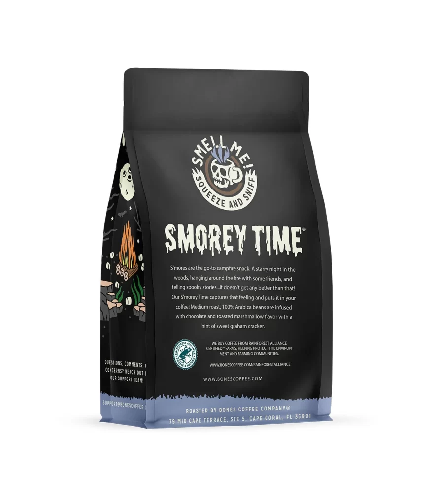
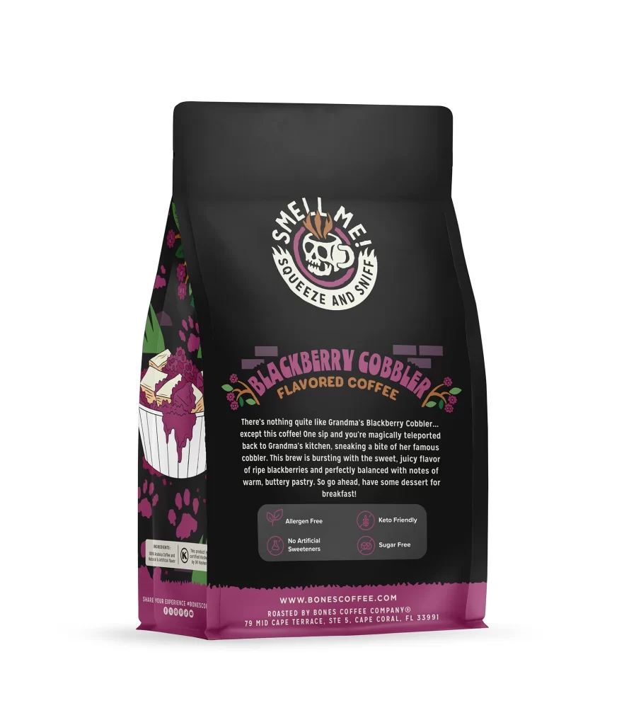
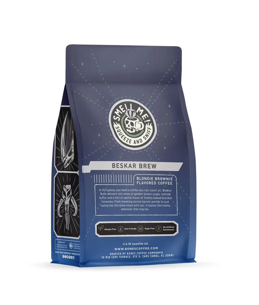
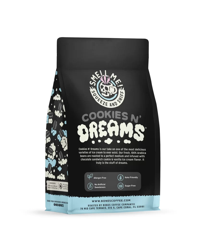
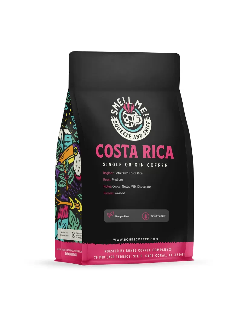
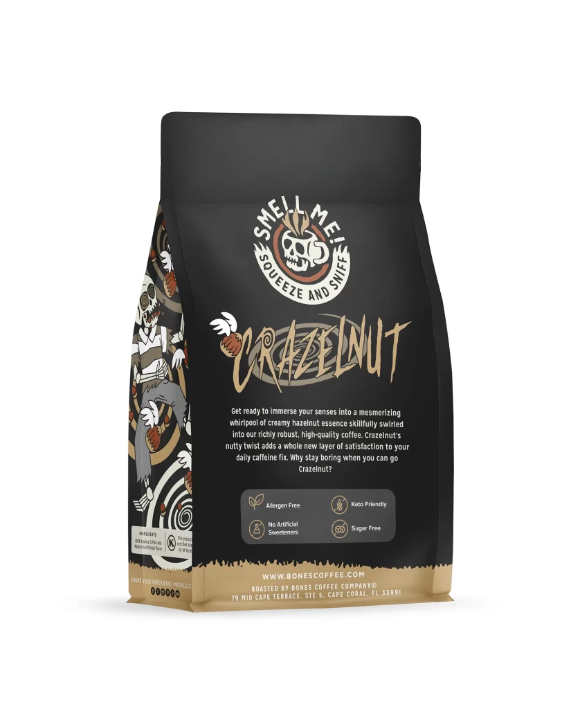
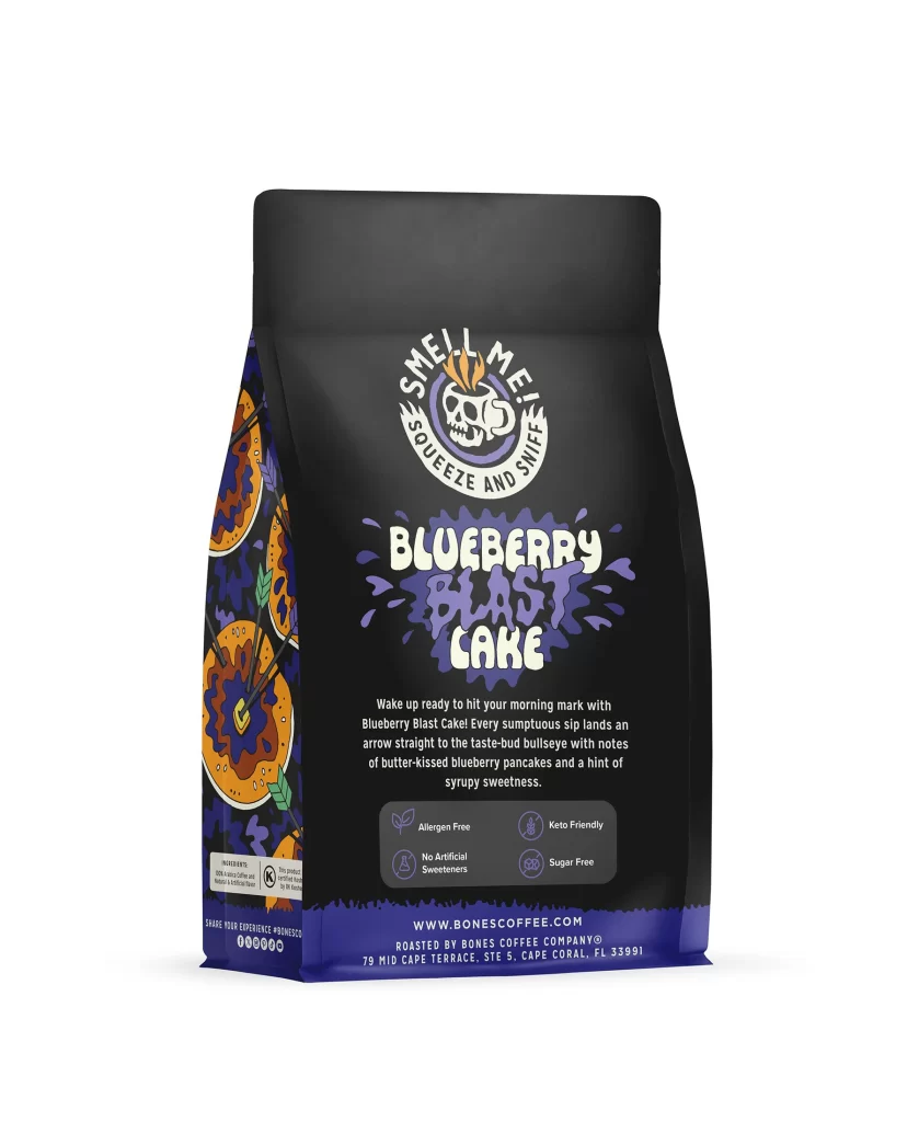
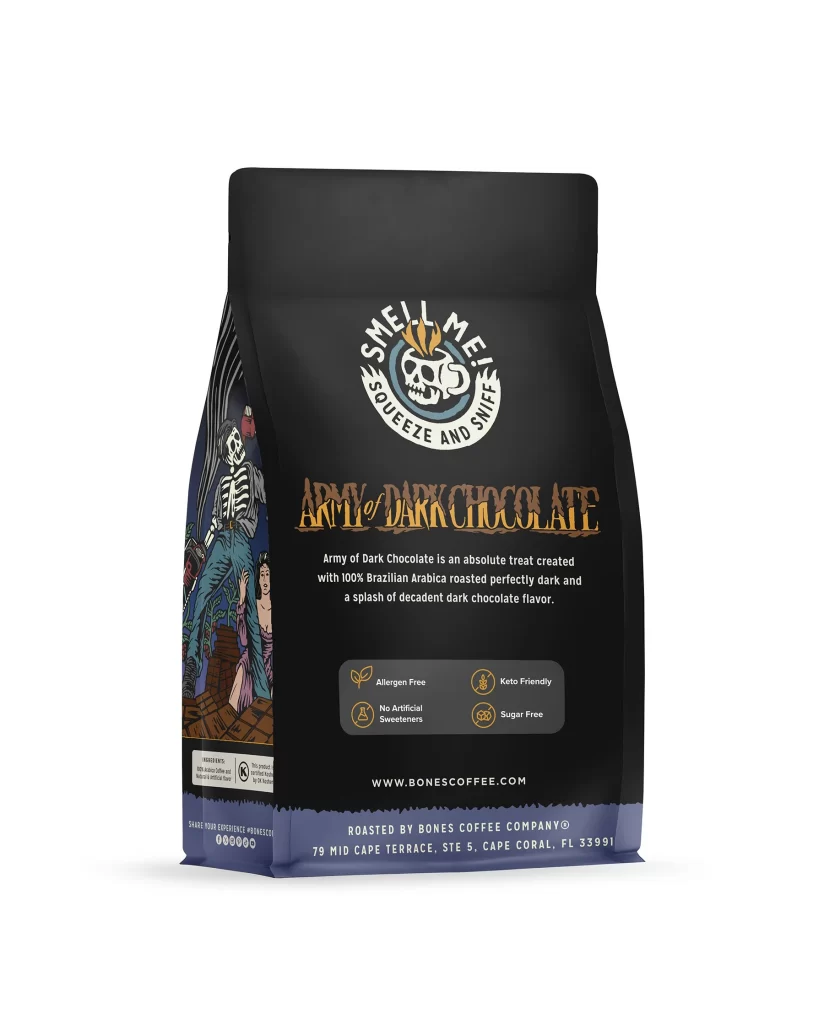
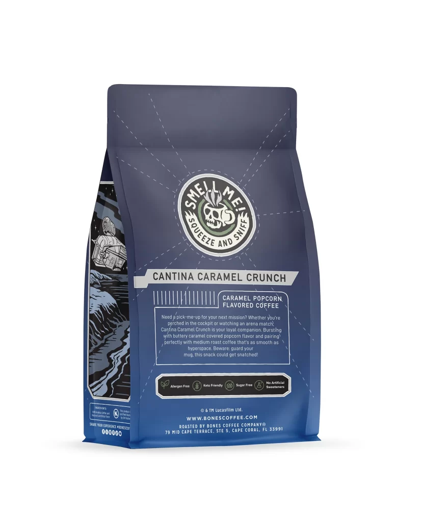
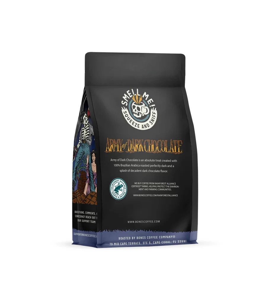
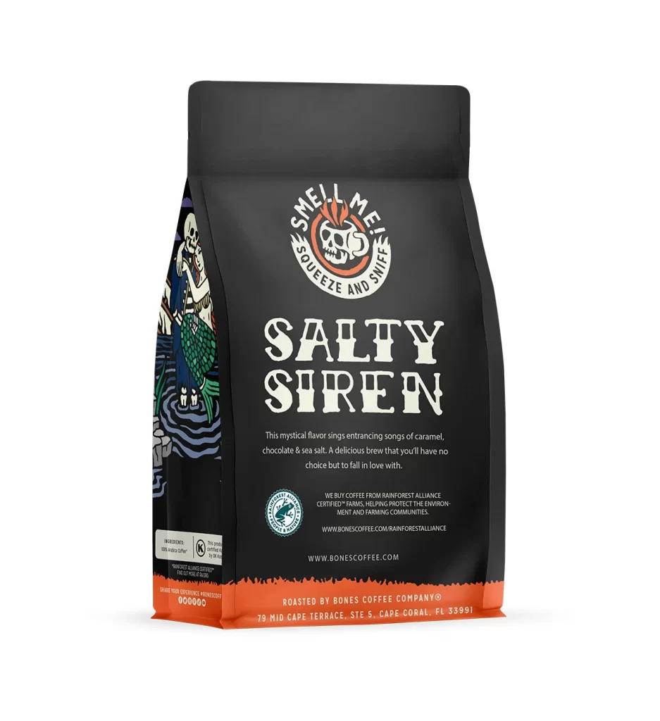
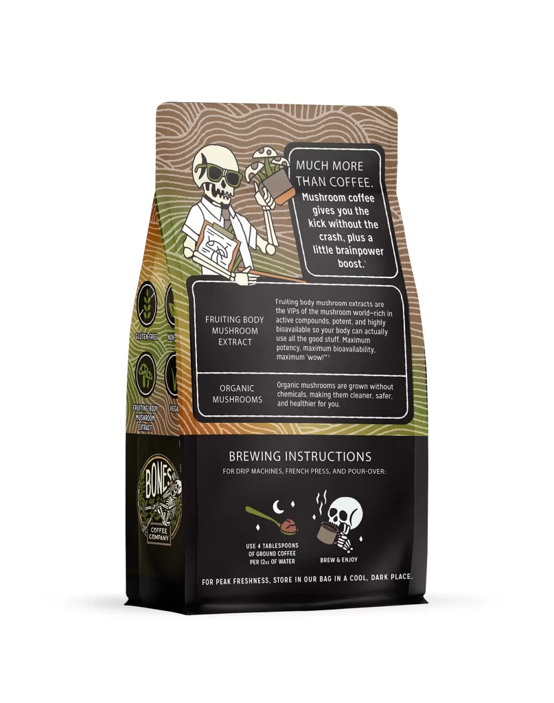
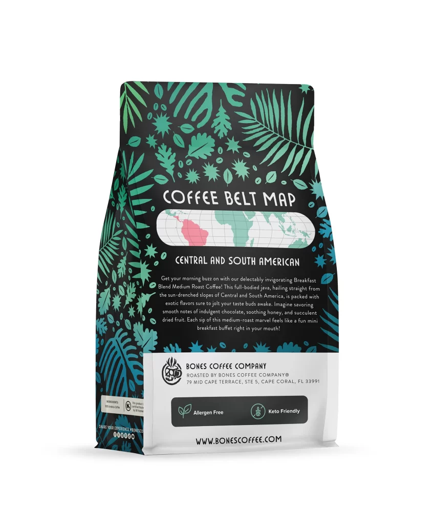
Designers should note how negative space focuses attention on the flavor art. The simple icon system on the back panel efficiently communicates dietary benefits without clutter. Using a consistent color palette across the front and back panels ties the entire bag together. This packaging succeeds by blending playful imagery with clear, functional information for a premium feel.