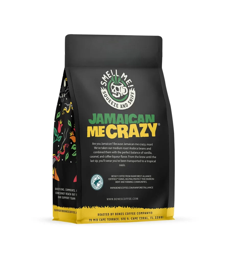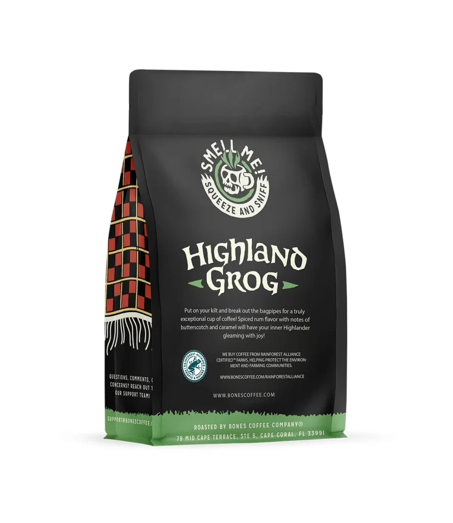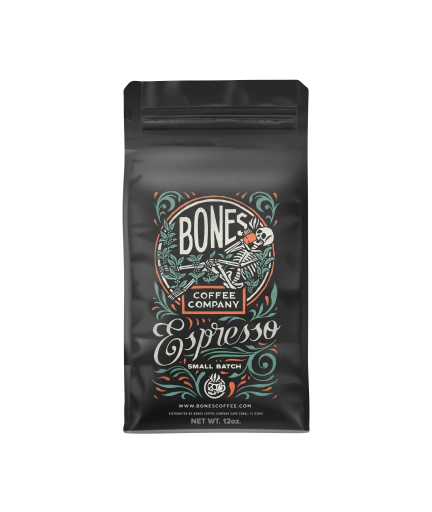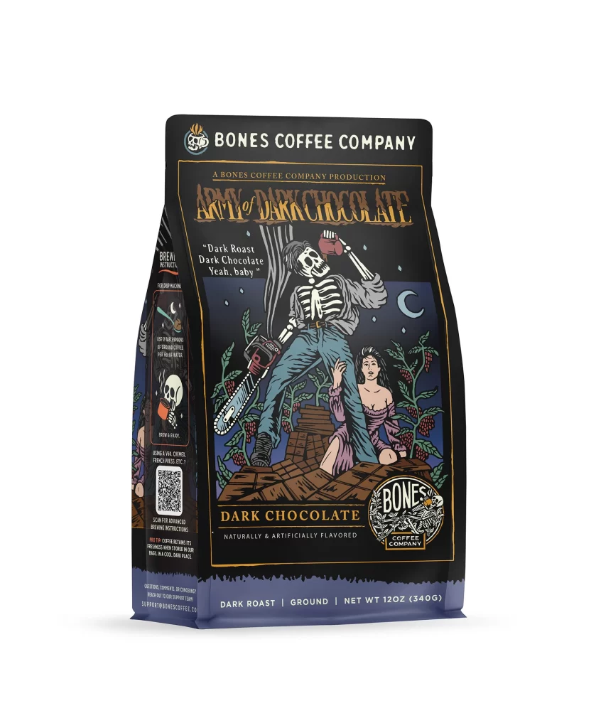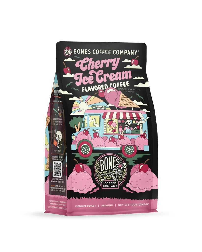
Bones Coffee Cherry Ice Cream Coffee Bag Front Packaging
Topics
Details
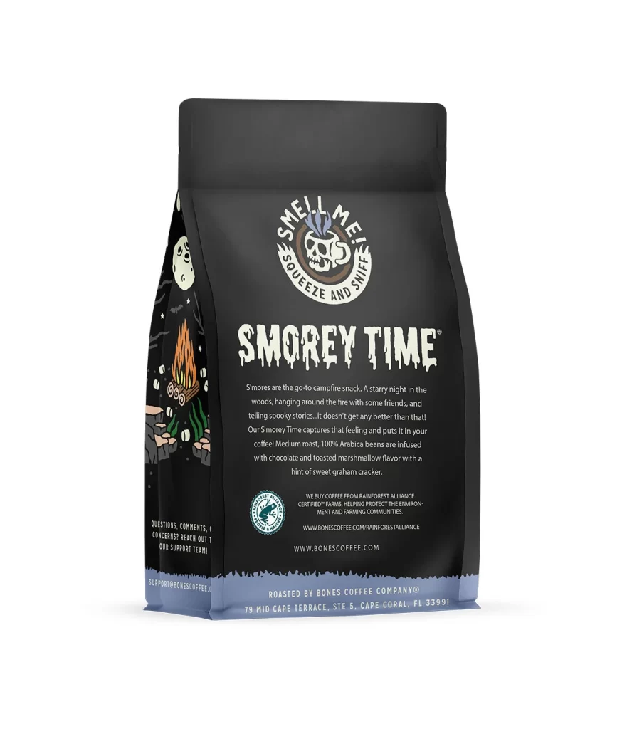
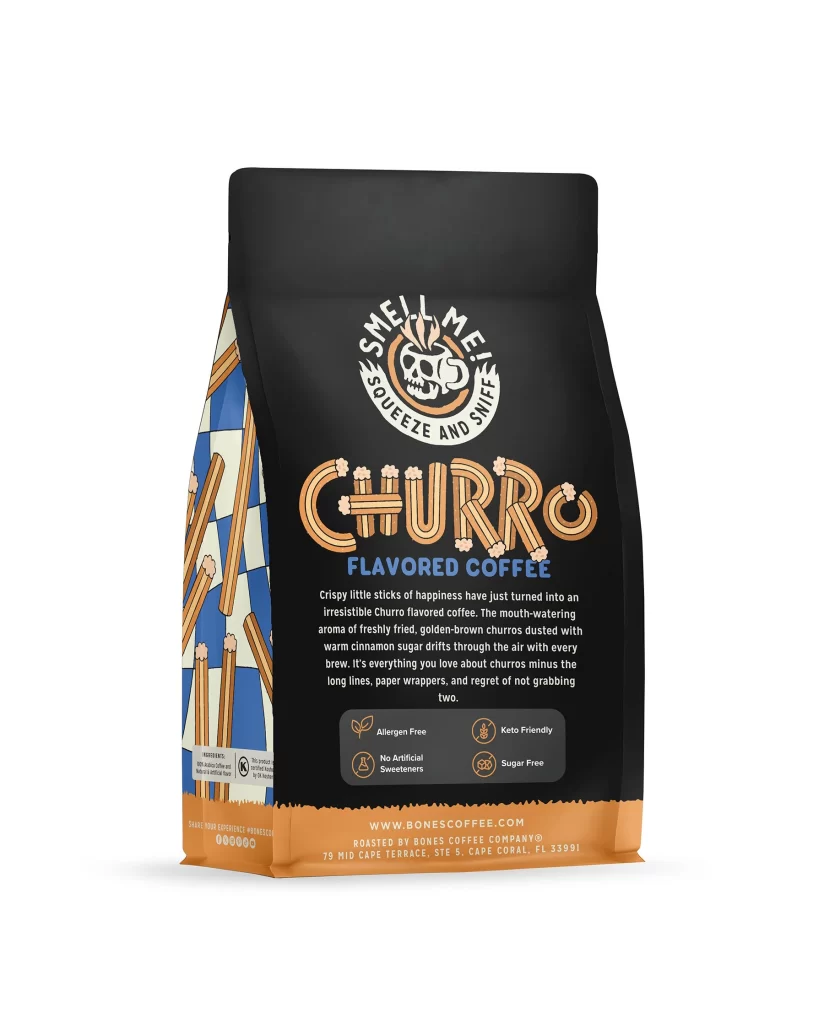
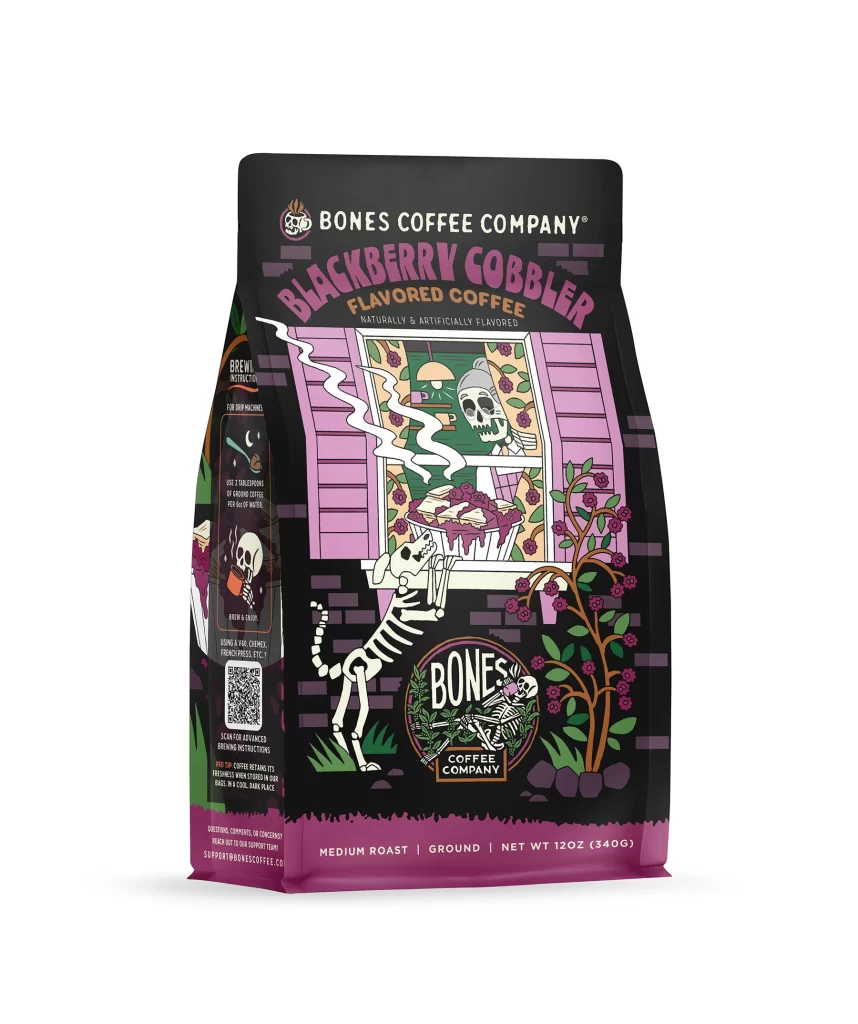
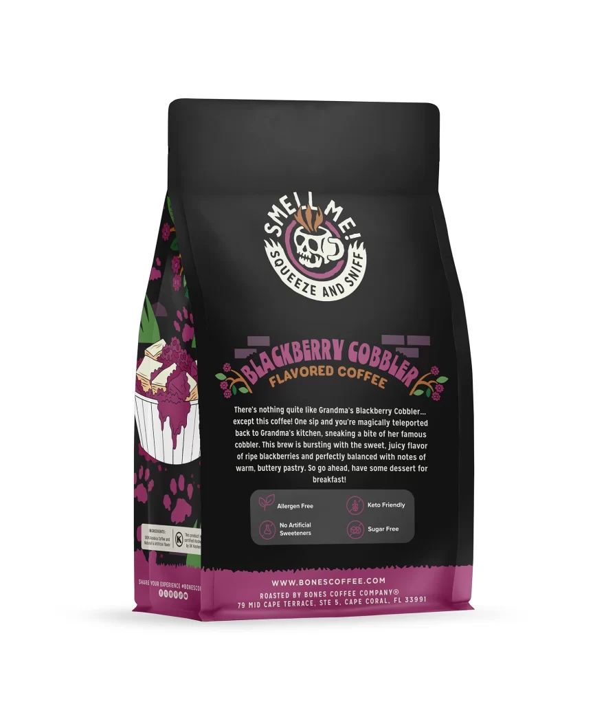
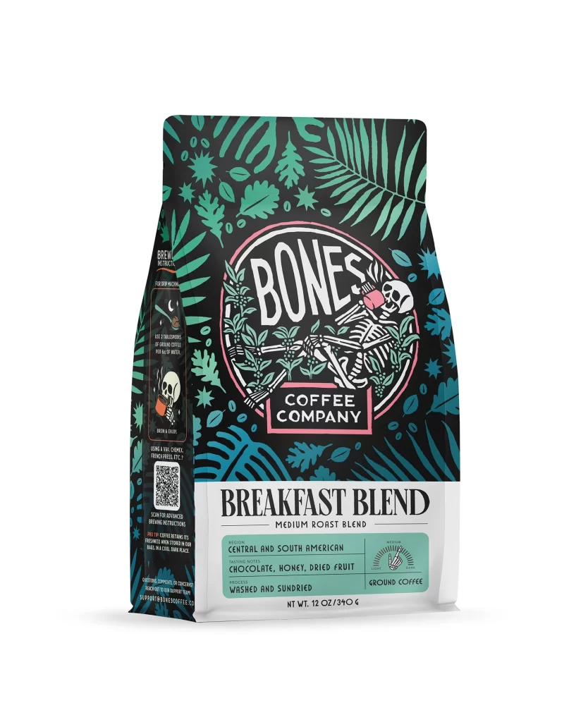
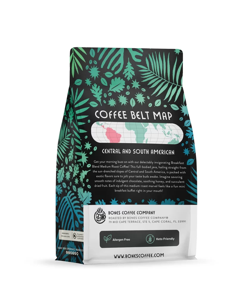
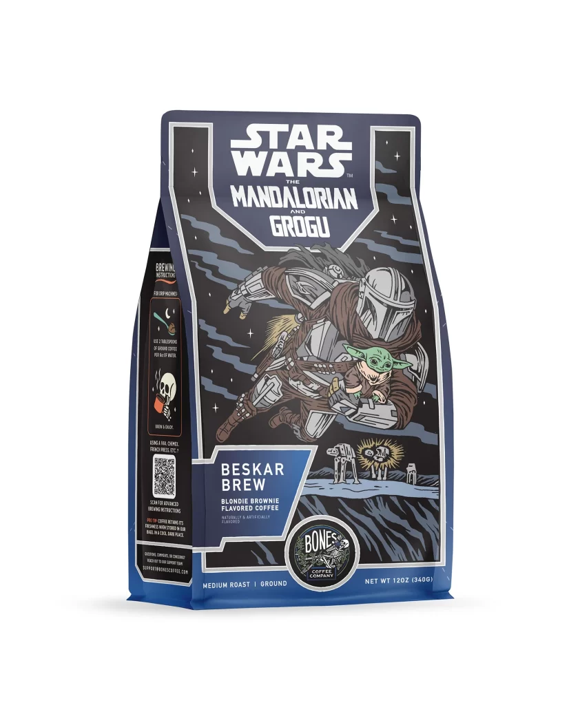
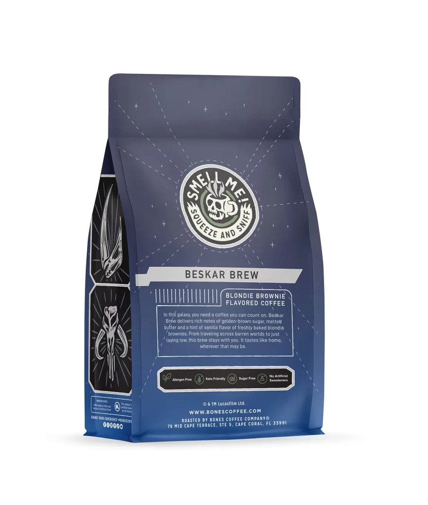
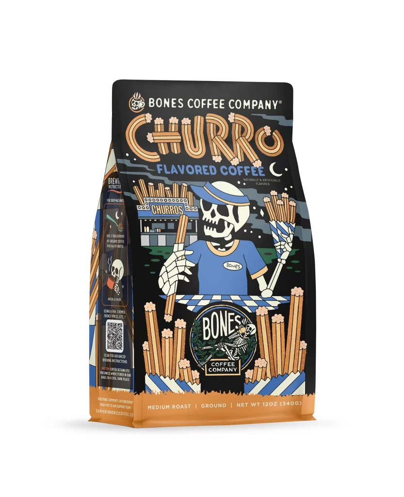
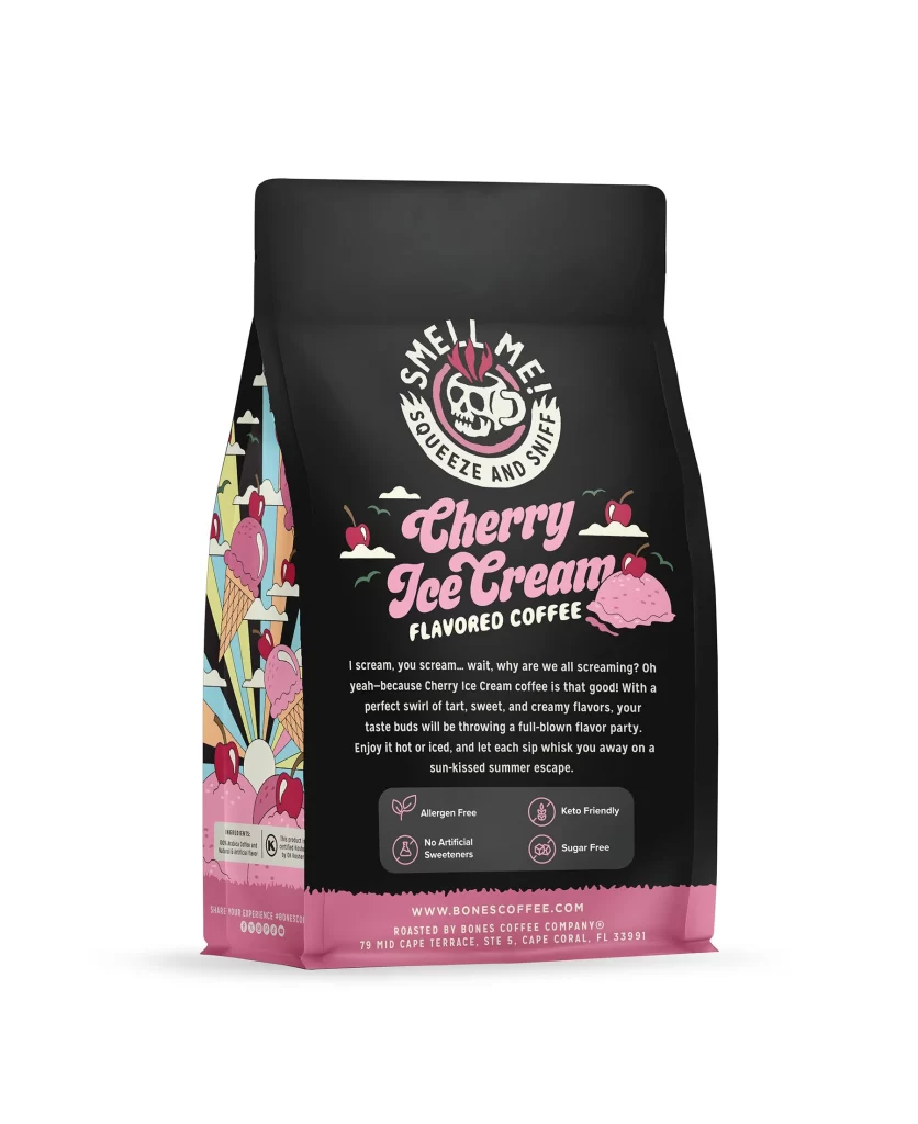
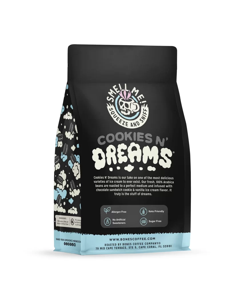
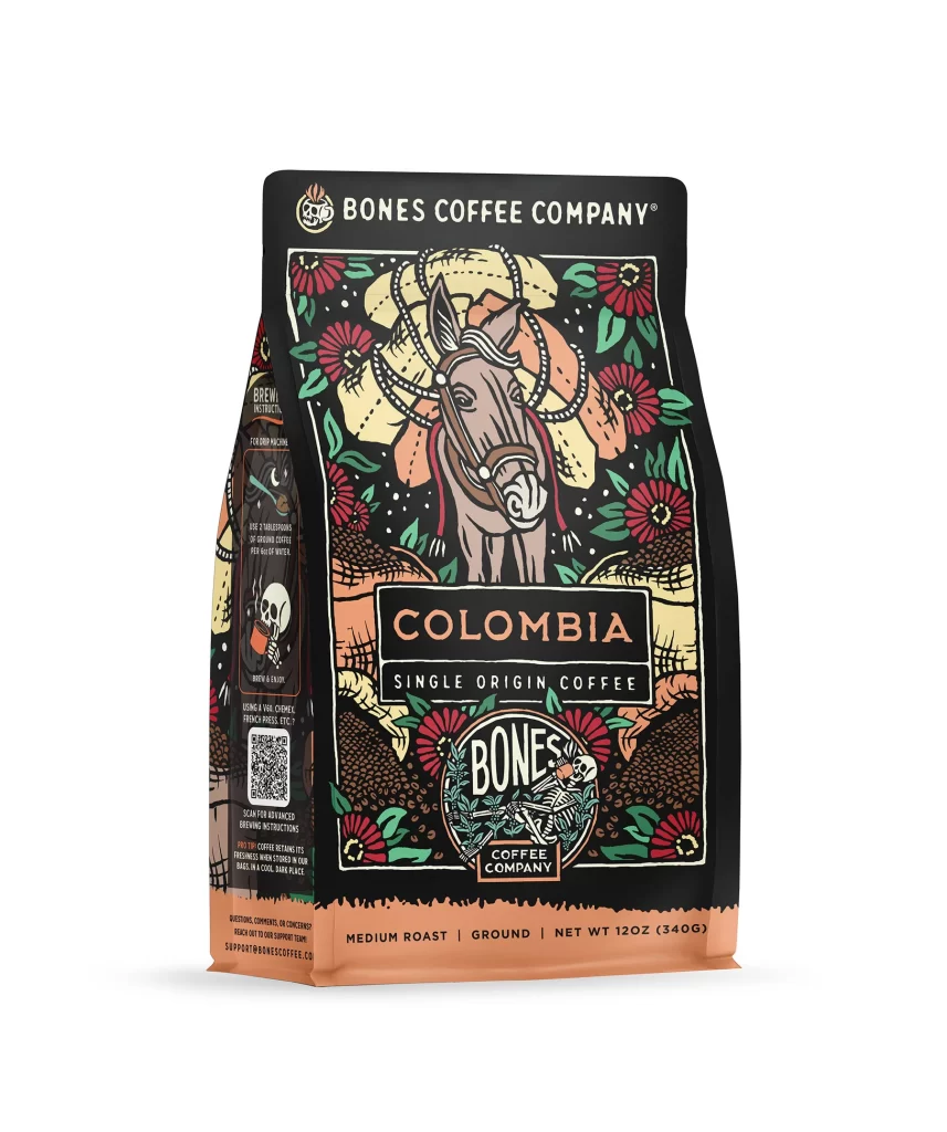
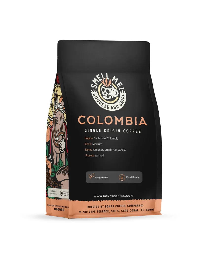
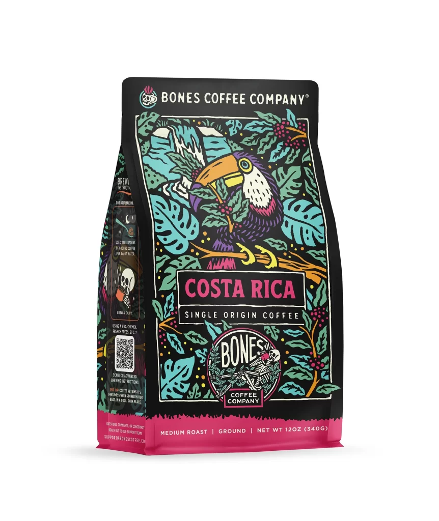
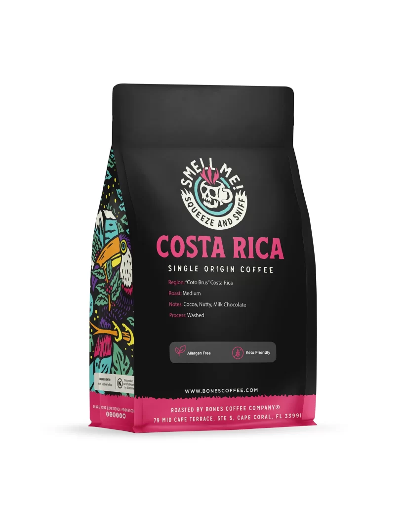
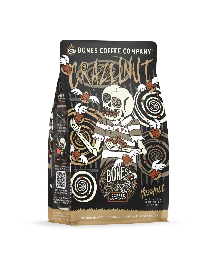
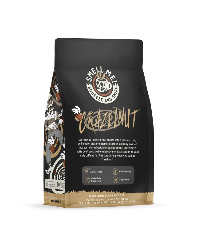
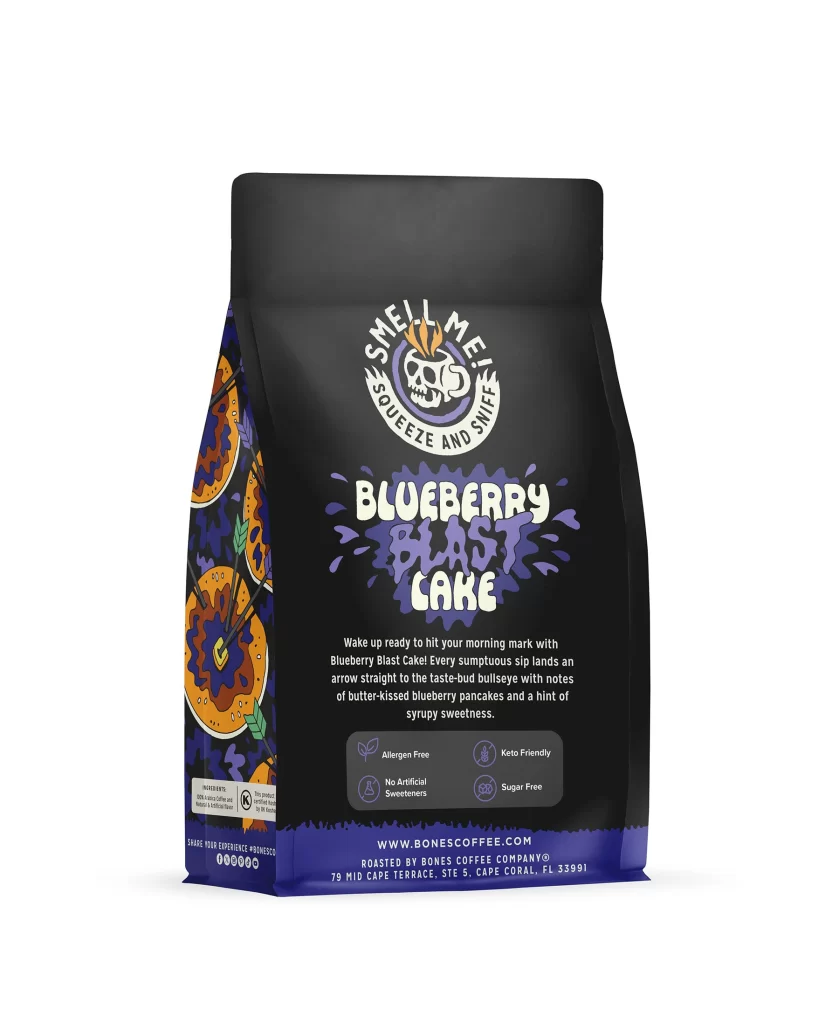
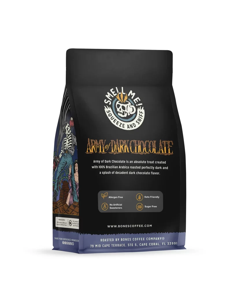
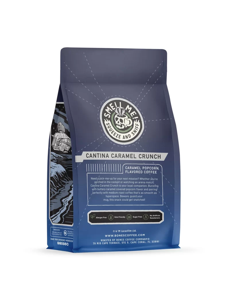
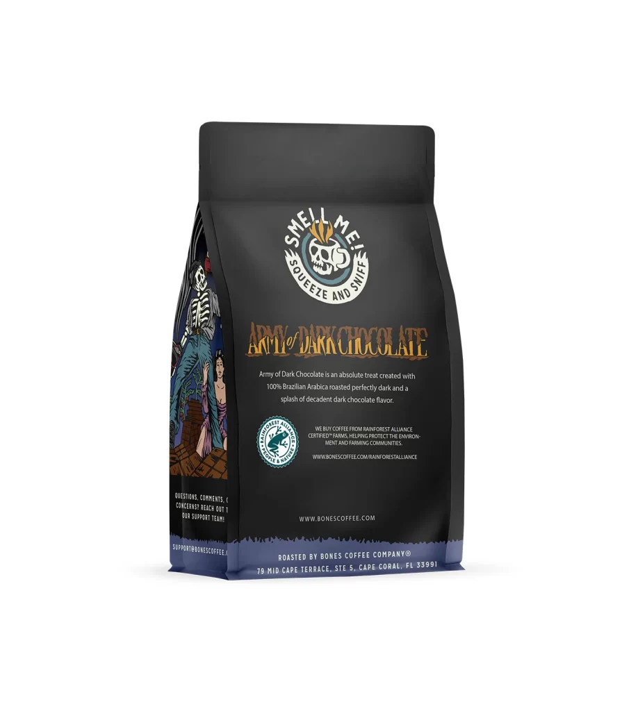
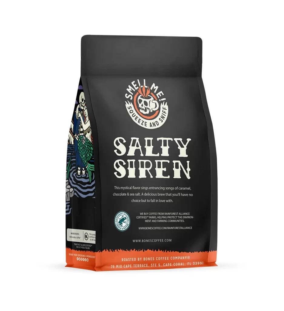
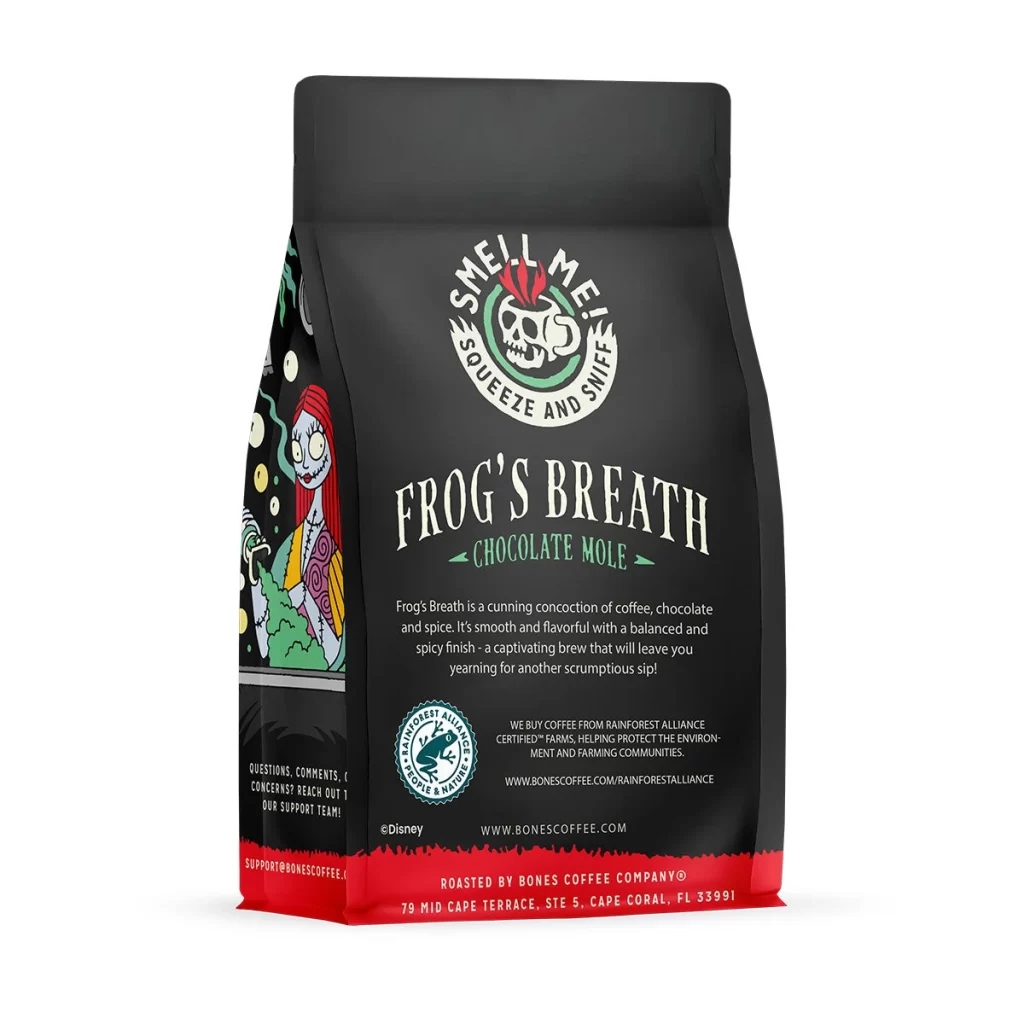
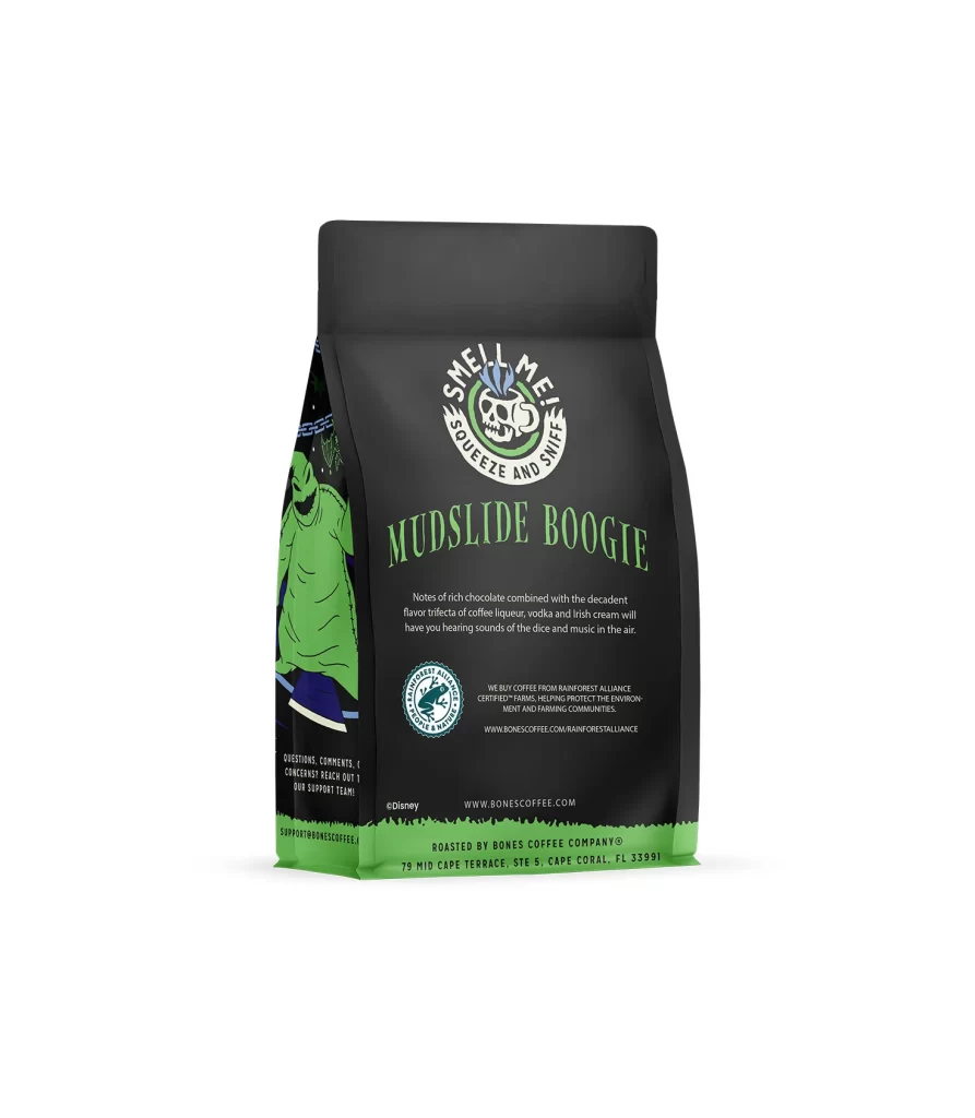
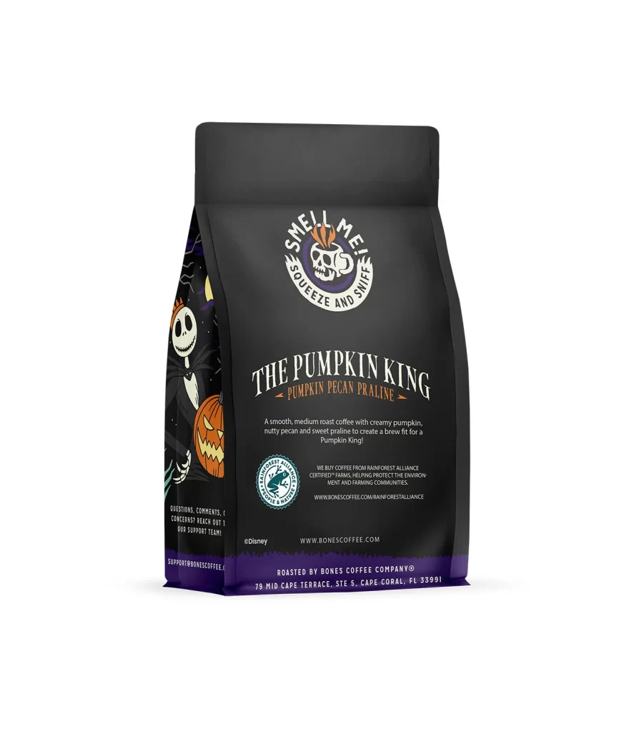
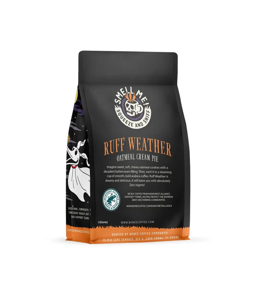
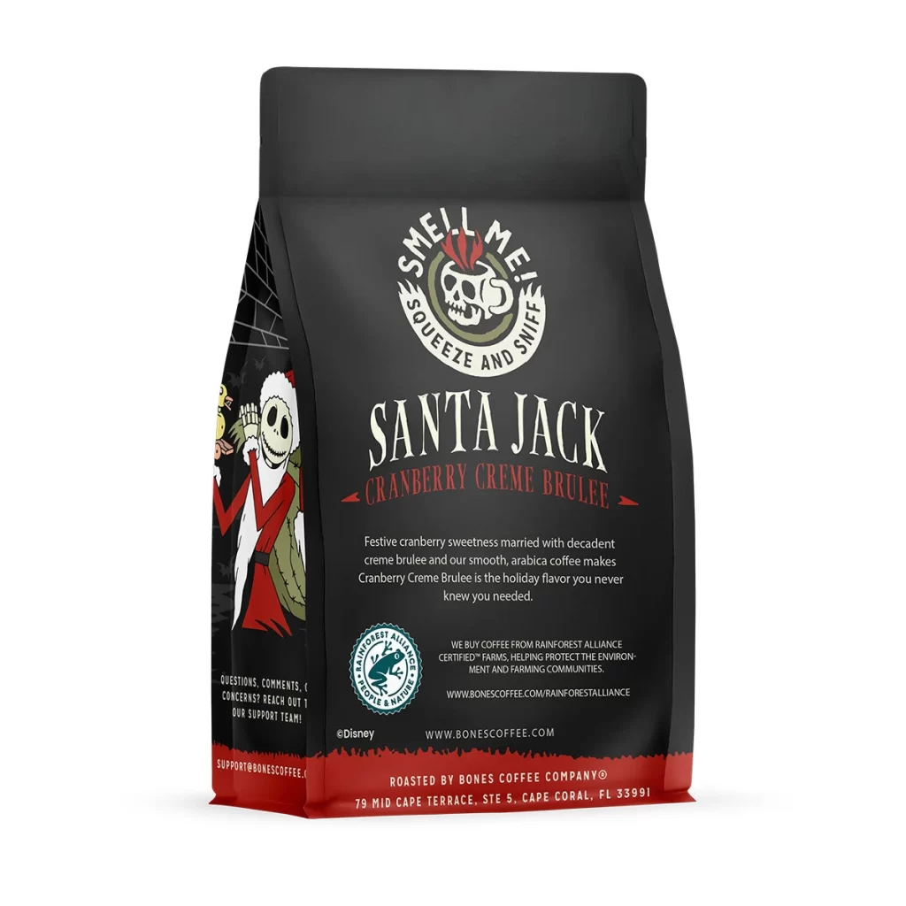
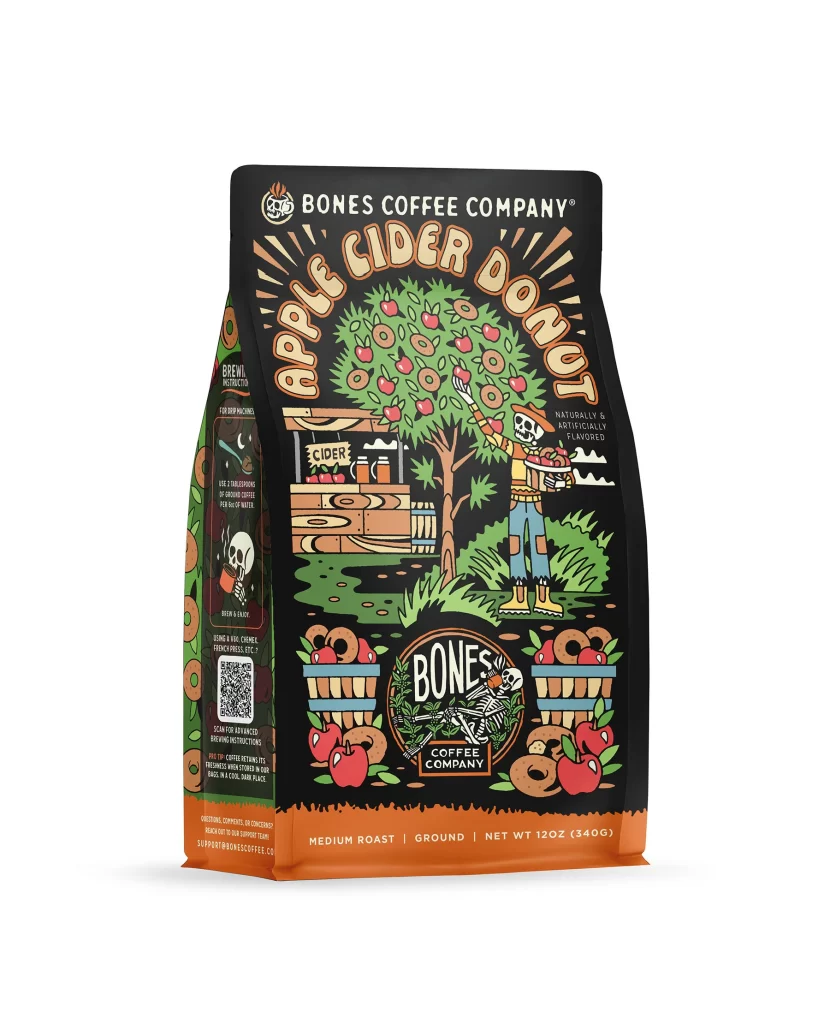
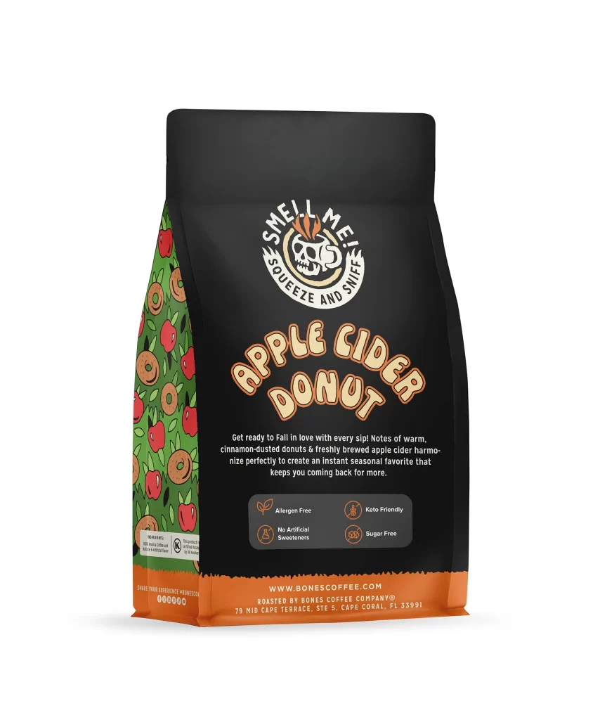
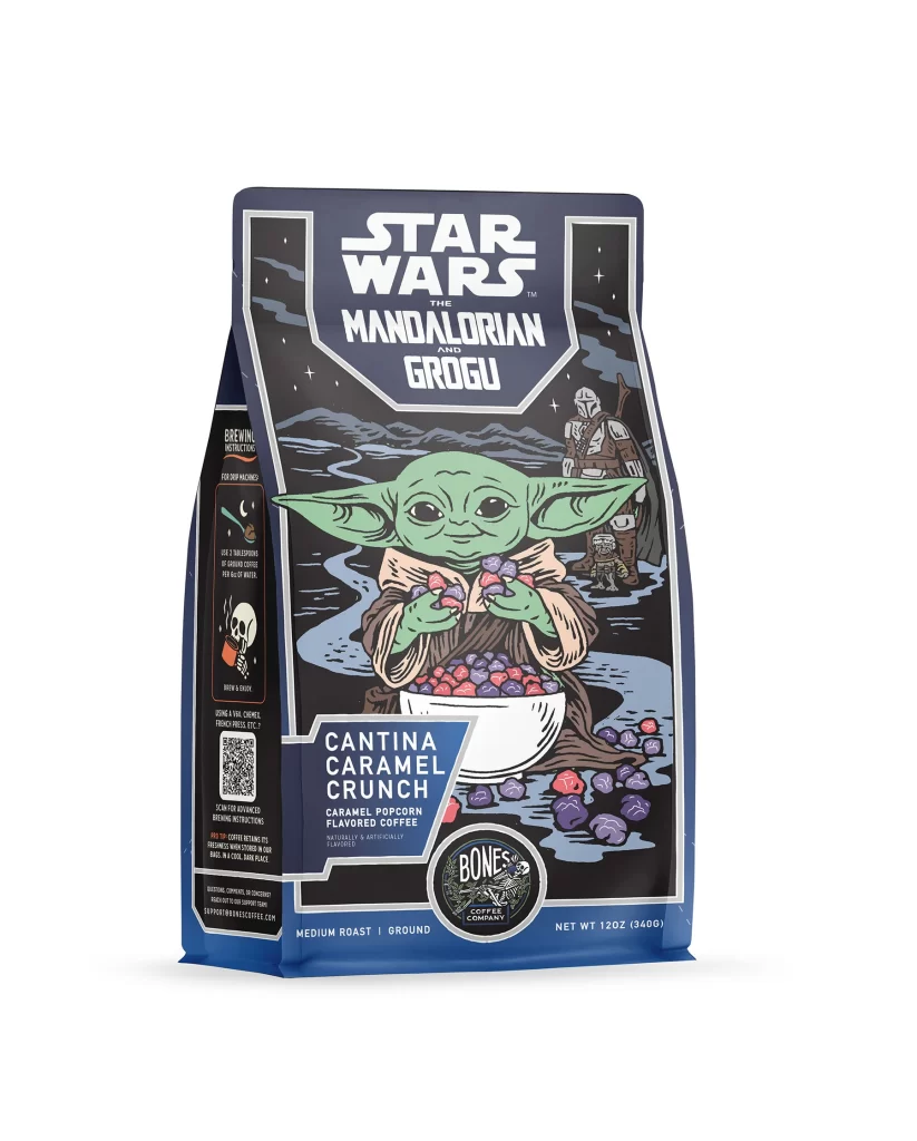
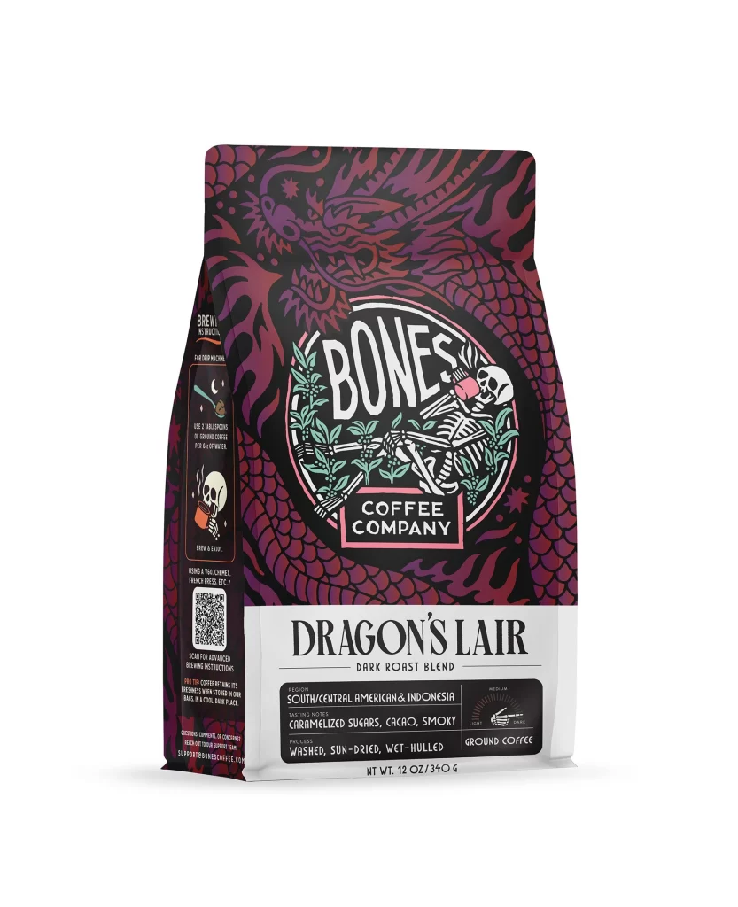
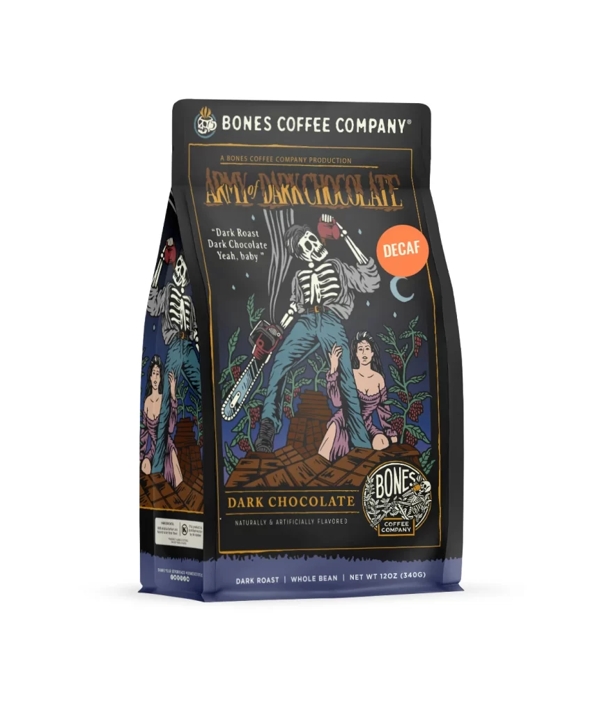
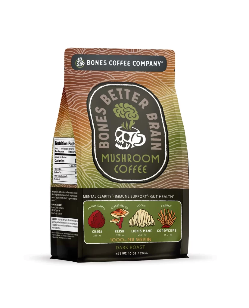
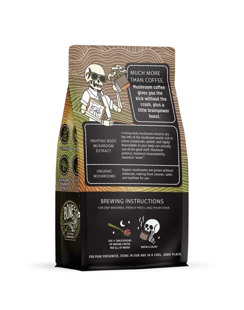
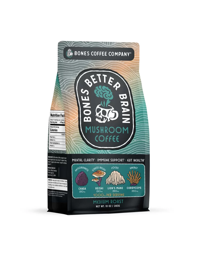
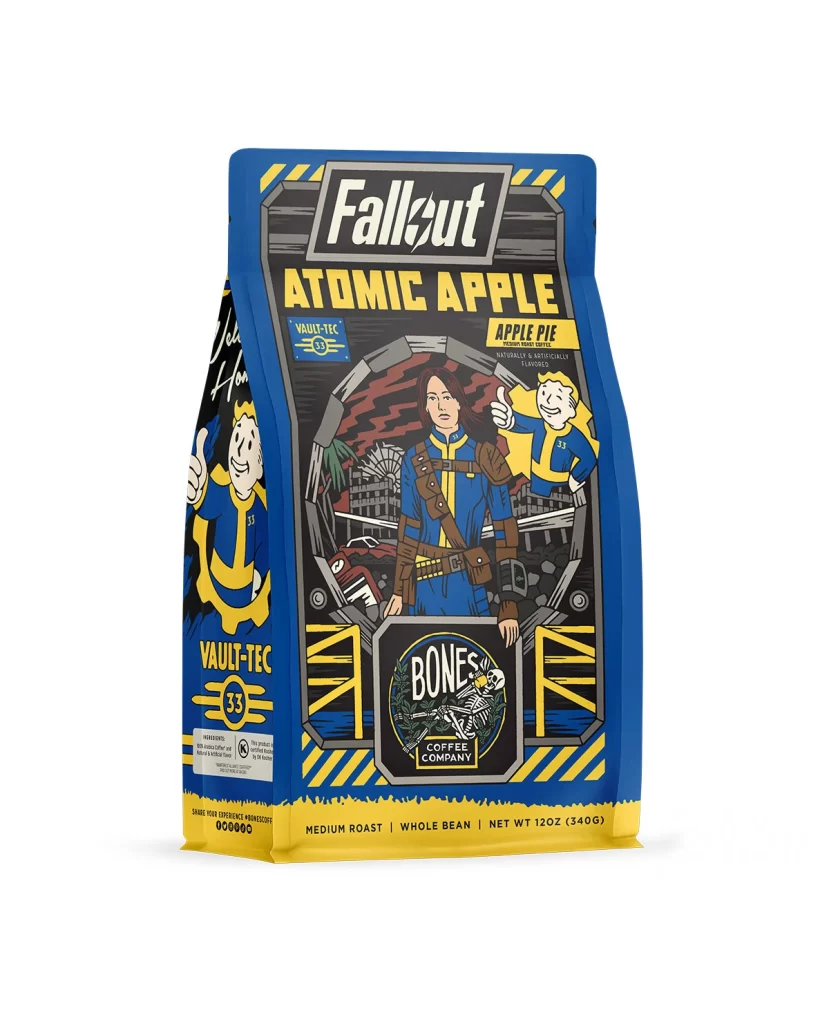
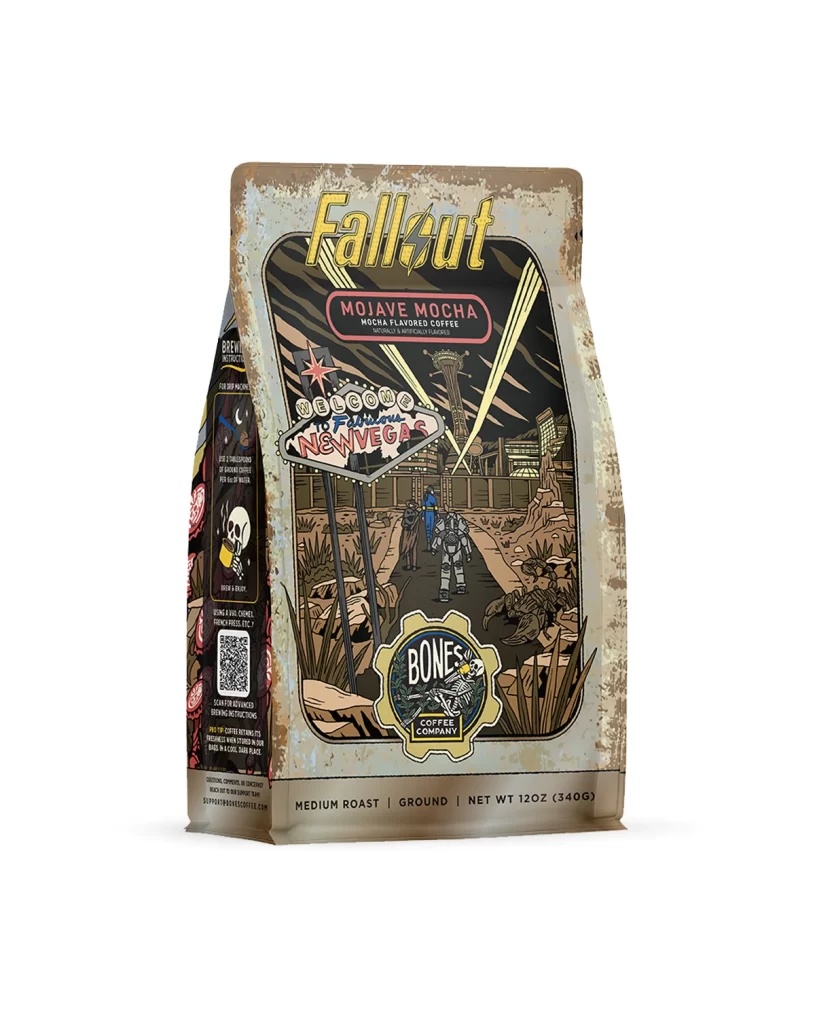
The front design layout centers on a matte pouch featuring bold flavor art. A vivid illustration of a cherry ice cream treat sits against a dark background, making the sweet theme obvious. The white studio product photo of the physical package highlights the glossy finish and clean layout. The 12 oz 340 g net weight mark rests neatly at the bottom.
Typography uses bright pink and white sans serif fonts to boost shelf appeal. The color palette pairs deep charcoal with vibrant red, creating a strong contrast that draws the eye. This visual mix triggers an appetite appeal by blending dessert imagery with coffee cues. The clear text hierarchy ensures shoppers quickly spot the brand and the unique flavor.
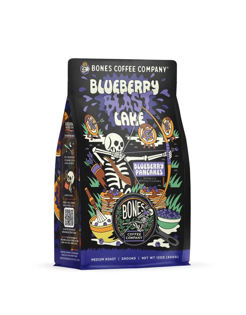
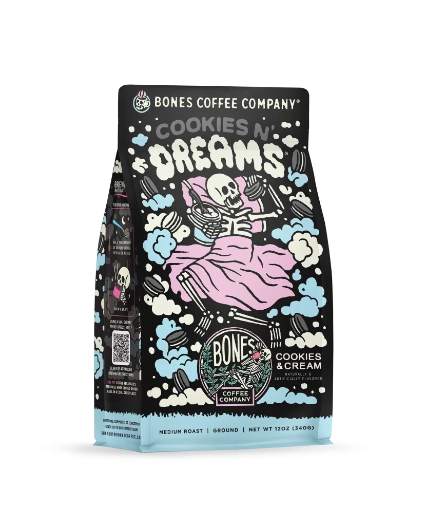
Designers should note how the layout balances bold illustrations with minimal text. The strong color contrast is a great takeaway for grabbing attention in retail environments. Using dessert themed art on coffee packaging effectively bridges sweet cravings with morning brews. This reference shows how to merge playful graphics with clear product details to create a highly memorable brand presence.