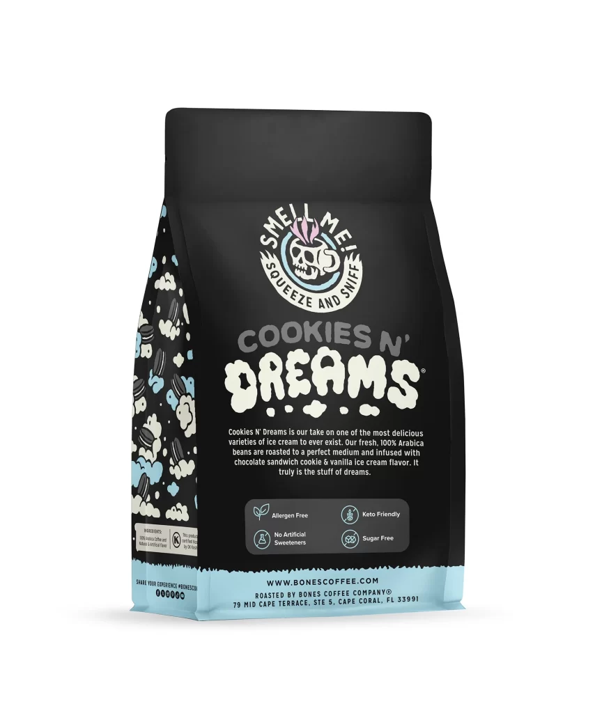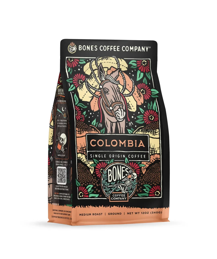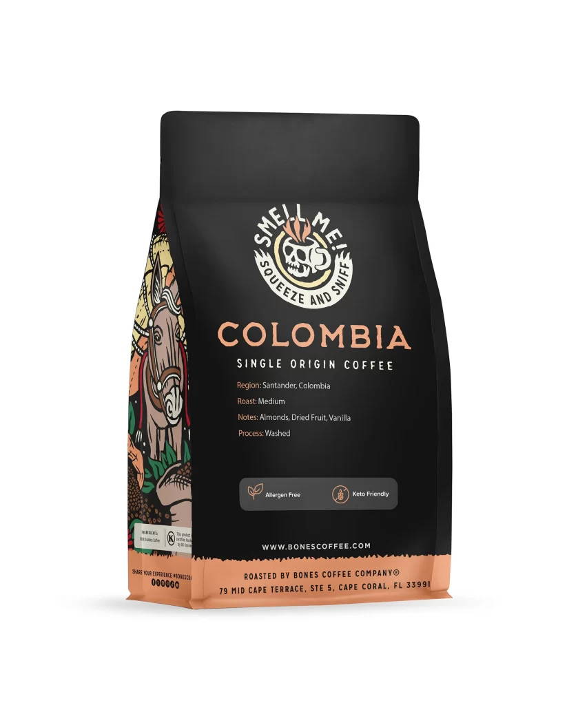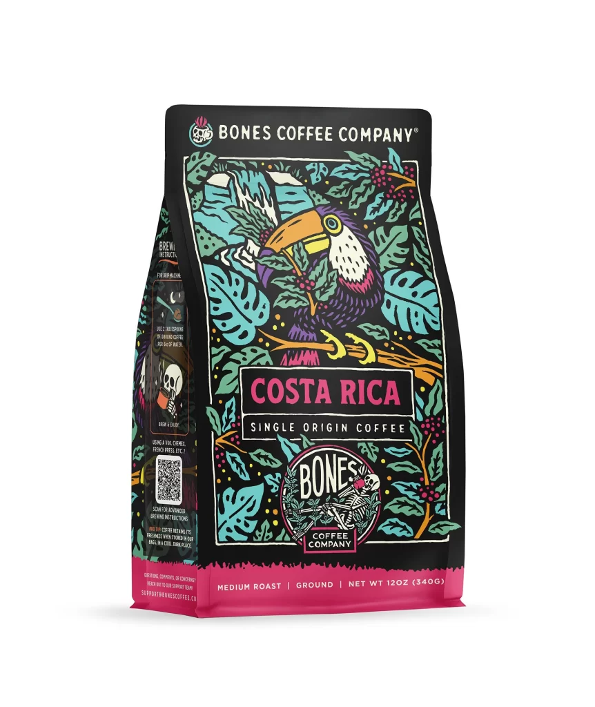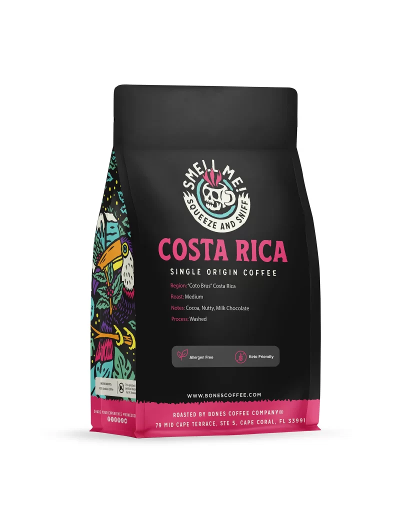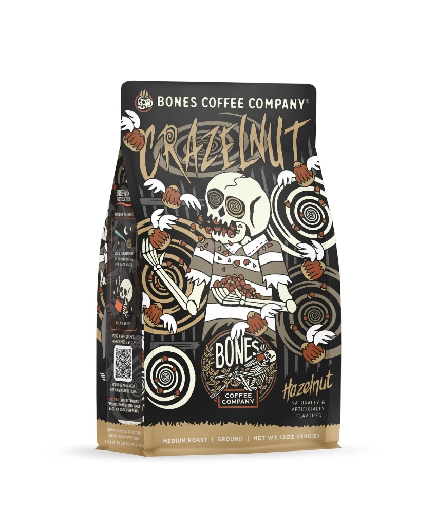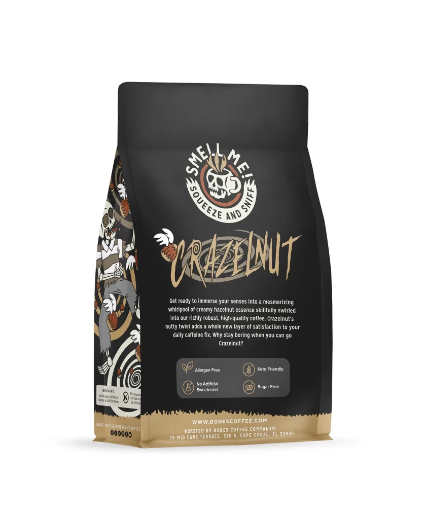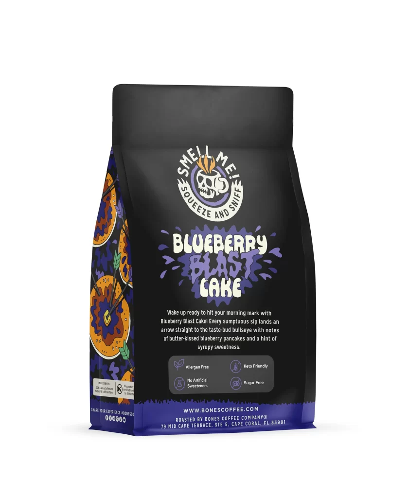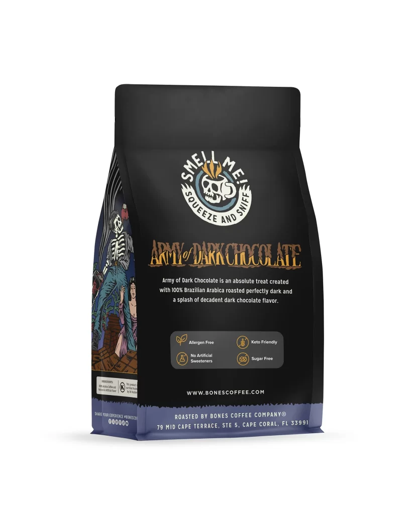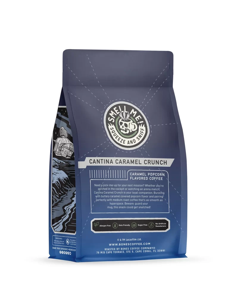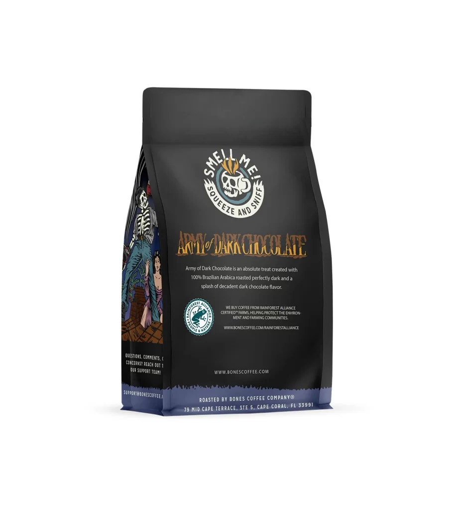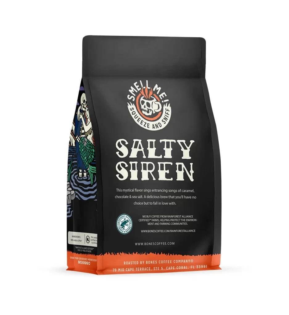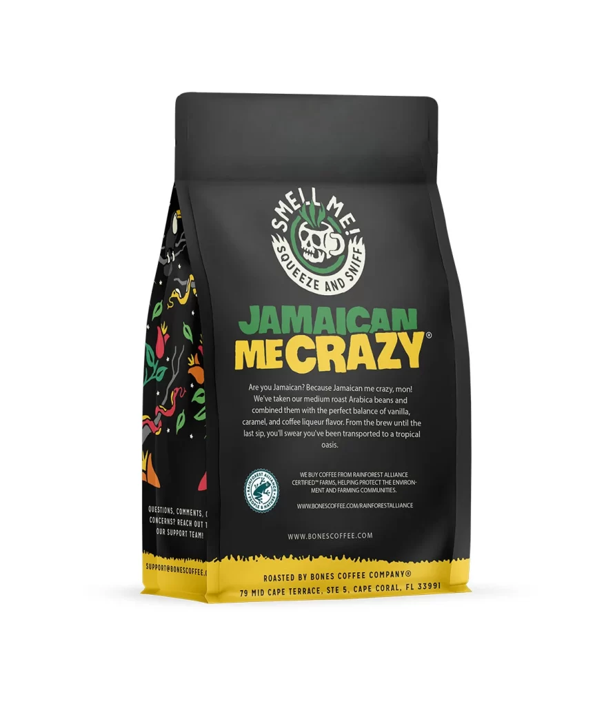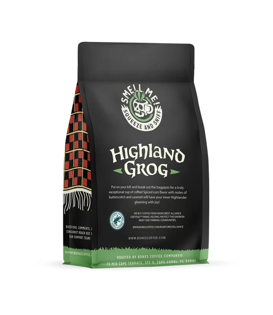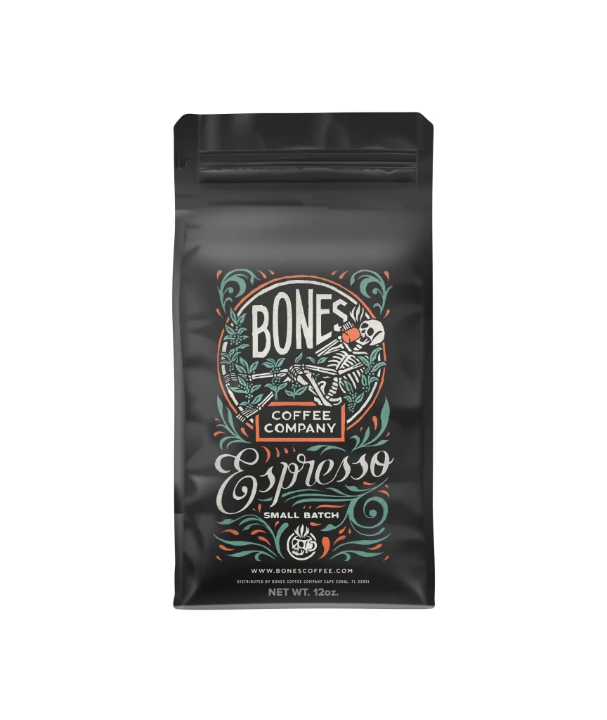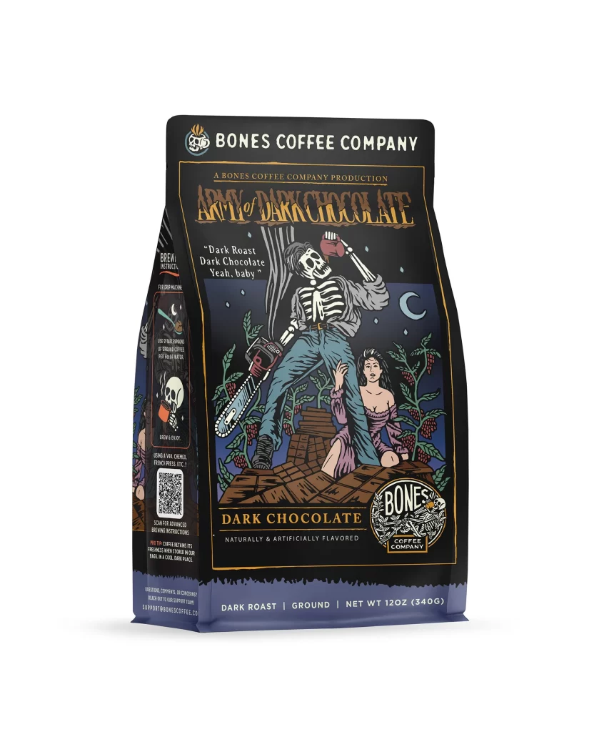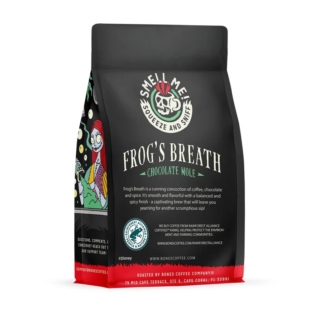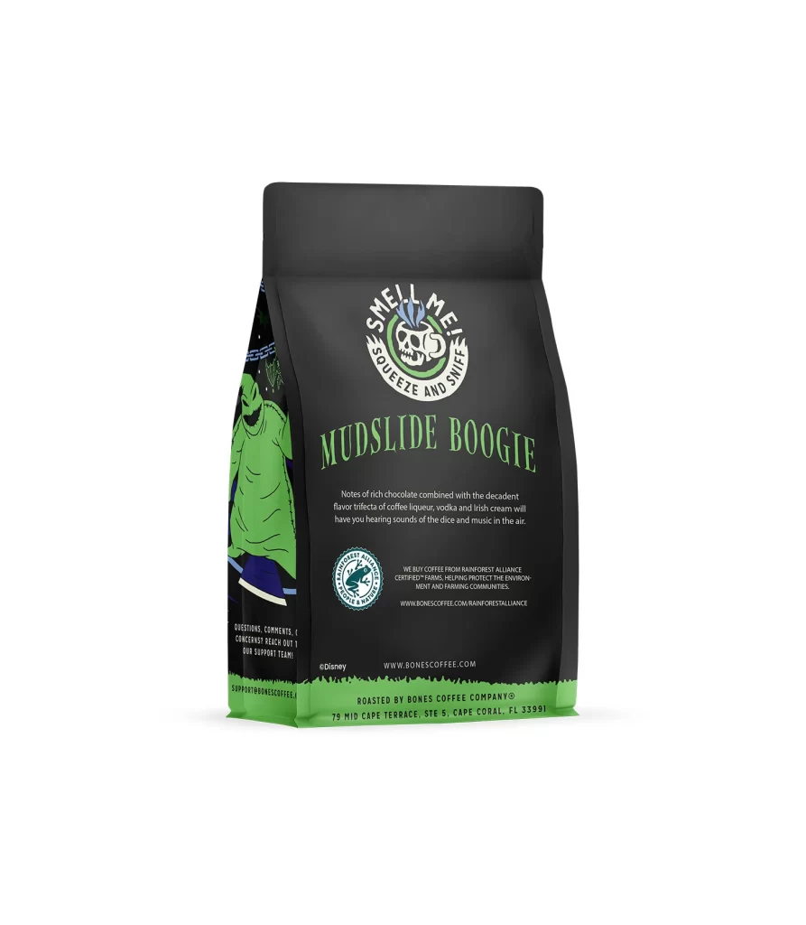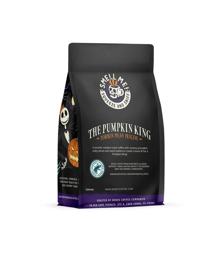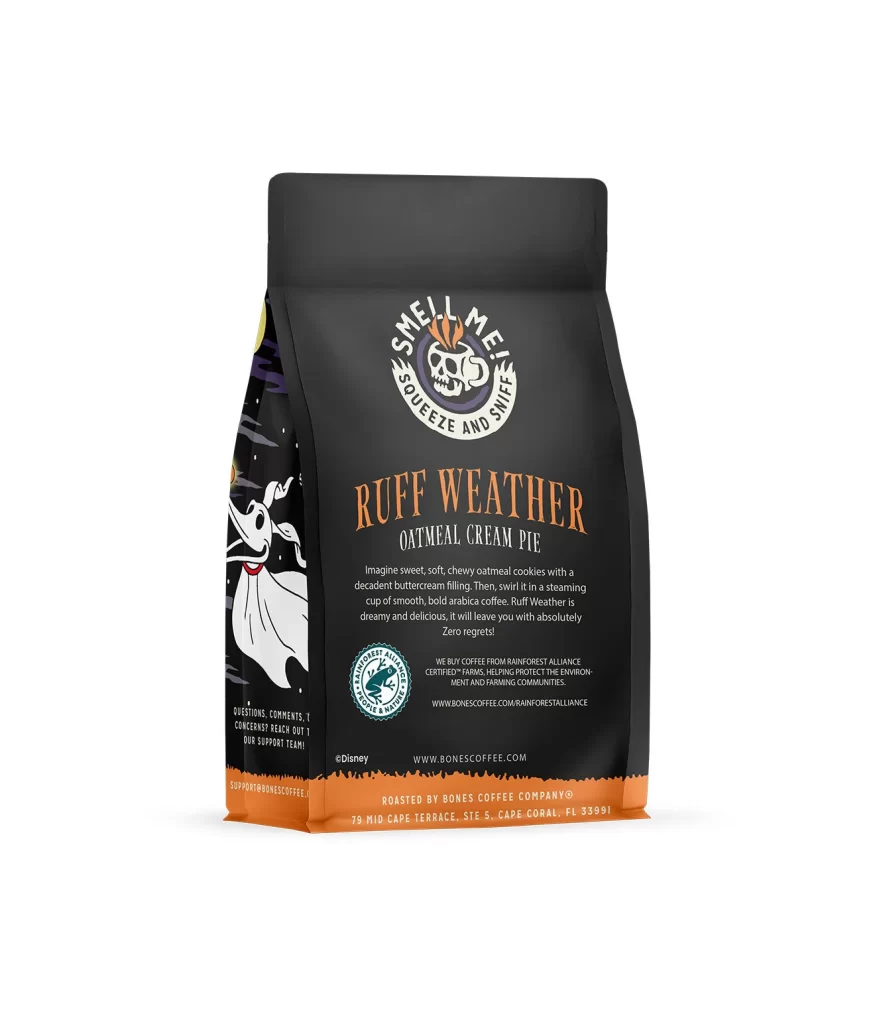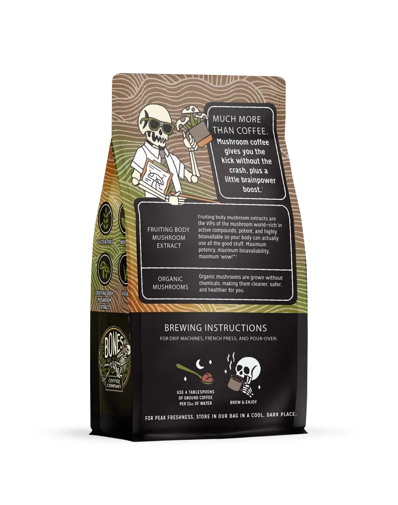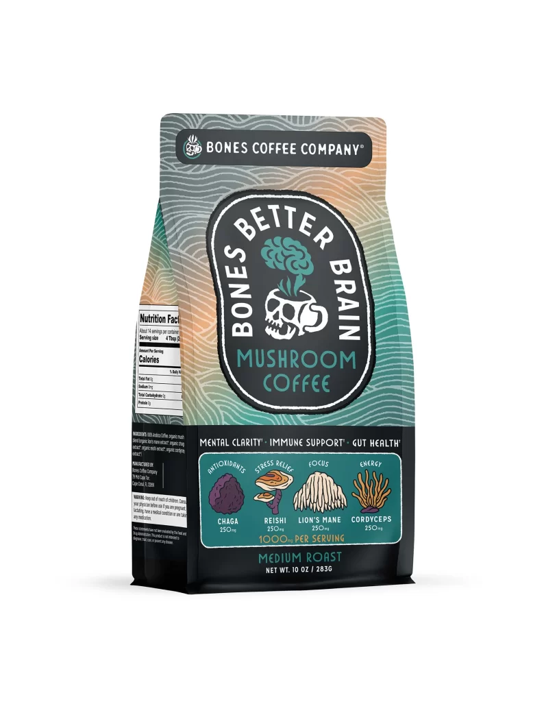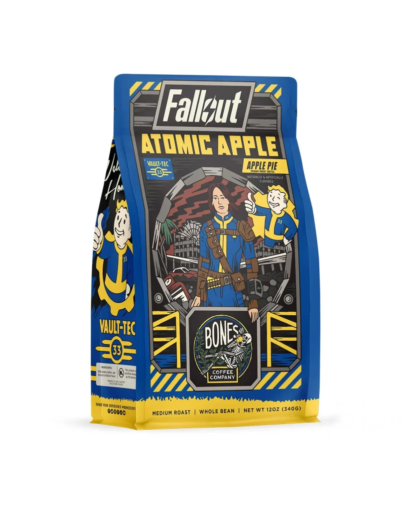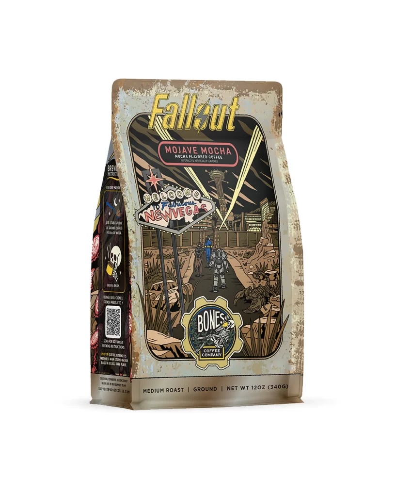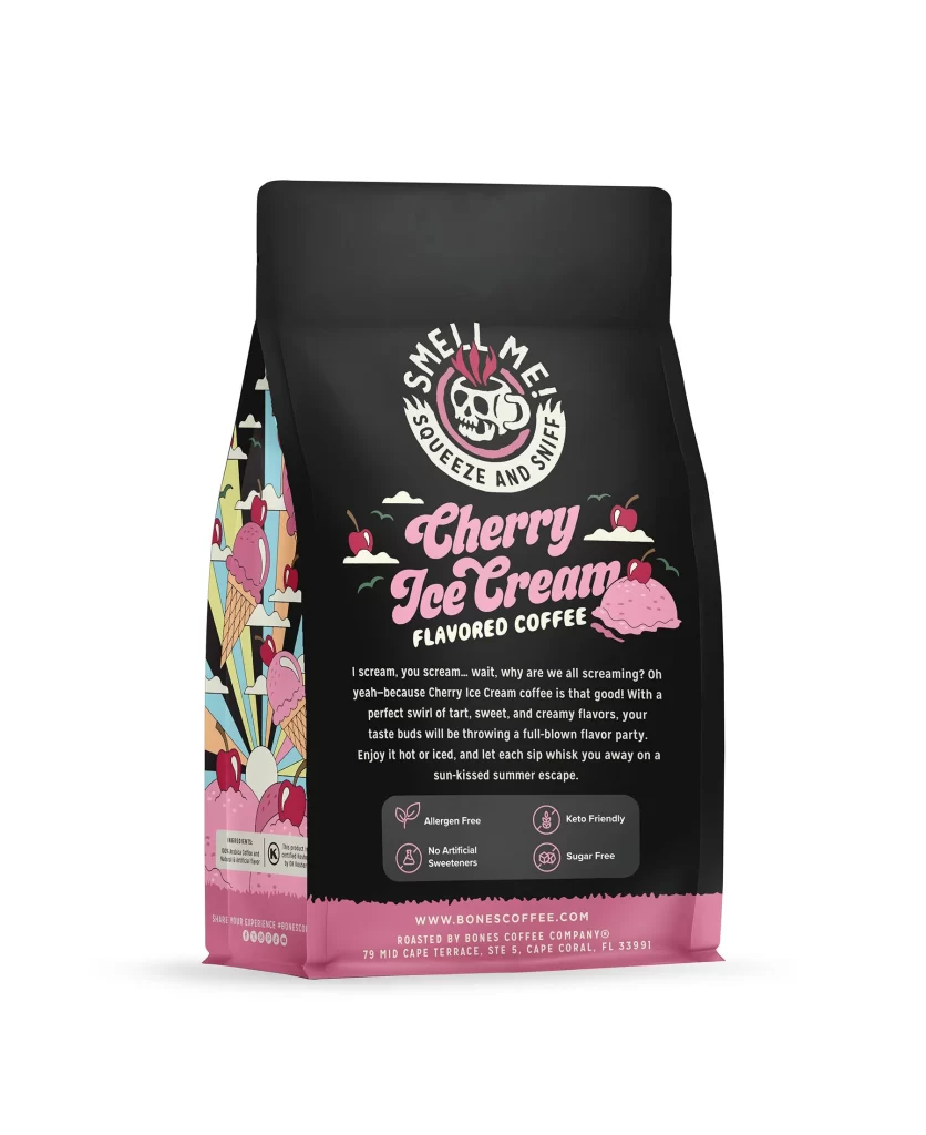
Bones Coffee Cherry Ice Cream Coffee Bag Back Packaging
Topics
Details
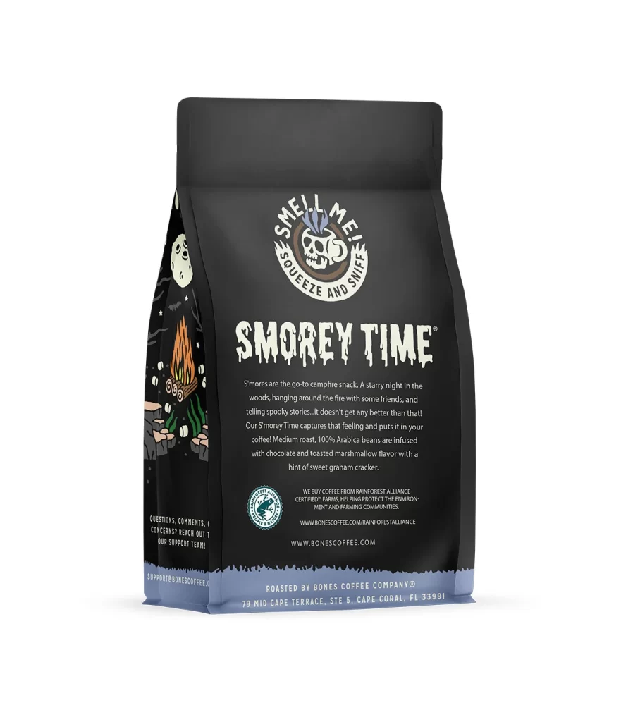
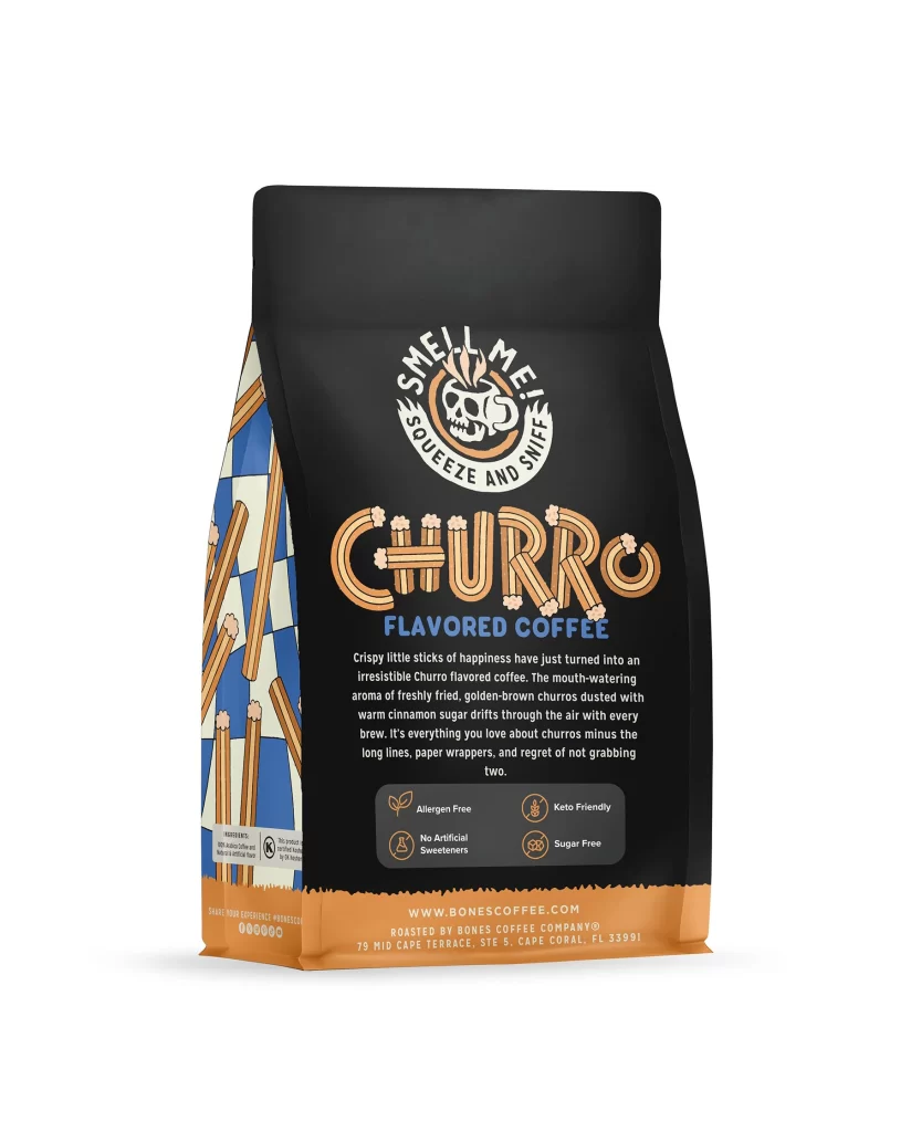
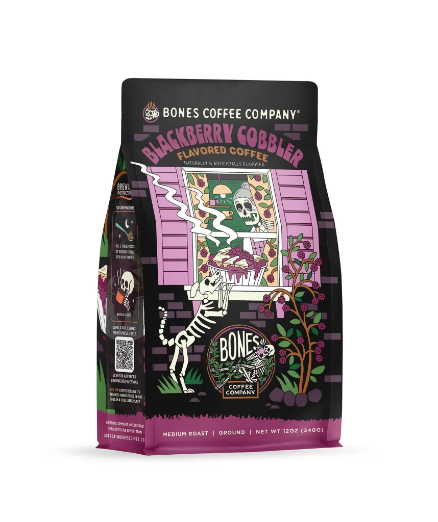
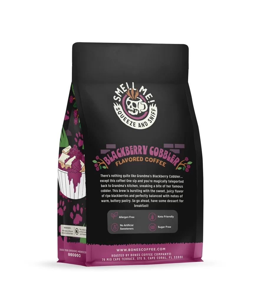
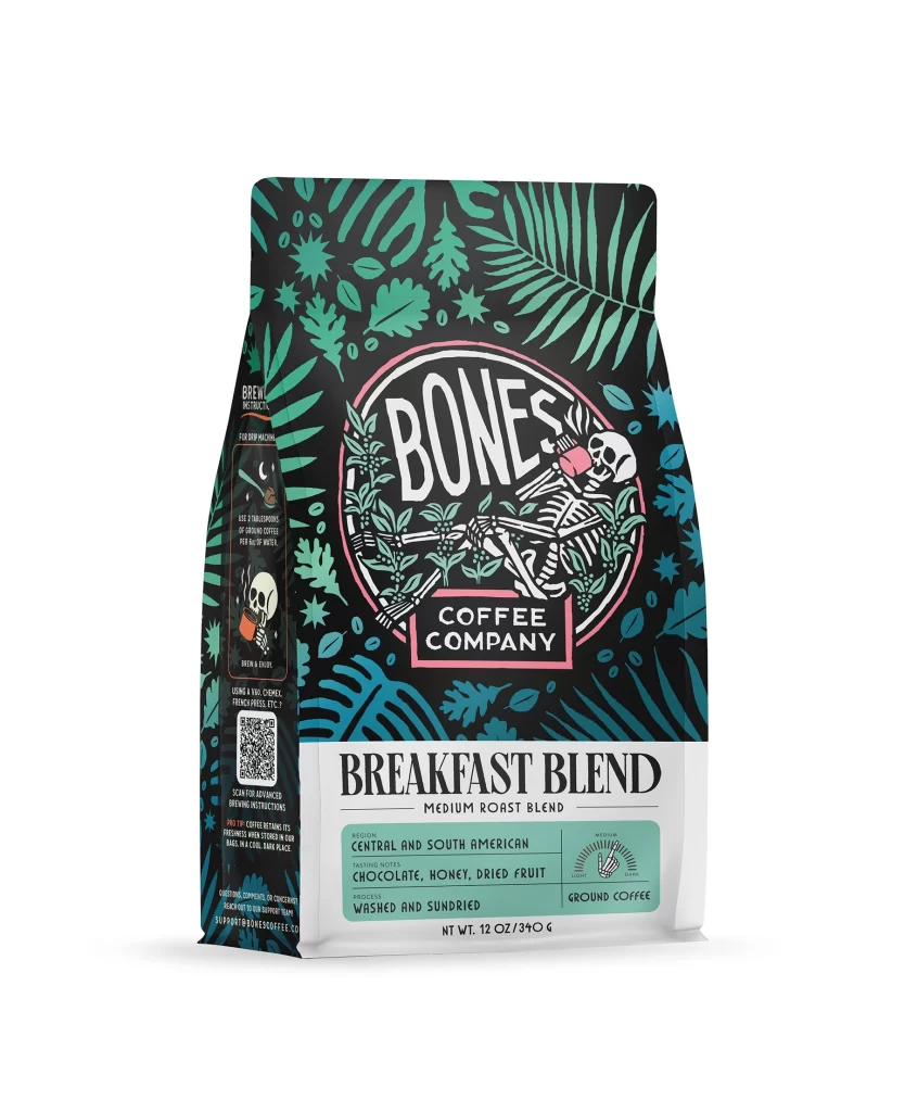
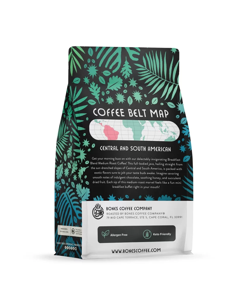
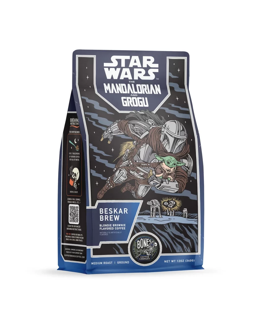
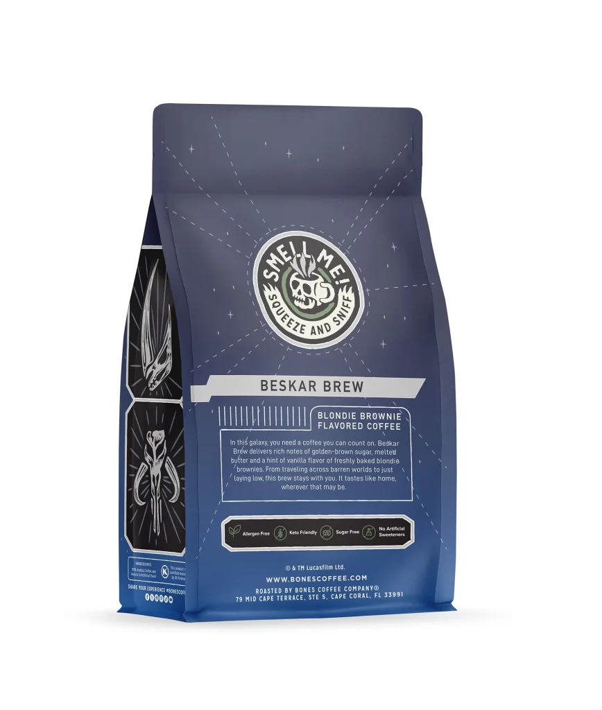
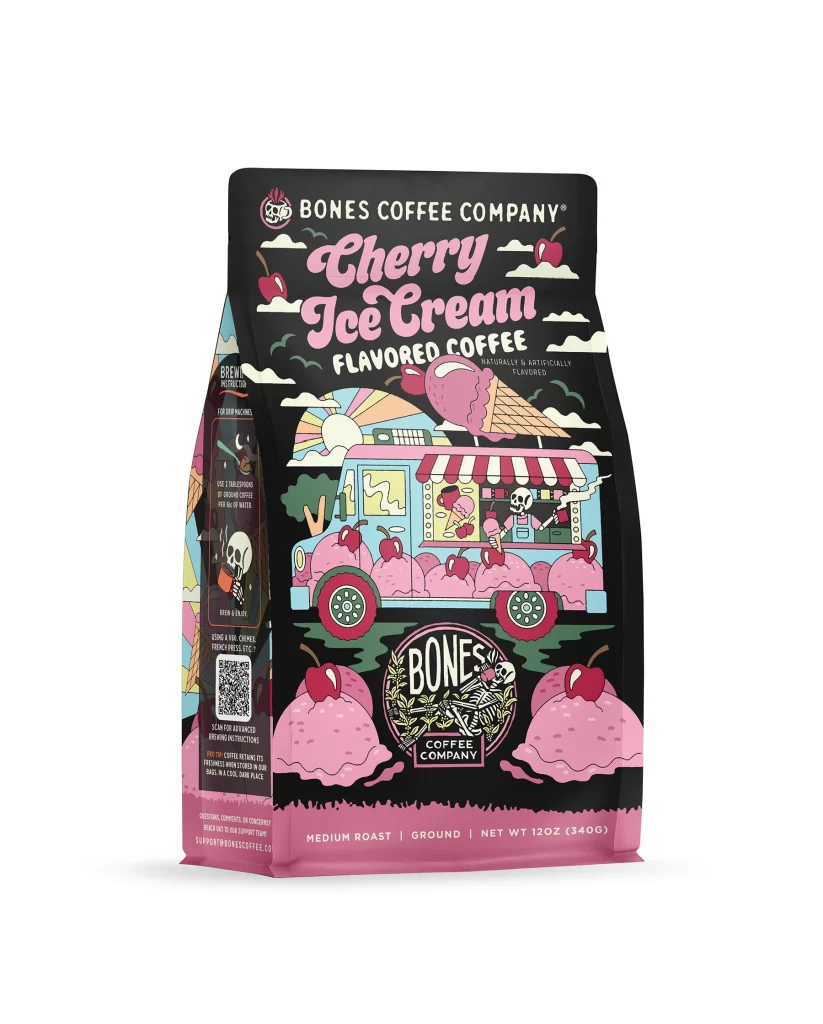
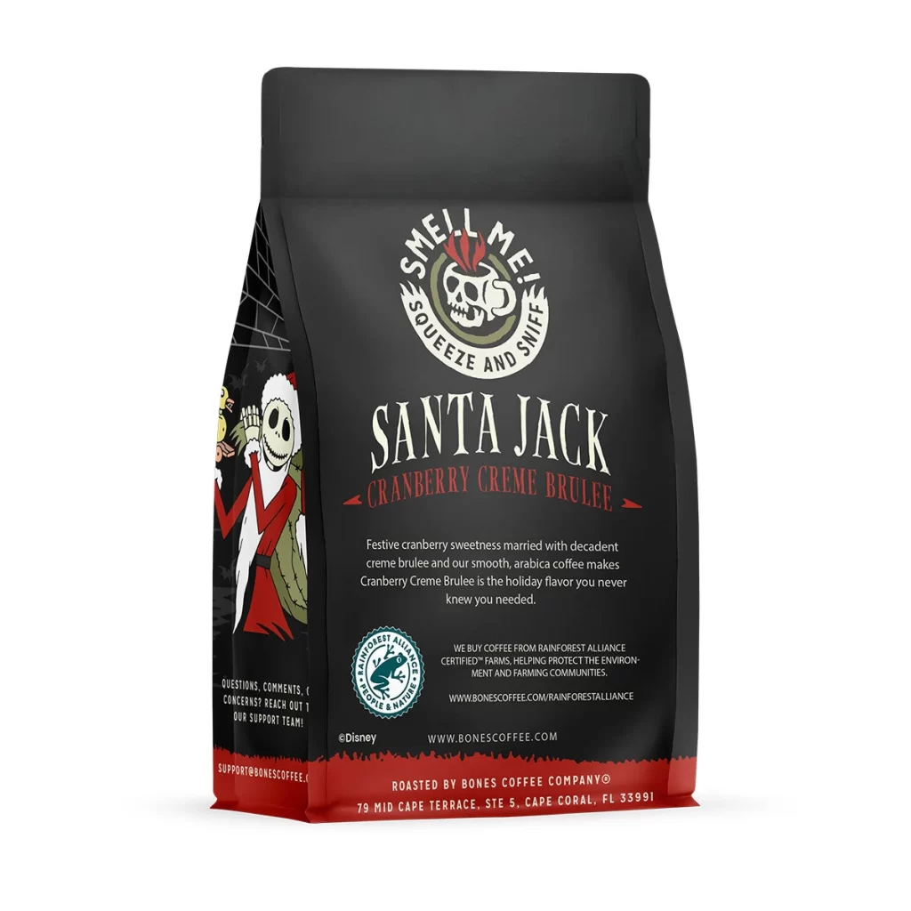
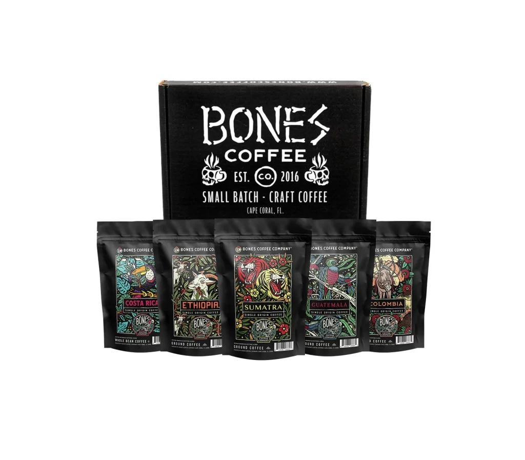
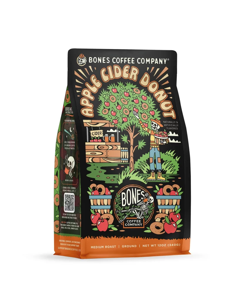
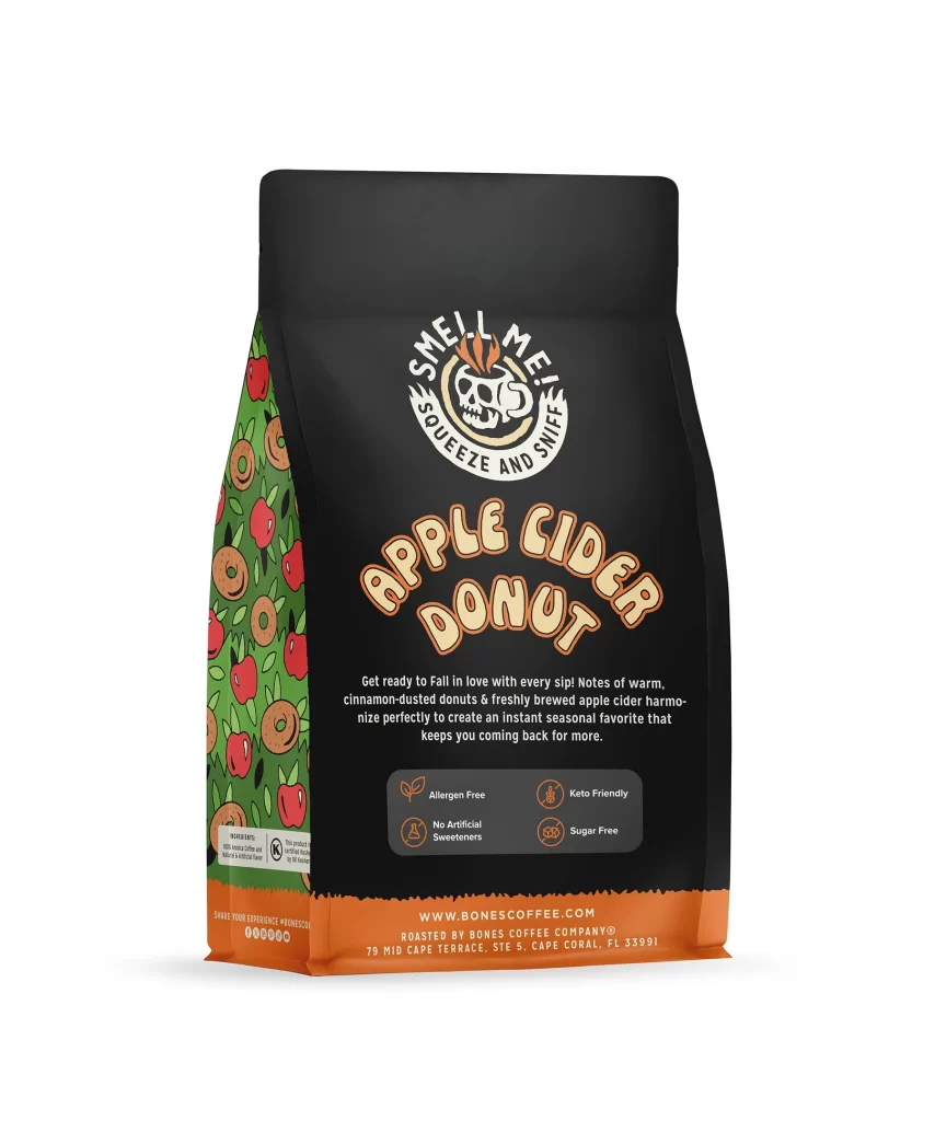
The front layout centers on a tall white coffee bag featuring a glossy cherry ice cream scoop. The creamy pink dessert art pops against the bright background. A clean header displays the brand name above the sweet treat illustration. The composition feels balanced and modern, directing the eye straight to the tempting frozen flavor graphic.
Typography uses dark brown text to ground the layout and evoke roasted beans. Soft pink accents tie the lettering to the cherry theme, creating strong shelf appeal. This color pairing triggers an appetite response by blending morning brew warmth with sugary dessert nostalgia. The contrast ensures high readability while maintaining a playful grocery aisle presence.
Designers should note how minimal color choices create a distinct dessert identity without clutter. The simple layout proves that bold imagery and restrained typography communicate flavor instantly. Using a white background maximizes the pink and brown pop, offering a valuable lesson in visual hierarchy. This packaging succeeds by merging clean aesthetic rules with highly effective commercial cues.