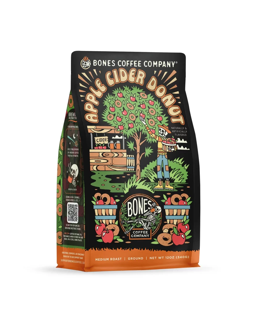
Bones Coffee Apple Cider Donut Coffee Bag Front Packaging
Topics
Details
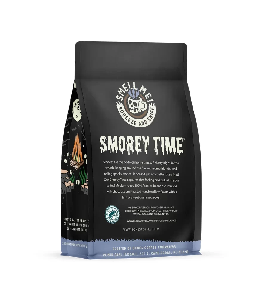
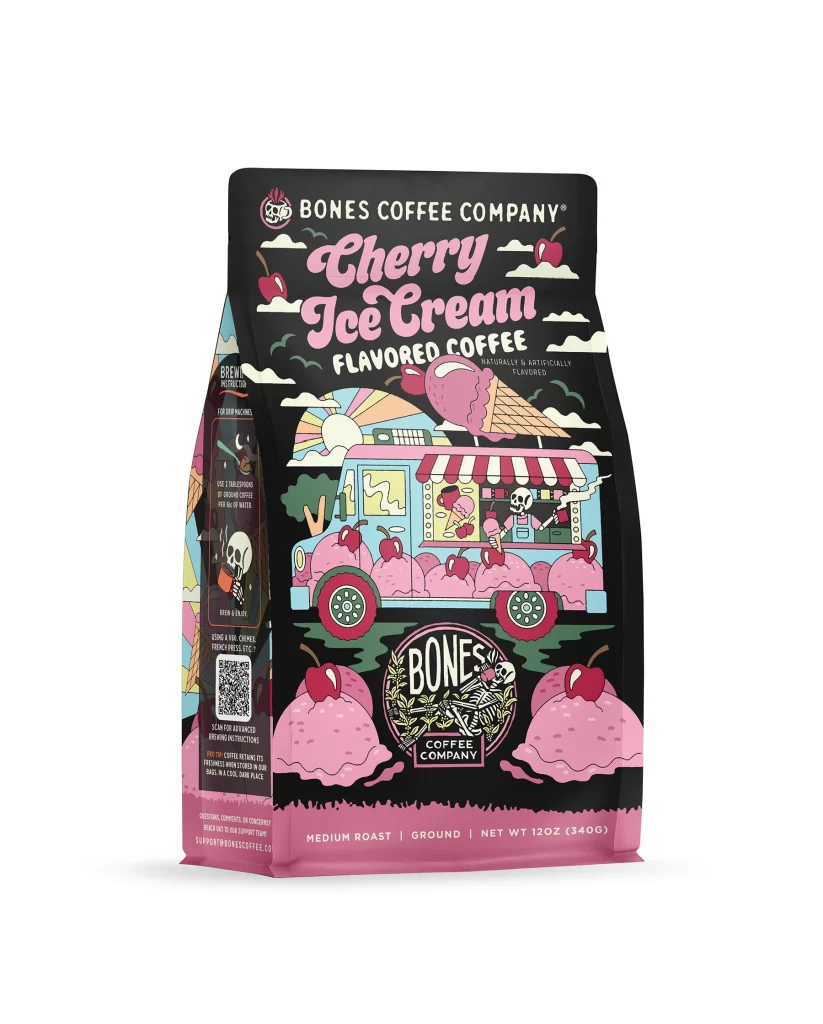
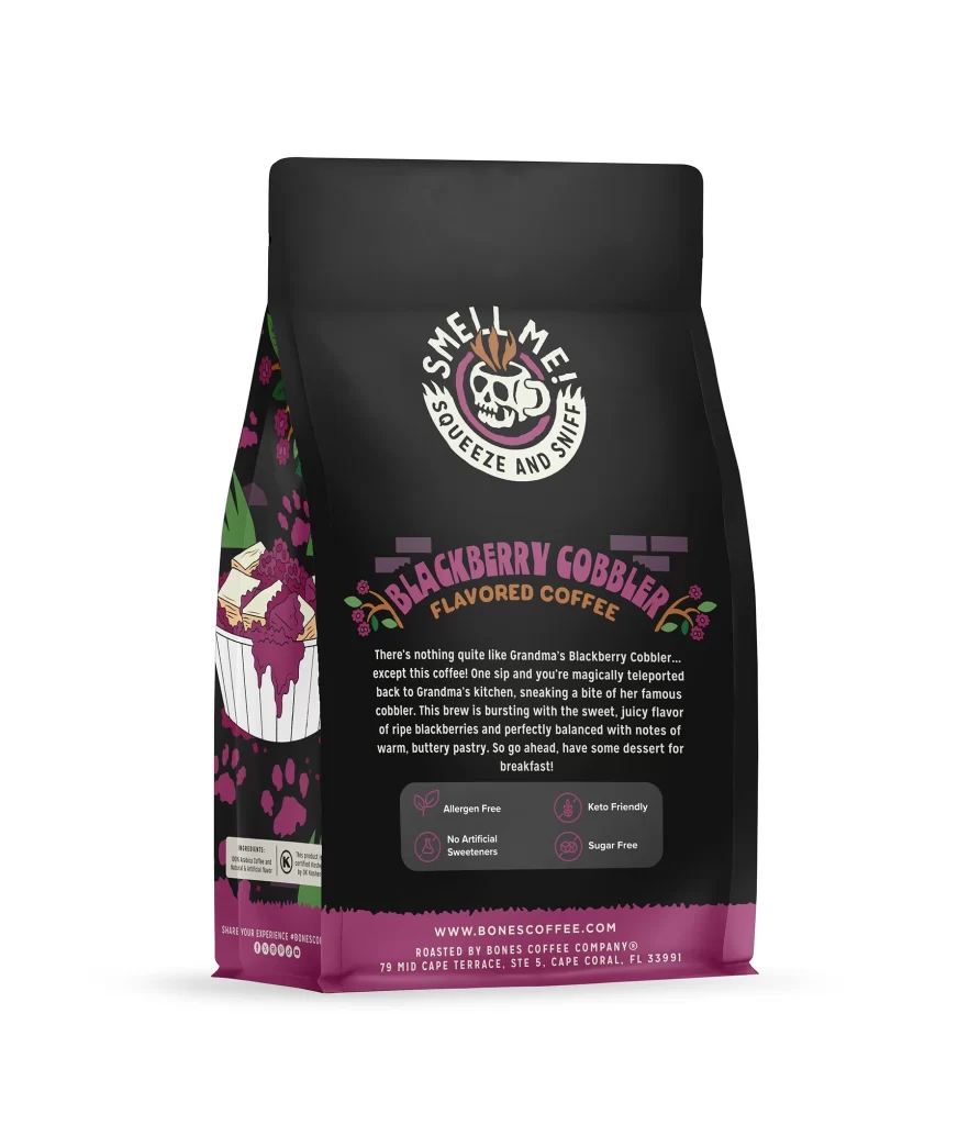
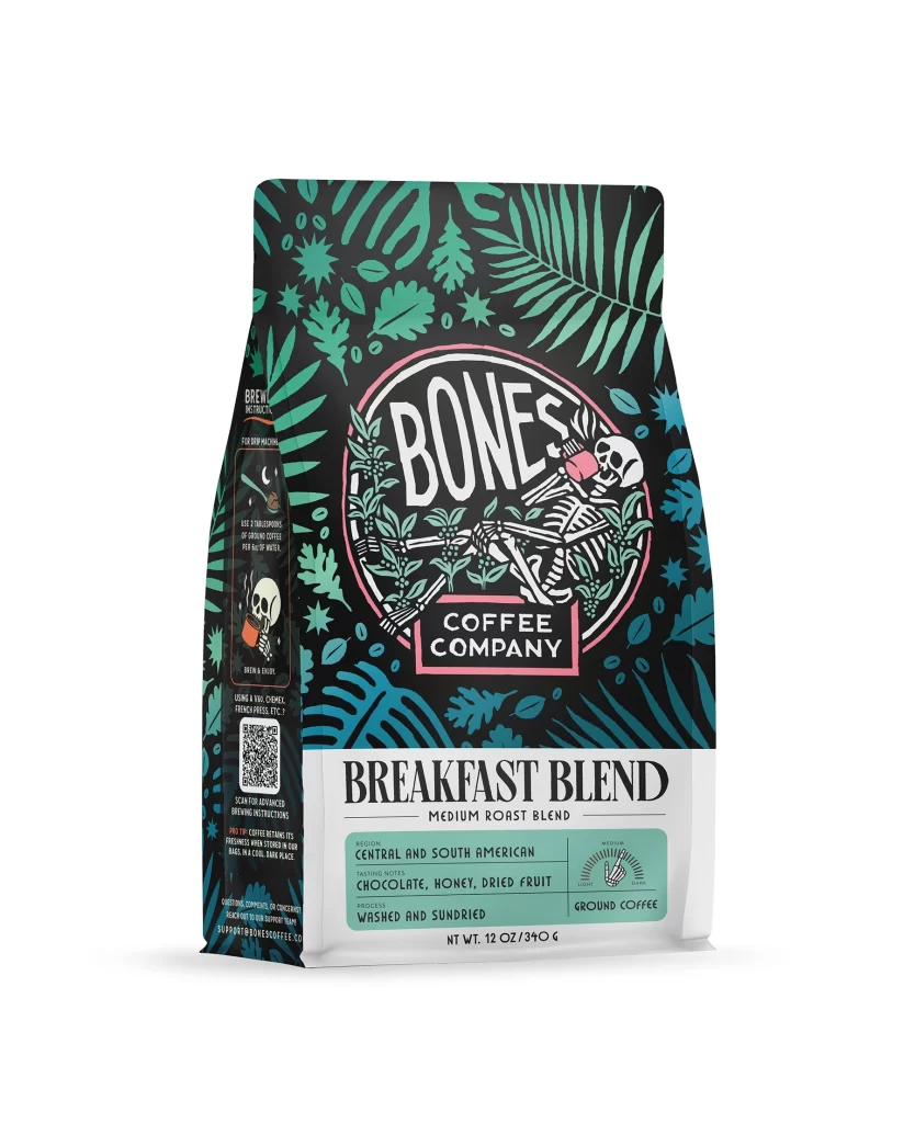
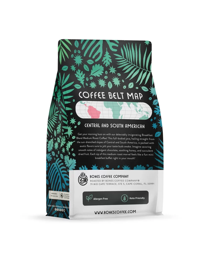
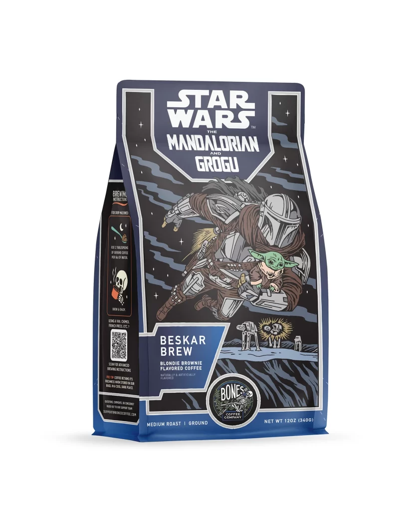
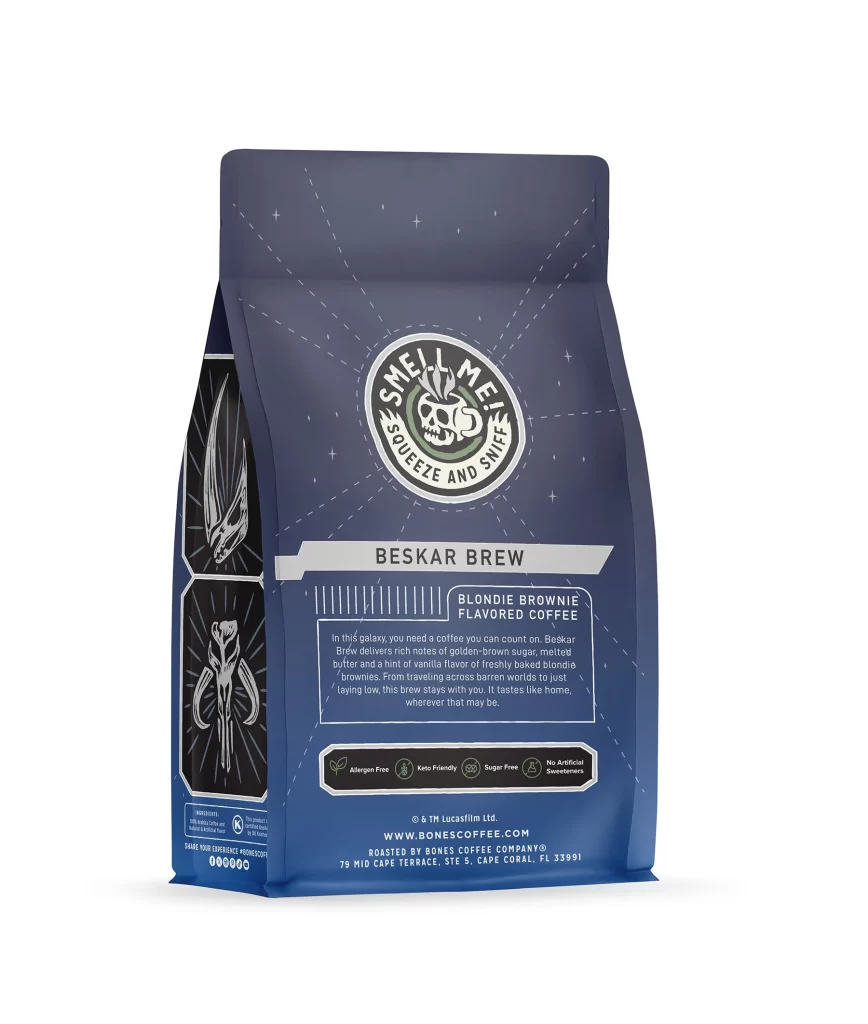
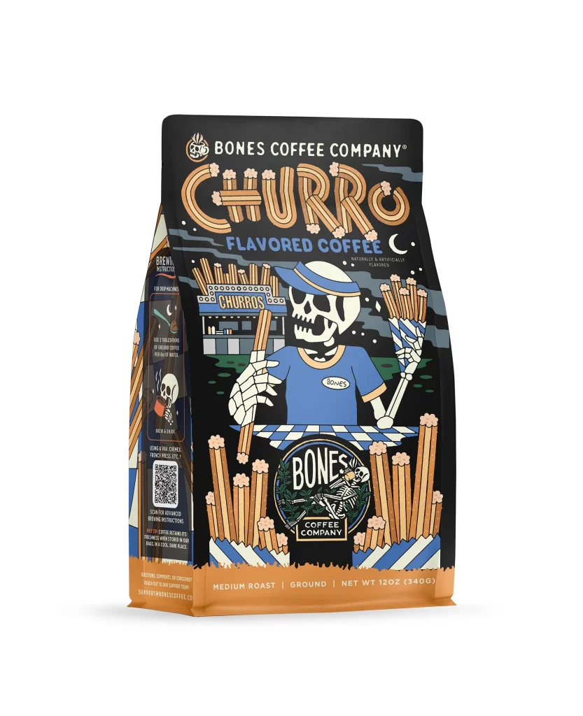
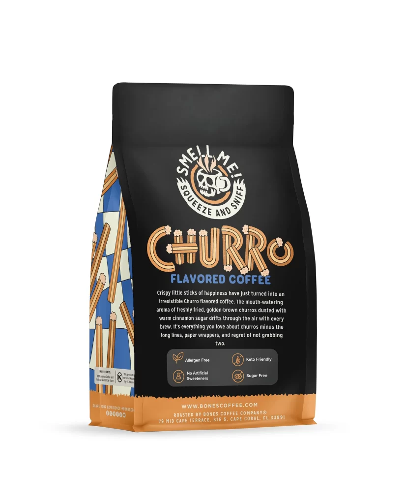
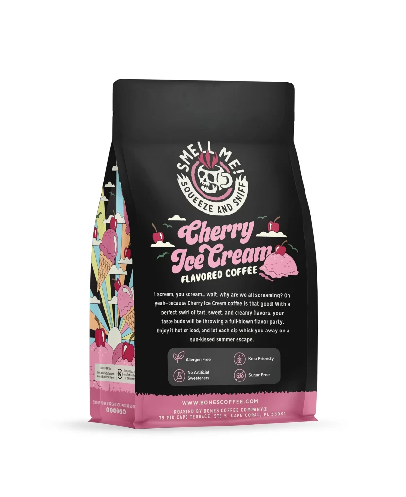
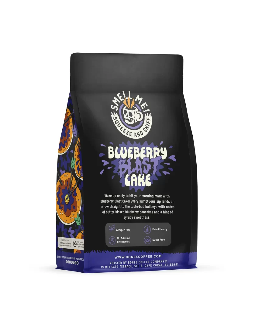
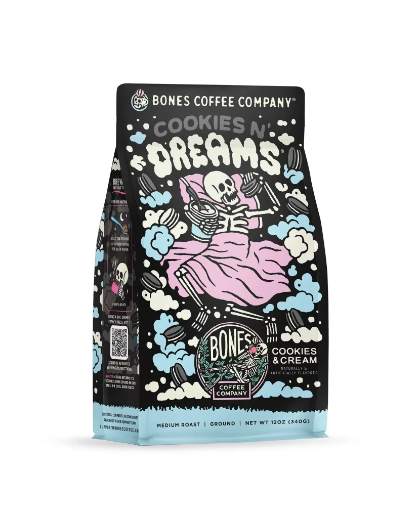
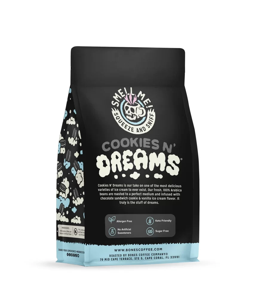
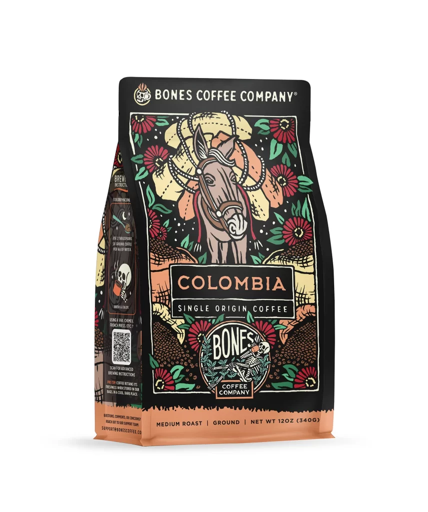
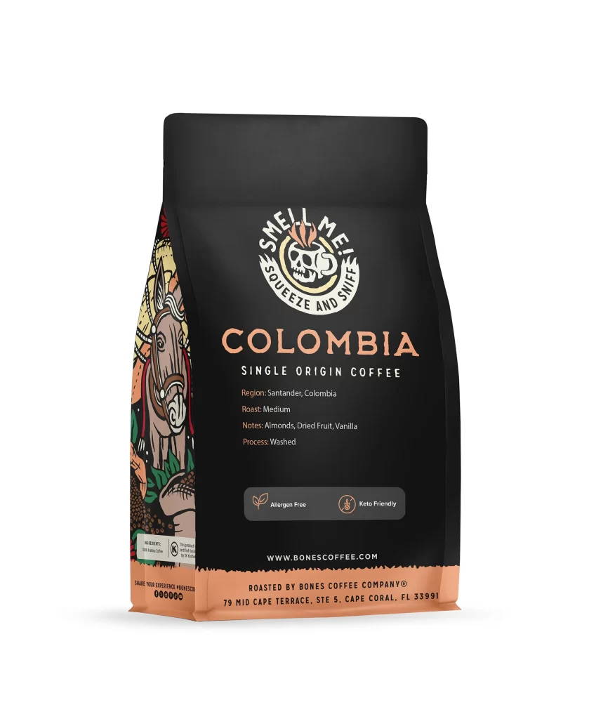
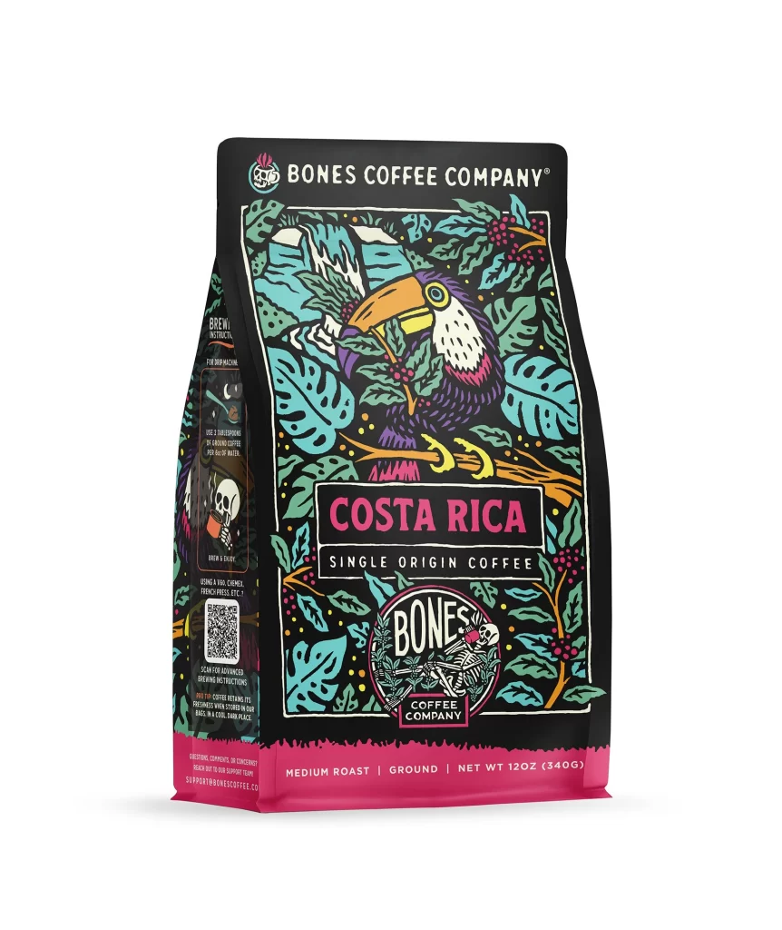
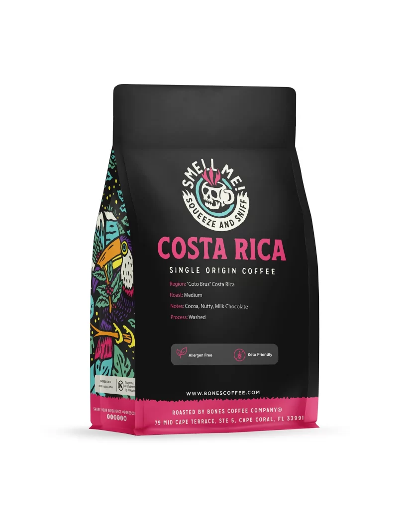
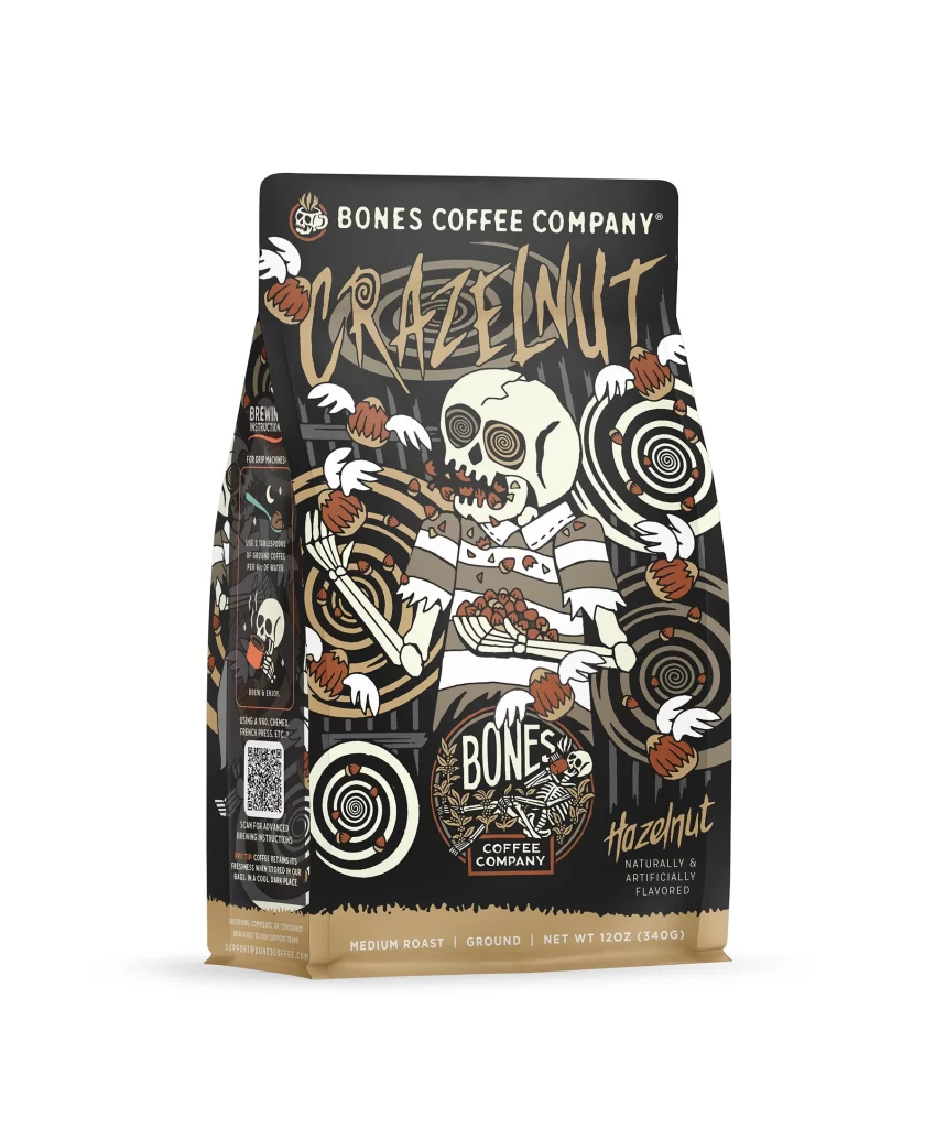
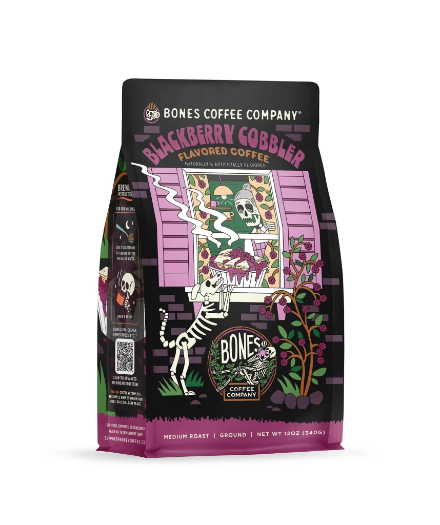
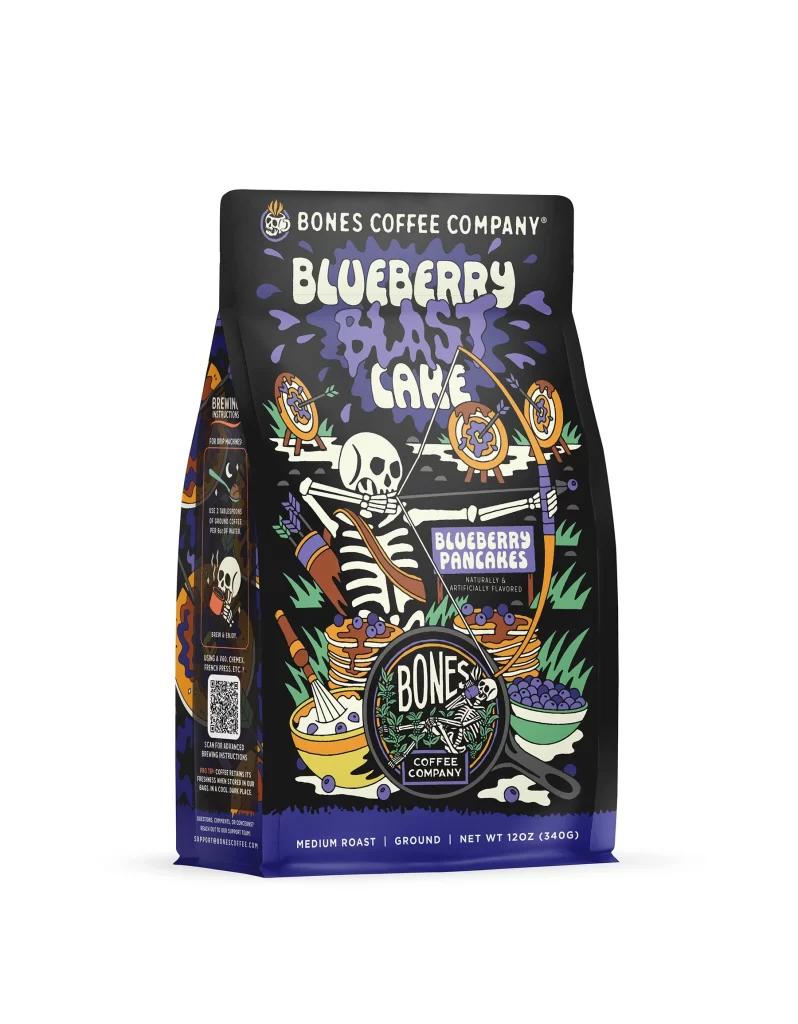
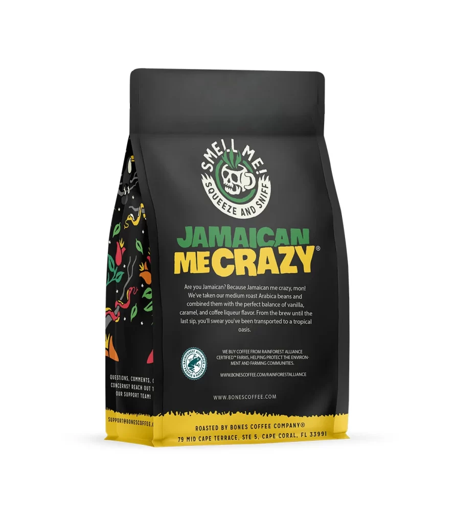
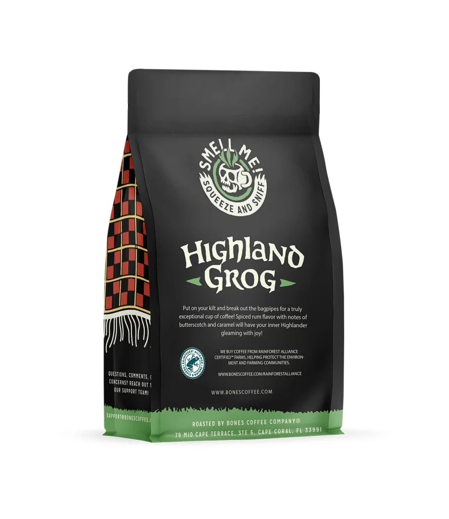
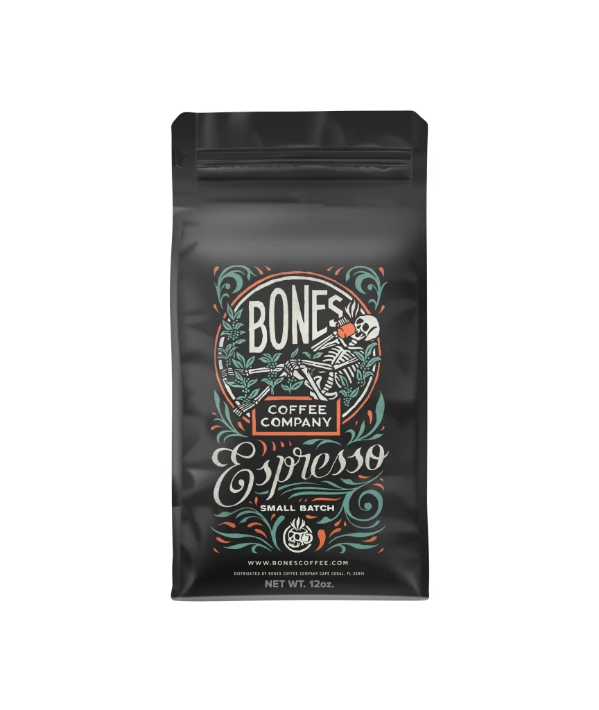
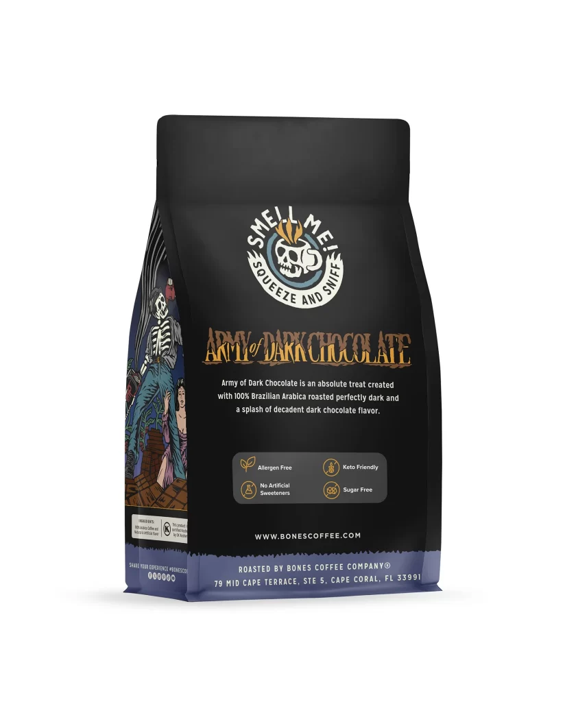
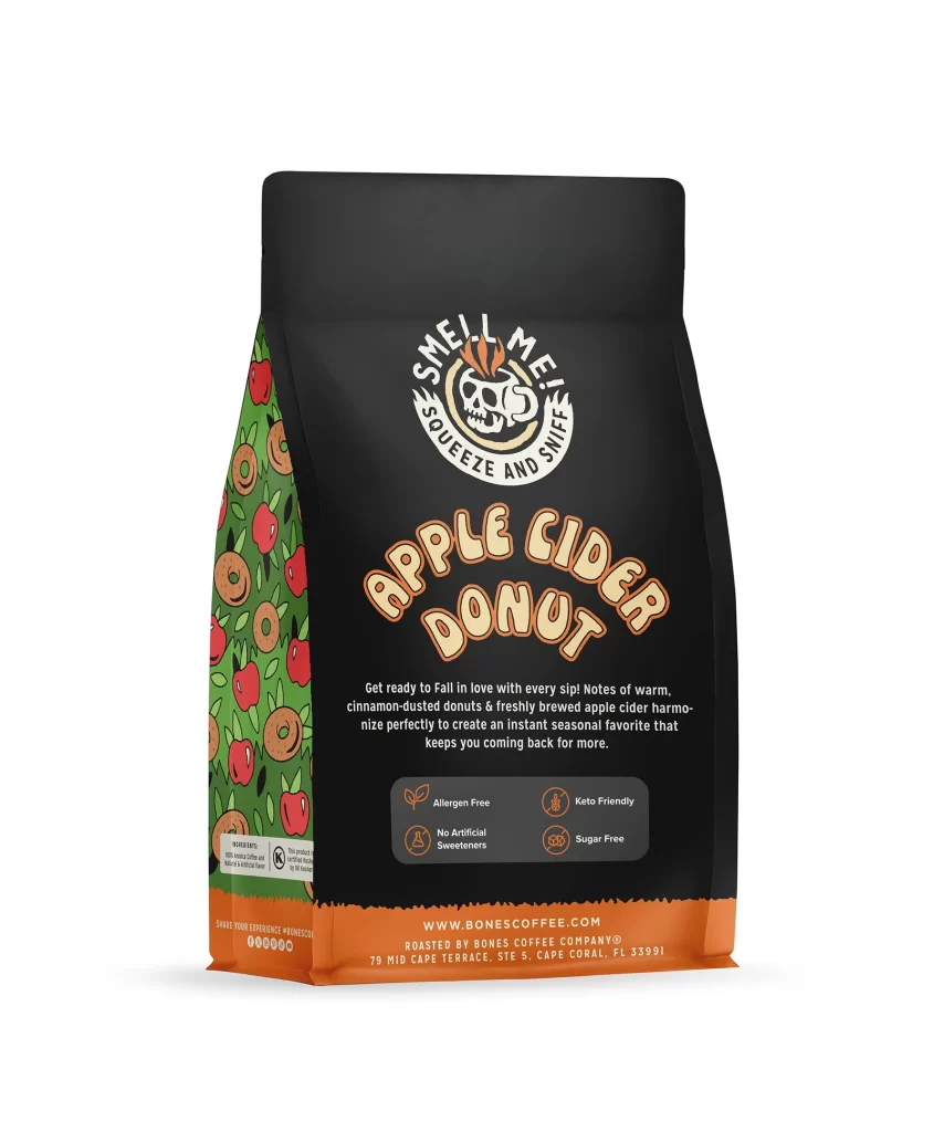
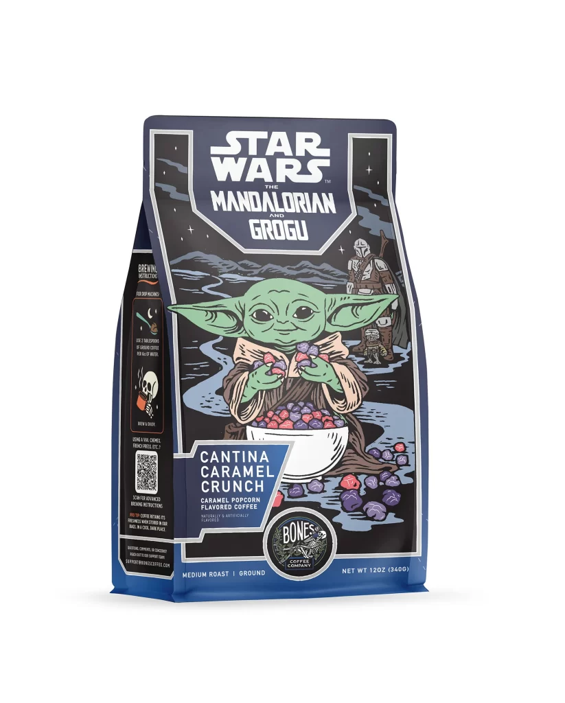
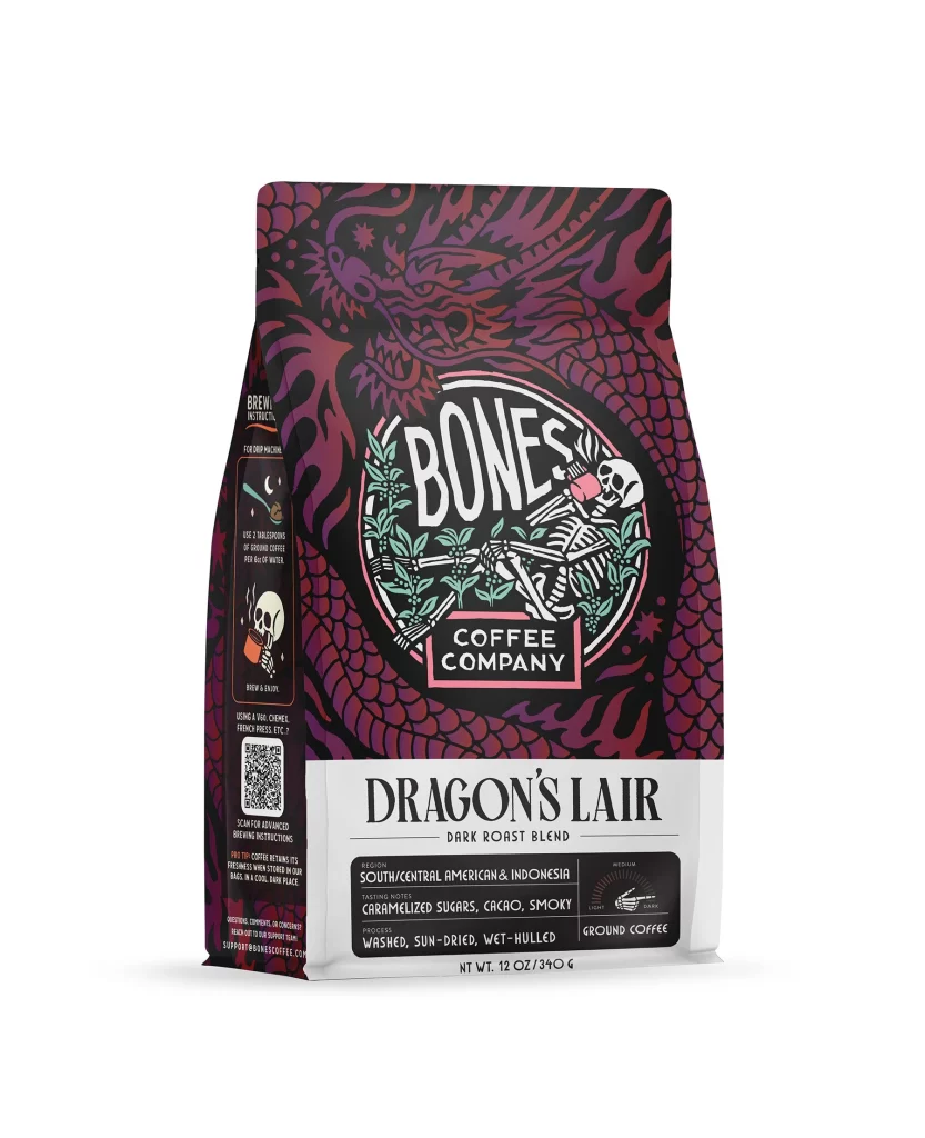
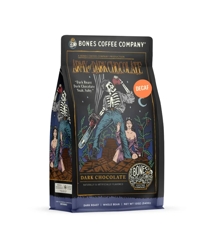
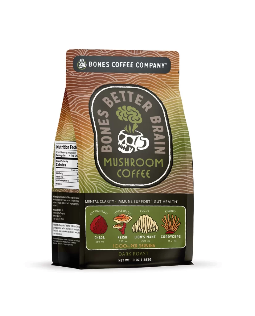
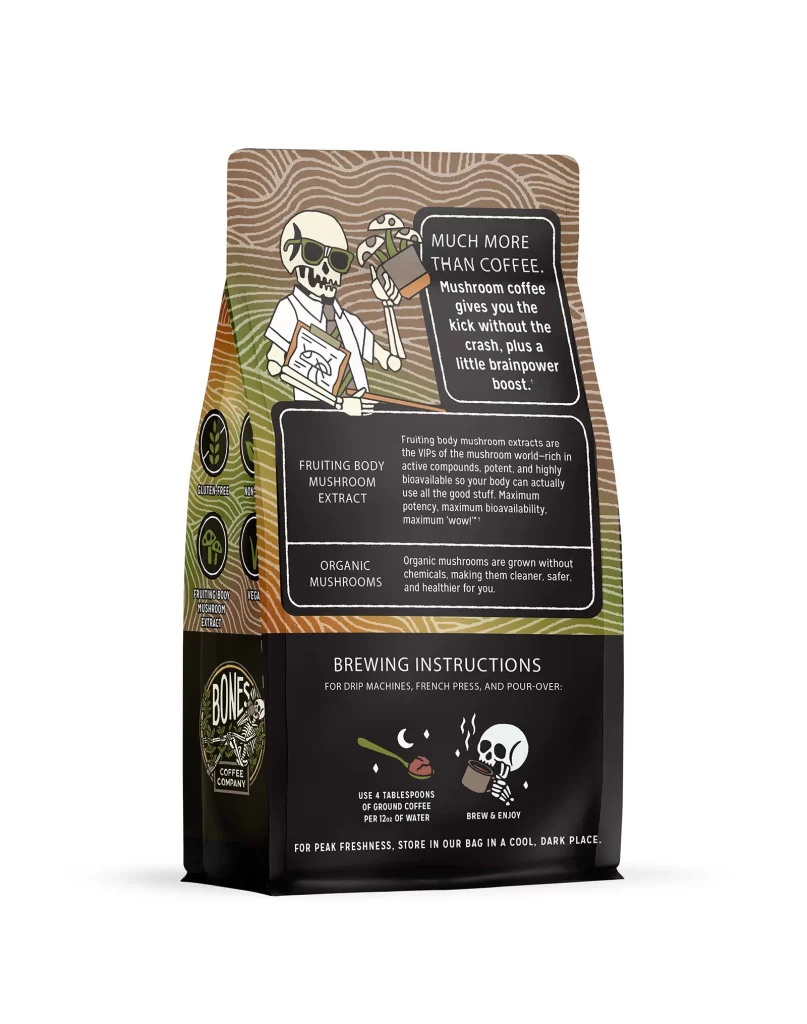
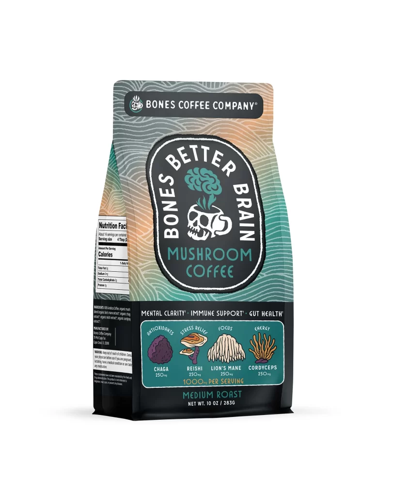
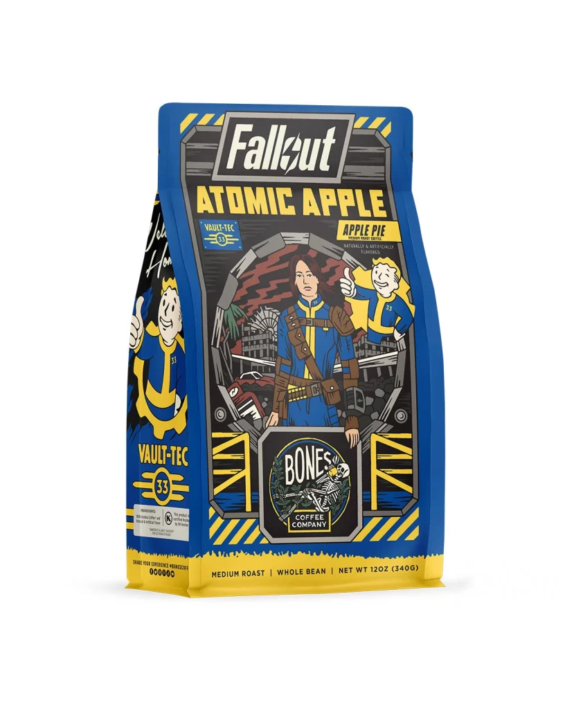
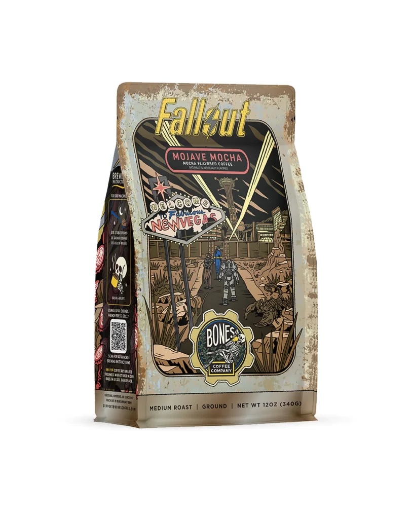
The front of the bag features a clean layout centered on appetizing flavor art. A large graphic of an apple cider donut sits next to roasted coffee beans, instantly communicating the flavor profile. The design uses a white studio product photo of the physical package, highlighting the matte finish and the 12 oz 340 g net weight details printed clearly at the bottom.
Typography relies on bold, custom lettering in warm caramel and deep red tones to evoke a cozy autumn mood. These colors pop against the light background, creating strong shelf appeal. The visual hierarchy guides the eye from the brand name to the donut illustration, effectively stimulating appetite and assuring buyers of the premium coffee inside the bag.
Designers should note how the layout balances playful food illustrations with clear product data. The contrast between the warm pastry colors and the simple background creates a modern yet comforting aesthetic. This reference shows how to use flavor art and strategic typography to communicate taste and quality while maintaining a professional look suitable for a premium coffee brand.